SplitContainerControl
SplitContainerControl is a composite control that displays two panels separated by a movable splitter. Users can drag the splitter to change size of the panels. They can also click the splitter to collapse a selected panel, and then click the splitter again to restore the panel.
The control's main features include:
- Users can drag-and-drop the splitter to resize the panels.
- Setting size of the panels in code.
- Vertical or horizontal arrangement of the panels.
- Ability to collapse/expand one of the panels.
- An option to hide the splitter.
Specify Content for the Panels
Use the SplitContainerControl.Panel1 and SplitContainerControl.Panel2 properties to place contents onto the control's panels. Two usage scenarios are supported:
- Initialize these properties with controls to be displayed in the panels.
- Initialize these properties with custom objects. In this case, use the
SplitContainerControl.Panel1TemplateandSplitContainerControl.Panel2Templateproperties to specify DataTemplates that will render the custom objects.
<mxe:SplitContainerControl Name="splitContainer"
                            Grid.Row="1"
                            BorderThickness="1" BorderBrush="Gray">
    <mxe:SplitContainerControl.Panel1>
        <Label Content="Panel1" HorizontalAlignment="Center" VerticalAlignment="Center"/>
    </mxe:SplitContainerControl.Panel1>
    <mxe:SplitContainerControl.Panel2>
        <Label Content="Panel2" HorizontalAlignment="Center" VerticalAlignment="Center"/>
    </mxe:SplitContainerControl.Panel2>
</mxe:SplitContainerControl>
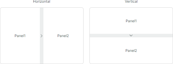
Set Panel Size and Direction
Use the SplitContainerControl.Orientation property to choose between the horizontal (default) and vertical panel arrangement.
To set size of the container's panels, use the SplitContainerControl.Panel1Length or SplitContainerControl.Panel2Length properties.
- In a horizontal orientation, these properties set the width of the panels.
- In a vertical orientation, they set the height of the panels.
The Panel1MinLength, Panel1MaxLength, Panel2MinLength, and Panel2MaxLength properties allow you to set resizing constraints for the panels. Users cannot resize the panels beyond these limits.
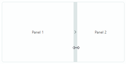
Collapse and Restore a Panel
An arrow icon displayed in the splitter indicates that a panel will be collapsed when a user clicks the splitter. In the collapsed state, the splitter's arrow icon inverts its direction. A user can click the splitter again to restore the panel.
The SplitContainerControl.CollapsePanel property allows you to specify the collapsible panel. The property's default value is Panel2.
To collapse and restore a panel in code, use the IsCollapsed property.
Disable Panel Collapsing
Set the SplitContainerControl.CollapsePanel property to None to disable the panel collapse feature. In this mode, the splitter does not display arrow icons.
Hide the Splitter
Use the SplitContainerControl.IsSplitterVisible property to false to hide the splitter in specific cases. This prevents a user from performing resize and collapse/restore operations on the panels.