Heatmap
The Heatmap control (Eremex.AvaloniaUI.Charts.Heatmap) allows you to create a two-dimensional heat map, a chart that visualizes data using color.
The control paints each data point within a 2D "map" with a color that corresponds to a value at this point.
Heatmap control is a Eremex.AvaloniaUI.Charts.ChartControl descendant, which is the base class for all chart controls, including CartersianChart and PolarChart. Thus, it inherits specific functionality common to all chart controls. The Heatmap control's features include:
- Custom color encoding
- Grayscale colorization
- Customization of the X and Y axes
- Crosshair
- Strips and constant lines
- Scroll and zoom with the mouse and keyboard
- Export the result of data colorization to a bitmap
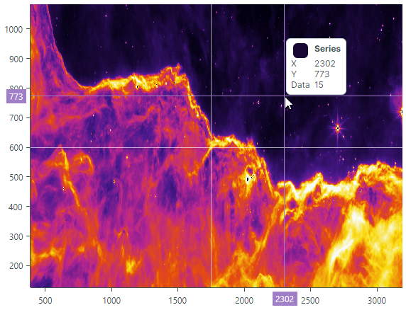
Demo Application
See the Eremex Controls Demo application for examples that demonstrate the Heatmap control's features in action.
Get Started with Heatmap Control
To set up a Heatmap control, provide data to the control, and specify a color provider that colors values of data points according to specific logic. You can also customize axes to display the axis values and, for example, constant lines.
Note that the X and Y axes in the Heatmap control are qualitative. The arguments of these axes are of the string type. The values of the data points within the "map" are of the Double type.
Provide Data
Set the Heatmap.DataAdapter property to a Eremex.AvaloniaUI.Charts.HeatmapDataAdapter object to supply data to a Heatmap control.
The HeatmapDataAdapter class contains the following main properties that need to be initialized:
public class HeatmapDataAdapter : ISeriesDataAdapter
{
    public IList<string> XArguments;
    public IList<string> YArguments;
    public double[,] Values;
    //...
}
XArguments— A list of strings that specify arguments of the X axis. The X arguments must be unique.YArguments— A list of strings that specify arguments of the Y axis. The Y arguments must be unique.Values— A two-dimensional array of values of the Double type.The width and height of the
Valuesarray must match the number of items in theXArgumentsandYArgumentslist, respectively.The
Valuesarray may contain theDouble.NaNvalue for specific points. These points are not rendered by the Heatmap control, and a user can see the control's background through these points.Rows of the
Valuesarray are rendered by the Heatmap control from bottom to top. The first row of theValuesarray is rendered at the bottom, and the last row at the top. See the example below for details.
Use the following methods to update data for the Heatmap control at runtime:
HeatmapDataAdapter.UpdateValues(double[,] newValues)— Updates current values (HeatmapDataAdapter.Values) with values specified by the method'snewValuesparameter. The number of columns and rows in thenewValuesarray must match those in theHeatmapDataAdapter.Valuesarray.HeatmapDataAdapter.UpdateXArguments(IList<string> newArguments)— Updates current X arguments (HeatmapDataAdapter.XArguments) with new arguments. The number of elements in thenewArgumentslist must match the number of elements in theHeatmapDataAdapter.XArgumentslist. The X arguments must be unique.HeatmapDataAdapter.UpdateYArguments(IList<string> newArguments)— Updates current Y arguments (HeatmapDataAdapter.YArguments) with new arguments. The number of elements in thenewArgumentslist must match the number of elements in theHeatmapDataAdapter.YArgumentslist. The Y arguments must be unique.
Example - Provide data and Use Default Rendering
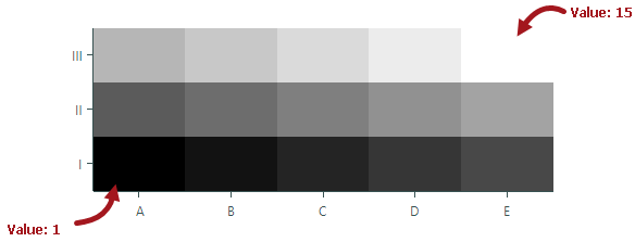
The following example supplies sample data to a Heatmap control. The data represents a two-dimensional array that consists of three rows and five columns.
The control's default color provider (HeatmapGrayscaleColorProvider) represents the minimum value in black, and the maximum value in white. Other values are colored in proportional shades of gray.
//Create an array that contains 3 rows with 5 values in each row
double[,] values = new double[,]
{
    {1, 2, 3, 4, 5}, // values rendered at the bottom
    {6, 7, 8, 9, 10},
    {11, 12, 13, 14, 15}, // values rendered at the top
};
List<string> xArgs = new List<string>() { "A", "B", "C", "D", "E" };
List<string> yArgs = new List<string>() { "I", "II", "III" };

HeatmapDataAdapter dataAdapter = new HeatmapDataAdapter(xArgs, yArgs, values);
heatMap1.DataAdapter = dataAdapter;
Data Point Value Colorization
Color providers are used to color data points in a Heatmap control. For each data point, the control requests a color for a specific value from the color provider (the Heatmap.ColorProvider property).
The following color providers are available:
HeatmapGrayscaleColorProvider(default) — Allows you to color values in grayscale.HeatmapRangeColorProvider— Allows you to color data points in a custom manner by associating custom colors with specific values.
When required, you can create your own color provider by implementing the IHeatmapColorProvider interface.
Grayscale Colorization
The Heatmap control uses grayscale coloring of data points by default. Grayscale coloring is implemented by HeatmapGrayscaleColorProvider. To use this color provider, you can leave the Heatmap.ColorProvider property unassigned, or explicitly set the Heatmap.ColorProvider property to a HeatmapGrayscaleColorProvider object.
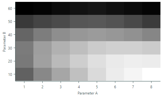
The HeatmapGrayscaleColorProvider object renders the minimum value across all data points in black, and the maximum value in white. Other values, which lie between the minimum and maximum values, are rendered in proportional shades of gray.
Example - Grayscale Colorization
The following example binds a Heatmap control to sample data and renders data points using the default color provider (HeatmapGrayscaleColorProvider). The code also shows how to change axis titles.
xmlns:mxc="https://schemas.eremexcontrols.net/avalonia/charts"

<mxc:Heatmap DataAdapter="{Binding DataAdapter}">
    <mxc:Heatmap.AxisX>
        <mxc:HeatmapAxisX Title="Parameter A">
        </mxc:HeatmapAxisX>
    </mxc:Heatmap.AxisX>
    <mxc:Heatmap.AxisY>
        <mxc:HeatmapAxisY Title="Parameter B">
        </mxc:HeatmapAxisY>
    </mxc:Heatmap.AxisY>
</mxc:Heatmap>
public partial class MainWindowViewModel : ViewModelBase
{
    [ObservableProperty]
    HeatmapDataAdapter dataAdapter;

    public MainWindowViewModel()
    {
        double[,] values = new double[,]
        {
            {148, 169, 185, 199, 213, 223, 228, 233}, // values rendered at the bottom
            {161, 182, 196, 207, 216, 222, 224, 223},
            {162, 181, 191, 198, 205, 208, 208, 205},
            {150, 163, 172, 177, 179, 177, 174, 168},
            {126, 132, 136, 142, 143, 140, 135, 127},
            {95, 97, 101, 105, 107, 104, 101, 98} // values rendered at the top
        };

        List<string> xArgs = new List<string>() { "1", "2", "3", "4", "5", "6", "7", "8" };
        List<string> yArgs = new List<string>() { "10", "20", "30", "40", "50", "60"};

        dataAdapter = new HeatmapDataAdapter(xArgs, yArgs, values);
    }
}
Custom Colorization
To color data points in a Heatmap control in a custom manner, assign a HeatmapRangeColorProvider object to the Heatmap.ColorProvider property. HeatmapRangeColorProvider allows you to associate custom colors with specific values (transition values). To calculate the colors for values that fall between two transition values, HeatmapRangeColorProvider uses a gradient between the colors assigned to these transition values.
When specifying transition values, you can specify absolute or normalized magnitudes.
The following image shows how HeatmapRangeColorProvider builds color gradients between sample absolute transition values. In this example three transition values are defined:
- Value 1 is associated with the Teal color
- Value 6 is associated with Yellow
- Value 10 is associated with Purple

Example - Custom Colorization
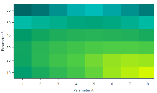
The following example uses HeatmapRangeColorProvider to colorize a Heatmap control's data points according to custom color rules. The code specifies colors to represent the absolute transition values: 95, 110, 150, 210 and 233.
Colors for other values are calculated according to a gradient between the colors assigned to adjacent transition values.
xmlns:mxc="https://schemas.eremexcontrols.net/avalonia/charts"

<mxc:Heatmap DataAdapter="{Binding DataAdapter}" ColorProvider="{Binding ColorProvider}">
    <mxc:Heatmap.AxisX>
        <mxc:HeatmapAxisX Title="Parameter A">
        </mxc:HeatmapAxisX>
    </mxc:Heatmap.AxisX>
    <mxc:Heatmap.AxisY>
        <mxc:HeatmapAxisY Title="Parameter B">
        </mxc:HeatmapAxisY>
    </mxc:Heatmap.AxisY>
</mxc:Heatmap>
public partial class MainWindowViewModel : ViewModelBase
{
    [ObservableProperty]
    HeatmapDataAdapter dataAdapter;

    [ObservableProperty]
    HeatmapRangeColorProvider colorProvider = new HeatmapRangeColorProvider();

    public MainWindowViewModel()
    {
        HeatmapRangeStop[] colorRanges = new HeatmapRangeStop[]
        {
            new() { Value = 95, Color = Color.FromRgb(0,102,101) },
            new() { Value = 110, Color = Color.FromRgb(1,210,207) },
            new() { Value = 150, Color = Color.FromRgb(0,155,105)},
            new() { Value = 210, Color = Color.FromRgb(81,206,68)},
            new() { Value = 233, Color = Color.FromRgb(213,248,0) }
        };
        colorProvider.AddRange(colorRanges);

        double[,] values = new double[,]
        {
            {148, 169, 185, 199, 213, 223, 228, 233}, // values rendered at the bottom
            {161, 182, 196, 207, 216, 222, 224, 223},
            {162, 181, 191, 198, 205, 208, 208, 205},
            {150, 163, 172, 177, 179, 177, 174, 168},
            {126, 132, 136, 142, 143, 140, 135, 127},
            {95, 97, 101, 105, 107, 104, 101, 98}    // values rendered at the top
        };

        List<string> xArgs = new List<string>() { "1", "2", "3", "4", "5", "6", "7", "8" };
        List<string> yArgs = new List<string>() { "10", "20", "30", "40", "50", "60"};

        dataAdapter = new HeatmapDataAdapter(xArgs, yArgs, values);
    }
}
Colors for Values Beyond the Boundary Transition Values
Typically, a HeatmapRangeColorProvider object should include colors for the minimum and maximum values of the entire value range. This ensures that the color gradients built by the HeatmapRangeColorProvider object cover all values supplied to the Heatmap control.
Otherwise, the values beyond the boundary transition values are colored with the same colors as the boundary transition values.
The following image demonstrates how HeatmapRangeColorProvider calculates colors when specific values are beyond the minimum and maximum transition values.

Normalized Transition Values
If you do not know the minimum and maximum absolute values of the entire data range, you can specify transition values using normalized magnitudes. Set the HeatmapRangeColorProvider.IsNormalizedValues property to true to enable value normalization for the HeatmapRangeColorProvider object. In this mode, specify transition values in the range between 0 and 1, where 0 and 1 represent the minimum and maximum values, respectively. The normalized value 0.5 represents the absolute value in the middle of the data range (minimum + (maximum-minimum)/2).
Example - Colorize Data Points if the Minimum and Maximum are not Known Beforehand
The following example uses the HeatmapRangeColorProvider object to colorize data points using normalized transition values. The HeatmapRangeColorProvider.IsNormalizedValues property is set to true to enable value normalization. Transition values are specified in normalized magnitudes: 0, 0.3, 0.7 and 1, where values 0 and 1 represent the minimum and maximum values of the data range.
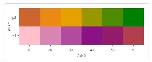
double[,] values = new double[,]
{
    {-5, -4, -3, -2, -1, 0}, // values rendered at the bottom
    {1, 2, 3, 4, 5, 6}       // values rendered at the top
};

List<string> xArgs = new List<string>();

for (int i=1; i <= values.GetLength(1); i++)
{
    xArgs.Add((i*10).ToString());
}

List<string> yArgs = new List<string>() { "p1", "p2" };


HeatmapRangeColorProvider colorProvider = new HeatmapRangeColorProvider();
colorProvider.IsNormalizedValues = true;
HeatmapRangeStop[] colorRanges = new HeatmapRangeStop[]
{
    new() { Value = 0, Color = Colors.Pink },
    new() { Value = 0.3, Color = Colors.Purple},
    new() { Value = 0.7, Color = Colors.Orange },
    new() { Value = 1, Color = Colors.Green},
};
colorProvider.AddRange(colorRanges);

heatmap.ColorProvider = colorProvider;
heatmap.DataAdapter = new HeatmapDataAdapter(xArgs, yArgs, values);
Axes
The Heatmap control contains two axes, X and Y. Arguments for these axes are provided with a call to the HeatmapDataAdapter constructor, by the xArguments and yArguments parameters.
double[,] values = new double[,]
{
    {1, 2, 3, 4, 5}, // values rendered at the bottom
    {6, 7, 8, 9, 10},
    {11, 12, 13, 14, 15}, // values rendered at the top
};
List<string> xArgs = new List<string>() { "A", "B", "C", "D", "E" };
List<string> yArgs = new List<string>() { "I", "II", "III" };
//...
HeatmapDataAdapter dataAdapter = new HeatmapDataAdapter(xArgs, yArgs, values);
heatmap.DataAdapter = dataAdapter;
- The control's axes are qualitative, which means that their values are of the string type.
- The number of elements in the
yArgumentslist must match the number of rows in the two-dimensional data array (HeatmapDataAdapter.Values). - The number of elements in the
xArgumentslist must match the number of columns in the two-dimensional data array (HeatmapDataAdapter.Values).
You can customize axis settings by specifying the Heatmap.AxisX and Heatmap.AxisY objects.
The following code sets titles for the axes.
xmlns:mxc="https://schemas.eremexcontrols.net/avalonia/charts"

<mxc:Heatmap ...>
    <mxc:Heatmap.AxisX>
        <mxc:HeatmapAxisX Title="Axis X">
        </mxc:HeatmapAxisX>
    </mxc:Heatmap.AxisX>
    <mxc:Heatmap.AxisY>
        <mxc:HeatmapAxisY Title="Axis Y">
        </mxc:HeatmapAxisY>
    </mxc:Heatmap.AxisY>
</mxc:Heatmap>
Axis Scale
You can use the AxisX.ScaleOptions and AxisY.ScaleOptions properties to customize axis display options. These properties are of the QualitativeScaleOptions type.
The following example sets the GridSpacing scale option to 2 to display every second label and major tickmark, and skip the labels and tickmarks in between.

<mxc:HeatmapAxisX >
    <mxc:HeatmapAxisX.ScaleOptions>
        <mxc:QualitativeScaleOptions GridSpacing="2" />
    </mxc:HeatmapAxisX.ScaleOptions>
</mxc:HeatmapAxisX>
Format Axis Labels
The ScaleOptions.LabelFormatter property allows you to specify an object that formats axis display values in a custom manner. You can implement a custom label formatter based on a function/expression using the Eremex.AvaloniaUI.Charts.FuncLabelFormatter object.
The following example implements a custom label formatter for axis values.

<mxc:Heatmap Grid.Row="1" Name="heatmap">
    <mxc:Heatmap.AxisX>
        <mxc:HeatmapAxisX Title="Parameter A">
            <mxc:HeatmapAxisX.ScaleOptions>
                <mxc:QualitativeScaleOptions LabelFormatter="{Binding CustomLabelFormatter}" />
            </mxc:HeatmapAxisX.ScaleOptions>
        </mxc:HeatmapAxisX>
    </mxc:Heatmap.AxisX>
</mxc:Heatmap>
public partial class MainWindowViewModel : ViewModelBase
{
    // ...
    [ObservableProperty] FuncLabelFormatter customLabelFormatter = new(o => String.Format("val: {0}", o));
}
Axis Settings
The following list summarizes display and behavior settings of the Heatmap control's axes:
ConstantLinesandConstantLinesSource— Allows you to paint constant lines for specific values. See Constant Lines and Strips.EnableZooming— Allows a user to zoom an axis with the mouse wheel and keyboard.EnableScrolling— Allows a user to scroll an axis with a mouse drag operation and keyboard shortcuts.InterlacingColor- The color used to paint interlaced strip lines (when theShowInterlacingoption is enabled).MinorCount— Specifies the number of minor tickmarks and grid lines.Position— Specifies the position of the axis. Available options include:Near(the X-axis is displayed at the bottom, and the Y-axis is displayed at the chart's left edge), andFar(the X-axis is displayed at the top, and the Y-axis is displayed at the chart's right edge).ShowAxisLine— Specifies the visibility of the axis line.ShowInterlacing— Specifies whether to paint interlaced strip lines between major gridlines. SeeShowMajorGridlinesfor more information.ShowLabels— Specifies the visibility of the labels corresponding to major tickmarks.ShowMajorGridlines— Specifies the visibility of the grid lines corresponding to major tickmarks. Major and minor gridlines are displayed behind colored data points. Gridlines are visible in the following cases:- at positions where data points are rendered using semi-transparent colors.
- at positions where data points are not rendered (for instance, when a data point's value is
Double.NaN).
ShowMajorTickmarks— Specifies the visibility of the major tickmarks.ShowMinorGridlines— Specifies the visibility of the grid lines corresponding to minor tickmarks. SeeShowMajorGridlinesfor more information.ShowMinorTickmarks— Specifies the visibility of the minor tickmarks.ShowTitle— Specifies the visibility of the axis title (theTitleproperty).StripsandStripsSource— Allows you to fill ranges between specific values. See Constant Lines and Strips.Thickness— The thickness of the axis line.Title— Gets or sets the title for the axis.TitlePosition— Gets or sets the position of the axis title.
Crosshair
A crosshair is a pair of thin vertical and horizontal lines (argument and value lines) that allow a user to see exact values of axes and data points at the current cursor position. The crosshair appears when hovering over the data area, and it follows the mouse pointer.
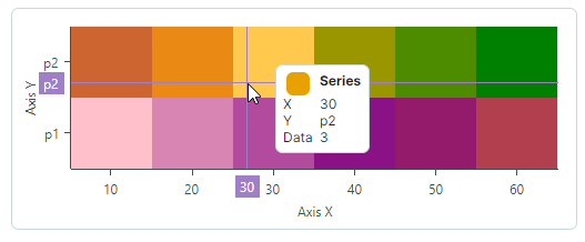
Use the Heatmap.CrosshairOptions property to customize display settings of the crosshair, or disable this feature.
Disable the Crosshair
The CrosshairOptions.ShowCrosshair property allows you to disable the crosshair.
<mxc:Heatmap x:Name="heatmap1" >
    <mxc:Heatmap.CrosshairOptions>
        <mxc:CrosshairOptions ShowCrosshair="False" />
    </mxc:Heatmap.CrosshairOptions>
    <!-- ... -->
</mxc:Heatmap>
Constant Lines and Strips
The Heatmap control allows you to use constant lines and strips to mark specific values and value ranges for the horizontal and vertical axes.
Constant Lines
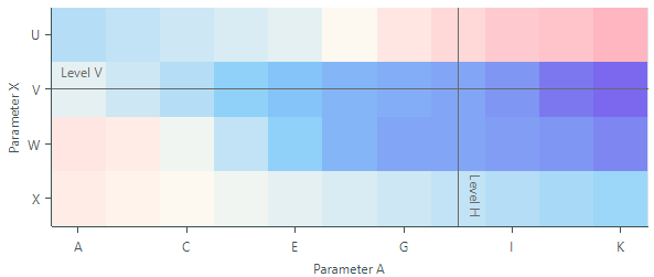
A constant line is a line drawn perpendicular to an axis that marks a specific axis value. To create constant lines, use the ConstantLines collection or the ConstantLinesSource source of the HeatmapAxisX and HeatmapAxisY objects.
The following example creates constant lines for the X and Y axes to mark axis values "H" and "V", respectively.
<mxc:Heatmap Name="heatmap">
    <mxc:Heatmap.AxisX>
        <mxc:HeatmapAxisX Title="Parameter A">
            <mxc:HeatmapAxisX.ConstantLines>
                <mxc:ConstantLine AxisValue="H" ShowTitle="True" Title="Level H" Color="DimGray" ShowBehind="False" />
            </mxc:HeatmapAxisX.ConstantLines>
        </mxc:HeatmapAxisX>
    </mxc:Heatmap.AxisX>
    <mxc:Heatmap.AxisY>
        <mxc:HeatmapAxisY Title="Parameter X">
            <mxc:HeatmapAxisY.ConstantLines>
                <mxc:ConstantLine AxisValue="V" ShowTitle="True" Title="Level V" Color="DimGray" ShowBehind="False" />
            </mxc:HeatmapAxisY.ConstantLines>
        </mxc:HeatmapAxisY>
    </mxc:Heatmap.AxisY>
</mxc:Heatmap>
Set the ConstantLine.ShowBehind option to false to draw constant lines above colored data points. Otherwise, they are drawn behind data points, and are visible in the following cases:
- at positions where data points are rendered using semi-transparent colors.
- at positions where data points are not rendered (for instance, when a data point's value is
Double.NaN).
Strips
A strip is an extension of a constant line. Strips are used to highlight ranges of axis values. They are always displayed behind colored data points.
To create strips, use the Strips collection or the StripsSource source of the HeatmapAxisX and HeatmapAxisY objects.
<mxc:Heatmap.AxisY>
    <mxc:HeatmapAxisY Title="Parameter">
        <mxc:HeatmapAxisY.Strips>
            <mxc:Strip AxisValue1="W" AxisValue2="V" Color="Gray" />
        </mxc:HeatmapAxisY.Strips>
    </mxc:HeatmapAxisY>
</mxc:Heatmap.AxisY>
The strips are visible in the following cases:
- at positions where data points are rendered using semi-transparent colors.
- at positions where data points are not rendered (for instance, when a data point's value is
Double.NaN).
Scroll and Zoom
Allow Scroll and Zoom Operations
Scroll and zoom operations are enabled by default. The following options allow you to disable these operations for the X and/or Y axes:
Axis.EnableZoomingAxis.EnableScrolling
<!-- Disable scroll and zoom operations for the X axis -->
<mxc:Heatmap.AxisX>
    <mxc:HeatmapAxisX EnableZooming="False" EnableScrolling="False"/>
</mxc:Heatmap.AxisX>
<!-- Disable scroll and zoom operations for the Y axis -->
<mxc:Heatmap.AxisY>
    <mxc:HeatmapAxisY EnableZooming="False" EnableScrolling="False"/>
</mxc:Heatmap.AxisY>
Scroll and Zoom by Users
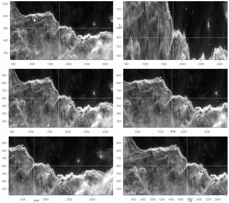
Scroll the heat map (the X and Y axes simultaneously)
Drag the data area with the mouse
or
Press Ctrl+ARROW keys to scroll using the keyboard.
Zoom the heat map
Scroll the mouse wheel over the data area
or
Press Ctrl+'+' to zoom in, and Ctrl+'-' to zoom out.
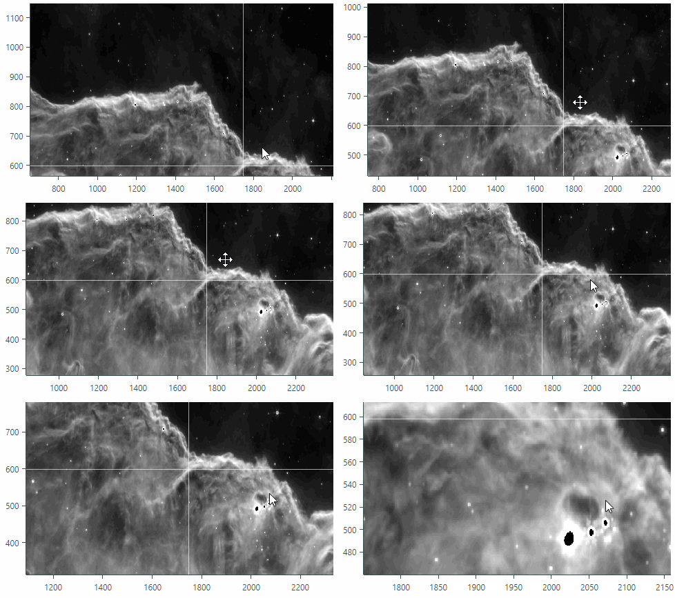
Scroll an X or Y axis
- Drag with the mouse within a corresponding axis area.
Zoom an X or Y axis
- Scroll the mouse wheel within a corresponding axis area.
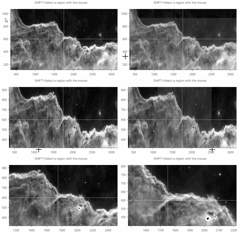
Zoom into a specific region
- Press and hold SHIFT in the data area, and then drag to select the desired rectangle.
Zoom into a value range on an axis
- Press and hold SHIFT in the axis area, and then drag to select the desired range.
Export
You can use the Heatmap.Export method to export the control's rendering to a WriteableBitmap object. The resulting bitmap contains colored data points. The size of the bitmap matches the size of the Heatmap control's data specified by the Heatmap.DataAdapter.Values array.
The following example saves a Heatmap control's rendering to an image file.
WriteableBitmap bitmap = heatmap.Export();
bitmap.Save("exported-heatmap.png");