Context Menus
Data Grid supports built-in context menus for specific elements. This topic shows how to replace and modify these menus, and display custom popup menus for the Data Grid's elements that do not have built-in context menus.
Built-in Column Header Context Menu
A right-click on a column header displays the built-in column header menu. The menu contains commands to sort and group data, show the search panel, and display the column chooser.
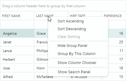
The DataGridControl.ColumnMenu property allows you to access and customize this menu.
To replace the default menu, assign a Eremex.AvaloniaUI.Controls.Bars.PopupMenu object to the DataGridControl.ColumnMenu property.
To customize the existing column header menu (add new items, or remove default items), access the menu after it has been initialized (for instance, within your DataGrid's Initialized event handler), and then modify the menu.
Data Context
The DataContext property of the column header menu and its items (ToolbarButtonItem objects) specifies the GridColumn object for which the menu has been invoked.
Example - How to replace the default column header menu
The following code creates a custom column header menu that contains the Copy Column menu item. The code binds the menu item to the CopyColumnDataCommand command defined in a ViewModel.
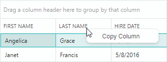
Take note of the initialization of the Command and CommandParameter properties for the menu item in the code below. The expression CommandParameter="{Binding FieldName}" specifies binding to the FieldName property of the menu item's DataContext (GridColumn.FieldName).
A GridColumn's DataContext matches the Data Grid's DataContext (a ViewModel object in this example). This allows you to access the View Model and its CopyColumnCommand command using the expression: Command="{Binding DataContext.CopyColumnCommand}".
xmlns:mxdg="https://schemas.eremexcontrols.net/avalonia/datagrid"
xmlns:mxe="https://schemas.eremexcontrols.net/avalonia/editors"
xmlns:mxb="https://schemas.eremexcontrols.net/avalonia/bars"

<mxdg:DataGridControl Name="dataGrid1">
    <mxdg:DataGridControl.ColumnMenu>
        <mxb:PopupMenu>
            <mxb:ToolbarButtonItem
                Header="Copy Column"
                Command="{Binding DataContext.CopyColumnCommand}"
                CommandParameter="{Binding FieldName}">
            </mxb:ToolbarButtonItem>
        </mxb:PopupMenu>
    </mxdg:DataGridControl.ColumnMenu>
</mxdg:DataGridControl>
public MainView()
{
    DataContext = new ViewModel();
}

public partial class ViewModel : ObservableObject
{
    [RelayCommand]
    void CopyColumn(string fieldName)
    {
        //...
    }
}
Example - How to modify the existing column header menu
The following example adds a custom command to the default column header menu.
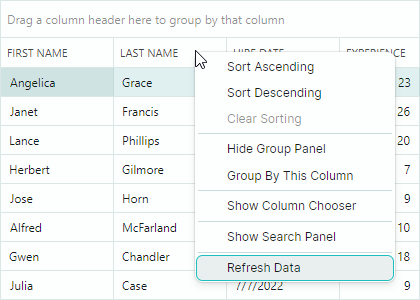
The example handles the DataGridControl.Initialized event to access the default column header menu after it has been initialized, and adds a Refresh Data command to the menu.
xmlns:mxdg="https://schemas.eremexcontrols.net/avalonia/datagrid"
xmlns:mxe="https://schemas.eremexcontrols.net/avalonia/editors"
xmlns:mxb="https://schemas.eremexcontrols.net/avalonia/bars"

<mxdg:DataGridControl Name="dataGrid1" Initialized="OnInitialized">
    ...
</mxdg:DataGridControl>
using Eremex.AvaloniaUI.Controls.Bars;

private void OnInitialized(object sender, System.EventArgs e)
{
    ToolbarButtonItem btn1 = new ToolbarButtonItem();
    btn1.Header = "Refresh Data";
    btn1.ShowSeparator = true;
    btn1.Command = new RelayCommand<DataGridControl>(UpdateDataGrid);
    btn1.CommandParameter = dataGrid1;
    dataGrid1.ColumnMenu.Items.Add(btn1);
}

[RelayCommand]
void UpdateDataGrid(DataGridControl dataGrid)
{
    //...
}
Row Cell Menu
Data Grid supports a built-in context menu for row cells (see the DataGridControlBase.RowCellMenu property). This menu is initially empty, and therefore hidden. To show the row cell menu, populate it with items in XAML or in code-behind.
Data Context
The DataContext of the row cell menu and its items contains a Eremex.AvaloniaUI.Controls.DataControl.Visuals.CellData object, which allows you to access context specific information:
CellData.DataControl— Returns the container control (DataGridControl) for which the menu is invoked.CellData.Row— Returns the clicked row's underlying data object.
Example - How to show the same context menu commands for all rows
The following example adds the "Copy Row" command to the row cell menu (DataGridControlBase.RowCellMenu) for all rows.
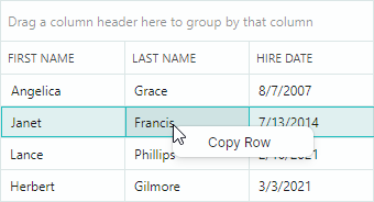
The XAML code below assigns a popup menu to the DataGridControl.RowCellMenu property. The popup menu contains a single item (ToolbarButtonItem) bound to the CopyRowCommand command defined in a View Model (a Data Grid's DataContext).
xmlns:mxdg="https://schemas.eremexcontrols.net/avalonia/datagrid"
xmlns:mxe="https://schemas.eremexcontrols.net/avalonia/editors"
xmlns:mxb="https://schemas.eremexcontrols.net/avalonia/bars"

<mxdg:DataGridControl Name="dataGrid1">
    <mxdg:DataGridControl.RowCellMenu>
        <mxb:PopupMenu>
            <mxb:PopupMenu.Items>
                <mxb:ToolbarButtonItem Header="Copy Row"
                 Command="{Binding DataControl.DataContext.CopyRowCommand}"
                 CommandParameter="{Binding Row}"/>
            </mxb:PopupMenu.Items>
        </mxb:PopupMenu>
    </mxdg:DataGridControl.RowCellMenu>
</mxdg:DataGridControl>
public partial class MainView : UserControl
{
    ViewModel viewModel = new ViewModel();
    public MainView()
    {
        DataContext = viewModel;
        InitializeComponent();
    }
}

public partial class ViewModel : ObservableObject
{
    public ViewModel() { }
    [RelayCommand]
    void CopyRow(object row)
    {
        //...
    }
}
Example - How to show different context menu commands for different rows
A Data Grid control in this example displays a list of Employee objects. The example initializes the context menu for rows (DataGridControlBase.RowCellMenu), and displays different menu items for different data rows.

The context menu displays the Show Working Hours menu item for rows that refer to part-time employees (the Employee.IsPartTime property returns true).
The context menu displays the Open Contract Details menu item for rows that refer to contractors (the Employee.IsContract property returns true).
The XAML code below adds two items ("Show Working Hours" and "Open Contract Details") to the context menu. Visibility of these items is managed dynamically by the business object's IsPartTime and IsContract properties.
xmlns:mxdg="https://schemas.eremexcontrols.net/avalonia/datagrid"
xmlns:mxb="https://schemas.eremexcontrols.net/avalonia/bars"

<mxdg:DataGridControl Name="dataGrid1" AutoGenerateColumns="True" ItemsSource="{Binding Employees}">
    <mxdg:DataGridControl.RowCellMenu>
        <mxb:PopupMenu>
            <mxb:PopupMenu.Items>
                <mxb:ToolbarButtonItem
                    Header="Show Working Hours"
                    Command="{Binding DataControl.DataContext.ShowWorkingHoursCommand}"
                    CommandParameter="{Binding Row}"
                    Glyph="{SvgImage 'avares://AvaloniaApplication3/Assets/time.svg'}"
                    GlyphSize="20,20"
                    IsVisible="{Binding Row.IsPartTime}">
                </mxb:ToolbarButtonItem>
                <mxb:ToolbarButtonItem
                    Header="Open Contract Details"
                    Command="{Binding DataControl.DataContext.OpenContractDetailsCommand}"
                    CommandParameter="{Binding Row}"
                    Glyph="{SvgImage 'avares://AvaloniaApplication3/Assets/details.svg'}"
                    GlyphSize="20,20"
                    IsVisible="{Binding Row.IsContract}"
                    >
                </mxb:ToolbarButtonItem>
            </mxb:PopupMenu.Items>
        </mxb:PopupMenu>
    </mxdg:DataGridControl.RowCellMenu>
</mxdg:DataGridControl>
public partial class MainView : UserControl
{
    MainViewModel viewModel = new MainViewModel();

    public MainView()
    {
        DataContext = viewModel;

        viewModel.Employees.Add(new Employee() {
            Name = "Herbert McGill", EmploymentType=EmploymentType.FullTime,
            Position= "Customer Service"
        });
        viewModel.Employees.Add(new Employee() {
            Name = "Cora Gilmore", EmploymentType = EmploymentType.PartTime,
            Position = "Accountant"
        });
        viewModel.Employees.Add(new Employee() {
            Name = "Earl Case", EmploymentType = EmploymentType.PartTime,
            Position = "Software Engineer"
        });
        viewModel.Employees.Add(new Employee() {
            Name = "Julius Howell", EmploymentType = EmploymentType.Contract,
            Position = "Financial Analyst"
        });
        viewModel.Employees.Add(new Employee() {
            Name = "Trevor Cameron", EmploymentType = EmploymentType.Contract,
            Position = "Accountant"
        });
        viewModel.Employees.Add(new Employee() {
            Name = "Lon Monroe", EmploymentType = EmploymentType.FullTime,
            Position = "Management"
        });

        InitializeComponent();
    }
}

public partial class MainViewModel : ViewModelBase
{
    public MainViewModel() { }

    public ObservableCollection<Employee> Employees { get; } = new();

    [RelayCommand]
    void OpenContractDetails(Employee emp)
    {
        if(emp.EmploymentType == EmploymentType.Contract)
        {
            //...
        }
    }

    [RelayCommand]
    void ShowWorkingHours(Employee emp)
    {
        if(emp.EmploymentType == EmploymentType.PartTime)
        {
            //...
        }
    }
}

public partial class Employee : ObservableObject
{
    [ObservableProperty]
    public string name = "";

    [ObservableProperty]
    public string position = "";

    [ObservableProperty]
    public EmploymentType employmentType;

    [Browsable(false)]
    public bool IsContract => EmploymentType == EmploymentType.Contract;

    [Browsable(false)]
    public bool IsPartTime => EmploymentType == EmploymentType.PartTime;
}

public enum EmploymentType
{
    [Display(Name = "Full Time")]
    FullTime,
    [Display(Name = "Part Time")]
    PartTime,
    Contract
}
Example - How to generate context menu commands from a ViewModel
This example shows how to populate a DataGrid control's row cell menu with items defined in a ViewModel.
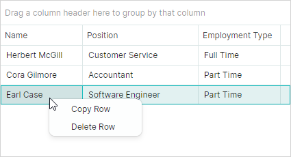
The row cell menu (DataGridControl.RowCellMenu) is populated with items (ToolbarButtonItem objects) from an item source specified by the PopupMenu.ItemsSource collection. In this example, the PopupMenu.ItemsSource property is bound to the MenuItems collection defined in the main View Model using the following binding expression:
<mxb:PopupMenu ItemsSource="{Binding DataControl.DataContext.MenuItems}">
When a PopupMenu is displayed for a DataGrid cell, the menu's DataContext contains a Eremex.AvaloniaUI.Controls.DataControl.Visuals.CellData object. The CellData object exposes the DataControl property, which allows you to access the control for which the menu is displayed.
The main View Model is assigned to the control's DataContext. Thus, the DataControl.DataContext.MenuItems syntax refers to the MenuItems collection defined in the main View Model.
The CellData object also contains other properties that allow you to access cell-related information (column, row object, etc.).
The menu items are initialized using styles. The DataContext of the menu items are elements of the PopupMenu.ItemsSource collection. In this example, the PopupMenu.ItemsSource property stores a collection of MenuItemViewModel objects. The following snippet binds the ToolbarButtonItem.Header and ToolbarButtonItem.Command properties to the MenuItemViewModel.Header and MenuItemViewModel.Command properties, respectively.
<mxb:PopupMenu.Styles>
    <Style Selector="mxb|ToolbarButtonItem">
        <Setter Property="Header" Value="{Binding Header}"/>
        <Setter Property="Command" Value="{Binding Command}"  />
    </Style>
</mxb:PopupMenu.Styles>
A ToolbarButtonItem's command requires information about the row that has been right-clicked. To pass the data row to the command, the XAML code sets the ToolbarButtonItem.CommandParameter property, as follows:
xmlns:mxvis="clr-namespace:Eremex.AvaloniaUI.Controls.DataControl.Visuals;
 assembly=Eremex.Avalonia.Controls"

<mxb:PopupMenu.Styles>
    <Style Selector="mxb|ToolbarButtonItem">
        ...
        <Setter Property="CommandParameter"
         Value="{Binding $parent[mxvis:CellControl].DataContext.Row}"  />
    </Style>
</mxb:PopupMenu.Styles>
Here, the $parent[mxvis:CellControl] expression traverses the logical tree to locate a CellControl object (it is a parent of the ToolbarButtonItem's DataContext). The CellControl.DataContext object contains an Eremex.AvaloniaUI.Controls.DataControl.Visuals.CellData object, which allows you to access the data row from the CellData.Row property.
The complete code is shown below.
xmlns:mxdg="https://schemas.eremexcontrols.net/avalonia/datagrid"
xmlns:mxb="https://schemas.eremexcontrols.net/avalonia/bars"
xmlns:mxvis="clr-namespace:Eremex.AvaloniaUI.Controls.DataControl.Visuals;
 assembly=Eremex.Avalonia.Controls"

<mxdg:DataGridControl Name="dataGrid1" AutoGenerateColumns="True" ItemsSource="{Binding Employees}">
    <mxdg:DataGridControl.RowCellMenu>
        <mxb:PopupMenu ItemsSource="{Binding DataControl.DataContext.MenuItems}">
            <mxb:PopupMenu.Styles>
                <Style Selector="mxb|ToolbarButtonItem">
                    <Setter Property="Header" Value="{Binding Header}"/>
                    <Setter Property="Command" Value="{Binding Command }"  />
                    <Setter Property="CommandParameter"
                     Value="{Binding $parent[mxvis:CellControl].DataContext.Row}"  />
                </Style>
            </mxb:PopupMenu.Styles>
        </mxb:PopupMenu>
    </mxdg:DataGridControl.RowCellMenu>
</mxdg:DataGridControl>
public partial class MainView : UserControl
{
    MainViewModel viewModel = new MainViewModel();

    public MainView()
    {
        DataContext = viewModel;

        viewModel.Employees.Add(new Employee() {
            Name = "Herbert McGill", EmploymentType=EmploymentType.FullTime,
            Position= "Customer Service"
        });
        viewModel.Employees.Add(new Employee() {
            Name = "Cora Gilmore", EmploymentType = EmploymentType.PartTime,
            Position = "Accountant"
        });
        viewModel.Employees.Add(new Employee() {
            Name = "Earl Case", EmploymentType = EmploymentType.PartTime,
            Position = "Software Engineer"
        });

        InitializeComponent();
    }
}

public partial class MainViewModel : ViewModelBase
{
    public ObservableCollection<Employee> Employees { get; } = new();

    public MainViewModel()
    {
        MenuItemViewModel menuItem1 = new MenuItemViewModel();
        menuItem1.Header = "Copy Row";
        menuItem1.Command = new RelayCommand<object>(CopyRow);
        MenuItems.Add(menuItem1);

        MenuItemViewModel menuItem2 = new MenuItemViewModel();
        menuItem2.Header = "Delete Row";
        menuItem2.Command = new RelayCommand<object>(DeleteRow);
        MenuItems.Add(menuItem2);

    }

    public ObservableCollection<MenuItemViewModel> MenuItems { get; } = new();

    [RelayCommand]
    void CopyRow(object row)
    {
        //...
    }
    [RelayCommand]
    void DeleteRow(object row)
    {
        //...
    }
}

public partial class MenuItemViewModel : ObservableObject
{
    [ObservableProperty]
    string? header;

    [ObservableProperty]
    ICommand? command;
}

public partial class Employee : ObservableObject
{
    [ObservableProperty]
    public string name = "";

    [ObservableProperty]
    public string position = "";

    [ObservableProperty]
    public EmploymentType employmentType;

    [Browsable(false)]
    public bool IsContract => EmploymentType == EmploymentType.Contract;

    [Browsable(false)]
    public bool IsPartTime => EmploymentType == EmploymentType.PartTime;
}

public enum EmploymentType
{
    [Display(Name = "Full Time")]
    FullTime,
    [Display(Name = "Part Time")]
    PartTime,
    Contract
}
Customize Menus on Showing
You can handle the PopupMenu.Opening event to dynamically customize a DataGrid's context menus. The event occurs when a PopupMenu is about to be displayed.
Example - How to show a context menu for the first column
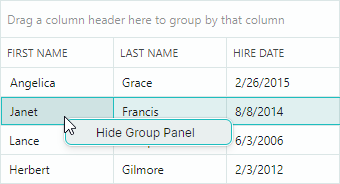
The following example assign an empty PopupMenu to the DataGridControlBase.RowCellMenu property, and then handles the PopupMenu.Opening event to populate the menu with items when a user right-clicks cells within the first visible DataGrid column. The menu remains empty (and thus it's not displayed) when a user right-clicks within other columns.
The created menu contains the "Show/Hide Group Panel" check button that toggles the visibility of the DataGrid's Group Panel (the DataGridControlBase.ShowGroupPanel property).
<mxdg:DataGridControl Name="dataGrid1" ...>
    <mxdg:DataGridControl.RowCellMenu>
        <mxb:PopupMenu Opening="RowCellMenuOpening"/>
    </mxdg:DataGridControl.RowCellMenu>
</mxdg:DataGridControl>
using Eremex.AvaloniaUI.Controls.DataControl.Visuals;

void RowCellMenuOpening(object sender, CancelEventArgs e)
{
    if (sender == null) return;
    PopupMenu menu = sender as PopupMenu;
    menu.Items.Clear();

    CellData cellData = menu.DataContext as CellData;
    DataGridControl control = cellData.DataControl as DataGridControl;
    GridColumn column = cellData.Column as GridColumn;
    //// Access the underlying data row, when required.
    //object dataRow = cellData.Row;

    if(column.VisibleIndex == 0)
    {
        ToolbarCheckItem btn1 = new ToolbarCheckItem();
        btn1.IsChecked = control.ShowGroupPanel;
        btn1.Header = (control.ShowGroupPanel) ? "Hide Group Panel" : "Show Group Panel";
        btn1.Command = new RelayCommand<DataGridControl>(ShowGroupPanelCommand);
        btn1.CommandParameter = control;
        menu.Items.Add(btn1);
    }
}

[RelayCommand]
void ShowGroupPanelCommand(DataGridControl dataGrid)
{
    dataGrid.ShowGroupPanel = !dataGrid.ShowGroupPanel;
}
Show a Context Menu for Controls Using a ToolbarManager's Attached Property
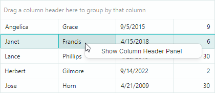
The Eremex.AvaloniaUI.Controls.Bars.ToolbarManager component provides the ContextPopup attached property that allows you to assign a context menu to any control, including DataGrid. This context menu is displayed for DataGrid regions that have no default context menus, and for regions with empty default menus.
Example - How to assign a context menu using the ToolbarManager.ContextPopup attached property
The following code uses the ToolbarManager.ContextPopup attached property to specify a context menu for a DataGrid control. The menu contains the Show Column Header Panel/Hide Column Header Panel menu check item which toggles the visibility of the DataGridControl.ShowColumnHeaders option.
<mxdg:DataGridControl Name="dataGrid1">
    <mxdg:DataGridControl.Styles>
        <Style Selector="mxdg|DataGridControl">
            <Setter Property="mxb:ToolbarManager.ContextPopup" >
                <Template>
                    <mxb:PopupMenu Tag="dataGrid1">
                        <mxb:ToolbarCheckItem Header="Show Column Header Panel"
                         IsChecked="{Binding $parent[mxdg:DataGridControl].ShowColumnHeaders, Mode=TwoWay}"
                         IsVisible="{Binding !$parent[mxdg:DataGridControl].ShowColumnHeaders}"/>
                        <mxb:ToolbarCheckItem Header="Hide Column Header Panel"
                         IsChecked="{Binding $parent[mxdg:DataGridControl].ShowColumnHeaders, Mode=TwoWay}"
                         IsVisible="{Binding $parent[mxdg:DataGridControl].ShowColumnHeaders}"/>
                    </mxb:PopupMenu>
                </Template>
            </Setter>
        </Style>
    </mxdg:DataGridControl.Styles>
</mxdg:DataGridControl>