Styles
The Avalonia styling system allows you to customize settings of the Eremex Avalonia Controls as well as settings of specific visual elements from which the controls consist. This topic shows how to use styles to customize the following visual elements of the Data Grid control:
- Column header
- Row
- Group Row
- Row cell
Use the DataGridControl.Styles property to change the control's styles.
A typical style has a style selector and a collection of property setters. The selector specifies the target Control object that encapsulates a visual element. The property setters specify the target control's properties and their values.
The following code creates a simple style that sets the background of all data rows to the same color.
xmlns:mxdg="https://schemas.eremexcontrols.net/avalonia/datagrid"
xmlns:mxdgvis="clr-namespace:Eremex.AvaloniaUI.Controls.DataGrid.Visuals;assembly=Eremex.Avalonia.Controls"

<mxdg:DataGridControl.Styles>
    <Style Selector="mxdgvis|DataGridRowControl">
        <Setter Property="Background" Value="Ivory" />
    </Style>
</mxdg:DataGridControl.Styles>
Apply Styles to Specific Control States
Style selectors in Avalonia support pseudo-classes. A pseudo-class is a keyword added to a selector. It specifies a target control's state to which the style is applied.
DataGrid provides custom pseudo-classes to address specific states of the controls' visual elements. The sections below list custom pseudo-classes supported for the controls' visual elements.
The code below creates a style selector that targets DataGrid rows. The :focusedAndSelectedState pseudo-class is used to only apply the style to rows that are in the focused state.
xmlns:mxdgvis="clr-namespace:Eremex.AvaloniaUI.Controls.DataGrid.Visuals;assembly=Eremex.Avalonia.Controls"

<Style Selector="mxdgvis|DataGridRowControl:focusedAndSelectedState">
    ...
</Style>
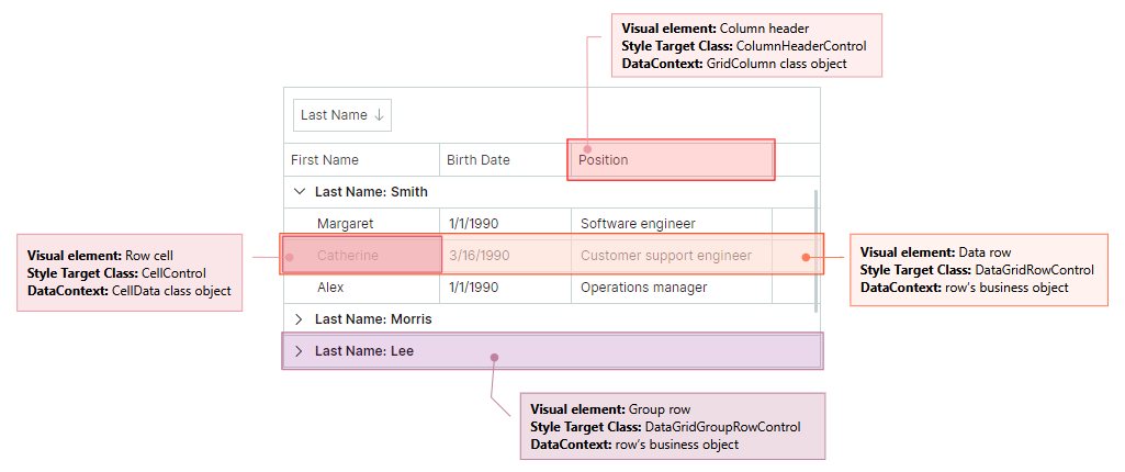
Visual Elements' Controls
The style selector's syntax should specify the target control (a Control object that encapsulates a visual element) to which the style is applied. The following image shows a Data Grid's visual elements and corresponding target controls.
Style a Data Row
A data row displays cells with data.
Use the following information to customize the data row's style:
Target Control Class
DataGridRowControl
DataContext
A row's data (business) object
Custom Pseudo Classes
- ":focusedAndSelectedState" — A row is focused.
- ":editingState" — A row has an active in-place editor.
Example - How to customize the focused row's style
The following code creates a style that customizes the background of the focused row.
Data Grid rows are rendered according to a predefined template. This template contains a Border object (named RowBorder) that decorates cells with a border and background.
The example below changes the Background setting of the RowBorder object for the focused row.
xmlns:mxdg="https://schemas.eremexcontrols.net/avalonia/datagrid"
xmlns:mxdgvis="clr-namespace:Eremex.AvaloniaUI.Controls.DataGrid.Visuals;assembly=Eremex.Avalonia.Controls"

<mxdg:DataGridControl.Styles>
    <Style Selector="mxdgvis|DataGridRowControl:focusedAndSelectedState /template/ Border#RowBorder">
        <Setter Property="Background" Value="SkyBlue" />
    </Style>
</mxdg:DataGridControl.Styles>
Example - How to customize a row's appearance settings according to cell values
The following code customizes the background color and font settings of rows depending on row values.
Rows that have the Contract value in the EmploymentType column are painted in italic. When row cells are not in edit mode, they are rendered using TextBlock controls. The created style modifies the TextBlock.FontStyle attached property to adjust the font style of text in all row cells. The actual font style is determined by the EmploymentTypeToFontStyleConverter object.
Rows with the Married status have the background color set to CornSilk. The Binding object gets the Married Boolean property value from the DataContext, which contains a row's business object. Then it converts the Boolean value to a brush using the Eremex.AvaloniaUI.Controls.BoolToObjectConverter converter.
xmlns:mxdg="https://schemas.eremexcontrols.net/avalonia/datagrid"
xmlns:mx="https://schemas.eremexcontrols.net/avalonia"
xmlns:mxdgvis="clr-namespace:Eremex.AvaloniaUI.Controls.DataGrid.Visuals;assembly=Eremex.Avalonia.Controls"
xmlns:views="using:DemoCenter.Views"

<UserControl.Resources>
    <views:EmploymentTypeToFontStyleConverter x:Key="employmentTypeToFontStyleConverter" />
</UserControl.Resources>

<mxdg:DataGridControl.Styles>
    <Style Selector="mxdgvis|DataGridRowControl">
        <Setter Property="TextBlock.FontStyle" Value="{Binding EmploymentType,
         Converter={StaticResource employmentTypeToFontStyleConverter}}"/>
        <Setter Property="Background">
            <Setter.Value>
                <Binding Path="Married">
                    <Binding.Converter>
                        <mx:BoolToObjectConverter>
                            <mx:BoolToObjectConverter.TrueValue>
                                <SolidColorBrush>Cornsilk</SolidColorBrush>
                            </mx:BoolToObjectConverter.TrueValue>
                        </mx:BoolToObjectConverter>
                    </Binding.Converter>
                </Binding>
            </Setter.Value>
        </Setter>
    </Style>
</mxdg:DataGridControl.Styles>
public class EmploymentTypeToFontStyleConverter : IValueConverter
{
    static Brush lightRedBrush = new SolidColorBrush(0xFFffe6e6);
    public object Convert(object value, Type targetType, object parameter, CultureInfo culture)
    {
        if (value == null) return null;
        EmploymentType empType = (EmploymentType)value;

        if (empType == EmploymentType.Contract)
            return FontStyle.Italic;

        return null;
    }

    public object ConvertBack(object value, Type targetType, object parameter, CultureInfo culture)
    {
        throw new NotImplementedException();
    }
}
Style a Row Cell
Cells in data rows display values for grid columns.
To customize a row cell's style, use the following information:
Target Control Class
CellControl
DataContext
A Eremex.AvaloniaUI.Controls.DataControl.Visuals.CellData object. The main properties exposed by the CellData object are:
Column— The column (aGridColumnobject) that displays the cell.DataControl— The currentDataGridControlobject.Row— The row's underlying data (business) object.ValidationInfo— An object that contains the cell's validation information.Value— The cell's value.
Custom Pseudo Classes
The custom pseudo classes match those applied to row objects. They are shown below:
- ":focusedAndSelectedState" — A row is focused.
- ":editingState" — A cell's in-place editor is active.
Example - How to customize a cell's style according to the cell value
The Style object in the code below sets the background of cells that contain the true value in the OnVacation row property.
The Style sets the Background property of cell controls (CellControl objects) to a brush returned by a custom OnVacationCellValueToBrushConverter converter. The converter returns a brush according to a cell's column and value.
xmlns:mxdg="https://schemas.eremexcontrols.net/avalonia/datagrid"
xmlns:mxvis="clr-namespace:Eremex.AvaloniaUI.Controls.DataControl.Visuals;
 assembly=Eremex.Avalonia.Controls"
xmlns:local="clr-namespace:AvaloniaApplication1.Views"

<Grid.Resources>
    <local:OnVacationCellValueToBrushConverter x:Key="myOnVacationCellValueToBrushConverter" />
</Grid.Resources>

<mxdg:DataGridControl.Styles>
    <Style Selector="mxvis|CellControl">
        <Setter Property="Background">
            <Setter.Value>
                <MultiBinding Converter="{StaticResource myOnVacationCellValueToBrushConverter}">
                    <Binding Path="Row.OnVacation" />
                    <Binding Path="Column" />
                </MultiBinding>
            </Setter.Value>
        </Setter>
    </Style>
</mxdg:DataGridControl.Styles>
using Eremex.AvaloniaUI.Controls.DataGrid;

namespace AvaloniaApplication1.Views;

public class OnVacationCellValueToBrushConverter : IMultiValueConverter
{
    public object? Convert(IList<object?> values, Type targetType,
     object? parameter, CultureInfo culture)
    {
        bool onVacation = (bool)values[0];
        GridColumn column = (GridColumn)values[1];
        if (column.FieldName == "OnVacation" && onVacation)
            return new SolidColorBrush(Colors.Aqua);
        return null;
    }
}
Style a Group Row
Group rows combine other rows when you group data by a column(s).
To customize the style of group rows, use the following information:
Target Control Class
DataGridGroupRowControl
Example - How to customize a group row's appearance settings
The following code shows how to paint text of group rows in bold.
xmlns:mxdg="https://schemas.eremexcontrols.net/avalonia/datagrid"
xmlns:mxdgvis="clr-namespace:Eremex.AvaloniaUI.Controls.DataGrid.Visuals;assembly=Eremex.Avalonia.Controls"

<mxdg:DataGridControl.Styles>
    <Style Selector="mxdgvis|DataGridGroupRowControl">
        <Setter Property="FontWeight" Value="SemiBold"/>
    </Style>
</mxdg:DataGridControl.Styles>
Style a Column Header
A column header displays a column's caption and sort indicators.
Use the following information to customize a column header's style:
Target Control Class
ColumnHeaderControl
DataContext
GridColumn
Custom Pseudo Classes
- ":sortascending" — A column is sorted in ascending order.
- ":sortdescending" — A column is sorted in descending order.
- ":dragging" — A column is being dragged.
Example - How to customize a specific column header's appearance settings
The following code paints the OnVacation column header in bold.
xmlns:mxdg="https://schemas.eremexcontrols.net/avalonia/datagrid"
xmlns:mxvis="clr-namespace:Eremex.AvaloniaUI.Controls.DataControl.Visuals;
 assembly=Eremex.Avalonia.Controls"
xmlns:local="clr-namespace:AvaloniaApplication1.Views"

<Grid.Resources>
    <local:ColumnToFontWeightConverter x:Key="myColumnToFontWeightConverter" />
</Grid.Resources>

<mxdg:DataGridControl.Styles>
    <Style Selector="mxvis|ColumnHeaderControl">
        <Setter Property="FontWeight"
         Value="{Binding Converter={StaticResource myColumnToFontWeightConverter}}">
        </Setter>
    </Style>
</mxdg:DataGridControl.Styles>
using Eremex.AvaloniaUI.Controls.DataGrid;

public class ColumnToFontWeightConverter : IValueConverter
{
    public object? Convert(object? value, Type targetType, object? parameter, CultureInfo culture)
    {
        GridColumn col = value as GridColumn;
        if (col != null && col.FieldName == "OnVacation")
        {
            return FontWeight.Bold;
        }

        return null;
    }

    public object? ConvertBack(object? value, Type targetType, object? parameter, CultureInfo culture)
    {
        throw new NotImplementedException();
    }
}