ButtonEditor
The ButtonEditor is a text editor that can display multiple built-in regular and toggle buttons.
The control's main features include:
- Regular and toggle buttons.
- Displaying text and images in buttons.
- Right and left button alignment.
- Tooltips.
- Built-in 'x' button to clear the editor's value.
- Watermarks.
Built-in Buttons
To add a built-in button, add a ButtonSettings object to the ButtonEditor.Buttons collection. A ButtonSettings object contains button display and behavior options.
Main Properties and Events
ButtonKind— Specifies whether the button is a regular or toggle button.Content— The button's text or custom data. Use theContentTemplateproperty to specify the template to render the custom data.Glyph— The button's image.GlyphSize— The button's image size.IsLeft— Specifies whether the button is aligned to the left or right (default) edge of the edit box.Click— The event that allows you to respond to button clicks.Command— Specifies a command raised when the button is clicked.CommandParameter— Specifies the command's parameter.IsChecked— Gets or sets whether the toggle button is checked.
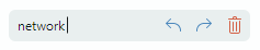
Example - How to add regular and toggle buttons
The following example defines a ButtonEditor control with two buttons:
- A regular button associated with the ResetValue command that sets the editor's value to '0'.
- A check button that toggles the parent editor's
IsTextEditablesetting. Text editing is disabled when the button is checked.
It is assumed that the project contains the 'dot.svg', 'locked.svg' and 'unlocked.svg' images in the 'Images' folder. The regular button displays the 'dot.svg' image. The check button displays either 'locked.svg' or 'unlocked.svg' image depending on the check state.
xmlns:mxe="https://schemas.eremexcontrols.net/avalonia/editors"
xmlns:local="clr-namespace:EditorsSample"

<Window.DataContext>
    <local:MainViewModel/>
</Window.DataContext>

<mxe:ButtonEditor Name="btnEditor1"
                  EditorValue="{Binding Quantity, Mode=TwoWay}"
                  IsTextEditable="True">
    <mxe:ButtonEditor.Buttons>
        <mxe:ButtonSettings ButtonKind="Simple"
                            Glyph="{SvgImage 'avares://EditorsSample/Images/dot.svg'}"
                            Command="{Binding ResetValueCommand}"
                            CommandParameter="{Binding #btnEditor1}"
                            ToolTip.Tip = "Reset value"
                            >
        </mxe:ButtonSettings>
        <mxe:ButtonSettings ButtonKind="Toggle"
                            Glyph="{Binding $self.IsChecked,
                             Converter={local:LockedStateToSvgNameConverter}}"
                            IsChecked="{Binding !$parent.IsTextEditable}"
                            ToolTip.Tip = "Toggle text editing mode"
                >
        </mxe:ButtonSettings>
    </mxe:ButtonEditor.Buttons>
</mxe:ButtonEditor>
using Eremex.AvaloniaUI.Controls.Utils;

namespace EditorsSample;

[ObservableObject]
public partial class MainViewModel
{
    [ObservableProperty]
    decimal quantity = 0;

    // Sets the editor's value to '0'.
    [RelayCommand]
    void ResetValue(TextEditor editor)
    {
        // You can access the current editor from the command parameter,
        // and change its value.
        editor.EditorValue = 0;
    }
}

public class LockedStateToSvgNameConverter : MarkupExtension, IValueConverter
{
    public object? Convert(object? value, Type targetType, object? parameter, CultureInfo culture)
    {
        if (value == null)
            return null;
        bool isLocked = (bool)value;
        string lockedState = isLocked ? "locked" : "unlocked";
        if (isLocked)
            lockedState = "locked";
        return ImageLoader.LoadSvgImage(Assembly.GetExecutingAssembly(), $"Images/{lockedState}.svg");
    }

    public object? ConvertBack(object? value, Type targetType, object? parameter, CultureInfo culture)
    {
        throw new NotImplementedException();
    }

    public override object ProvideValue(IServiceProvider serviceProvider)
    {
        return this;
    }
}
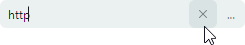
Clear Value ('x') Button
Set the ButtonEditor.NullValueButtonPosition property to ComponentPlacement.EditorBox to enable the built-in 'x' button which allows a user to set the current value to null.
Watermark
As all TextEditor descendants, the ButtonEditor control supports a watermark (a grayed out hint displayed when the editor's value is empty or null).
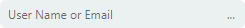
Use the inherited TextEditor.Watermark property to specify a watermark.
xmlns:mxe="https://schemas.eremexcontrols.net/avalonia/editors"

<mxe:ButtonEditor Name="buttonEditor1" Watermark="User Name or Email" Margin="5">
    ...
</mxe:ButtonEditor>