ComboBoxEditor
The ComboBoxEditor control is a control that displays a list of items in its dropdown window. A user can select one or multiple items at a time according to the control's selection mode.
The control's main features include:
- Displaying values from a list of strings, list of business objects, or an enumeration type.
- Single and multiple item selection modes.
- Auto-completion feature.
- Text editing in the edit box in single item selection mode.
- Item templates allow you to render items in a custom manner.
- Use of the control as an in-place editor within container controls (for instance, TreeList, TreeView, and PropertyGrid).
Specify the Items Source
Use the ComboBoxEditor.ItemsSource property to specify a list of items to be displayed in the dropdown. You can bind the editor to a list of strings, list of business objects, or an enumeration type.
Bind to a List of Strings
The simplest items source is a list of strings.
A user can select one or multiple values according to the current selection mode (see below).
If text editing is enabled in the edit box (see IsTextEditable), a user can enter text that does not match any item in the dropdown list.
Example - How to bind to a String list
The following example populates ComboBoxEditor with a list of strings.
xmlns:mxe="https://schemas.eremexcontrols.net/avalonia/editors"
xmlns:sys="clr-namespace:System;assembly=mscorlib"
xmlns:local="clr-namespace:ComboBoxTestSample"

<mxe:ComboBoxEditor x:Name="myComboBox1">
    <mxe:ComboBoxEditor.ItemsSource>
        <local:MyItemList>
            <sys:String>Moscow</sys:String>
            <sys:String>Kazan</sys:String>
            <sys:String>Tver</sys:String>
        </local:MyItemList>
    </mxe:ComboBoxEditor.ItemsSource>
</mxe:ComboBoxEditor>
public class MyItemList : List<string>
{
}
Bind to a List of Business Objects
You can bind a ComboBoxEditor to a list of business objects. In this case, the control's default behavior is as follows:
- A business object's
ToStringmethod specifies the default text representation of items. - When you select an item, the editor's value (
ComboBoxEditor.EditorValue) is set to the corresponding business object.
A typical business object has multiple properties. You can specify which business object properties supply item display text and edit values. Use the following API members for this purpose:
ComboBoxEditor.DisplayMember- Gets or sets the name of the business object's property that specifies item display text.ComboBoxEditor.ValueMember- Gets or sets the name of the business object's property that specifies item values. When you select an item, the editor's value (ComboBoxEditor.EditorValue) is set to the item'sValueMemberproperty value.
Example - How to bind to a Business Object list
The following example binds a ComboBoxEditor to a list of Product business objects. The Product.ProductName property specifies item display text. The Product.ProductID property specifies item values.
xmlns:mxe="https://schemas.eremexcontrols.net/avalonia/editors"
xmlns:local="clr-namespace:ComboBoxTestSample"

<Window.DataContext>
    <local:MainViewModel/>
</Window.DataContext>

<mxe:ComboBoxEditor
    x:Name="myComboBox2"
    ItemsSource="{Binding Products}"
    DisplayMember="ProductName"
    ValueMember="ProductID"
    SelectionMode="Multiple"
/>
public MainViewModel()
{
    Products = new ObservableCollection<Product>();
    //...
}

public partial class Product :ObservableObject
{
    public Product(int productID, string productName, string category, int productPrice)
    {
        ProductID = productID;
        ProductName = productName;
        Category = category;
        ProductPrice = productPrice;
    }

    [ObservableProperty]
    public int productID;

    [ObservableProperty]
    public string productName;

    [ObservableProperty]
    public string category;

    [ObservableProperty]
    public decimal productPrice;
}
Bind to an Enumeration
A ComboBoxEditor can display values of an enumeration type in the dropdown.
The Eremex.AvaloniaUI.Controls.Common.EnumItemsSource helper class facilitates binding to an enumeration. Its main features include:
- Images for enumeration members in the dropdown. Apply the
Eremex.AvaloniaUI.Controls.Common.ImageAttributeattribute to the target enumeration members to specify images. - Custom display names for enumeration members. Use the
System.ComponentModel.DataAnnotations.DisplayAttributeattribute or custom converter to change the default item display text. - Tooltips for dropdown items. A tooltip contains a target item's description that you can supply with the
System.ComponentModel.DataAnnotations.DisplayAttributeattribute or custom converter.
Use the following EnumItemsSource properties to set up binding to an enumeration type:
EnumItemsSource.EnumType— Specifies the enumeration type whose values are displayed in the ComboBoxEditor.EnumItemsSource.ShowImages— Specifies whether to display images for enumeration members in the dropdown. You can supply images using theEremex.AvaloniaUI.Controls.Common.ImageAttributeattribute.EnumItemsSource.ShowNames— Specifies whether to display item text. SetShowNamestofalseandShowImagestotrueto render enumeration members using images without text.EnumItemsSource.ImageSize— Specifies the display size of images assigned to enumeration members.EnumItemsSource.NameToDisplayTextConverter— Allows you to assign a converter that retrieves custom display text for enumeration members.EnumItemsSource.NameToDescriptionConverter— Allows you to assign a converter that retrieves enumeration member descriptions, which are displayed as tooltips when a user hovers the mouse over dropdown items.
Example - How to display enumeration values, and use attributes to supply display text and images for enumeration members.
The following example displays values of a ProductCategoryEnum enumeration in a ComboBoxEditor. It uses the EnumItemsSource class for data binding.
The System.ComponentModel.DataAnnotations.DisplayAttribute and Eremex.AvaloniaUI.Controls.Common.ImageAttribute attributes specify custom display text, descriptions (tooltips) and images for the enumeration members.
xmlns:mx="https://schemas.eremexcontrols.net/avalonia"
xmlns:mxe="https://schemas.eremexcontrols.net/avalonia/editors"

<mxe:ComboBoxEditor Name="comboBoxEditorEnum"
 ItemsSource="{mx:EnumItemsSource
  EnumType=local:ProductCategoryEnum, ImageSize='16, 16',
  ShowImages=True, ShowNames=True}"
 IsTextEditable="True"
 AutoComplete="True">
</mxe:ComboBoxEditor>
using Eremex.AvaloniaUI.Controls.Common;
using System.ComponentModel.DataAnnotations;

public enum ProductCategoryEnum
{
    // The images assigned to the enumeration values below are placed
    // in the ComboBoxTestSample/Images folder.
    // They have their "Build Action" properties set to "AvaloniaResource".
    [Image($"avares://ComboBoxTestSample/Images/Products/DairyProducts.svg")]
    [Display(Name = "Dairy Products", Description = "Products made from milk")]
    DairyProducts,

    [Image($"avares://ComboBoxTestSample/Images/Products/Beverages.svg")]
    [Display(Description = "Edible drinks")]
    Beverages,

    [Image($"avares://ComboBoxTestSample/Images/Products/Condiments.svg")]
    [Display(Description = "Flavor Enhancers")]
    Condiments,

    [Image($"avares://ComboBoxTestSample/Images/Products/Confections.svg")]
    [Display(Description = "Sweets")]
    Confections
}
Example - How to display enumeration values, and use custom converters to supply display text for enumeration members.
The following example uses the EnumItemsSource class to display values of an enumeration type in a ComboBoxEditor. The EnumItemsSource.NameToDisplayTextConverter and EnumItemsSource.NameToDescriptionConverter objects supply custom display text and descriptions (tooltips) for enumeration members.
xmlns:mxe="https://schemas.eremexcontrols.net/avalonia/editors"
xmlns:mx="https://schemas.eremexcontrols.net/avalonia"
xmlns:local="clr-namespace:ComboBoxTestSample"

<mxe:ComboBoxEditor Name="comboBoxEditorEnumWithConverters"
 ItemsSource="{mx:EnumItemsSource EnumType=local:ProductCategoryEnum,
  ImageSize='16, 16', ShowImages=True, ShowNames=True,
  NameToDisplayTextConverter={local:EnumMemberNameToDisplayTextConverter},
  NameToDescriptionConverter={local:EnumMemberNameToDescriptionConverter}}"
 IsTextEditable="True"
 AutoComplete="True">
</mxe:ComboBoxEditor>
using Eremex.AvaloniaUI.Controls.Common;

public enum ProductCategoryEnum
{
    // The images assigned to the enumeration values below are placed
    // in the ComboBoxTestSample/Images folder.
    // They have their "Build Action" properties set to "AvaloniaResource".
    [Image($"avares://ComboBoxTestSample/Images/Products/DairyProducts.svg")]
    DairyProducts,

    [Image($"avares://ComboBoxTestSample/Images/Products/Beverages.svg")]
    Beverages,

    [Image($"avares://ComboBoxTestSample/Images/Products/Condiments.svg")]
    Condiments,

    [Image($"avares://ComboBoxTestSample/Images/Products/Confections.svg")]
    Confections
}

public class EnumMemberNameToDisplayTextConverter : BaseEnumConverter
{
    protected override void PopulateDictionary()
    {
        TextValueDictionary.Add("ProductCategoryEnum_DairyProducts", "Dairy");
    }
}
public class EnumMemberNameToDescriptionConverter : BaseEnumConverter
{
    protected override void PopulateDictionary()
    {
        TextValueDictionary.Add("ProductCategoryEnum_DairyProducts", "Milk Products");
    }
}

public abstract class BaseEnumConverter : MarkupExtension, IValueConverter
{
    protected Dictionary<string, string> TextValueDictionary;

    public BaseEnumConverter()
    {
        TextValueDictionary = new Dictionary<string, string>();
        PopulateDictionary();
    }

    protected abstract void PopulateDictionary();

    public override object ProvideValue(IServiceProvider serviceProvider)
    {
        return this;
    }
    public object? Convert(object? value, Type targetType, object? parameter,
     System.Globalization.CultureInfo culture)
    {
        var type = value?.GetType();
        var memberName = value?.ToString();
        if (type == null || !type.IsEnum || string.IsNullOrEmpty(memberName))
            return null;
        return EnumMemberToString(type.Name, memberName);
    }

    protected virtual string EnumMemberToString(string enumName, string enumMemberName)
    {
        string fullMemberName = enumName + "_" + enumMemberName;
        if (TextValueDictionary.ContainsKey(fullMemberName))
            return TextValueDictionary[fullMemberName];
        else
            return enumMemberName;
    }

    public object? ConvertBack(object? value, Type targetType, object? parameter,
     System.Globalization.CultureInfo culture)
    {
        return null;
    }
}
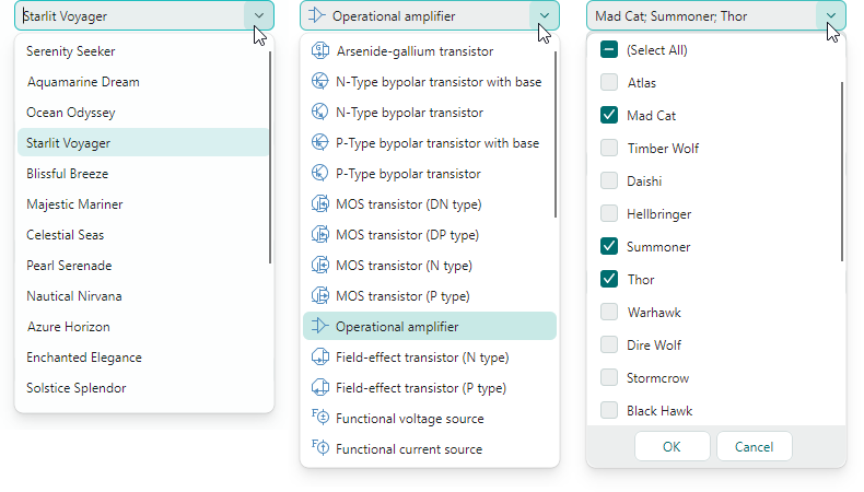
Specify Item Selection Mode
The SelectionMode property allows you to choose between single- and multiple item selection modes.
Single item selection mode is default. If text editing is enabled (see IsTextEditable), it is possible to specify the edit value (or text in the edit box) that does not match any item in the dropdown list.
Set the SelectionMode property to ItemSelectionMode.Multiple to enable item multi-selection. In multi-select mode, the editor displays check boxes before each item in the dropdown list. A user can toggle these check boxes to add and remove items to/from the selection.
Text editing is disabled in the edit box in multi-select mode.
Get and Set Selected Item (Items)
The SelectedItem property allows you to select and retrieve the selected item in single selection mode. The property returns a null value if no item is selected.
The SelectedItems property specifies a list (an IList object) that contains selected items in multiple selection mode. The property returns an empty list if no item is selected.
Note
The SelectedItem and SelectedItems properties are in sync in the way described below.
In single selection mode, the SelectedItems property specifies a list that contains one item – the selected item (the value of the SelectedItem property). The property returns an empty list if no item is selected.
In multiple selection mode, the SelectedItem property specifies the first selected item (the first item of the SelectedItems list). The property returns a null value if no item is selected.
Example - How to select items
The following code selects items in ComboBoxEditors that function in single- and multiple selection modes.
// Select an item in single selection mode
var itemSource1 = myComboBox1.ItemsSource as MyItemList;
if(itemSource1 != null)
    myComboBox1.SelectedItem = itemSource1[0];

// Select items in multi-select mode
var itemSource2 = myComboBox2.ItemsSource as ObservableCollection<Product>;
if (itemSource2 != null)
    myComboBox2.SelectedItems = new List<Product>()
     { itemSource2[0], itemSource2[1] };
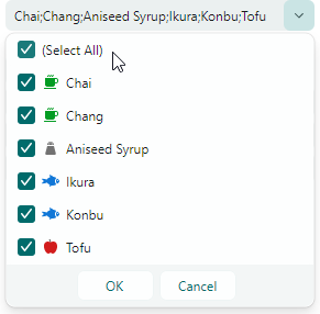
'(Select All)' Item in Multiple Selection Mode
In multiple selection mode, the editor displays the predefined (Select All) check box at the top of the dropdown. This checkbox allows a user to select/deselect all items. To hide the (Select All) check box, set the ComboBoxEditor.ShowPredefinedSelectItem property to false.
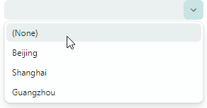
'(None)' Item in Single Selection Mode
In single selection mode, you can set the ComboBoxEditor.ShowPredefinedSelectItem property to true to display the predefined (None) item in the dropdown. The (None) item sets the editor's value to null and thus clears the selection.
Specify the Editor Value
When a user types text, selects an item in the edit box using the auto-complete feature, or picks an item in the dropdown, the editor changes its edit value (the EditorValue property value).
Typically, the edit value matches the value of the SelectedItem property (in single selection mode) or the SelectedItems property (in multiple selection mode), with the exceptions described in this section.
The edit value is dependent on item selection mode. In single item selection mode, the edit value is a single value, while in multiple item selection mode, the edit value is an IList object that specifies a value list.
The EditorValue and SelectedItem/SelectedItems properties are not in sync in the following cases:
A ComboBoxEditor is bound to a list of strings, and the text specified in the edit box does not match any item in the dropdown. In this case, the
SelectedItemproperty returnsnull, while theEditorValueproperty specifies the text displayed in the edit box.Tip
Enable the
ComboBoxEditor.IsTextEditableoption to allow a user to edit text in the edit box.Example - How to set the editor value when ComboBox is bound to a string list
The following example sets the edit value for a ComboBoxEditor that is bound to a list of strings.
xmlns:mxe="https://schemas.eremexcontrols.net/avalonia/editors"
xmlns:sys="clr-namespace:System;assembly=mscorlib"
xmlns:local="clr-namespace:ComboBoxTestSample"

<mxe:ComboBoxEditor x:Name="myComboBox1">
    <mxe:ComboBoxEditor.ItemsSource>
        <local:MyItemList>
            <sys:String>Moscow</sys:String>
            <sys:String>Kazan</sys:String>
            <sys:String>Tver</sys:String>
        </local:MyItemList>
    </mxe:ComboBoxEditor.ItemsSource>
</mxe:ComboBoxEditor>
myComboBox1.EditorValue = "Moscow"; //The SelectedItem property will return "Moscow" as well. myComboBox1.EditorValue = "Rostov"; //The SelectedItem property will return `null`, //since the edit value does not match any item in the bound list. //... public class MyItemList : List<string> { }A ComboBoxEditor is bound to a list of business objects, and the
ValueMemberproperty is set. TheValueMemberproperty specifies the name of the business object's property that supplies item values. When you select an item(s), theSelectedItem/SelectedItemsproperty contains the selected object(s), while theEditorValueproperty specifies the selected objects' value (values).Example - How to select an item when ComboBoxEditor is bound to a business object list
In the following example, a ComboBoxEditor is bound to a list of Product objects in multi-select mode. The
ValueMemberproperty refers to the Product.ProductID member. Thus, product IDs serve as item values. When a user selects items, theEditorValueproperty is set to a list that contains correponding product IDs. The example uses theEditorValueproperty to select items in code.xmlns:mxe="https://schemas.eremexcontrols.net/avalonia/editors" xmlns:sys="clr-namespace:System;assembly=mscorlib" xmlns:local="clr-namespace:ComboBoxTestSample" <mxe:ComboBoxEditor x:Name="myComboBox2" ItemsSource="{Binding Products}" DisplayMember="ProductName" ValueMember="ProductID" SelectionMode="Multiple" />// Select items by their product IDs: var itemSource2 = myComboBox2.ItemsSource as ObservableCollection<Product>; if(itemSource2 != null) myComboBox2.EditorValue = new List<int>() { itemSource2[3].ProductID, itemSource2[5].ProductID }; //The SelectedItems property will return a list that contains //two Product objects (itemSource2[3] and itemSource2[5]). //... public partial class Product :ObservableObject { public Product(int productID, string productName, string category, int productPrice) { ProductID = productID; ProductName = productName; Category = category; ProductPrice = productPrice; } [ObservableProperty] public int productID; [ObservableProperty] public string productName; [ObservableProperty] public string category; [ObservableProperty] public decimal productPrice; }
Specify Item Templates
A ComboBoxEditor renders each item in the dropdown list using item display text, by default. The default item display text is specified by items' ToString method. When the editor is bound to a business object list, you can use the DisplayMember property to specify the property that supplies item display text.
You can use the ItemTemplate property to assign a data template that presents items in the dropdown in a custom manner. For instance, a data template helps you to display images for items, as demonstrated in the example below.
Enable the ComboBoxEditor.ApplyItemTemplateToEditBox option to apply the specified item template (ItemTemplate property) to the edit box. This property is not in effect if text editing is enabled (the IsTextEditable option is set to true).
Example - How to display images for ComboBox items using a DataTemplate
The following example uses the ItemTemplate property to specify a data template that displays images for ComboBox items in the dropdown list.
A ComboBoxEditor is bound to a list that stores Product objects. The Product object contains the Category property that specifies a product category (Beverages, Condiments, Seafood, or Produce).
It is assumed that the project stores SVG images for the product categories in the "ComboBoxTestSample/Images/Products" folder. The images have the following names: "Beverages.svg", "Condiments.svg", "Seafood.svg" and "Produce.svg", and they are marked with the "AvaloniaResource" flag.
The created item data template displays a product name and an image that corresponds to the product's category.
xmlns:mxe="https://schemas.eremexcontrols.net/avalonia/editors"
xmlns:sys="clr-namespace:System;assembly=mscorlib"
xmlns:local="clr-namespace:ComboBoxTestSample"

<Window.DataContext>
    <local:MainViewModel/>
</Window.DataContext>
<Window.Resources>
    <local:NameToSvgConverter x:Key="NameToSvgConverter"/>
    <DataTemplate x:Key="ProductItemTemplate">
        <Grid>
            <Grid.ColumnDefinitions>
                <ColumnDefinition Width="Auto"/>
                <ColumnDefinition Width="*"/>
            </Grid.ColumnDefinitions>
            <Image Width="16" Height="16" Source="{Binding Path=Category,
             Converter={StaticResource NameToSvgConverter}}"/>
            <TextBlock VerticalAlignment="Center" Grid.Column="1" Margin="6,0,0,0"
             Text="{Binding Path=ProductName}"/>
        </Grid>
    </DataTemplate>
</Window.Resources>

<mxe:ComboBoxEditor
    x:Name="myComboBox2"
    ItemsSource="{Binding Products}"
    DisplayMember="ProductName"
    ValueMember="ProductID"
    SelectionMode="Multiple"
    ItemTemplate="{StaticResource ProductItemTemplate}"
/>
using Avalonia.Svg.Skia;
using Eremex.AvaloniaUI.Controls.Utils;

public partial class MainViewModel : ViewModelBase
{
    [ObservableProperty]
    public ObservableCollection<Product> products;

    public MainViewModel()
    {
        Products = new ObservableCollection<Product>();
        Products.Add(new Product(0, "Chai", "Beverages", 200));
        Products.Add(new Product(1, "Chang", "Beverages", 100));
        Products.Add(new Product(2, "Aniseed Syrup", "Condiments", 150));
        Products.Add(new Product(3, "Ikura", "Seafood", 500));
        Products.Add(new Product(4, "Konbu", "Seafood", 390));
        Products.Add(new Product(5, "Tofu", "Produce", 430));
    }
}

public partial class Product :ObservableObject
{
    public Product(int productID, string productName, string category, int productPrice)
    {
        ProductID = productID;
        ProductName = productName;
        Category = category;
        ProductPrice = productPrice;
    }

    [ObservableProperty]
    public int productID;

    [ObservableProperty]
    public string productName;

    [ObservableProperty]
    public string category;

    [ObservableProperty]
    public decimal productPrice;
}

public class NameToSvgConverter : MarkupExtension, IValueConverter
{
    public object? Convert(object? value, Type targetType, object? parameter,
     CultureInfo culture)
    {
        if(value == null)
            return null;
        string name = value.ToString();

        return ImageLoader.LoadSvgImage(Assembly.GetExecutingAssembly(), $"Images/Products/{name}.svg");
    }

    public object? ConvertBack(object? value, Type targetType, object? parameter,
     CultureInfo culture)
    {
        throw new NotImplementedException();
    }

    public override object ProvideValue(IServiceProvider serviceProvider)
    {
        return this;
    }
}
Add Custom Buttons
The ComboBoxEditor is a ButtonEditor control descendant. Thus, you can add custom buttons to the edit box next to the default dropdown button. Use the ComboBoxEditor.Buttons collection to add custom buttons.
Example - How to add custom buttons
The following example adds a regular button and check button to a ComboBoxEditor. The editor is bound to a ProductCategoryEnum enumeration using the EnumItemsSource helper class.
The first button is regular (its ButtonKind property is set to Simple). A click on this button invokes the ResetValue command that sets the editor's value to a default value (the first element of the bound enumeration type).
The second button is a check button (its ButtonKind property is set to Toggle). A click on this button toggles the editor's IsTextEditable property value. The LockedStateToSvgNameConverter converter assigns the "locked.svg" or "unlocked.svg" image to the button's glyph according to the button's check state. These images are stored in the ComboBoxTestSample/Images folder and are marked with the "AvaloniaResource" flag.
xmlns:mxe="https://schemas.eremexcontrols.net/avalonia/editors"
xmlns:mx="https://schemas.eremexcontrols.net/avalonia"
xmlns:local="clr-namespace:ComboBoxTestSample"

<mxe:ComboBoxEditor Name="comboBoxEditorEnum"
 ItemsSource="{mx:EnumItemsSource EnumType=local:ProductCategoryEnum,
  ImageSize='16, 16', ShowImages=True, ShowNames=True}"
 IsTextEditable="True"
 AutoComplete="True">
    <mxe:ComboBoxEditor.Buttons>
        <mxe:ButtonSettings ButtonKind="Simple"
         Glyph="{SvgImage 'avares://ComboBoxTestSample/Images/square_dot_icon.svg'}"
         Command="{Binding ResetValueCommand}"
         CommandParameter="{Binding #comboBoxEditorEnum}">
        </mxe:ButtonSettings>
        <mxe:ButtonSettings ButtonKind="Toggle"
         Glyph="{Binding $self.IsChecked, Converter={local:LockedStateToSvgNameConverter}}"
         IsChecked="{Binding !$parent.IsTextEditable}">
        </mxe:ButtonSettings>
    </mxe:ComboBoxEditor.Buttons>
</mxe:ComboBoxEditor>
using CommunityToolkit.Mvvm.Input;
using Eremex.AvaloniaUI.Controls.Editors;
using Avalonia.Svg.Skia;
using Eremex.AvaloniaUI.Controls.Utils;

public partial class MainViewModel : ViewModelBase
{
    // Sets the editor's value to the first element.
    [RelayCommand]
    void ResetValue(ComboBoxEditor editor)
    {
        // Get the first item in the ComboBoxEditor's bound list.
        var enumerator = editor.ItemsSource.GetEnumerator();
        enumerator.MoveNext();
        object firstItem = enumerator.Current;
        // When the ComboBoxEditor is bound to an EnumItemsSource,
        // the editor's items are EnumMemberInfo objects.
        EnumMemberInfo mInfo = firstItem as EnumMemberInfo;
        if (mInfo != null)
            editor.EditorValue = mInfo.Id;
    }
}

public class LockedStateToSvgNameConverter : MarkupExtension, IValueConverter
{
    public object? Convert(object? value, Type targetType, object? parameter,
    CultureInfo culture)
    {
        if (value == null)
            return null;
        bool isLocked = (bool)value;
        string lockedState = isLocked ? "locked" : "unlocked";

        if (isLocked)
            lockedState = "locked";

        return ImageLoader.LoadSvgImage(Assembly.GetExecutingAssembly(), $"Images/{lockedState}.svg");
    }

    public object? ConvertBack(object? value, Type targetType, object? parameter,
     CultureInfo culture)
    {
        throw new NotImplementedException();
    }

    public override object ProvideValue(IServiceProvider serviceProvider)
    {
        return this;
    }
}

public enum ProductCategoryEnum
{
    [Image($"avares://ComboBoxTestSample/Images/Products/DairyProducts.svg")]
    [Display(Name = "Dairy Products", Description = "Products made from milk")]
    DairyProducts,

    [Image($"avares://ComboBoxTestSample/Images/Products/Beverages.svg")]
    [Display(Description = "Edible drinks")]
    Beverages,

    [Image($"avares://ComboBoxTestSample/Images/Products/Condiments.svg")]
    [Display(Description = "Flavor Enhancers")]
    Condiments,

    [Image($"avares://ComboBoxTestSample/Images/Products/Confections.svg")]
    [Display(Description = "Sweets")]
    Confections
}
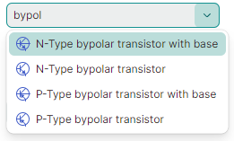
Text Auto-Completion
Set the AutoComplete option to true to enable text automatic completion. This feature automatically completes text typed by users if it matches any item in the dropdown list.
The ComboBoxEditor does not support text auto-completion in the following cases:
- Text editing is disabled (the
IsTextEditableproperty is set tofalse). - Multiple item selection mode is used (the
SelectionModeproperty is set toMultiple).
Auto-Filter
If the auto-completion feature is disabled, the ComboBox editor uses the automatic filtering mechanism to filter items in the dropdown list to match the text a user types in the editor.
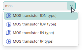
The FilterCondition property specifies the filter operator (StartsWith or Contains) used to filter items.
The following example applies the Contains filter to the editor.
<mxe:ComboBoxEditor x:Name="comboBox1" FilterCondition="Contains" .../>
You can handle the FilterItem event to custom filter items during automatic filtering. This event fires repeatedly, for each item in the dropdown list. The event's arguments allow you to identify combobox items and specify their visibility.
e.Item— The object that represents the currently processed item.e.SearchText— The text typed by a user in the edit box used for automatic item filtering.e.IsVisible— The visibility of the item in the dropdown list.
The following FilterItem event handler custom filters items in the ComboBoxEditor control by searching in the MyBusinessObject.InvoiceID field of combobox items.
void ComboBox1_FilterItem(object sender, Eremex.AvaloniaUI.Controls.Editors.ComboBoxFilterEventArgs e)
{
    var invID = (e.Item as MyBusinessObject)!.InvoiceID;
    e.IsVisible = invID == null || string.IsNullOrEmpty(e.SearchText) ?
      false : invID.Contains(e.SearchText!.Substring(0, 3));
}