PopupColorEditor
The Eremex Controls library includes the PopupColorEditor control that allows you to display a color in the edit box, and pick a color from the associated popup window.
The control's main features include:
- Customizable default color pallete.
- Standard color palette.
- Custom color palette, which can be customized by users.
- Built-in dialog allows you to select colors using a color picker or by specifying individual color components in the RGB or HSB format.
Select a Color
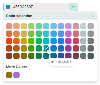
A user can pick a color using color palletes displayed in the dropdown window.
In code, you can specify a color or read the currently selected color with the PopupColorEditor.Color or PopupColorEditor.EditorValue property. These properties are in sync. They differ in the value type: the Color property is of the nullable Color type, while the EditorValue property is of the object type as in all Eremex editors.
Palettes
The PopupColorEditor supports three palettes: default, standard and custom. Use the PopupColorEditor.ColorsShowMode property to customize the visibility of individual palettes. The ColorsShowMode property is defined as a set of flags.
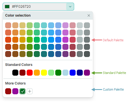
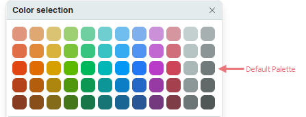
Default Color Palette
The default palette displays a set of predefined colors.
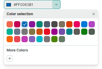
You can replace these colors with a custom palette, using the following code:
List<uint> fluentIntColors = new List<uint>()
{
    0xffef6950, 0xffc30052, 0xff0063b1, 0xff881798, 0xff018574, 0xff515c6b, 0xff4c4a48, 0xff7e735f,
    0xffda3b01, 0xffea005e, 0xff0078d7, 0xffb146c2, 0xff00b294, 0xff68768a, 0xff767676, 0xff847545,
    0xffca5010, 0xffe81123, 0xff9a0089, 0xff744da9, 0xff038387, 0xff5d5a57, 0xff107c10, 0xff525e54,
    0xfff7630c, 0xffe74856, 0xffc239b3, 0xff8764b8, 0xff00b7c3, 0xff7a7574, 0xff498205, 0xff647c64
};

List<Color> fluentColors = new List<Color>();
fluentIntColors.ForEach(intColor => fluentColors.Add(Color.FromUInt32(intColor)));

ColorPalette colorPalette = new Eremex.AvaloniaUI.Controls.Editors.CustomPalette("myPalette", fluentColors);
popupColorEditor1.ThemePalette = colorPalette;
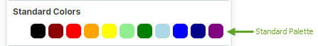
Standard Color Palette
Enable the StandardColors flag in the ColorsShowMode property value to display the 'Standard Colors' palette.
<mxe:PopupColorEditor
    Width="190" Height="30"
    Name="popupColorEditor1"
    ColorsShowMode="StandardColors,CustomColors"/>
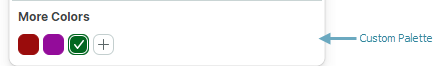
Custom Color Palette
Include the CustomColors flag into the ColorsShowMode property value to display the 'Custom Colors' palette.
<mxe:PopupColorEditor ColorsShowMode="CustomColors"/>
Users can add and customize colors in the Custom palette at runtime. Click the '+' button to add a color.
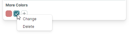
Right-click an existing color to display the context menu that allows you to change and delete the color.
You can populate the 'Custom Colors' palette in code beforehand, using the CustomColors property.
Example - How to set up a custom palette
The following code enables the Custom Colors palette, and populates it from a CustomColorCollection property defined in a ViewModel.
xmlns:mxe="https://schemas.eremexcontrols.net/avalonia/editors"
xmlns:sys="clr-namespace:System;assembly=mscorlib"
xmlns:local="clr-namespace:ComboBoxTestSample"

<Window.DataContext>
    <local:MainViewModel/>
</Window.DataContext>

<mxe:PopupColorEditor ColorsShowMode="CustomColors"
 CustomColors="{Binding CustomColorCollection}"/>
using Avalonia.Media;
using CommunityToolkit.Mvvm.ComponentModel;
using System.Collections.ObjectModel;

[ObservableObject]
public partial class MainViewModel
{
    public MainViewModel()
    {
        CustomColorCollection = new ObservableCollection<Color>()
        {
            Color.FromRgb(0x7d, 0xd7, 0xab),
            Color.FromRgb(0xc5, 0x94, 0x88),
            Color.FromRgb(0x47, 0xfe, 0xff),
            Color.FromRgb(0xe9, 0xbf, 0x3f),
        };
    }

    [ObservableProperty]
    ObservableCollection<Color> customColorCollection;
}
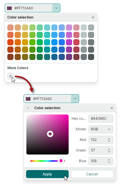
Color Selection Dialog
When a user clicks the '+' button, or right-clicks an existing color box in the Custom palette, the editor activates the Color Picker dialog.
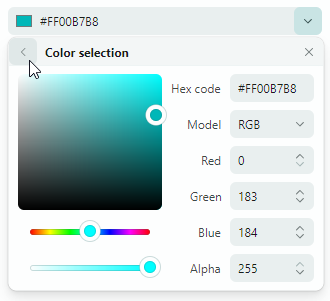
The dialog's UI contains the color picker and controls to specify components of a color in the RGB or HSB format.
Related API
ShowAlphaChannel— Allows you to hide the controls used to specify the Alpha component of a color.ShowConfirmationButtons— Specifies whether to display the Apply and Cancel buttons in the Color Selection dialog. If the property is enabled, a user needs to press the Apply button to confirm a color selection. A click on the Back or Cancel button cancels the dialog. If theShowConfirmationButtonsproperty is set tofalse, a click on the Back button confirms the selected color.