Get Started With ListView Control
ListViewControl allows you to display a list of items in a single or multiple columns. The control supports item sorting, grouping, filtering and multiple selection.
This tutorial shows how to use the ListViewControl control to implement a list of items, and sort and group the items by item properties.
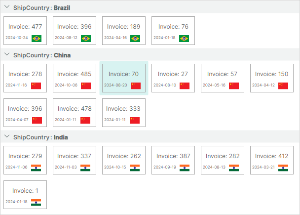
The ListView control can be populated with items from an item source. To render bound items, you need to provide an item template. When using the ListView control, you can create complex item templates that consist of multiple fields. This example creates an item template that defines a border with an SVG image and text blocks inside.
Create a New Application
Create a new Eremex Avalonia .NET MVVM Application. Name it ListView-example.
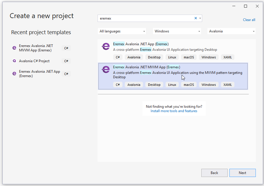
To display SVG images, add the Avalonia.Svg.Skia NuGet package to the project.
Define an Item Source
In the MainWindowViewModel.cs file, create the ItemViewModel class, which encapsulates an item object.
public partial class ItemViewModel : ObservableObject
{
    [ObservableProperty] private int invoiceId;
    [ObservableProperty] private string shipCountry;
    [ObservableProperty] private DateTime date;
    [ObservableProperty] private IImage flag;

    public ItemViewModel(int id, string shipCountry, IImage flag)
    {
        InvoiceId = id;
        ShipCountry = shipCountry;
        Random random = new Random();
        Date = new DateTime(DateTime.Now.Year, random.Next(1, 12), random.Next(1, 28));
        Flag = flag;
    }
}
The InvoiceId, Date and Flag properties exposed by the ItemViewModel class contain values to display in ListView items. The ItemViewModel.ShipCountry property specifies a shipping country associated with an item. ListView items will be grouped by this property.
Create and initialize the Items collection in the MainWindowViewModel class, as demonstrated below. The following code populates the Items collection with three sets of items. Each item set is associated with its own shipping country (China, Brazil and India).
using CommunityToolkit.Mvvm.ComponentModel;
using Avalonia.Svg.Skia;
using Eremex.AvaloniaUI.Controls.Utils;

public partial class MainWindowViewModel : ViewModelBase
{
    [ObservableProperty]
    private List<ItemViewModel> items;

    public MainWindowViewModel()
    {
        SvgImage chinaFlag = ImageLoader.LoadSvgImage(Assembly.GetExecutingAssembly(), "Assets/china-flag.svg");
        SvgImage indiaFlag = ImageLoader.LoadSvgImage(Assembly.GetExecutingAssembly(), "Assets/india-flag.svg");
        SvgImage brazilFlag = ImageLoader.LoadSvgImage(Assembly.GetExecutingAssembly(), "Assets/brazil-flag.svg");

        Random random = new Random();
        Items = new List<ItemViewModel>();
        for (int i = 1; i < 10; i++)
        {
            Items.Add(new ItemViewModel(random.Next(500), "China", chinaFlag));
        }

        for (int i = 1; i < 5; i++)
        {
            Items.Add(new ItemViewModel(random.Next(500), "Brazil", brazilFlag));
        }

        for (int i = 1; i < 8; i++)
        {
            Items.Add(new ItemViewModel(random.Next(500), "India", indiaFlag));
        }
    }
}
The Eremex.AvaloniaUI.Controls.Utils.ImageLoader.LoadSvgImage method is used to load SVG images stored in a specific folder of the current project. It is assumed that the SVG images are placed in the Assets folder, and they have their Build Action property set to AvaloniaResource. Ensure that the Avalonia.Svg.Skia package is included to the project.
Create a ListView Control
Open the MainWindow.axaml file, and define a ListViewControl component in XAML.
xmlns:mxlv="https://schemas.eremexcontrols.net/avalonia/listview"

<mxlv:ListViewControl Name="listViewControl1">
</mxlv:ListViewControl>
Bind the ListView to an Item Collection
Ensure that the Main Window's DataContext and thus the ListView's DataContext is set to a MainWindowViewModel object. See the App.axaml.cs file which assigns a DataContext to the Main Window.
Bind the ListView to a collection of items defined in the MainWindowViewModel class using the ListViewControl.ItemsSource property.
<mxlv:ListViewControl Name="listViewControl1" ItemsSource="{Binding Items}">
</mxlv:ListViewControl>
Define an Item Template
There is no default rendering for items in the ListView control. To render items in a specific manner, specify an item template from the ListViewControl.ItemTemplate property.
In the code below, an item template defines a bordered Grid object with two text blocks and an image inside. The text blocks display values of the ItemViewModel.InvoiceId and ItemViewModel.Date properties, respectively. The Image control is bound to the _ItemViewModel.Flag property which stores an SVG image.

<mxlv:ListViewControl Name="listViewControl1" ItemsSource="{Binding Items}">
    <mxlv:ListViewControl.ItemTemplate>
        <DataTemplate DataType="vm:ItemViewModel">
            <Border BorderBrush="DarkGray" BorderThickness="1">
                <Grid RowDefinitions="2*, *" Margin="3">
                    <TextBlock Text="{Binding InvoiceId, StringFormat={}Invoice: {0}}" HorizontalAlignment="Center" VerticalAlignment="Center"/>
                    <DockPanel Grid.Row="1" VerticalAlignment="Center">
                        <TextBlock Text="{Binding Date, StringFormat=yyyy-MM-dd}" FontSize="8" DockPanel.Dock="Left"/>
                        <Image Width="20"  DockPanel.Dock="Right" Source="{Binding Flag}"/>
                    </DockPanel>
                </Grid>
            </Border>
        </DataTemplate>
    </mxlv:ListViewControl.ItemTemplate>
</mxlv:ListViewControl>
Specify Item Size
The ListView control calculates the default item size from the first item and applies it to other items. Thus, all ListView items have the same display size.
If the default item size does not meet your needs, you can use the ListViewControl.ItemWidth and ListViewControl.ItemHeight properties to specify a custom item size. The code below applies a custom item size to ListView items.
<mxlv:ListViewControl Name="listViewControl1" ItemsSource="{Binding Items}"
    ItemHeight="70" ItemWidth="100">
Group Items
You can sort and/or group ListView elements by an unlimited number of item properties. When you group by a property, group rows that combine items are created. Take note that group rows are automatically sorted by a group property.
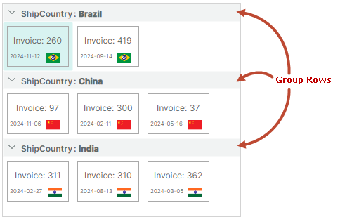
The ListViewControl.SortInfo collection defines item properties used to sort and group items.
To group items, do the following:
- Add a
ListViewSortInfoobject(s) to theListViewControl.SortInfocollection. Set theListViewSortInfo.FieldNamemember to the item property by which to group items. Optionally, use theListViewSortInfo.SortDirectionproperty to choose between ascending and descending sort order, in which group rows are arranged. - Set the
ListViewControl.GroupCountproperty to the number of group levels (group properties).ListViewControl.GroupCountspecifies how manyListViewSortInfoobjects starting from the beginning of theListViewControl.SortInfocollection are used to group data. If you group by one property, setGroupCountto1. If you group by two properties, setGroupCountto2, and so on.
The following code implements item grouping by the ShipCountry property:
<mxlv:ListViewControl Name="listViewControl1" ItemsSource="{Binding Items}"
        ItemHeight="40" ItemWidth="60"
        GroupCount="1">
    <mxlv:ListViewControl.SortInfo>
        <mxlv:ListViewSortInfo FieldName="ShipCountry" SortDirection="Ascending" />
    </mxlv:ListViewControl.SortInfo>
    <!-- ... -->
</mxlv:ListViewControl>
Sort Items
Let's sort items in each group by the Date item property in descending order. For this purpose, add a new ListViewSortInfo object to the ListViewControl.SortInfo collection, and set its ListViewSortInfo.FieldName and ListViewSortInfo.SortDirection members to corresponding values.
<mxlv:ListViewControl.SortInfo>
    <mxlv:ListViewSortInfo FieldName="ShipCountry" SortDirection="Ascending" />
    <mxlv:ListViewSortInfo FieldName="Date" SortDirection="Descending" />
</mxlv:ListViewControl.SortInfo>
Since the ListViewControl.GroupCount property is set to 1, the first ListViewSortInfo object in the ListViewControl.SortInfo collection specifies the field used to group data. The second ListViewSortInfo object refers to the field used only to sort data.
Select Item Arrangement Mode
ListView supports two item arrangement modes, which you can choose with the ListViewControl.ItemLayoutMode property:
ListViewItemLayoutMode.Wrap(default) — Items are arranged across then down. They are automatically wrapped at the control's right edge, creating multiple lines.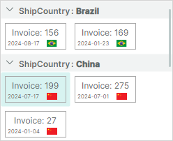
ListViewItemLayoutMode.Stack— Items are arranged in a vertical list. They are stretched to fit the LayoutView's width.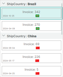
In this tutorial, we'll stick to the default Wrap layout mode.
Obtain Focused (Selected) Item
When a user clicks a specific item with the mouse or keyboard in single item selection mode, the focused item changes. You can use the ListViewControl.FocusedItem or ListViewControl.FocusedItemIndex property to identify the focused item.
The following code defines the FocusedItem property in the main View Model, and binds the ListViewControl.FocusedItem member to this property.
//MainWindowViewModel.cs
public partial class MainWindowViewModel : ViewModelBase
{
    //...
    ItemViewModel focusedItem;
    ItemViewModel FocusedItem {
        get {
            return focusedItem;
        }
        set
        {
            if (value != focusedItem)
            {
                focusedItem = value;
                // Perform actions when the focused item changes.
            }
        }
    }
}
<!-- MainWindow.axaml -->
<mxlv:ListViewControl Name="listViewControl1" ItemsSource="{Binding Items}"
                      ItemHeight="70" ItemWidth="100"
                      GroupCount="1"
                      FocusedItem="{Binding FocusedItem, Mode=TwoWay}"
                      >
To allow multiple items to be selected simultaneously, set the ListViewControl.SelectionMode property to Multiple. In this case, you can retrieve selected items from the ListViewControl.SelectedItems collection.
Result
You can build and run the application to see the following result:

Complete Code
MainWindow.axaml:
<mx:MxWindow xmlns="https://github.com/avaloniaui"
        xmlns:x="http://schemas.microsoft.com/winfx/2006/xaml"
        xmlns:vm="using:ListView_example.ViewModels"
        xmlns:d="http://schemas.microsoft.com/expression/blend/2008"
        xmlns:mc="http://schemas.openxmlformats.org/markup-compatibility/2006"
        xmlns:mx="https://schemas.eremexcontrols.net/avalonia"
        mc:Ignorable="d" d:DesignWidth="800" d:DesignHeight="450"
        x:Class="ListView_example.Views.MainWindow"
        x:DataType="vm:MainWindowViewModel"
        Icon="/Assets/EMXControls.ico"
        Title="ListView_example"
        xmlns:mxlv="https://schemas.eremexcontrols.net/avalonia/listview"
        >

    <Design.DataContext>
        <!-- This only sets the DataContext for the previewer in an IDE,
             to set the actual DataContext for runtime, set the DataContext property in code (look at App.axaml.cs) -->
        <vm:MainWindowViewModel/>
    </Design.DataContext>
    <Border BorderBrush="LightGray" BorderThickness="1" Margin="5">
        <mxlv:ListViewControl Name="listViewControl1" ItemsSource="{Binding Items}"
                              ItemHeight="70" ItemWidth="100"
                              GroupCount="1"
                              FocusedItem="{Binding FocusedItem, Mode=TwoWay}" SelectionMode="Multiple" SelectedItems=""
                              >
            <mxlv:ListViewControl.SortInfo>
                <mxlv:ListViewSortInfo FieldName="ShipCountry" SortDirection="Ascending" />
                <mxlv:ListViewSortInfo FieldName="Date" SortDirection="Descending" />
            </mxlv:ListViewControl.SortInfo>

            <mxlv:ListViewControl.ItemTemplate>
                <DataTemplate DataType="vm:ItemViewModel">
                    <Border BorderBrush="DarkGray" BorderThickness="1">
                        <Grid RowDefinitions="2*, *" Margin="3">
                            <TextBlock Text="{Binding InvoiceId, StringFormat={}Invoice: {0}}" HorizontalAlignment="Center" VerticalAlignment="Center"/>
                            <DockPanel Grid.Row="1" VerticalAlignment="Center">
                                <TextBlock Text="{Binding Date, StringFormat=yyyy-MM-dd}" FontSize="8" DockPanel.Dock="Left"/>
                                <Image Width="20"  DockPanel.Dock="Right" Source="{Binding Flag}"/>
                            </DockPanel>
                        </Grid>
                    </Border>
                </DataTemplate>
            </mxlv:ListViewControl.ItemTemplate>
        </mxlv:ListViewControl>
    </Border>
</mx:MxWindow>
MainWindowViewModel.cs:
using Avalonia.Media;
using Avalonia.Svg.Skia;
using CommunityToolkit.Mvvm.ComponentModel;
using Eremex.AvaloniaUI.Controls.ListView;
using Eremex.AvaloniaUI.Controls.Utils;
using System;
using System.Collections.Generic;
using System.Reflection;
using System.Xml.Linq;

namespace ListView_example.ViewModels;

public partial class MainWindowViewModel : ViewModelBase
{
    [ObservableProperty]
    private List<ItemViewModel> items;

    public MainWindowViewModel()
    {
        SvgImage chinaFlag = ImageLoader.LoadSvgImage(Assembly.GetExecutingAssembly(), "Assets/china-flag.svg");
        SvgImage indiaFlag = ImageLoader.LoadSvgImage(Assembly.GetExecutingAssembly(), "Assets/india-flag.svg");
        SvgImage brazilFlag = ImageLoader.LoadSvgImage(Assembly.GetExecutingAssembly(), "Assets/brazil-flag.svg");

        Random random = new Random();
        Items = new List<ItemViewModel>();
        for (int i = 1; i < 10; i++)
        {
            Items.Add(new ItemViewModel(random.Next(500), "China", chinaFlag));
        }

        for (int i = 1; i < 5; i++)
        {
            Items.Add(new ItemViewModel(random.Next(500), "Brazil", brazilFlag));
        }

        for (int i = 1; i < 8; i++)
        {
            Items.Add(new ItemViewModel(random.Next(500), "India", indiaFlag));
        }

        // Set focus to the first item in the item collection.
        focusedItem = Items[0];
    }

    ItemViewModel focusedItem;
    ItemViewModel FocusedItem {
        get {
            return focusedItem;
        }
        set
        {
            if (value != focusedItem)
            {
                focusedItem = value;
                // Perform actions when the focused item changes.
            }
        }
    }
}

public partial class ItemViewModel : ObservableObject
{
    [ObservableProperty] private int invoiceId;
    [ObservableProperty] private string shipCountry;
    [ObservableProperty] private DateTime date;
    [ObservableProperty] private IImage flag;

    public ItemViewModel(int id, string shipCountry, IImage flag)
    {
        InvoiceId = id;
        ShipCountry = shipCountry;
        Random random = new Random();
        Date = new DateTime(DateTime.Now.Year, random.Next(1, 12), random.Next(1, 28));
        Flag = flag;
    }
}
The *.svg images used in this tutorial are placed in the Assets folder of the project. They have their Build Action property set to AvaloniaResource.