Application Button and Main Menu
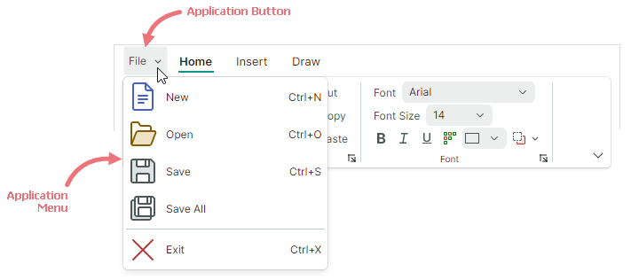
The Ribbon control has a built-in Application Button. A click on the Application Button typically invokes an associated dropdown Application Menu. You can also perform custom actions when this button is clicked.

Application Button Content
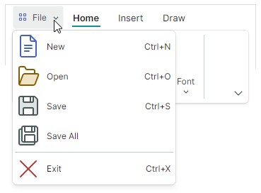
The Application Button can display an image and content (text).
RibbonControl.ApplicationButtonContent— Specifies the Application Button's caption.RibbonControl.ApplicationButtonContentTemplate— A data template to render the Application Button's caption in a custom manner.RibbonControl.ApplicationButtonGlyph— Specifies an image displayed before the caption.
The following code assign a custom caption and image to the Application Button:

xmlns:icons="https://schemas.eremexcontrols.net/avalonia/icons"

<mxr:RibbonControl Name="ribbon1"
  ApplicationButtonContent="File"
  ApplicationButtonGlyph="{x:Static icons:Basic.Small_Images}"
  ApplicationButtonKeyTip="F" >
Application Button Visibility
The Application Button is located at the left edge, before ribbon page headers.
When the Application Button and Menu are not required, you can use the RibbonControl.IsApplicationButtonVisible property to hide the Application Button.
Click the Application Button
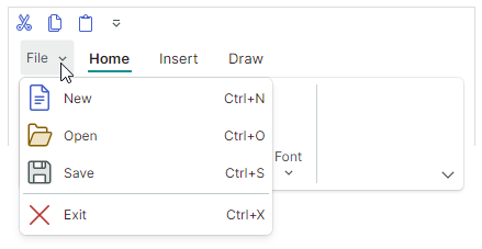
A click on the Application Button invokes the Application Menu (if specified).
You can also process Application Button clicking with the following API members:
RibbonControl.ApplicationButtonCommand— A command that fires on right-clicking the Application Button. Use theRibbonControl.ApplicationButtonCommandParameterproperty to specify a parameter for the command.RibbonControl.ApplicationButtonClick— An event raised when the Application Button is right-clicked.RibbonControl.ApplicationButtonPress— An event raised when any mouse button is pressed over the Application Button.
Application Menu
Use the RibbonControl.ApplicationButtonDropDownControl property to specify a popup menu/dropdown control invoked when the Application Button is clicked. You can set the ApplicationButtonDropDownControl property to the following objects:
PopupMenu— A popup menu that can display various items (buttons, check buttons, sub-menus, and so on). See Popup and Context Menus to learn more.
PopupContainer— A popup control that can display custom content.
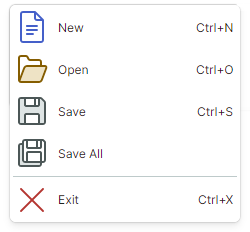
The following example specifies a PopupMenu component as the Application Menu for a Ribbon control.

<mxr:RibbonControl Name="ribbon1" ApplicationButtonContent="File">
    <mxr:RibbonControl.ApplicationButtonDropDownControl>
        <mxb:PopupMenu MinWidth="250" ContentRightIndent="30">
            <mxb:ToolbarButtonItem Header="New" Glyph="{x:Static icons:Basic.Doc}"
              GlyphSize="24,24" HotKey="Ctrl+N"/>
            <mxb:ToolbarButtonItem Header="Open" Glyph="{x:Static icons:Basic.Folder_Open}"
              GlyphSize="24,24" HotKey="Ctrl+O"/>
            <mxb:ToolbarButtonItem Header="Save" Glyph="{x:Static icons:Basic.Save}"
              GlyphSize="24,24"  HotKey="Ctrl+S"/>
            <mxb:ToolbarButtonItem Header="Exit" Glyph="{x:Static icons:Basic.Cancel}"
              ShowSeparator="True" GlyphSize="24,24"  HotKey="Ctrl+X"/>
        </mxb:PopupMenu>
    </mxr:RibbonControl.ApplicationButtonDropDownControl>
    <!-- ... -->
</mxr:RibbonControl>