Ribbon Command Layouts
The ribbon command layout determines the arrangement of commands in the Ribbon bar. The Ribbon control supports two layouts: Classic and Simplified.
Classic Command Layout

The Ribbon bar is tall enough to display three rows of commands with small icons.
Page group headers are visible
Groups cannot be partially collapsed when the Ribbon is resized
Support for inline galleries
The default size of small icons is
16x16. You can use theRibbonControl.SmallGlyphSizeproperty to change the size of small icons. Large icons are twice the size of small icons.When the Ribbon is resized, the adaptive layout feature adjusts the size of icons — from large to small with text to small glyphs, and backwards.

Simplified Command Layout

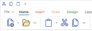
Buttons are arranged in one row
Page group headers are hidden
Groups can be partially collapsed when the Ribbon is resized. Collapsed buttons are accessible from the group's dropdown menu.
Galleries are displayed in dropdown menus
The default size of icons in the Simplified Command Layout is
22x22. Use theRibbonControl.GlyphSizeInSimplifiedLayoutproperty to specify a custom icon size.<mxr:RibbonControl GlyphSizeInSimplifiedLayout="32">
Select a Command Layout
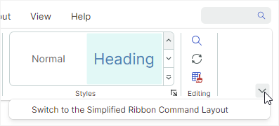
A user can switch between the Classic and Simplified views at runtime by clicking the Command Layout Selection button at the Ribbon's right bottom corner.

Set the RibbonControl.IsCommandLayoutSelectionButtonVisible option to false to hide this button.
The RibbonControl.CommandLayout property allows you to specify the command layout in code.
<mxr:RibbonControl Name="ribbon" CommandLayout="Simplified">
    <!-- ... -->
</mxr:RibbonControl>