Styles
The TreeList and TreeView controls supports the Avalonia styling system, which allows you to customize settings of the controls' visual elements.
Use the TreeListControl.Styles property to apply styles to the following visual elements:
- Column header
- Row
- Row cell
- Row's indent
A typical style has a style selector and a collection of property setters. The selector specifies the target Control object that encapsulates a visual element. The property setters specify the target control's properties and their values.
The following code creates a simple style that sets the background of all TreeList rows to the same color.
xmlns:mxtl="https://schemas.eremexcontrols.net/avalonia/treelist"
xmlns:mxtlvis="clr-namespace:Eremex.AvaloniaUI.Controls.TreeList.Visuals;assembly=Eremex.Avalonia.Controls"

<mxtl:TreeListControl.Styles>
    <Style Selector="mxtlvis|TreeListRowControl">
        <Setter Property="Background" Value="Ivory" />
    </Style>
</mxtl:TreeListControl.Styles>
Apply Styles to Specific Control States
Style selectors support pseudo-classes in Avalonia. A pseudo-class is a keyword added to a selector. It specifies a target control's state to which the style is applied.
TreeList and TreeView controls provide custom pseudo-classes to address specific states of the controls' visual elements. The sections below list custom pseudo-classes supported for the controls' visual elements.
The code below creates a style selector that targets TreeList rows. The :focusedAndSelectedState pseudo-class is used to only apply the style to rows that are in the focused state.
xmlns:mxtl="https://schemas.eremexcontrols.net/avalonia/treelist"
xmlns:mxtlvis="clr-namespace:Eremex.AvaloniaUI.Controls.TreeList.Visuals;assembly=Eremex.Avalonia.Controls"

<Style Selector="mxtlvis|TreeListRowControl:focusedAndSelectedState">
    ...
</Style>
Visual Elements' Controls
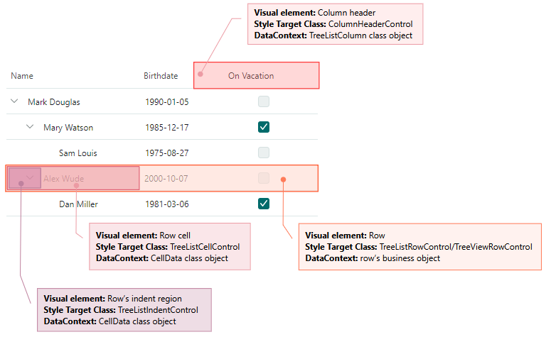
The style selector's syntax should specify the target control (a Control object that encapsulates a visual element) to which the style is applied. The following image shows a TreeList's/TreeView's visual elements and corresponding target controls.
Style a Row (Node)
A row is a visual element that displays cells.
Use the following information to customize the row's style:
Target Control Class
TreeListRowControl (in the TreeList control), TreeViewRowControl (in the TreeView control)
DataContext
A row's data (business) object
Custom Pseudo Classes
- ":selectedState" — A row is selected, but not focused. This state is in effect in multiple row selection mode.
- ":focusedState" — A row is focused, but not selected. This state is in effect in multiple row selection mode.
- ":focusedAndSelectedState" — A row is focused and selected. This state is in effect in multiple- and single row selection modes.
- ":editingState" — A node has an active in-place editor.
Example - How to customize the focused node's style
The following code creates a style that customizes the background of a TreeList's focused node.
Tree List rows are rendered according to a predefined template. This template contains a Border object (named RowBorder) that decorates cells with a border and background.
The example below changes the Background setting of the RowBorder object for the focused node.
xmlns:mxtl="https://schemas.eremexcontrols.net/avalonia/treelist"
xmlns:mxtlvis="clr-namespace:Eremex.AvaloniaUI.Controls.TreeList.Visuals;assembly=Eremex.Avalonia.Controls"

<mxtl:TreeListControl.Styles>
    <Style Selector="mxtlvis|TreeListRowControl:focusedAndSelectedState /template/ Border#RowBorder">
        <Setter Property="Background" Value="SkyBlue" />
    </Style>
</mxtl:TreeListControl.Styles>
Example - How to customize a node's appearance settings according to cell values
The following code customizes the background color and font settings of rows (nodes) depending on row values.
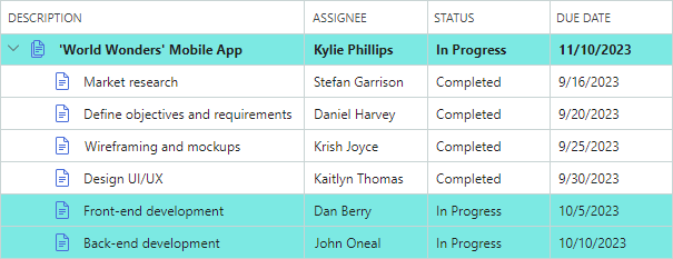
A row's background is dependent on the row's Status property. The RowStatusToBrushConverter object specifies the brush to use for rows that have their Status property set to InProgress.
If rows have children, the HasTasks Boolean property of these rows returns true. These rows are painted in bold.
When row cells are not in edit mode, they are rendered using TextBlock controls. The created style modifies the TextBlock.FontWeight attached property to adjust the font weight of text in all row cells. The Eremex.AvaloniaUI.Controls.BoolToObjectConverter object determines the actual font weight. The converter returns a value that depends on a row's HasTasks property.
xmlns:mxtl="https://schemas.eremexcontrols.net/avalonia/treelist"
xmlns:mxtlvis="clr-namespace:Eremex.AvaloniaUI.Controls.TreeList.Visuals;assembly=Eremex.Avalonia.Controls"
xmlns:mx="https://schemas.eremexcontrols.net/avalonia"
xmlns:views="using:DemoCenter.Views"

<UserControl.Resources>
    <views:RowStatusToBrushConverter x:Key="myRowStatusToBrushConverter"/>
</UserControl.Resources>

<mxtl:TreeListControl.Styles>
    <Style Selector="mxtlvis|TreeListRowControl">
        <Setter Property="Background" Value="{Binding Status,
         Converter={StaticResource myRowStatusToBrushConverter}}"/>
        <Setter Property="TextBlock.FontWeight">
            <Setter.Value>
                <Binding Path="HasTasks">
                    <Binding.Converter>
                        <mx:BoolToObjectConverter>
                            <mx:BoolToObjectConverter.TrueValue>
                                <FontWeight>Bold</FontWeight>
                            </mx:BoolToObjectConverter.TrueValue>
                            <mx:BoolToObjectConverter.FalseValue>
                                <FontWeight>Normal</FontWeight>
                            </mx:BoolToObjectConverter.FalseValue>
                        </mx:BoolToObjectConverter>
                    </Binding.Converter>
                </Binding>
            </Setter.Value>
        </Setter>
    </Style>
</mxtl:TreeListControl.Styles>
public class RowStatusToBrushConverter : IValueConverter
{
    static Brush lightGreenBrush = new SolidColorBrush(0xFFA8F0ED);
    public object Convert(object value, Type targetType, object parameter,
     CultureInfo culture)
    {
        if (value == null) return null;
        DemoData.TaskStatus rowStatus = (DemoData.TaskStatus)value;

        if (rowStatus == DemoData.TaskStatus.InProgress)
            return lightGreenBrush;

        return null;
    }

    public object ConvertBack(object value, Type targetType, object parameter,
     CultureInfo culture)
    {
        throw new NotImplementedException();
    }
}
Style a Row Cell
Row (node) cells display column values. In the TreeView control each row displays only one value.
To customize a row cell's style, use the following information:
Target Control Class
TreeListCellControl
DataContext
A Eremex.AvaloniaUI.Controls.DataControl.Visuals.CellData object. The main properties exposed by the CellData object are:
Column— The column (aColumnBaseobject) that displays the cell. When you apply a style to a TreeView object, theCellData.Columnproperty contains aColumnBaseobject that encapsulates the TreeView's value column.DataControl— The TreeList/TreeView control (aDataControlBaseobject).Row— The row's underlying data (business) object.ValidationInfo— An object that contains the cell's validation information.Value— The cell's value.
Custom Pseudo Classes
The custom pseudo classes match those applied to row objects. They are shown below:
- ":selectedState" — A row is selected, but not focused. This state is in effect in multiple row selection mode.
- ":focusedState" — A row is focused, but not selected. This state is in effect in multiple row selection mode.
- ":focusedAndSelectedState" — A row is focused and selected. This state is in effect in multiple- and single row selection modes.
- ":editingState" — A cell's in-place editor is active.
Example - How to customize a cell's style according to the cell value
The Style object in the code below sets the background of cells that contain the true value in the OnVacation row property.
The Style sets the Background property of cell controls (TreeListCellControl objects) to a brush returned by a custom OnVacationCellValueToBrushConverter converter. The converter returns a brush according to a cell's column and value.
xmlns:mxtl="https://schemas.eremexcontrols.net/avalonia/treelist"
xmlns:mxtlvis="clr-namespace:Eremex.AvaloniaUI.Controls.TreeList.Visuals;assembly=Eremex.Avalonia.Controls"
xmlns:mx="https://schemas.eremexcontrols.net/avalonia"
xmlns:local="clr-namespace:AvaloniaApp1"

<Grid.Resources>
    <local:OnVacationCellValueToBrushConverter x:Key="myOnVacationCellValueToBrushConverter" />
</Grid.Resources>

<mxtl:TreeListControl.Styles>
    <Style Selector="mxtlvis|TreeListCellControl">
        <Setter Property="Background">
            <Setter.Value>
                <MultiBinding Converter="{StaticResource myOnVacationCellValueToBrushConverter}">
                    <Binding Path="Row.OnVacation" />
                    <Binding Path="Column" />
                </MultiBinding>
            </Setter.Value>
        </Setter>
    </Style>
</mxtl:TreeListControl.Styles>
public class OnVacationCellValueToBrushConverter : IMultiValueConverter
{
    public object? Convert(IList<object?> values, Type targetType,
     object? parameter, CultureInfo culture)
    {
        bool onVacation = (bool)values[0];
        TreeListColumn column = (TreeListColumn)values[1];
        if (column.FieldName == "OnVacation" && onVacation)
            return new SolidColorBrush(Colors.Aqua);
        return null;
    }
}
Style a Row's Indent Region
The indent region displays expand buttons and node images. The indent region is a part of the cell that displays the node hierarchy.
To customize the style of a row's indent region, use the following information:
Target Control Class
TreeListIndentControl
DataContext
A Eremex.AvaloniaUI.Controls.DataControl.Visuals.CellData object. See the Style a Row Cell section for more information.
Custom Pseudo Classes
The custom pseudo classes match those applied to row objects. They are shown below:
- ":selectedState" — A row is selected, but not focused. This state is in effect in multiple row selection mode.
- ":focusedState" — A row is focused, but not selected. This state is in effect in multiple row selection mode.
- ":focusedAndSelectedState" — A row is focused and selected. This state is in effect in multiple- and single row selection modes.
- ":editingState" — A node has an active in-place editor.
Example - How to customize a specific row's indent region
The following code creates a Style that customizes the background of indents in the rows that have the HasChildren row values set to true.
xmlns:mxtl="https://schemas.eremexcontrols.net/avalonia/treelist"
xmlns:mxtlvis="clr-namespace:Eremex.AvaloniaUI.Controls.TreeList.Visuals;assembly=Eremex.Avalonia.Controls"
xmlns:mx="https://schemas.eremexcontrols.net/avalonia"

<mxtl:TreeListControl.Styles>
    <Style Selector="mxtlvis|TreeListIndentControl">
        <Setter Property="Background">
            <Setter.Value>
                <Binding Path="Row.HasChildren">
                    <Binding.Converter>
                        <mx:BoolToObjectConverter>
                            <mx:BoolToObjectConverter.TrueValue>
                                <SolidColorBrush Color="Coral"/>
                            </mx:BoolToObjectConverter.TrueValue>
                        </mx:BoolToObjectConverter>
                    </Binding.Converter>
                </Binding>
            </Setter.Value>
        </Setter>
    </Style>
</mxtl:TreeListControl.Styles>
Style a Column Header (TreeList control)
A column header displays a column's caption and sort indicators.
Use the following information to customize a column header's style:
Target Control Class
ColumnHeaderControl
DataContext
TreeListColumn
Custom Pseudo Classes
- ":sortascending" — A column is sorted in ascending order.
- ":sortdescending" — A column is sorted in descending order.
- ":dragging" — A column is being dragged.
Example - How to customize a specific column header's appearance settings
The following code shows how to paint the OnVacation TreeList column header in bold.
xmlns:mxtl="https://schemas.eremexcontrols.net/avalonia/treelist"
xmlns:mxvis="Eremex.AvaloniaUI.Controls.DataControl.Visuals;assembly=Eremex.Avalonia.Controls"
xmlns:local="clr-namespace:AvaloniaApp1"

<Grid.Resources>
    <local:ColumnToFontWeightConverter x:Key="myColumnToFontWeightConverter" />
</Grid.Resources>

<mxtl:TreeListControl.Styles>
    <Style Selector="mxvis|ColumnHeaderControl">
        <Setter Property="FontWeight"
         Value="{Binding Converter={StaticResource myColumnToFontWeightConverter}}">
        </Setter>
    </Style>
</mxtl:TreeListControl.Styles>
public class ColumnToFontWeightConverter : IValueConverter
{
    public object? Convert(object? value, Type targetType, object? parameter,
     CultureInfo culture)
    {
        TreeListColumn col = value as TreeListColumn;
        if(col!=null && col.FieldName=="OnVacation")
        {
            return FontWeight.Bold;
        }

        return null;
    }

    public object? ConvertBack(object? value, Type targetType, object? parameter,
     CultureInfo culture)
    {
        throw new NotImplementedException();
    }
}