TabControl
The MxTabControl control allows you to organize panels into a tabbed UI. Users can activate a specific panel with a click on a corresponding tab.
MxTabControl is a descendant of the standard Avalonia.Controls.TabControl control. It inherits the TabControl's base functionality and extends it with additional features:
- An unlimited number of tabs.
- Population of tabs and tab contents from an items source.
- Tab re-ordering via drag-and-drop.
- Tab layout modes: Stretch, Scroll and Multi-line.
- 'Close Tab' buttons.
- 'New Tab' button.
- Custom controls in the tab header area.
Create Tabs
The MxTabControl inherits tab creation functionality from the base Avalonia.Controls.TabControl class. The controls support two approaches to adding tabs:
- Add tab items manually
- Populate tabs and tab contents from an items source.
Add Tab Items Manually
Tab items in the MxTabControl control are encapsulated by MxTabItem objects. They expose settings to specify tab header text, tab header image (glyph), 'Close' command (the command activated when the tab's 'Close' button is clicked), etc.
Example
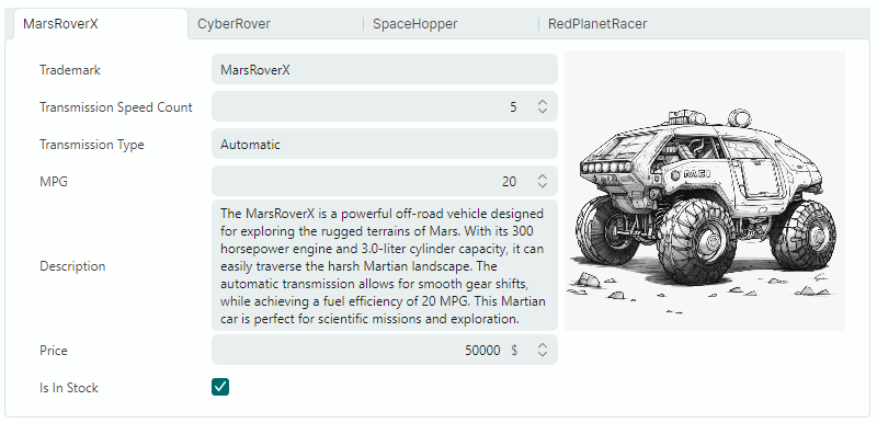
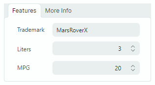
The following example creates two tabs with predefined contents (editors and labels).
xmlns:mx="https://schemas.eremexcontrols.net/avalonia"
xmlns:mxe="https://schemas.eremexcontrols.net/avalonia/editors"

<mx:MxTabControl Margin="5" Height="160" Name="tabControl1" Width="300">
    <mx:MxTabItem Header="Features">
        <Grid RowDefinitions="Auto Auto Auto" ColumnDefinitions="Auto *" Margin="5">
            <Label Classes="LayoutItem" Grid.Column="0" Grid.Row="0" Content="Trademark"/>
            <mxe:TextEditor EditorValue="{Binding SelectedCar.Trademark}" Margin="5"
             Height="20" Grid.Row="0" Grid.Column="1"/>
            <Label Classes="LayoutItem" Grid.Column="0" Grid.Row="1" Content="Liters"/>
            <mxe:SpinEditor EditorValue="{Binding SelectedCar.Liter}" Margin="5"
             Height="20" Grid.Row="1" Grid.Column="1"/>
            <Label Classes="LayoutItem" Grid.Column="0" Grid.Row="2" Content="MPG"/>
            <mxe:SpinEditor EditorValue="{Binding SelectedCar.MPG}" Margin="5"
             Height="20" Grid.Row="2" Grid.Column="1"/>
        </Grid>
    </mx:MxTabItem>
    <mx:MxTabItem Header="More Info" >
        <mxe:TextEditor Margin="5" EditorValue="{Binding SelectedCar.Description}"
         TextWrapping="Wrap" VerticalAlignment="Stretch"/>
    </mx:MxTabItem>
</mx:MxTabControl>
Populate Tabs from an Items Source
One of the MxTabControl's ancestors is the Avalonia.Controls.ItemsControl class. This allows you to populate the TabControl with items from an items source. Use the following main properties for this purpose:
ItemsSource— Specifies the source that contains items to be rendered as tabs.ItemTemplate— Specifies the DataTemplate used to render tab headers.ContentTemplate— Specifies the DataTemplate used to render tab contents.
Example
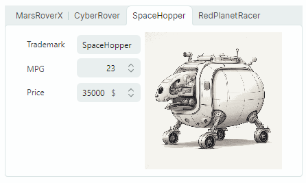
The following example binds an MxTabControl control to an items source and specifies the DataTemplates that render tab headers and contents.
xmlns:mx="https://schemas.eremexcontrols.net/avalonia"
xmlns:mxe="https://schemas.eremexcontrols.net/avalonia/editors"

<mx:MxTabControl ItemsSource="{Binding Cars}" SelectedItem="{Binding SelectedCar}">
    <mx:MxTabControl.ItemTemplate>
        <DataTemplate DataType="demoData:CarInfo">
            <TextBlock Text="{Binding Trademark}"></TextBlock>
        </DataTemplate>
    </mx:MxTabControl.ItemTemplate>

    <mx:MxTabControl.ContentTemplate>
        <DataTemplate DataType="demoData:CarInfo">
            <StackPanel Orientation="Horizontal" Margin="10">
                <Grid RowDefinitions="Auto Auto Auto" ColumnDefinitions="Auto *">
                    <Label Classes="LayoutItem" Grid.Column="0" Grid.Row="0" Content="Trademark"/>
                    <mxe:TextEditor Classes="LayoutItem"  Grid.Column="1" Grid.Row="0"
                     EditorValue="{Binding Trademark}"/>

                    <Label Classes="LayoutItem" Grid.Column="0" Grid.Row="1" Content="MPG"/>
                    <mxe:SpinEditor Classes="LayoutItem" Grid.Column="1" Grid.Row="1"
                     EditorValue="{Binding  MPG}" Minimum="0"/>

                    <Label Classes="LayoutItem" Grid.Column="0" Grid.Row="2" Content="Price"/>
                    <mxe:SpinEditor Classes="LayoutItem" Grid.Column="1" Grid.Row="2"
                     EditorValue="{Binding  Price}" Suffix="{Binding Currency}" Minimum="0"/>
                </Grid>
                <Image Grid.Column="1" Width="200" Source="{Binding Image}" VerticalAlignment="Top"/>
            </StackPanel>
        </DataTemplate>
    </mx:MxTabControl.ContentTemplate>
</mx:MxTabControl>
Select a Tab
Use the following properties to select tabs and get selected tabs:
SelectedIndex— Specifies the zero-based index of the selected tab among all tabs. You can use theMxTabControl.Itemsproperty to access the tab collection.SelectedItem— Specifies the selected tab's item. If tabs are manually added to the TabControl usingMxTabItemobjects, theSelectedItemproperty specifies the selectedMxTabItemobject. If the TabControl is populated from an items source, theSelectedItemproperty specifies the selected tab's data object from the bound items source.
The SelectedValue property specifies the selected tab's value. This property returns the following values:
null, if tabs are manually added to the TabControl usingMxTabItemobjects.- A tab's underlying data object, if the TabControl is populated from an items source.
The following properties allow you to return the contents of the selected tab:
SelectedContent— Specifies the selected tab's content.SelectedContentTemplate— Specifies the selected tab's content template.
Tab Arrangement
Tab headers are displayed along the TabControl's top edge by default. You can use the TabStripPlacement property to specify the position of tab headers.
TabControl supports three tab header layout modes. Use the MxTabControl.TabStripLayoutType property to specify the tab header arrangement type:
Scroll— Tab headers are wide enough to display tab headers' contents. Scroll buttons appear in the tab header region if there is not enough space to display all tab headers in their entirety.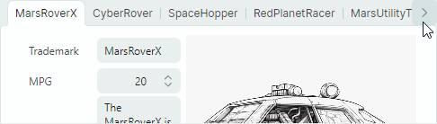
Stretch— All tab headers are arranged in a line, stretching to fit the control's width. They have the same width or height depending on the tab strip position (see theTabStripPlacementproperty).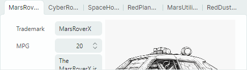
MultiLine— Tab headers are arranged in multiple lines if there is not enough space to display them in a single line.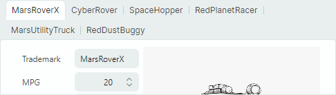
Tab Re-ordering
A user can re-arrange tabs using drag-and-drop if the MxTabControl.TabDragMode property is set to Reorder.
Handle the TabItemStartDragging and TabItemCompleteDragging events to cancel drag operations or perform additional actions when tabs are dragged.
'Close' Buttons
TabControl supports built-in 'Tab Close' ('x') buttons. They can be displayed in tabs and/or tab header region, as specified by the MxTabControl.CloseButtonShowMode property.
'Tab Close' buttons do not perform any action by default. You need to implement 'Close' button actions using one of the following approaches:
- Handle the
MxTabControl.CloseButtonClickevent. - Specify commands with the
MxTabItem.CloseCommandmember.
'New Tab' Button
Set the MxTabControl.NewButtonShowMode property to InHeaderPanel to display the 'New Tab' ('+') button. A click on this button has no action by default. You can specify an action with the following members:
MxTabControl.NewButtonClickevent.MxTabControl.NewCommandcommand.
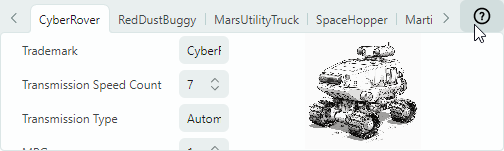
Custom Controls in the Tab Header Area
You can use the ControlBoxContent and ControlBoxContentTemplate properties to add custom controls to the tab header area.
Example
The following example adds the '?' button to the tab header area. A click on the button raises the HelpCommand command. The currently selected tab's item is passed as the command's parameter.
xmlns:mx="https://schemas.eremexcontrols.net/avalonia"
x:Class="SampleTabControl.TabControlPageView"
xmlns:vm="using:SampleTabControl"
x:DataType="vm:TabControlPageViewModel"

<mx:MxTabControl ItemsSource="{Binding Cars}"
                SelectedItem="{Binding SelectedCar}"
                x:Name="TabControl"
    >
    <mx:MxTabControl.ControlBoxContent>
        <Button Command="{Binding HelpCommand}"
         CommandParameter="{Binding $parent.SelectedItem}">
            <Image Width="20" Height="20"
             Source="{SvgImage 'avares://SampleTabControl/Images/help-icon.svg'}"/>
        </Button>
    </mx:MxTabControl.ControlBoxContent>
    ...
</mx:MxTabControl>
public partial class TabControlPageViewModel : PageViewModelBase
{
    //...
    [RelayCommand]
    private void Help(object parameter)
    {
        //...
    }
}