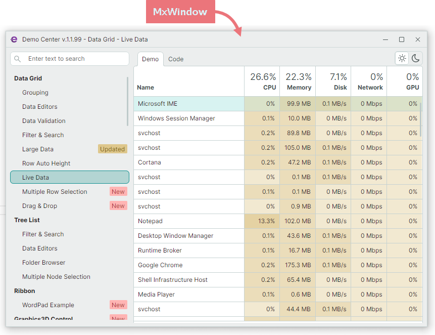
MxWindow
If you are using Eremex Avalonia Controls, consider utilizing the MxWindow component for both main and additional windows in your application. This enables you to maintain a consistent UI across your Avalonia project.
MxWindow is a window that paints its elements (background, border and title bar) according to an Eremex visual theme.
Add Theme Package and Register a Paint Theme
To use MxWindow and other Eremex Avalonia Controls, include a package that contains an Eremex paint theme. The following topic shows how you can register the paint theme in your application:
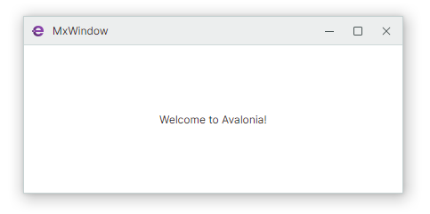
Create MxWindow
MxWindow is a descendant of the standard Avalonia Window component. You can seamlessly replace Window components in your existing applications with MxWindow to leverage the Eremex paint themes. The following XAML code demonstrates a sample MxWindow object declaration:
<mx:MxWindow
    xmlns:mx="https://schemas.eremexcontrols.net/avalonia"
    Title="MxWindow"
    ...
>

</mx:MxWindow>
Eremex Project Templates allow you to create new Avalonia applications with Eremex Controls. These templates create new projects in which the main window is encapsulated by the MxWindow component.
MxWindow Settings
MxWindow extends settings exposed by the standard Window component with the following options that specify the visibility and glyphs of the standard buttons in the title bar:
ShowCloseButton— Specifies the visibility of the Close button.ShowMaximizeButton— Specifies the visibility of the Maximize button.ShowMinimizeButton— Specifies the visibility of the Minimize button.CloseButtonGlyph— The Close button's glyph.MaximizeButtonGlyph— The Maximize button's glyph.MinimizeButtonGlyph— The Minimize button's glyph.RestoreButtonGlyph— The Restore button's glyph.