Context Menus
TreeList and TreeView controls support built-in context menus invoked when a user right-clicks the controls. You can customize these menus to provide users with custom context-dependent commands.
Built-in Column Header Context Menu (TreeList)
When a user right-clicks a TreeList column header, the control displays the built-in column header menu. It contains commands that allow the user to change sort settings for the clicked column.
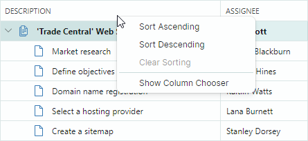
Use the TreeListControl.ColumnMenu property to customize this menu.
You can assign a Eremex.AvaloniaUI.Controls.Bars.PopupMenu object to the TreeListControl.ColumnMenu property to replace the default menu.
To customize the existing column header menu (add or remove default items), access the menu after it has been initialized (for instance, within your TreeList's Initialized event handler), and then modify the menu.
Data Context
The DataContext property of the column header menu and its items (ToolbarButtonItem objects) specifies the TreeListColumn object for which the menu has been invoked.
Example - How to replace the default column header menu
The following code creates a custom column header menu that contains the Clear Column Data menu item. The code binds the menu item to the ClearColumnDataCommand command defined in a ViewModel.
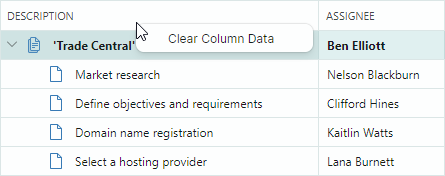
Take note of the initialization of the Command and CommandParameter properties for the menu item in the code below. The expression CommandParameter="{Binding FieldName}" specifies binding to the FieldName property of the menu item's DataContext (TreeListColumn.FieldName).
A TreeListColumn's DataContext matches the Tree List's DataContext (a ViewModel object in this example). This allows you to access the View Model and its ClearColumnDataCommand command using the expression: Command="{Binding DataContext.ClearColumnDataCommand}".
xmlns:mxtl="clr-namespace:Eremex.AvaloniaUI.Controls.TreeList;assembly=Eremex.Avalonia.Controls"
xmlns:mxe="clr-namespace:Eremex.AvaloniaUI.Controls.Editors;assembly=Eremex.Avalonia.Controls"
xmlns:mxb="clr-namespace:Eremex.AvaloniaUI.Controls.Bars;assembly=Eremex.Avalonia.Controls"

<mxtl:TreeListControl Name="treeList1"
                    >
    <mxtl:TreeListControl.ColumnMenu>
        <mxb:PopupMenu>
            <mxb:ToolbarButtonItem
                Header="Clear Column Data"
                Command="{Binding DataContext.ClearColumnDataCommand}"
                CommandParameter="{Binding FieldName}">
            </mxb:ToolbarButtonItem>
        </mxb:PopupMenu>
    </mxtl:TreeListControl.ColumnMenu>
</mxtl:TreeListControl>
public MainView()
{
    DataContext = new ViewModel();
}

public partial class ViewModel : ObservableObject
{
    [RelayCommand]
    void ClearColumnData(string fieldName)
    {
        //...
    }
}
Example - How to modify the existing column header menu
The following example adds a custom command to the default column header menu.
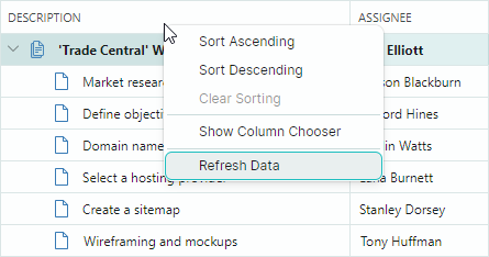
The example handles the TreeListControl.Initialized event to access the default column header menu after it has been initialized, and adds a Refresh Data command to the menu.
xmlns:mxtl="clr-namespace:Eremex.AvaloniaUI.Controls.TreeList;assembly=Eremex.Avalonia.Controls"
xmlns:mxe="clr-namespace:Eremex.AvaloniaUI.Controls.Editors;assembly=Eremex.Avalonia.Controls"
xmlns:mxb="clr-namespace:Eremex.AvaloniaUI.Controls.Bars;assembly=Eremex.Avalonia.Controls"

<mxtl:TreeListControl Name="treeList1"
                      Initialized="OnInitialized"
                    >
using Eremex.AvaloniaUI.Controls.Bars;
using Eremex.AvaloniaUI.Controls.TreeList;

private void OnInitialized(object sender, System.EventArgs e)
{
    ToolbarButtonItem btn1 = new ToolbarButtonItem();
    btn1.Header = "Refresh Data";
    btn1.ShowSeparator = true;
    btn1.Command = new RelayCommand<TreeListControl>(UpdateTreeList);
    btn1.CommandParameter = treeList1;
    treeList1.ColumnMenu.Items.Add(btn1);
}

[RelayCommand]
void UpdateTreeList(TreeListControl treeList)
{
    //...
}
Row Cell Menu (TreeList and TreeView)
TreeList and TreeView controls support a built-in context menu for row cells (see the TreeListControlBase.RowCellMenu property). This menu is initially empty, and therefore hidden. To show the row cell menu, populate it with items in XAML or in code-behind.
Data Context
The DataContext of the row cell menu and its items contains a CellData object, which allows you to access context specific information:
CellData.DataControl— Returns the container control (TreeListControl) for which the menu is invoked.CellData.Row— Returns the clicked node's underlying data object.
Example - How to show the same context menu commands for all rows
The following example adds the "Delete Row" command to the row cell menu (TreeListControlBase.RowCellMenu) for all rows.
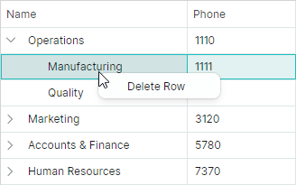
The XAML code below assigns a popup menu to the TreeListControlBase.RowCellMenu property. The popup menu contains a single item (ToolbarButtonItem) bound to the DeleteRowCommand command defined in a View Model (a Tree List's DataContext).
xmlns:mxtl="clr-namespace:Eremex.AvaloniaUI.Controls.TreeList;assembly=Eremex.Avalonia.Controls"
xmlns:mxe="clr-namespace:Eremex.AvaloniaUI.Controls.Editors;assembly=Eremex.Avalonia.Controls"
xmlns:mxb="clr-namespace:Eremex.AvaloniaUI.Controls.Bars;assembly=Eremex.Avalonia.Controls"

<mxtl:TreeListControl Name="treeList1"
                    AutoGenerateColumns="True"
                    ItemsSource="{Binding Departments}"
                    ChildrenFieldName="Children"
                    HasChildrenFieldName="HasChildren"
                    >
    <mxtl:TreeListControl.RowCellMenu>
        <mxb:PopupMenu>
            <mxb:PopupMenu.Items>
                <mxb:ToolbarButtonItem Header="Delete Row"
                 Command="{Binding DataControl.DataContext.DeleteRowCommand}"
                 CommandParameter="{Binding Row}">
                </mxb:ToolbarButtonItem>
            </mxb:PopupMenu.Items>
        </mxb:PopupMenu>
    </mxtl:TreeListControl.RowCellMenu>
</mxtl:TreeListControl>
public partial class MainView : UserControl
{
    MainViewModel viewModel = new MainViewModel();

    public MainView()
    {
        DataContext = viewModel;

        Department depOperations = new Department()
        {
            Name = "Operations", Phone = "1110", IsRoot = true
        };
        Department depManufacturing = new Department()
        {
            Name = "Manufacturing", Phone = "1111"
        };
        Department depQuality = new Department()
        {
            Name = "Quality", Phone = "1112"
        };
        depOperations.Children.Add(depManufacturing);
        depOperations.Children.Add(depQuality);

        Department depMarketing = new Department()
        {
            Name = "Marketing", Phone = "3120", IsRoot = true
        };
        Department depSales = new Department()
        {
            Name = "Sales", Phone = "3121"
        };
        Department depCRM = new Department()
        {
            Name = "CRM", Phone = "3122"
        };
        depMarketing.Children.Add(depSales);
        depMarketing.Children.Add(depCRM);

        Department depAccountsAndFinance = new Department()
        {
            Name = "Accounts & Finance", Phone = "5780", IsRoot = true
        };
        Department depAccounts = new Department()
        {
            Name = "Sales", Phone = "5781"
        };
        Department depFinance = new Department()
        {
            Name = "Finance", Phone = "5782"
        };
        depAccountsAndFinance.Children.Add(depAccounts);
        depAccountsAndFinance.Children.Add(depFinance);

        Department depHumanResources = new Department()
        {
            Name = "Human Resources", Phone = "7370", IsRoot = true
        };
        Department depHR = new Department()
        {
            Name = "HR", Phone = "7370"
        };
        depHumanResources.Children.Add(depHR);

        viewModel.Departments.Add(depOperations);
        viewModel.Departments.Add(depMarketing);
        viewModel.Departments.Add(depAccountsAndFinance);
        viewModel.Departments.Add(depHumanResources);

        InitializeComponent();
    }
}

public partial class MainViewModel : ViewModelBase
{
    public MainViewModel() { }

    public ObservableCollection<Department> Departments { get; } = new();

    [RelayCommand]
    void DeleteRow(Department row)
    {
        DeleteRowRecursively(Departments, row);
    }

    bool DeleteRowRecursively(ObservableCollection<Department> departments, Department row)
    {
        foreach (Department dep in departments)
        {
            if (dep == row)
            {
                departments.Remove(row);
                return true;
            }
            if (DeleteRowRecursively(dep.Children, row))
                break;
        }
        return false;
    }
}

public partial class Department : ObservableObject
{
    [ObservableProperty]
    public string name = "";

    [ObservableProperty]
    public string phone = "0";

    [Browsable(false)]
    public bool IsRoot { get; set; } = false;

    public ObservableCollection<Department> Children { get; } = new();

    public bool HasChildren { get { return Children.Count > 0; } }

    public void AddDepartment(Department department)
    {
        Children.Add(department);
        if (Children.Count == 1)
            OnPropertyChanged(nameof(HasChildren));
    }
}
Example - How to show different context menu commands for different rows
The following example initializes the context menu for rows (TreeListControlBase.RowCellMenu), and displays different menu items for root and nested rows.
The root context menu displays the "Add Child Dep" command, while the context menu for nested rows displays the "Delete Row" command.

The XAML code defines the context menu (a PopupMenu object) with the "Add Child Dep" and "Delete Row" commands.
The "Add Child Dep" command is displayed for root nodes. The "Delete Row" command is displayed for nested nodes.
Visibility of these commands is managed dynamically by the business object's IsRoot property.
xmlns:mxtl="clr-namespace:Eremex.AvaloniaUI.Controls.TreeList;assembly=Eremex.Avalonia.Controls"
xmlns:mxe="clr-namespace:Eremex.AvaloniaUI.Controls.Editors;assembly=Eremex.Avalonia.Controls"
xmlns:mxb="clr-namespace:Eremex.AvaloniaUI.Controls.Bars;assembly=Eremex.Avalonia.Controls"

<mxtl:TreeListControl Name="treeList1"
                        AutoGenerateColumns="True"
                        ItemsSource="{Binding Departments}"
                        ChildrenFieldName="Children"
                        HasChildrenFieldName="HasChildren"
                    >
    <mxtl:TreeListControl.RowCellMenu>
        <mxb:PopupMenu>
            <mxb:PopupMenu.Items>
                <mxb:ToolbarButtonItem
                    Header="Add Child Dep"
                    Command="{Binding DataControl.DataContext.AddChildRowCommand}"
                    CommandParameter="{Binding Row}"
                    Glyph="/Assets/add.png"
                    IsVisible="{Binding Row.IsRoot}">
                </mxb:ToolbarButtonItem>
                <mxb:ToolbarButtonItem
                    Header="Delete Row"
                    Command="{Binding DataControl.DataContext.DeleteRowCommand}"
                    CommandParameter="{Binding Row}"
                    Glyph="/Assets/delete.png"
                    IsVisible="{Binding !Row.IsRoot}">
                </mxb:ToolbarButtonItem>
            </mxb:PopupMenu.Items>
        </mxb:PopupMenu>
    </mxtl:TreeListControl.RowCellMenu>
</mxtl:TreeListControl>
public partial class MainView : UserControl
{
    MainViewModel viewModel = new MainViewModel();

    public MainView()
    {
        DataContext = viewModel;

        Department depOperations = new Department()
        {
            Name = "Operations", Phone = "1110", IsRoot = true
        };
        Department depManufacturing = new Department()
        {
            Name = "Manufacturing", Phone = "1111"
        };
        Department depQuality = new Department()
        {
            Name = "Quality", Phone = "1112"
        };
        depOperations.Children.Add(depManufacturing);
        depOperations.Children.Add(depQuality);

        Department depMarketing = new Department()
        {
            Name = "Marketing", Phone = "3120", IsRoot = true
        };
        Department depSales = new Department()
        {
            Name = "Sales", Phone = "3121"
        };
        Department depCRM = new Department()
        {
            Name = "CRM", Phone = "3122"
        };
        depMarketing.Children.Add(depSales);
        depMarketing.Children.Add(depCRM);

        Department depAccountsAndFinance = new Department()
        {
            Name = "Accounts & Finance", Phone = "5780", IsRoot = true
        };
        Department depAccounts = new Department()
        {
            Name = "Sales", Phone = "5781"
        };
        Department depFinance = new Department()
        {
            Name = "Finance", Phone = "5782"
        };
        depAccountsAndFinance.Children.Add(depAccounts);
        depAccountsAndFinance.Children.Add(depFinance);

        Department depHumanResources = new Department()
        {
            Name = "Human Resources", Phone = "7370", IsRoot = true
        };
        Department depHR = new Department()
        {
            Name = "HR", Phone = "7370"
        };
        depHumanResources.Children.Add(depHR);

        viewModel.Departments.Add(depOperations);
        viewModel.Departments.Add(depMarketing);
        viewModel.Departments.Add(depAccountsAndFinance);
        viewModel.Departments.Add(depHumanResources);

        InitializeComponent();
    }
}

public partial class MainViewModel : ViewModelBase
{
    public MainViewModel() { }

    public ObservableCollection<Department> Departments { get; } = new();

    [RelayCommand]
    void AddChildRow(Department parentRow)
    {
        parentRow.AddDepartment(new Department()
        {
            Name = "New dep", Phone = "0000"
        });
    }

    [RelayCommand]
    void DeleteRow(Department row)
    {
        DeleteRowRecursively(Departments, row);
    }

    bool DeleteRowRecursively(ObservableCollection<Department> departments, Department row)
    {
        foreach (Department dep in departments)
        {
            if (dep == row)
            {
                departments.Remove(row);
                return true;
            }
            if (DeleteRowRecursively(dep.Children, row))
                break;
        }
        return false;
    }
}

public partial class Department : ObservableObject
{
    [ObservableProperty]
    public string name = "";

    [ObservableProperty]
    public string phone = "0";

    [Browsable(false)]
    public bool IsRoot { get; set; } = false;

    public ObservableCollection<Department> Children { get; } = new();

    public bool HasChildren { get { return Children.Count > 0; } }

    public void AddDepartment(Department department)
    {
        Children.Add(department);
        if (Children.Count == 1)
            OnPropertyChanged(nameof(HasChildren));
    }
}
Example - How to generate context menu commands from a ViewModel
This example shows how to populate a TreeList control's row cell menu with items defined in ViewModel.
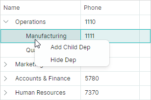
The row cell menu (TreeListControlBase.RowCellMenu) is populated with items (ToolbarButtonItem objects) from an item source specified by the PopupMenu.ItemsSource collection. In this example, the PopupMenu.ItemsSource property is bound to the MenuItems collection defined in the main View Model using the following binding expression:
<mxb:PopupMenu ItemsSource="{Binding DataControl.DataContext.MenuItems}">
When a PopupMenu is displayed for a TreeList cell, the menu's DataContext contains a Eremex.AvaloniaUI.Controls.DataControl.Visuals.CellData object. The CellData object exposes the DataControl property, which allows you to access the control for which the menu is displayed.
The main View Model is assigned to the control's DataContext. Thus, the DataControl.DataContext.MenuItems syntax refers to the MenuItems collection defined in the main View Model.
The CellData object also contains other properties that allow you to access cell-related information (column, row object, etc.).
The menu items are initialized using styles. The DataContext of the menu items are elements of the PopupMenu.ItemsSource collection. In this example, the PopupMenu.ItemsSource property stores a collection of MenuItemViewModel objects. The following snippet binds the ToolbarButtonItem.Header and ToolbarButtonItem.Command properties to the MenuItemViewModel.Header and MenuItemViewModel.Command properties, respectively.
<mxb:PopupMenu.Styles>
    <Style Selector="mxb|ToolbarButtonItem">
        <Setter Property="Header" Value="{Binding Header}"/>
        <Setter Property="Command" Value="{Binding Command}"  />
    </Style>
</mxb:PopupMenu.Styles>
A ToolbarButtonItem's command requires information about the row that has been right-clicked. To pass the data row to the command, the XAML code sets the ToolbarButtonItem.CommandParameter property, as follows:
xmlns:mxvis="clr-namespace:Eremex.AvaloniaUI.Controls.DataControl.Visuals;
 assembly=Eremex.Avalonia.Controls"

<mxb:PopupMenu.Styles>
    <Style Selector="mxb|ToolbarButtonItem">
        ...
        <Setter Property="CommandParameter"
         Value="{Binding $parent[mxvis:CellControl].DataContext.Row}"/>
    </Style>
</mxb:PopupMenu.Styles>
Here, the $parent[mxvis:CellControl] expression traverses the logical tree to locate a CellControl object (it is a parent of the ToolbarButtonItem's DataContext). The CellControl.DataContext object contains an Eremex.AvaloniaUI.Controls.DataControl.Visuals.CellData object, which allows you to access the data row from the CellData.Row property.
The complete code is shown below.
xmlns:mxtl="clr-namespace:Eremex.AvaloniaUI.Controls.TreeList;assembly=Eremex.Avalonia.Controls"
xmlns:mxb="clr-namespace:Eremex.AvaloniaUI.Controls.Bars;assembly=Eremex.Avalonia.Controls"
xmlns:mxvis="clr-namespace:Eremex.AvaloniaUI.Controls.DataControl.Visuals;
 assembly=Eremex.Avalonia.Controls"

<mxtl:TreeListControl Name="treeList1"
                AutoGenerateColumns="True"
                ItemsSource="{Binding Departments}"
                ChildrenFieldName="Children"
                HasChildrenFieldName="HasChildren"
                ExpandStateFieldName="IsExpanded"
                FocusedItem="{Binding SelectedDepartment, Mode=TwoWay}"
            >
    <mxtl:TreeListControl.RowCellMenu>
        <mxb:PopupMenu ItemsSource="{Binding DataControl.DataContext.MenuItems}">
            <mxb:PopupMenu.Styles>
                <Style Selector="mxb|ToolbarButtonItem">
                    <Setter Property="Header" Value="{Binding Header}"/>
                    <Setter Property="Command" Value="{Binding Command }"  />
                    <Setter Property="CommandParameter"
                     Value="{Binding $parent[mxvis:CellControl].DataContext.Row}"/>
                </Style>
            </mxb:PopupMenu.Styles>
        </mxb:PopupMenu>
    </mxtl:TreeListControl.RowCellMenu>
</mxtl:TreeListControl>
public partial class MainView : UserControl
{
    MainViewModel viewModel = new MainViewModel();

    public MainView()
    {
        DataContext = viewModel;

        Department depOperations = new Department()
        {
            Name = "Operations", Phone = "1110", IsRoot = true
        };
        Department depManufacturing = new Department()
        {
            Name = "Manufacturing", Phone = "1111"
        };
        Department depQuality = new Department()
        {
            Name = "Quality", Phone = "1112"
        };
        depOperations.Children.Add(depManufacturing);
        depOperations.Children.Add(depQuality);

        Department depMarketing = new Department()
        {
            Name = "Marketing", Phone = "3120", IsRoot = true
        };
        Department depSales = new Department()
        {
            Name = "Sales", Phone = "3121"
        };
        Department depCRM = new Department()
        {
            Name = "CRM", Phone = "3122"
        };
        depMarketing.Children.Add(depSales);
        depMarketing.Children.Add(depCRM);

        Department depAccountsAndFinance = new Department()
        {
            Name = "Accounts & Finance", Phone = "5780", IsRoot = true
        };
        Department depAccounts = new Department()
        {
            Name = "Sales", Phone = "5781"
        };
        Department depFinance = new Department()
        {
            Name = "Finance", Phone = "5782"
        };
        depAccountsAndFinance.Children.Add(depAccounts);
        depAccountsAndFinance.Children.Add(depFinance);

        Department depHumanResources = new Department()
        {
            Name = "Human Resources", Phone = "7370", IsRoot = true
        };
        Department depHR = new Department()
        {
            Name = "HR", Phone = "7370"
        };
        depHumanResources.Children.Add(depHR);

        viewModel.Departments.Add(depOperations);
        viewModel.Departments.Add(depMarketing);
        viewModel.Departments.Add(depAccountsAndFinance);
        viewModel.Departments.Add(depHumanResources);

        InitializeComponent();
    }
}

public partial class MainViewModel : ViewModelBase
{
    [ObservableProperty]
    Department? selectedDepartment;

    public MainViewModel()
    {
        MenuItemViewModel menuItem1 = new MenuItemViewModel();
        menuItem1.Header = "Add Child Dep";
        menuItem1.Command = new RelayCommand<Department>(AddChildRow);
        MenuItems.Add(menuItem1);

        MenuItemViewModel menuItem2 = new MenuItemViewModel();
        menuItem2.Header = "Hide Dep";
        menuItem2.Command = new RelayCommand<Department>(HideRow);
        MenuItems.Add(menuItem2);
    }

    public ObservableCollection<Department> Departments { get; } = new();

    public ObservableCollection<MenuItemViewModel> MenuItems { get; } = new();

    [RelayCommand]
    void AddChildRow(Department? parentRow)
    {
        if (parentRow == null) return;

        Department newDepartment = new()
        {
            Name = "New dep", Phone = "0000"
        };
        parentRow.AddDepartment(newDepartment);
        parentRow.IsExpanded = true;
        SelectedDepartment = newDepartment;
    }

    [RelayCommand]
    void HideRow(Department? row)
    {
        //...
    }
}

public partial class MenuItemViewModel : ObservableObject
{
    [ObservableProperty]
    string? header;

    [ObservableProperty]
    ICommand? command;
}

public partial class Department : ObservableObject
{
    [ObservableProperty]
    public string name = "";

    [ObservableProperty]
    public string phone = "0";

    [ObservableProperty]
    public bool isExpanded;

    [Browsable(false)]
    public bool IsRoot { get; set; } = false;

    public ObservableCollection<Department> Children { get; } = new();

    public bool HasChildren => Children.Count > 0;

    public void AddDepartment(Department department)
    {
        Children.Add(department);
        if (Children.Count == 1)
            OnPropertyChanged(nameof(HasChildren));
    }
}
Customize Menus on Showing
You can handle the PopupMenu.Opening event to dynamically customize a TreeList's menu. The event occurs when the PopupMenu is about to be displayed.
Example - How to show a context menu for the first column
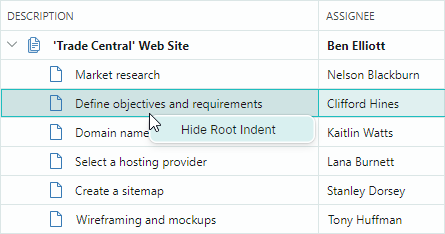
The following example assign an empty PopupMenu to the TreeListControlBase.RowCellMenu property, and then handles the PopupMenu.Opening event to populate the menu with items when a user right-clicks cells within the first visible TreeList column. The menu remains empty (and thus it's not displayed) when a user right-clicks within other columns.
The created menu contains the "Show/Hide Root Indent" check button that toggles the visibility of the TreeList's indent (the TreeListControlBase.ShowRootIndent property).
<mxtl:TreeListControl Name="treeList1" ...>
    <mxtl:TreeListControl.RowCellMenu>
        <mxb:PopupMenu Opening="RowCellMenuOpening"/>
    </mxtl:TreeListControl.RowCellMenu>
</mxtl:TreeListControl>
void RowCellMenuOpening(object sender, CancelEventArgs e)
{
    if (sender == null) return;
    PopupMenu menu = sender as PopupMenu;
    menu.Items.Clear();

    CellData cellData = menu.DataContext as CellData;
    TreeListControl control = cellData.DataControl as TreeListControl;
    TreeListColumn column = cellData.Column as TreeListColumn;
    //// Access the underlying data row, when required.
    //object dataRow = cellData.Row;

    if(column.VisibleIndex == 0)
    {
        ToolbarCheckItem btn1 = new ToolbarCheckItem();
        btn1.IsChecked = control.ShowRootIndent;
        btn1.Header = (control.ShowRootIndent) ? "Hide Root Indent" : "Show Root Indent";
        btn1.Command = new RelayCommand<TreeListControl>(ShowRootIndentCommand);
        btn1.CommandParameter = control;
        menu.Items.Add(btn1);
    }
}

[RelayCommand]
void ShowRootIndentCommand(TreeListControl treeList)
{
    treeList.ShowRootIndent = !treeList.ShowRootIndent;
}
Show a Context Menu for Controls Using a ToolbarManager's Attached Property
The Eremex.AvaloniaUI.Controls.Bars.ToolbarManager component provides the ContextPopup attached property that allows you to assign a context menu to any control, including TreeList and TreeView. This context menu is displayed for TreeList/TreeView regions that have no default context menus, and for regions with empty default menus.
Example - How to assign a context menu using the ToolbarManager.ContextPopup attached property
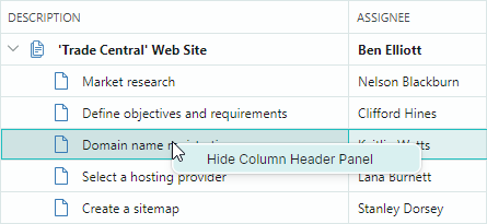
The following code uses the ToolbarManager.ContextPopup attached property to specify a context menu for a TreeList control. The menu contains the Show Column Header Panel/Hide Column Header Panel menu check item which toggles the visibility of the TreeListControl.ShowColumnHeaders option.
xmlns:mxtl="clr-namespace:Eremex.AvaloniaUI.Controls.TreeList;assembly=Eremex.Avalonia.Controls"

<mxtl:TreeListControl Name="treeList1">
    <mxtl:TreeListControl.Styles>
        <Style Selector="mxtl|TreeListControl">
            <Setter Property="mxb:ToolbarManager.ContextPopup" >
                <Template>
                    <mxb:PopupMenu Tag="treeList1">
                        <mxb:ToolbarCheckItem Header="Show Column Header Panel"
                         IsChecked="{Binding $parent[mxtl:TreeListControl].ShowColumnHeaders,
                          Mode=TwoWay}"
                         IsVisible="{Binding !$parent[mxtl:TreeListControl].ShowColumnHeaders}"/>
                        <mxb:ToolbarCheckItem Header="Hide Column Header Panel"
                        IsChecked="{Binding $parent[mxtl:TreeListControl].ShowColumnHeaders,
                         Mode=TwoWay}"
                        IsVisible="{Binding $parent[mxtl:TreeListControl].ShowColumnHeaders}"/>
                    </mxb:PopupMenu>
                </Template>
            </Setter>
        </Style>
    </mxtl:TreeListControl.Styles>
</mxtl:TreeListControl>