Line Series View
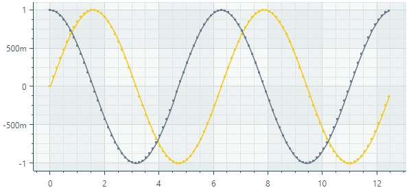
The Line Series View (CartesianLineSeriesView) connects points with lines. The series allows you to show or hide point markers, and adjust the thickness of lines and point markers. The following image demonstrates a chart control with two line series, each painted with its own color.
Create a Line Series View
To create a Line Series View, add a CartesianSeries object to the CartesianChart.Series collection, and initialize the CartesianSeries.View property with a CartesianLineSeriesView instance.
Use the CartesianSeries.DataAdapter property to supply data for the series.
The following code shows how to create an Line Series View in XAML and code-behind.
xmlns:mxc="https://schemas.eremexcontrols.net/avalonia/charts"

<mxc:CartesianChart x:Name="chartControl">
    <mxc:CartesianChart.Series>
        <mxc:CartesianSeries Name="lineSeries1" DataAdapter="{Binding DataAdapter}" >
            <mxc:CartesianLineSeriesView Color="Red" MarkerSize="4" ShowMarkers="True" Thickness="2"/>
        </mxc:CartesianSeries>
    </mxc:CartesianChart.Series>
</mxc:CartesianChart>
using Eremex.AvaloniaUI.Charts;

CartesianSeries series = new CartesianSeries();
chartControl.Series.Add(series);
double[] args = new double[] { 1, 2, 3, 4, 5, 6, 7 };
double[] values = new double[] { 0, 0.4, 1.5, 1.3, 0.4, 0, 0.1 };
series.DataAdapter = new SortedNumericDataAdapter(args, values);
series.View = new CartesianLineSeriesView()
{
    Color = Avalonia.Media.Colors.Green,
    ShowMarkers = true,
    MarkerSize = 4,
    Thickness = 2
};
Example - Create Two Line Series Views
The following example creates a CartesianChart control with two Line Series Views. Data for the Series Views is provided by FormulaDataAdapter objects, which calculate values according to specified formulas. It is implied that a MainWindowViewModel object is set as a data context for the window.
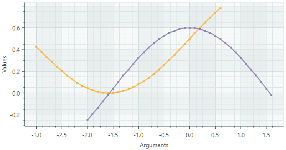
The example demonstrates how to customize the line thickness and point markers for the Series Views.
The X and Y axes are created in XAML to perform customization of their settings. Note the use of the NumericScaleOptions.LabelFormatter property to format axis labels in a custom manner.
<mx:MxWindow xmlns="https://github.com/avaloniaui"
        xmlns:x="http://schemas.microsoft.com/winfx/2006/xaml"
        xmlns:vm="using:ChartLinearSeriesView.ViewModels"
        xmlns:d="http://schemas.microsoft.com/expression/blend/2008"
        xmlns:mc="http://schemas.openxmlformats.org/markup-compatibility/2006"
        xmlns:mx="https://schemas.eremexcontrols.net/avalonia"
        xmlns:mxc="https://schemas.eremexcontrols.net/avalonia/charts"
        mc:Ignorable="d" d:DesignWidth="800" d:DesignHeight="450"
        x:Class="ChartLinearSeriesView.Views.MainWindow"
        x:DataType="vm:MainWindowViewModel"
        Icon="/Assets/EMXControls.ico"
        Title="ChartLinearSeriesView"
        Width="600" Height="350"
        >
    <Design.DataContext>
        <vm:MainWindowViewModel/>
    </Design.DataContext>

    <mxc:CartesianChart x:Name="chartControl">
        <mxc:CartesianChart.Series>
            <mxc:CartesianSeries Name="lineSeries1" DataAdapter="{Binding LineSeries1.DataAdapter}" >
                <mxc:CartesianLineSeriesView Color="{Binding LineSeries1.Color}" MarkerSize="4" ShowMarkers="True" Thickness="2"/>
            </mxc:CartesianSeries>
            <mxc:CartesianSeries Name="lineSeries2" DataAdapter="{Binding LineSeries2.DataAdapter}" >
                <mxc:CartesianLineSeriesView Color="{Binding LineSeries2.Color}" MarkerSize="4" ShowMarkers="True" Thickness="2"/>
            </mxc:CartesianSeries>
        </mxc:CartesianChart.Series>

        <mxc:CartesianChart.AxesX>
            <mxc:AxisX Name="xAxis" Title="Arguments" >
                <mxc:AxisX.ScaleOptions>
                    <mxc:NumericScaleOptions LabelFormatter="{Binding ArgsLabelFormatter}"/>
                </mxc:AxisX.ScaleOptions>
            </mxc:AxisX>
        </mxc:CartesianChart.AxesX>
        <mxc:CartesianChart.AxesY>
            <mxc:AxisY Title="Values">
                <mxc:AxisY.ScaleOptions>
                    <mxc:NumericScaleOptions LabelFormatter="{Binding ArgsLabelFormatter}"/>
                </mxc:AxisY.ScaleOptions>
            </mxc:AxisY>
        </mxc:CartesianChart.AxesY>
    </mxc:CartesianChart>
</mx:MxWindow>
using Avalonia.Media;
using CommunityToolkit.Mvvm.ComponentModel;
using Eremex.AvaloniaUI.Charts;
using System;

namespace ChartLinearSeriesView.ViewModels;

public partial class MainWindowViewModel : ViewModelBase
{
    static double Sin(double argument) => 0.5* Math.Sin(argument)+0.5;
    static double Cos(double argument) => 0.6*Math.Cos(argument);

    [ObservableProperty] SeriesViewModel lineSeries1;
    [ObservableProperty] SeriesViewModel lineSeries2;
    [ObservableProperty] FuncLabelFormatter argsLabelFormatter = new(o => String.Format("{0:n1}", o));

    const int ItemCount = 37;
    const double Step = 0.1;

    public MainWindowViewModel()
    {
        LineSeries1 = new()
        {
            Color = Color.FromUInt32(0xfffeb640),
            DataAdapter = new FormulaDataAdapter(-3, Step, ItemCount, Sin)
        };
        LineSeries2 = new()
        {
            Color = Color.FromUInt32(0xff9389bd),
            DataAdapter = new FormulaDataAdapter(-2, Step, ItemCount, Cos)
        };
    }
}

public partial class SeriesViewModel : ObservableObject
{
    [ObservableProperty] Color color;
    [ObservableProperty] ISeriesDataAdapter dataAdapter;
}
Data for the Line Series View
You can use the following data adapters to provide data for Line Series Views:
Numeric X Values:
SortedNumericDataAdapterFormulaDataAdapter
Date and Time X Values:
SortedDateTimeDataAdapterSortedTimeSpanDataAdapter
Qualitative X Values:
QualitativeDataAdapter
Line Series View Settings
Color— Specifies the color used to paint the series.CrosshairMode— Specifies whether the crosshair's chart label snaps to the nearest data point, or displays an interpolated value. See Show an Exact or Interpolated Value in Crosshair Chart Labels.MarkerImage— Allows you to specify an image in SVG format to use as point markers.MarkerImageCss— Specifies the CSS code that allows you to customize colors of elements in the specified SVG image (MarkerImage).MarkerSize— Specifies the size of point markers.ShowInCrosshair— Specifies the visibility of the crosshair chart label for the current series. See Customize Chart Labels of the Crosshair.ShowMarkers— Enables or disables point markers.Thickness— Specifies the line thickness.