Cartesian Chart
The CartesianChart control allows you to create diagrams using the Cartesian coordinate system.
The control's main features include:
- An unlimited number of data series
- Supported diagram types (views): Line, Scatter Line, Point (with SVG marker support), Area, Step Line, Bar, Candlestick, and more.
- Multiple axes support
- Multiple axis types: Numeric, Date-Time, Time Span, Qualitative, and Logarithmic
- Scrolling and zooming all axes at the same time
- Scrolling and zooming individual axes
- High-performance when displaying large data
- Real-time data visualization
- Strips and constant lines
- Using the MVVM design pattern to provide data and customize chart options
- Displaying rapidly changing real-time data. Use a special data adapter to implement a moving viewport
Get Started
Chart Control's Elements
The main elements of the chart control are series and axes.
Series — Provides data and specifies how to visualize this data. You can plot as many series as you need within the same chart control. See Series for more information.
Axes — A typical cartesian chart displays two axes: the X-axis and Y-axis. You can also add additional axes to the chart when it plots two or more series. Each series can be associated with its own axis. See Axes.
Series
A series provides data to plot by the chart control, and specifies the series view (visual presentation of this data).
The CartesianSeries class encapsulates a series for the CartesianChart control. To add series to the chart, use the CartesianChart.Series collection. You can also populate the chart with series using the MVVM design pattern. Use the CartesianChart.SeriesSource and CartesianChart.SeriesTemplate properties for this purpose. See the following link for more information: Get Started with Charts - MVVM Pattern.
The following code defines one series in the CartesianChart.Series collection.
<mxc:CartesianChart>
    <mxc:CartesianChart.Series>
        <mxc:CartesianSeries DataAdapter="{Binding Series.DataAdapter}">
            <mxc:CartesianLineSeriesView Color="{Binding Series.Color}" Thickness="2" />
        </mxc:CartesianSeries>
    </mxc:CartesianChart.Series>
    <!-- ... -->
</mxc:CartesianChart>
Series Data
You can supply data for a chart control's series using Data Adapters.
<mxc:CartesianSeries DataAdapter="{Binding Series.DataAdapter}">
    <!-- ... -->
</mxc:CartesianSeries>
A Data Adapter is an object that implements the ISeriesDataAdapter interface. Typically you do not need to implement this interface manually. Eremex Charts ship with multiple Data Adapters for various data types (numeric, date-time, and qualitative). Choose a Data Adapter based on your requirements.
Below you'll find Data Adapters grouped by the type of the X values:
Numeric X Values:
SortedNumericDataAdapterFormulaDataAdapterScatterDataAdapterNumericRangeDataAdapter
Date and Time X Values:
SortedDateTimeDataAdapterDateTimeRangeDataAdapterSortedTimeSpanDataAdapterTimeSpanRangeDataAdapterCandlestickDataAdapter(for the Candlestick Series View)SummaryCandlestickDataAdapter(for the Candlestick Series View)
Qualitative X Values:
QualitativeDataAdapterQualitativeRangeDataAdapter
Series Visibility
Use the Series.Visible property to hide a series.
chart1.Series[0].Visible = !chart1.Series[0].Visible;
Series Views
CartesianChart supports multiple series views (diagram types):
Line Series View (CartesianLineSeriesView object)Points connected with lines. 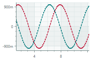 |
Scatter Line Series View (CartesianScatterLineSeriesView object)Connects points in the order in which they appear in the data series.  |
Point Series View (CartesianPointSeriesView object)Plots individual points. 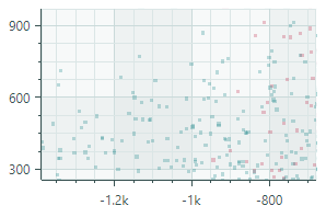 |
Area Series View (CartesianAreaSeriesView object)Connects points with lines and paints filled areas. 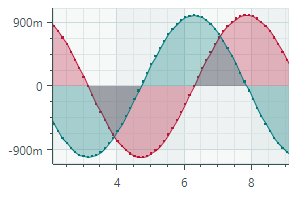 |
Step Line Series View (CartesianStepLineSeriesView object)Connects points with horizontal and vertical line segments. 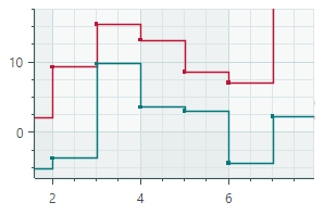 |
Step Area Series View (CartesianStepAreaSeriesView object)Connects points with horizontal and vertical line segments, and paints filled areas. 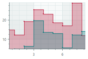 |
Range Area Series View (CartesianRangeAreaSeriesView object)Fills the area between the two Y-values of a data series. 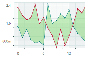 |
Bar Series View (CartesianSideBySideBarSeriesView object)Visualizes data as a set of rectangular bars.  |
Range Bar Series View (CartesianSideBySideRangeBarSeriesView object)Draws rectangular bars between the two Y-values of a data series. 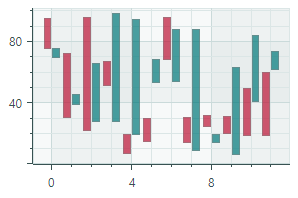 |
Candlestick Series View ( CartesianCandlestickSeriesView object)A financial chart that describes price movements of an asset. For each data point, the chart displays a set of four values, the Open, Close, High and Low prices. 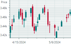 |
To specify a view for series, define a corresponding ...SeriesView object as the content of the CartesianSeries object. In code behind, use the CartesianSeries.View property to specify a series view.
The following sample assigns the 'Line Series View' to a series.
<mxc:CartesianSeries DataAdapter="{Binding Series.DataAdapter}">
    <mxc:CartesianLineSeriesView Color="{Binding Series.Color}" Thickness="2" />
</mxc:CartesianSeries>
Axes
The CartesianChart control automatically creates cartesian axes (the X-axis and Y-axis) if you do not define them manually. If you need to customize axes in XAML, define AxisX and/or AxisY objects in the CartesianChart.AxesX/CartesianChart.AxesY collections, and then modify settings of these axes.
<mxc:CartesianChart>
    <!-- ... -->

    <mxc:CartesianChart.AxesX>
        <mxc:AxisX ShowTitle="False">
        </mxc:AxisX>
    </mxc:CartesianChart.AxesX>

    <mxc:CartesianChart.AxesY>
        <mxc:AxisY Title="t(°C)" TitlePosition="WithLabels">
            <mxc:AxisYRange AlwaysShowZeroLevel="False" />
        </mxc:AxisY>
    </mxc:CartesianChart.AxesY>
</mxc:CartesianChart>
Axis Value Range
Place AxisXRange/AxisYRange objects as the content of the AxisX/AxisY objects to specify range settings of the axes. The AxisXRange/AxisYRange objects allow you to customize the total value range, visible value range, visibility of the zero level, etc.
<mxc:CartesianChart.AxesX>
    <mxc:AxisX ShowTitle="False" >
        <mxc:AxisXRange MinSideMargin="0.15" MaxSideMargin="0.15"/>
    </mxc:AxisX>
</mxc:CartesianChart.AxesX>
<mxc:CartesianChart.AxesY>
    <mxc:AxisY Title="Amplitude (dB SPL)">
        <mxc:AxisYRange AlwaysShowZeroLevel="False" />
    </mxc:AxisY>
</mxc:CartesianChart.AxesY>
AutoCorrectWholeRange(default istrue) — Gets or sets whether the total axis range is calculated automatically based on the series data.To set a custom total axis range, disable the
AutoCorrectWholeRangeoption and then use theWholeMinandWholeMaxproperties.SynchronizeVisualRange— Gets or sets whether the visible axis range is set to the total axis range when the latter is changed.AlwaysShowZeroLevel(forAxisYRangeobjects only) (default istrue) — Gets or sets whether the total axis range is automatically adjusted to include the zero level. SeeWholeMax.WholeMax— Gets or sets the maximum value of the total axis range. TheWholeMinproperty specifies the minimum value.Disable the
AutoCorrectWholeRangeproperty to use theWholeMinandWholeMaxproperties.If the
AlwaysShowZeroLeveloption is enabled (default behavior), the zero level is forcibly included in the total axis range.Example - Show and Hide the Zero Level
Consider the following example in which the
WholeMinandWholeMaxproperties define custom bounds for the total axis range. The range automatically includes the zero level because theAlwaysShowZeroLevelproperty is enabled.<mxc:CartesianChart.AxesY> <mxc:AxisY ShowTitle="False"> <mxc:AxisYRange WholeMin="100" WholeMax="350" AutoCorrectWholeRange="False" AlwaysShowZeroLevel="True" /> </mxc:AxisY> </mxc:CartesianChart.AxesY>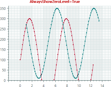
Disable the
AlwaysShowZeroLevelproperty to limit the total axis range by theWholeMinandWholeMaxproperties, while ignoring the zero level.<mxc:AxisYRange WholeMin="100" WholeMax="350" AutoCorrectWholeRange="False" AlwaysShowZeroLevel="False" />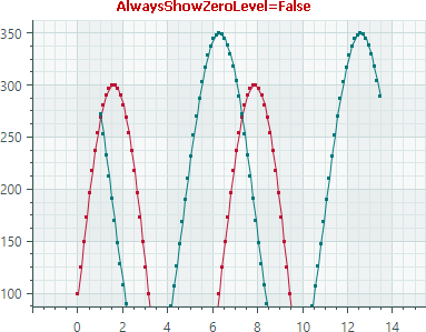
WholeMin— Gets or sets the minimum value of the total axis range. SeeWholeMaxfor more information.VisualMax— Gets or sets the maximum value of the currently visible axis range. TheVisualMinproperty specifies the minimum value.VisualMin— Gets or sets the minimum value of the currently visible axis range.MaxSideMargin— Gets or sets the amount of empty space after the rightmost/topmost point of the chart data.MinSideMargin— Gets or sets the amount of empty space before the leftmost/bottommost point of the chart data.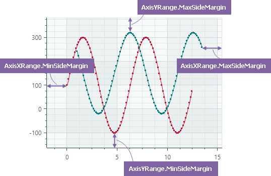
Axis Scale
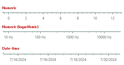
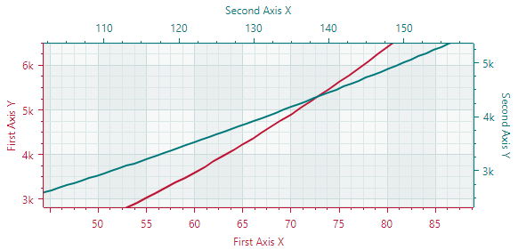
An axis scale defines the type of scale units and various axis display options. The image below demonstrates a few scale types:
To specify the scale settings for axes, use the AxisX.ScaleOptions and AxisY.ScaleOptions properties.
Customize Scale Settings for an X Axis
Use the AxisX.ScaleOptions property to change the scale settings for an X axis.
This property is of the base ScaleOptions type.
To modify the scale settings, set the AxisX.ScaleOptions property to one of the following objects based on the type of the X values of the series:
NumericScaleOptions— Numeric data scale. Use this scale type if the X values provided by the series are numeric values.<mxc:AxisX Title="Frequency"> <mxc:AxisX.ScaleOptions> <mxc:NumericScaleOptions LogarithmicBase="{Binding AxisX.LogarithmicBase}" LabelFormatter="{Binding FrequencyFormatter}" /> </mxc:AxisX.ScaleOptions> </mxc:AxisX>DateTimeScaleOptions— DateTime data scale. Use this scale type if the X values provided by the series areDateTimevalues. TheDateTimeScaleOptions.MeasureUnitproperty allows you to specify the time unit (axis unit) for the axis scale:Millisecond,Second,Minute,Hour,Day,Week,Month,Quarter, orYear<mxc:AxisX ShowTitle="False"> <mxc:AxisX.ScaleOptions> <mxc:DateTimeScaleOptions MeasureUnit="Day" /> </mxc:AxisX.ScaleOptions> </mxc:AxisX>TimeSpanScaleOptions— TimeSpan data scale. Use this scale type if the X values provided by the series areTimeSpanvalues. TheTimeSpanScaleOptions.MeasureUnitproperty allows you to specify the time unit for the axis scale:Millisecond,Second,Minute,Hour, orDay.<mxc:AxisX> <mxc:AxisX.ScaleOptions> <mxc:TimeSpanScaleOptions MeasureUnit="Minute" /> </mxc:AxisX.ScaleOptions> </mxc:AxisX>QualitativeScaleOptions— Qualitative data scale. Use this scale type if the X values provided by the series are qualitative values (text strings).<mxc:AxisX > <mxc:AxisX.ScaleOptions> <mxc:QualitativeScaleOptions GridSpacing="1" /> </mxc:AxisX.ScaleOptions> </mxc:AxisX>
Customize Scale Settings for an Y Axis
Use the AxisY.ScaleOptions property to modify the scale settings of the Y axis. This property is of the NumericScaleOptions type.
<mxc:AxisY Title="Amplitude (dB SPL)">
    <mxc:AxisY.ScaleOptions>
        <mxc:NumericScaleOptions LabelFormatter="{Binding MyCustomLabelFormatter}"/>
    </mxc:AxisY.ScaleOptions>
</mxc:AxisY>
Format Axis Labels
The ScaleOptions.LabelFormatter property allows you to specify an object that formats axis display values in a custom manner. You can implement a custom label formatter based on a function/expression using the Eremex.AvaloniaUI.Charts.FuncLabelFormatter object.
The following example implements a custom label formatter for DateTime values.
<mxc:AxisX Name="salesAxis" Title="Sales">
    <mxc:AxisX.ScaleOptions>
        <mxc:DateTimeScaleOptions MeasureUnit="Month" LabelFormatter="{Binding MonthFormatter}" />
    </mxc:AxisX.ScaleOptions>
</mxc:AxisX>
public partial class MainWindowViewModel : ViewModelBase
{
    // ...
    [ObservableProperty] FuncLabelFormatter monthFormatter = new(o => String.Format("{0:MMM} {0:yy}", o));
}
Multiple Axes
A typical cartesian chart has one X and one Y axis. You can add any number of additional X and Y axes when required. This is helpful when you display multiple series, and want to show its own X and/or Y axis for each series.
Do the following to link a series with an axis:
- Set the
Axis.Keyproperty of the axis to a unique ID (string). - Set the series's
AxisXKey/AxisYKeyproperty to the value of theAxis.Keyproperty.
The following example adds an X axis and binds it to the lineSeries series.
<mxc:CartesianSeries Name="lineSeries" DataAdapter="{Binding LineSeries.DataAdapter}"
  AxisXKey="lineSeriesAxis">
    <mxc:CartesianLineSeriesView Color="{Binding LineSeries.Color}" />
</mxc:CartesianSeries>

<mxc:CartesianChart.AxesX>
    <!-- ... -->
    <mxc:AxisX Position="Far" Title="Expenses"
       Key="lineSeriesAxis">
        <mxc:AxisX.ScaleOptions>
            <mxc:NumericScaleOptions />
        </mxc:AxisX.ScaleOptions>
    </mxc:AxisX>
</mxc:CartesianChart.AxesX>
Scroll and Zoom
Users can zoom and scroll the entire view and individual axes with the mouse. They can also zoom into a specific rectangle or a value range.
Scroll and zoom all axes simultaneously
Scroll and zoom individual axes
Zoom into a specific region and axis value range
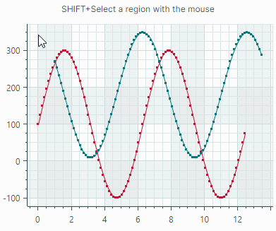
See the following topic for more information: Scroll and Zoom in a Chart Control
Axis Settings
The following list summarizes display and behavior settings of cartesian axes:
ConstantLinesandConstantLinesSource— Allows you to paint constant lines for specific values. See Constant Lines and Strips.EnableScrolling— Allows a user to scroll an axis with a mouse drag operation.EnableZooming— Allows a user to zoom an axis.InterlacingColor- The color used to paint interlaced strip lines (when theShowInterlacingoption is enabled).MinorCount— Specifies the number of minor tickmarks and grid lines.Position— Specifies the position of the axis. Available options include:Near(the X-axis is displayed at the bottom, and the Y-axis is displayed at the chart's left edge), andFar(the X-axis is displayed at the top, and the Y-axis is displayed at the chart's right edge).ShowAxisLine— Specifies the visibility of the axis line.ShowInterlacing— Specifies whether to paint interlaced strip lines between major gridlines.ShowLabels— Specifies the visibility of the labels corresponding to major tickmarks.ShowMajorGridlines— Specifies the visibility of the grid lines corresponding to major tickmarks.ShowMajorTickmarks— Specifies the visibility of the major tickmarks.ShowMinorGridlines— Specifies the visibility of the grid lines corresponding to minor tickmarks.ShowMinorTickmarks— Specifies the visibility of the minor tickmarks.ShowTitle— Specifies the visibility of the axis title (theTitleproperty).StripsandStripsSource— Allows you to fill ranges between specific values. See Constant Lines and Strips.Thickness— The thickness of the axis line.Title— Gets or sets the title for the axis.TitlePosition— Specifies the position of the axis title.
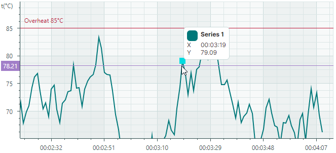
Constant Lines and Strips
The CartesianChart control includes support for constant lines and strips. They allow you to highlight specific values and value ranges along the axes.
Constant Lines
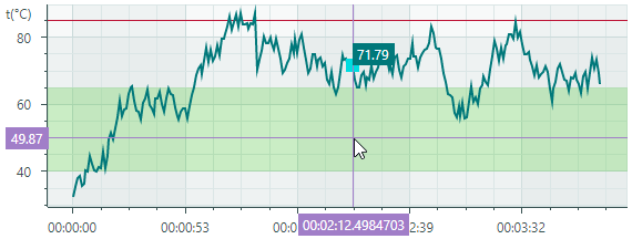
Constant lines are vertical or horizontal lines that are drawn perpendicular to the axes. They serve as visual markers to highlight specific values along the axes. Use the Axis.ConstantLines or Axis.ConstantLinesSource property to specify constant lines. Each constant line is encapsulated by a ConstantLine object.
The following code creates a horizontal constant line that indicates the value of 85 along the Y axis.
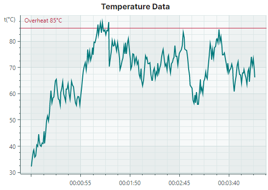
<mxc:CartesianChart.AxesY>
    <mxc:AxisY Title="t(°C)" TitlePosition="WithLabels">
        <mxc:AxisY.ConstantLines>
            <mxc:ConstantLine Title="Overheat 85°C" AxisValue="85" Color="#BD1436"/>
        </mxc:AxisY.ConstantLines>
    </mxc:AxisY>
</mxc:CartesianChart.AxesY>
The Axis.ConstantLinesSource property allows you to initialize constant lines from a collection of objects defined in a View Model. To create ConstantLine objects from the underlying data objects, use the Axis.ConstantLineTemplate property to specify a template. See the Strips and Constant Lines demo for an example.
Constant Line Settings
ConstantLine.AxisValue— The axis value associated with the constant line.ConstantLine.Color— The color to paint the constant line.ConstantLine.ShowBehind— Specifies whether to paint the constant line below (default) or above the series.ConstantLine.ShowTitle— Specifies whether to show (default) or hide the title (See theTitleoption).ConstantLine.Thickness— The thickness of the constant line.ConstantLine.Title— A title to paint next to the constant line. TheTitlePositionoption specifies the position of the title.ConstantLine.TitleIndent— The horizontal and vertical distance of the title from the line.ConstantLine.TitlePosition— The placement of the title relative to the line. Available options include:NearAboveLine,NearBelowLine,FarAboveLineandFarBelowLine.
Constant Strips
Constant strips allow you to highlight specific value ranges along the axes. Similar to constant lines, strips are drawn perpendicular to the axes. You can specify strips using the Axis.Strips and Axis.StripsSource properties. Each strip is encapsulated by a Strip object.
The following code creates a strip that highlights a range of Y values between 40 and 65. The strip is filled with a semi-transparent light green color. Note that if you use an opaque color for the strip, it will obscure the chart control's grid lines.
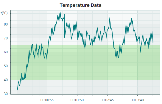
<mxc:CartesianChart.AxesY>
    <mxc:AxisY Title="t(°C)" TitlePosition="WithLabels">
        <mxc:AxisY.Strips>
            <mxc:Strip AxisValue1="40" AxisValue2="65" Color="#4043C927" />
        </mxc:AxisY.Strips>
    </mxc:AxisY>
</mxc:CartesianChart.AxesY>
The Axis.StripsSource property allows you to initialize strips from a collection of objects defined in a View Model. To create Strip objects from the underlying data objects, use the Axis.StripTemplate property to specify a template.
Strip Settings
ConstantLine.AxisValue1— Specifies the first (start or end) value of the range along the axisConstantLine.AxisValue2— Specifies the second (end or start) value of the range along the axis.ConstantLine.Color— The color used to fill the strip.Tip
Use a semi-transparent color to allow grid lines to be seen beneath the strip.
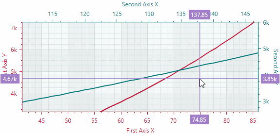
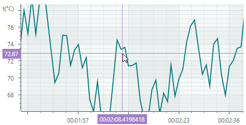
Crosshair
A crosshair is a pair of thin vertical and horizontal lines (argument and value lines) that allow a user to see exact values on axes and charts at the current cursor position. The crosshair appears when hovering over the chart, and it follows the mouse pointer.
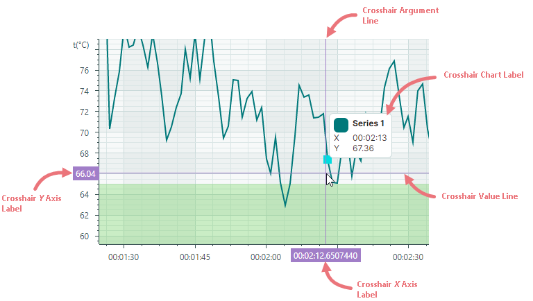
To customize display settings of the crosshair, or disable this feature, initialize the CartesianChart.CrosshairOptions property with an instance of the Eremex.AvaloniaUI.Charts.CrosshairOptions class. Then use the properties exposed by the CrosshairOptions class to adjust the crosshair settings as needed.
Disable the Crosshair
The CrosshairOptions.ShowCrosshair property allows you to disable the crosshair.
<mxc:CartesianChart x:Name="chartControl1" >
    <mxc:CartesianChart.CrosshairOptions>
        <mxc:CrosshairOptions ShowCrosshair="False"/>
    </mxc:CartesianChart.CrosshairOptions>
    <!-- ... -->
</mxc:CartesianChart>
Disable Individual Lines and Axis Labels of the Crosshair
The CrosshairOptions.ShowArgumentLine and CrosshairOptions.ShowValueLine properties can be used to hide the vertical and horizontal line of the crosshair, respectively. To prevent crosshair labels from being displayed for the X and Y axes, use the CrosshairOptions.ShowArgumentLabel and CrosshairOptions.ShowValueLabel properties.
The following example hides the crosshair's vertical line and label for the X axis:
<mxc:CartesianChart x:Name="chartControl1" >
    <mxc:CartesianChart.CrosshairOptions>
        <mxc:CrosshairOptions ShowArgumentLabel="False" ShowValueLabel="False"/>
    </mxc:CartesianChart.CrosshairOptions>
    <!-- ... -->
</mxc:CartesianChart>
Customize Chart Labels of the Crosshair
A series view's CrosshairSeriesViewBase.ShowInCrosshair property specifies the visibility of the crosshair chart label for this series.
The following code hides the crosshair's chart label:
<mxc:CartesianChart.Series>
    <mxc:CartesianSeries DataAdapter="{Binding Series.DataAdapter}">
        <mxc:CartesianLineSeriesView Color="{Binding Series.Color}" Thickness="2" ShowInCrosshair="false"/>
    </mxc:CartesianSeries>
</mxc:CartesianChart.Series>
The CrosshairOptions.SeriesLabelIndent property allows you to adjust the horizontal distance between the crosshair chart label and the target chart point. The property's default value is 2.
Show an Exact or Interpolated Value in Crosshair Chart Labels
Cartesian Chart supports series that consist of sorted discrete data points. For these series, the crosshair lines do not always intersect data points, but are most often displayed between them.
You can use the CartesianSortedLineSeriesView.CrosshairMode property to specify whether the crosshair's chart label snaps to the nearest data point, or displays an interpolated value. The following options are available:
CrosshairSeriesMode.Point— The crosshair chart label snaps to the nearest data point and displays its value.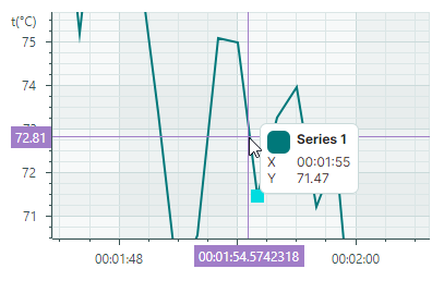
CrosshairSeriesMode.Interpolate— The crosshair chart label displays an interpolated value of the point at the intersection of the vertical crosshair line with the chart.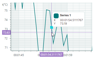
The following code shows how to customize the CrosshairMode option:
<mxc:CartesianChart.Series>
    <mxc:CartesianSeries DataAdapter="{Binding Series.DataAdapter}">
        <mxc:CartesianLineSeriesView Color="{Binding Series.Color}" Thickness="2" CrosshairMode="Interpolate"/>
    </mxc:CartesianSeries>
</mxc:CartesianChart.Series>
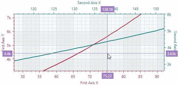
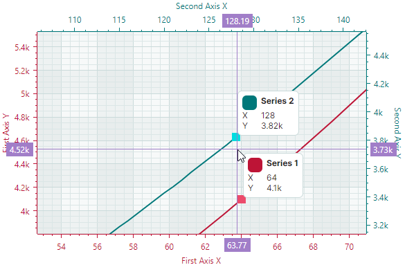
Customize Crosshair Chart Labels for Multiple Series
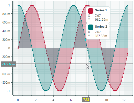
When the Cartesian Chart contains multiple series, the crosshair displays a chart label for each series:
Use the CrosshairOptions.SeriesLabelMode property to specify display mode of chart labels for multiple series. The following options are available:
CrosshairSeriesLabelMode.ForEachSeries— A crosshair chart label is displayed for each series.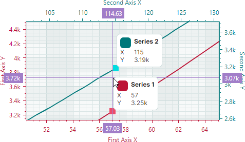
CrosshairSeriesLabelMode.ForNearestSeries— A crosshair chart label is displayed for the nearest series.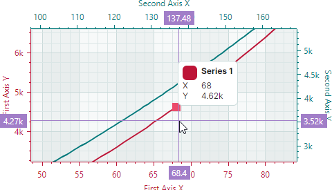
CrosshairSeriesLabelMode.OneForAllSeries— The crosshair displays one chart label that combines information on values of all series.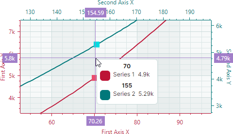
Below is an example that enables one crosshair chart label in the case of multiple series.
<mxc:CartesianChart.CrosshairOptions>
    <mxc:CrosshairOptions SeriesLabelMode="OneForAllSeries"/>
</mxc:CartesianChart.CrosshairOptions>
Customize Crosshair Lines and Labels of the X and Y Axes
A chart control's CrosshairOptions object contains a set of properties that allow you to change the visual settings of crosshair lines, X axis label, and Y axis label.
ArgumentColor— The background color of the crosshair X axis labels.ArgumentLineThickness— The thickness of the crosshair argument line.ArgumentTextColor— The foreground (text) color of the crosshair X axis labels.ValueColor— The background color of the crosshair Y axis labels.ValueLineThickness— The thickness of the crosshair value line.ValueTextColor— The foreground (text) color of the crosshair Y axis labels.
The following XAML code demonstrates how to customize these settings for a sample chart control. The crosshair line thickness is set to 3. The crosshair labels have a gray background, but different text colors: yellow for the X-axis labels and cyan for the Y-axis labels.
<mxc:CartesianChart ...>
    <mxc:CartesianChart.CrosshairOptions>
        <mxc:CrosshairOptions
            ArgumentColor="Gray" ArgumentTextColor="Yellow" ArgumentLineThickness="3"
            ValueColor="Gray" ValueTextColor="Cyan" ValueLineThickness="3" />
    </mxc:CartesianChart.CrosshairOptions>
</mxc:CartesianChart>
Convert Between Diagram Coordinates and Screen Coordinates
Sometimes you may need to translate from chart coordinates to screen coordinates, and vice versa. The following methods allow you to accomplish this task:
CartesianChart.DiagramPointToScreenPoint— Converts coordinates of a chart point to screen coordinates. The chart point is addressed by the X and Y axes, and the values along these axes.CartesianChart.ScreenPointToDiagramPoint— Converts screen coordinates to the coordinates of a point within the chart control. The object returned by the method allows you to obtain the chart coordinates, or determine if the screen coordinates are within the control's viewport.