Get Started with Charts - MVVM Pattern
You can populate Chart Controls with data using the MVVM design pattern. This is helpful when you need to display multiple data series.
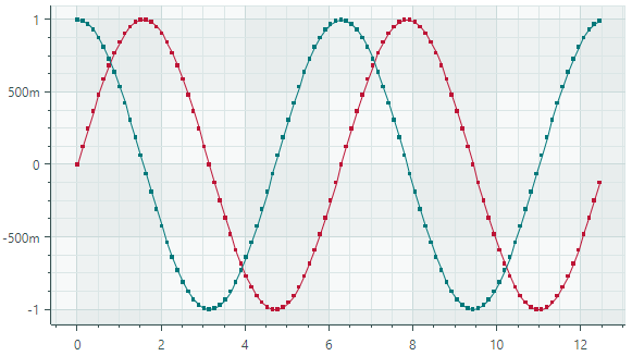
This tutorial shows how to paint two line charts in the CartesianChart control using the MVVM pattern. Data for line charts in this example is calculated using math functions (sine and cosine).
You can find the complete code of this tutorial in the Cartesian Chart→Line module of the Demo application.
Define View Models
Start by defining View Models that provide data and series settings for a chart control.
CartesianLineSeriesViewViewModel — The main View Model that will be set as a chart control's Data Context. The main View Model exposes the CartesianLineSeriesViewViewModel.Series property which specifies a collection of data series' View Models.
SeriesViewModel — A View Model for a data series.
// The main View Model
public partial class CartesianLineSeriesViewViewModel : ChartsPageViewModel
{
    static double Sin(double argument) => Math.Sin(argument);
    static double Cos(double argument) => Math.Cos(argument);

    const int ItemCount = 100;
    const double Step = 4 * Math.PI / ItemCount;

    // A collection of View Models used to create data series.
    [ObservableProperty] ObservableCollection<SeriesViewModel> series = new()
    {
        new SeriesViewModel { Color = Color.FromArgb(255, 189, 20, 54), DataAdapter = new FormulaDataAdapter(0, Step, ItemCount, Sin)},
        new SeriesViewModel { Color = Color.FromArgb(255, 0, 120, 122), DataAdapter = new FormulaDataAdapter(0, Step, ItemCount, Cos)},
    };
}

// A View Model for a data series.
public partial class SeriesViewModel : ObservableObject
{
    [ObservableProperty] string axisXKey;
    [ObservableProperty] string axisYKey;
    [ObservableProperty] Color color;
    [ObservableProperty] ISeriesDataAdapter dataAdapter;
}
The CartesianLineSeriesViewViewModel.Series collection is initialized with two series View Models. The Cartesian Chart will render them as two data series.
A View Model for a data series (SeriesViewModel) exposes properties that specify data and color to paint the series in the chart control:
Color — A color to paint a data series.
DataAdapter — An
ISeriesDataAdapterobject that supplies data for a series.Eremex Charts ship with multiple Data Adapters for various data types (numeric, date-time, and qualitative). All Data Adapters implement the
ISeriesDataAdapterinterface.This tutorial uses a
Eremex.AvaloniaUI.Charts.FormulaDataAdapterobject. It specifies a function that returns numeric Y values in Step increments.A few examples of other Data Adapters include:
SortedNumericDataAdapter— Supplies (numeric X, numeric Y) pairs sorted by the X values.QualitativeDataAdapter— Supplies (string X, numeric Y) pairs.
See the following topic for more information: Cartesian Chart.
Create a Chart Control
In XAML, create a CartesianChart control and initialize its CartesianChart.SeriesSource and CartesianChart.SeriesTemplate properties:
CartesianChart.SeriesSource— The collection of View Models representing data series (the CartesianLineSeriesViewViewModel.Series collection storing SeriesViewModel objects).It is assumed that a chart control's Data Context is set to a CartesianLineSeriesViewViewModel object.
CartesianChart.SeriesTemplate- A template that creates aCartesianSeriesobject from a series View Model. TheCartesianSeriesclass encapsulates a single data series in theCartesianChartcontrol.
<mxc:CartesianChart Grid.Column="0" Classes="DemoChart"
 SeriesSource="{Binding Series}" x:Name="chart1">
    <mxc:CartesianChart.SeriesTemplate>
        <DataTemplate x:DataType="vm:SeriesViewModel">
            <mxc:CartesianSeries DataAdapter="{Binding DataAdapter}">
                <mxc:CartesianLineSeriesView Color="{Binding Color}"
                                             ShowMarkers="True"
                                             MarkerSize="4"
                                             Thickness="2"/>
            </mxc:CartesianSeries>
        </DataTemplate>
    </mxc:CartesianChart.SeriesTemplate>
</mxc:CartesianChart>
When you create a CartesianSeries object, initialize the following properties to specify the series data and view:
CartesianSeries.DataAdapter— The Data Adapter that supplies data. Set this property to the DataAdapter property defined in the View Model.CartesianSeries.View— The series view, which determines the visual representation of the data series.
Customize a Series View
The CartesianSeries.View property specifies the visual representation of the data series. In XAML, you can specify a view as the content of the CartesianSeries object.
<mxc:CartesianSeries DataAdapter="{Binding DataAdapter}">
    <mxc:CartesianLineSeriesView Color="{Binding Color}"
                                    ShowMarkers="True"
                                    MarkerSize="4"
                                    Thickness="2"/>
</mxc:CartesianSeries>
In this tutorial, the CartesianSeries.View property is initialized with a CartesianLineSeriesView object to render data as a line connecting underlying data points.
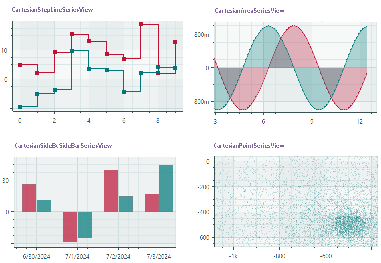
To present data in a different way in your projects, use other series views (SeriesViewBase class descendants). A few examples of available series views are shown below:
A series view contains settings that allow you to change the display style of the series.
<mxc:CartesianLineSeriesView Color="{Binding Color}"
                             ShowMarkers="True"
                             MarkerSize="4"
                             Thickness="2"/>
For instance, the CartesianLineSeriesView class exposes the following properties:
Color— A color to paint the series.CrosshairMode— Specifies whether to display an interpolated Y value or the Y value of the nearest point when the crosshair feature is active and theShowInCrosshairoption istrue.MarkerSize— Specifies the size of the point marker.MarkerImage— Allows you to specify an image in SVG format to use as the point marker.MarkerImageCss— The CSS code that allows you to customize colors of elements in the specified SVG image (MarkerImage).ShowInCrosshair— Specifies whether to display the chart's Y value at the intersection of the vertical crosshair line with the graph.ShowMarkers— Enables or disables point markers.Thickness— Specifies the line thickness.
Create Chart Axes
The CartesianChart control automatically creates cartesian axes (the X-axis and Y-axis) if you do not define them manually. If you want to customize axes in XAML, add AxisX and/or AxisY objects to the CartesianChart.AxesX/CartesianChart.AxesY collections, and then modify axis settings.
 <mxc:CartesianChart Grid.Column="0" Classes="DemoChart" SeriesSource="{Binding Series}" x:Name="chart1">
    <!-- ... -->
    <mxc:CartesianChart.AxesX>
        <mxc:AxisX ShowTitle="True"  />
    </mxc:CartesianChart.AxesX>
    <mxc:CartesianChart.AxesY>
        <mxc:AxisY ShowTitle="False" />
    </mxc:CartesianChart.AxesY>
</mxc:CartesianChart>
The following list shows basic settings of cartesian axes:
ConstantLinesandConstantLinesSource— Allows you to paint constant lines for specific values. See alsoStripsandStripsSource.EnableScrolling— Allows a user to scroll the axis with a mouse drag operation.EnableZooming— Allows a user to zoom the axis.MinorCount— Specifies the number of minor tickmarks and grid lines.Position— Specifies the position of the axis. Available options include:Near(the X-axis is displayed at the bottom, and the Y-axis is displayed at the chart's left edge), andFar(the X-axis is displayed at the top, and the Y-axis is displayed at the chart's right edge).Range— The value range settings.ScaleOptions— Specifies the scale settings.ShowAxisLine— Specifies the visibility of the axis line.ShowInterlacing— Specifies whether to paint interlaced strip lines between major gridlines.ShowLabels— Specifies the visibility of the labels corresponding to major tickmarks.ShowMajorGridlines— Specifies the visibility of the grid lines corresponding to major tickmarks.ShowMajorTickmarks— Specifies the visibility of the major tickmarks.ShowMinorGridlines— Specifies the visibility of the grid lines corresponding to minor tickmarks.ShowMinorTickmarks— Specifies the visibility of the minor tickmarks.ShowTitle— Specifies the visibility of the axis title (theTitleproperty).StripsandStripsSource— Allows you to fill ranges between specific values. See alsoConstantLinesandConstantLinesSource.Thickness— The thickness of the axis line.Title— Gets or sets the title for the axis.TitlePosition— Specifies the position of the axis title.
Result
Run the application to see the result of this tutorial. The CartesianChart control displays two data series using the Line series view.
Complete Code
You can find the complete code of this tutorial in the Cartesian Chart→Line module of the Demo application.