Columns
DataGrid supports bound and unbound columns. Bound columns display values from fields of the bound data source. Unbound columns allow you to display custom data.
DataGrid columns provide properties to customize the column caption, cell editor, sort/group settings, and other options.
Create Columns
The GridColumn class represents a column in the DataGridControl. GridColumn and TreeListColumn (a column in the TreeListControl) are derived from the ColumnBase class. Thus, columns in the DataGrid and TreeList controls share many API members.
To access the grid column collection, use the DataGridControl.Columns property.
The DataGrid control does not automatically create columns when you bind the control to a data source. Four approaches allow you to create columns:
Manual Column Creation
You can define all DataGrid columns manually in the
DataGridControl.Columnscollection (in XAML or code-behind). With this approach you have access to the created column objects by name in code.The following sample creates two DataGrid columns and customizes the display format of the second column's values:
xmlns:mxdg="https://schemas.eremexcontrols.net/avalonia/datagrid"

<mxdg:DataGridControl Name="dataGrid1" >
    <mxdg:DataGridControl.Columns>
        <mxdg:GridColumn Name="colName" FieldName="Name" />
        <mxdg:GridColumn Name="colBirthdate" FieldName="Birthdate" >
            <mxdg:GridColumn.EditorProperties>
                <mxe:TextEditorProperties DisplayFormatString="yyyy-MM-dd"/>
            </mxdg:GridColumn.EditorProperties>
        </mxdg:GridColumn>
    </mxdg:DataGridControl.Columns>
</mxdg:DataGridControl>
Automatic Column Generation
Enable the
DataGridControl.AutoGenerateColumnsoption to automatically generate missing columns when you bind the control to a data source. You can apply specific attributes (from theSystem.ComponentModelandSystem.ComponentModel.DataAnnotationsnamespaces) to properties of a business object to manage the automatic generation of columns, and customize settings of auto-generated columns (for instance, the column display name and order).Combining Manual Column Creation and Automatic Generation
You can combine the two approaches above: manually create the required columns in the
DataGridControl.Columnscollection, and then enable theDataGridControl.AutoGenerateColumnsoption to delegate the generation of other columns to the DataGrid.Column Generation from a View Model
DataGrid can create columns from a column source defined in a View Model. Use the
ColumnsSourceandColumnTemplateproperties in this scenario. See Generate Columns from a View Model.
See Column Automatic Generation for information on auto-generated columns.
Bind Columns to Data
The GridColumn.FieldName property allows you to bind a column to a field in the underlying data table, or to a public property of a business object. Once bound, the column retrieves values from the data source.
DataGrid also allows you to create unbound columns, whose values should be supplied manually, using the DataGridControl.CustomUnboundColumnData event. See Unbound Columns for more information.
It is not recommended to bind multiple DataGrid columns to the same data field/property.
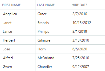
The following example creates DataGrid columns and binds them to data.
xmlns:mxdg="https://schemas.eremexcontrols.net/avalonia/datagrid"

<mxdg:DataGridControl Grid.Column="3" Width="200" Name="dataGrid1" HorizontalAlignment="Stretch">
    <mxdg:DataGridControl.Columns>
        <mxdg:GridColumn Name="colFirstName" FieldName="FirstName" Header="First Name"
         Width="*" AllowSorting="False"  />
        <mxdg:GridColumn Name="colLastName" FieldName="LastName" Header="Last Name" Width="*"/>
        <mxdg:GridColumn Name="colCity" FieldName="City" Header="City" Width="*" ReadOnly="True" />
        <mxdg:GridColumn Name="colPhone" FieldName="Phone" Header="Phone" Width="*"/>
    </mxdg:DataGridControl.Columns>
</mxdg:DataGridControl>
using Eremex.AvaloniaUI.Controls.DataGrid;

GridColumn colFirstName = new GridColumn()
 { FieldName = "FirstName", Header = "First Name", AllowSorting = false,
   Width= new GridLength(1, GridUnitType.Star) };
dataGrid1.Columns.Add(colFirstName);
Automatic Column Generation
Set the AutoGenerateColumns property to true (the default value is false) to enable automatic column generation for properties in the data source. When AutoGenerateColumns is set to true, the DataGrid control fetches public properties from the data source, generates columns and binds them to the properties. If the control's Columns collection already contains a column bound to a specific property/field, no extra column bound to the same property/field is auto-generated.
The AutoGeneratingColumn and AutoGeneratedColumns events allow you to customize auto-generated columns. The AutoGeneratingColumn event fires when an auto-generated column is about to be added to the Columns collection. The event allows you to prevent a column from being added to the collection.
The AutoGeneratedColumns event fires after all columns have been auto-generated.
When you assign another data source to the control, the DataGrid first deletes columns that were previously auto-generated, and then auto-generates columns for the new data source.
Use Attributes to Customize Settings of Auto-Generated Columns
You can apply specific attributes (from the System.ComponentModel and System.ComponentModel.DataAnnotations namespaces) to properties of a business object (data source record) to customize the visibility status, view and behavior settings for corresponding auto-generated DataGrid columns. The supported attributes are described below:
Browsable Attribute
The System.ComponentModel.BrowsableAttribute attribute controls column auto-generation. Apply the Browsable(false) attribute to specific properties to prevent corresponding columns from being auto-generated.
using CommunityToolkit.Mvvm.ComponentModel;
using System.ComponentModel;

public partial class MyBusinessObject : ObservableObject
{
    [ObservableProperty]
    [property: Browsable(false)]
    public int serviceId = "";
}
The System.ComponentModel.BrowsableAttribute attribute is equivalent to using the System.ComponentModel.DataAnnotations.DisplayAttribute attribute with the AutoGenerateField parameter.
Display Attribute
The System.ComponentModel.DataAnnotations.DisplayAttribute is a general-purpose attribute that controls column auto-generation and display settings of auto-generated columns. The attribute has the following parameters supported by the DataGrid control:
AutoGenerateField— Specifies whether to auto-generate a corresponding column.Order— Specifies the auto-generated column's visible position (ColumnBase.VisibleIndex).Name— Specifies the auto-generated column's caption (ColumnBase.Header).ShortName— Equivalent to theNameparameter.
using CommunityToolkit.Mvvm.ComponentModel;
using System.ComponentModel.DataAnnotations;

public partial class MyBusinessObject : ObservableObject
{
    [ObservableProperty]
    [Display(Name = "Birth date", Order=2)]
    public DateTime? birthdate = null;
}
DisplayName Attribute
The System.ComponentModel.DisplayNameAttribute attribute allows you to initialize an auto-generated column's caption (ColumnBase.Header).
using CommunityToolkit.Mvvm.ComponentModel;
using System.ComponentModel;

public partial class MyBusinessObject : ObservableObject
{
    [ObservableProperty]
    [property: DisplayName("Birth date")]
    public DateTime? birthdate = null;
}
The System.ComponentModel.DisplayNameAttribute attribute is equivalent to using the System.ComponentModel.DataAnnotations.DisplayAttribute attribute with the Name or ShortName parameter.
Editable Attribute
The System.ComponentModel.EditableAttribute attribute applied to a property creates a non-editable column. Users cannot open in-place editors, and thus select and copy text.
using CommunityToolkit.Mvvm.ComponentModel;
using System.ComponentModel;

public partial class MyBusinessObject : ObservableObject
{
    [ObservableProperty]
    [property: Editable(false)]
    public int parentId = -1;
}
Readonly Attribute
The System.ComponentModel.ReadonlyAttribute attribute applied to a property creates a read-only column. Users can select and copy text in read-only columns, but not edit values.
using CommunityToolkit.Mvvm.ComponentModel;
using System.ComponentModel;

public partial class MyBusinessObject : ObservableObject
{
    [ObservableProperty]
    [property: ReadOnly(true)]
    public int id = -1;
}
Generate Columns from a View Model
You can populate the DataGrid control with columns from a column source defined in a View Model. The column source is a collection of business objects from which GridColumn objects are generated according to a specified template. The following API members maintain column generation from a View Model:
DataGridControl.ColumnsSource— A collection of business objects used to generate grid columns according to theColumnTemplatetemplate.DataGridControl.ColumnTemplate— A template that initializes aGridColumnobject from business objects stored in the column source.
Example - Generate Columns from a Column Source
The following code snippet from the "Large Data" demo shows how you can create and initialize Data Grid columns from a column source (DataGridControl.ColumnsSource).
<mxdg:DataGridControl ItemsSource="{Binding Items}" ColumnsSource="{Binding Columns}" AutoGenerateColumns="True" BorderThickness="0,0,1,0"
                      CustomUnboundColumnData="DataGridControl_CustomUnboundColumnData" PropertyChanged="DataGridControl_PropertyChanged">
    <mxdg:DataGridControl.ColumnTemplate>
        <views:DataGridLargeDataViewColumnTemplate/>
    </mxdg:DataGridControl.ColumnTemplate>
</mxdg:DataGridControl>
public class DataGridLargeDataViewColumnTemplate : ITemplate<object, GridColumn>
{
    public GridColumn Build(object param)
    {
        var largeDataColumn = (LargeDataColumn)param;
        var gridColumn = new GridColumn()
        {
            FieldName = largeDataColumn.FieldName,
            Header = largeDataColumn.Header
        };
        if (!largeDataColumn.FieldName.Contains("Id"))
        {
            gridColumn.UnboundDataType = largeDataColumn.DataType;

            if (largeDataColumn.FieldName.Contains("ComboBox"))
                gridColumn.EditorProperties = new ComboBoxEditorProperties() { ItemsSource = EmployeesData.EmployeeNames };
            else if (largeDataColumn.FieldName.Contains("Numeric"))
                gridColumn.EditorProperties = new SpinEditorProperties() { MaskType = MaskType.Numeric, Mask = "c" };
        }
        return gridColumn;
    }
}
For the complete example, see the Large Data demo for the Data Grid control.
Move Columns
Use the GridColumn.VisibleIndex property to specify the column's visual position. To hide the column, set its GridColumn.VisibleIndex property to -1, or set the IsVisible property to false.
The control's default behavior allows a user to rearrange columns. Use the following properties to forbid column movement:
DataGridControl.AllowColumnMoving— Specifies whether a user can move any column.GridColumn.AllowMoving— Specifies whether a user can move a specific column.
Resize Columns
You can use the following properties to control column width in DataGrid:
GridColumn.Width— The column width specified as aGridLengthvalue.GridColumn.MinWidth— The column's minimum width.GridColumn.MaxWidth— The column's maximum width.
The Width property is of the GridLength type. It allows you to set the column width to:
- A fixed width (a number of pixels).
- A weighted proportion of available space (the star notation).
- The 'Auto' value — Activates automatic column width calculation to fit the column's header and visible values. When a user scrolls the control vertically, the control can enlarge the column width to fit new cell values appeared during the scroll operation.
xmlns:mxdg="https://schemas.eremexcontrols.net/avalonia/datagrid"

<mxdg:DataGridControl Name="dataGrid1">
    <mxdg:DataGridControl.Columns>
        <mxdg:GridColumn Name="colFirstName" FieldName="FirstName" Header="First Name" Width="*"/>
        <mxdg:GridColumn Name="colLastName" FieldName="LastName" Header="Last Name" Width="2*"/>
        <mxdg:GridColumn Name="colPhone" FieldName="Phone" Header="Phone" Width="*"/>
    </mxdg:DataGridControl.Columns>
</mxdg:DataGridControl>
The following properties control column resize operations performed by users.
DataGridControl.AllowColumnResizing— Specifies whether a user can resize any column.GridColumn.AllowResizing— Specifies whether a user can resize a specific column.
Column Headers
DataGrid column headers are displayed in the header panel. You can hide this panel with the DataGridControl.ShowColumnHeaders property.
The panel's height is automatically adjusted to fit contents of column headers. Use the HeaderPanelMinHeight property to limit the panel's minimum height.
A column header initially displays a caption (text label), which is a text representation of the ColumnBase.Header property. If the ColumnBase.Header property is not set, the column caption is generated from the column's field name (ColumnBase.FieldName).
Use the ColumnBase.HeaderTemplate property to specify a template used to render the column header. The template allows you to display images and custom controls, and to render text in a custom manner.
The following code displays an image before the column's caption. The <TextBlock Text="{Binding}"> expression displays the contents of the column's Header property:
xmlns:mxdg="https://schemas.eremexcontrols.net/avalonia/datagrid"

<mxdg:DataGridControl Name="DataGrid" HeaderPanelMinHeight="50">
    <mxdg:GridColumn FieldName="Number" Header="Position" HeaderVerticalAlignment="Bottom">
        <mxdg:GridColumn.HeaderTemplate>
            <DataTemplate>
                <StackPanel Orientation="Horizontal">
                    <Image Source="/info24x24.png" Width="24" Height="24" Margin="0,0,5,0"></Image>
                    <TextBlock Text="{Binding}" VerticalAlignment="Center"/>
                </StackPanel>
            </DataTemplate>
        </mxdg:GridColumn.HeaderTemplate>
    </mxdg:GridColumn>
</mxdg:DataGridControl>
Use the ColumnBase.HeaderHorizontalAlignment and ColumnBase.HeaderVerticalAlignment properties to align a column header's content horizontally and vertically.
Column Sorting
A user can click a column header or use a column header's context menu to sort the DataGrid against the column. See Data Sorting for more information.
Column Grouping
Users can group data by any number of columns. To group by a column, a user can drag-and-drop a column to the group panel, or use a corresponding command in the column header's context menu. See the following topic for more information: Data Grouping.
Column Values
To learn how to retrieve cell values for specific rows, see Rows.
Column Header Tooltips
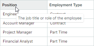
Use the HeaderToolTip property to specify custom tooltips for column headers. Custom tooltips are displayed when hovering over column headers regardless of whether column header text is trimmed or not.
<mxdg:GridColumn FieldName="Position" HeaderToolTip="The job title or role of the employee"/>
When no custom tooltip is assigned to a column, the default tooltip is shown for the column header if the header text is trimmed. The default tooltip displays the full, untrimmed header text.