Document Panes
Document Pane objects (DocumentPane) allow you to create a tabbed MDI (Multiple Document Interface) in your application. Document Panes are tailored to display the main content of your window.
When you combine them in a DocumentGroup container, they are rendered as tabs.
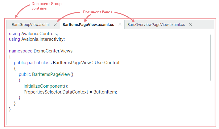
Drag-and-drop operations and context menus allow you to change the order of Document Panes, move Document Panes to another container, or make them floating.
You can also add regular Dock Panes to a DocumentGroup container. All items added to a DocumentGroup container are rendered as tabs.
DocumentPane and DockPane objects share multiple features, as DocumentPane is a DockPane class descendant. DocumentGroup is a TabbedGroup descendant. Thus, these objects have many features in common.
Like dock panels, DocumentPane and DocumentGroup objects can be combined with other dock items in a split container (a DockGroup container), which arranges its children side-by-side, either horizontally or vertically.
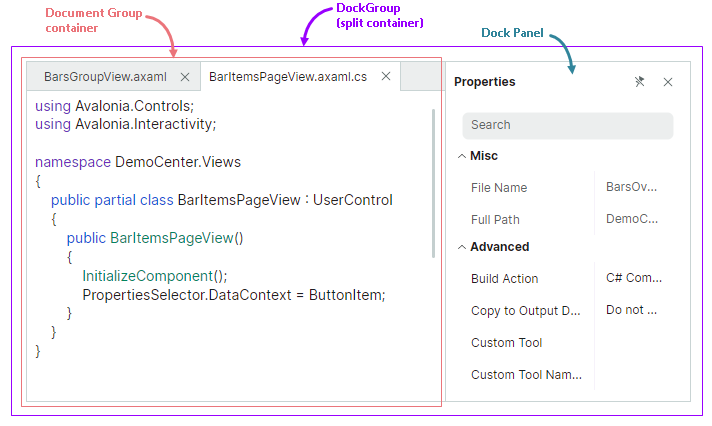
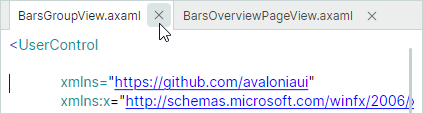
The following XAML code creates the layout of dock items shown in the image above.
xmlns:mxd="https://schemas.eremexcontrols.net/avalonia/docking"

<mxd:DockManager>
    <mxd:DockGroup Orientation="Horizontal">
        <mxd:DocumentGroup>
            <mxd:DocumentPane Header="BarsGroupView.axaml"/>
            <mxd:DocumentPane Header="BarItemsPageView.axaml"/>
        </mxd:DocumentGroup>
        <mxd:DockPane Header="Properties"/>
    </mxd:DockGroup>
</mxd:DockManager>
The auto-hide feature is not supported for DocumentPane and DocumentGroup objects.
Using MVVM to Create a Docking UI
You can use the MVVM design pattern to populate a Docking UI with dock items (Dock Panes and Document Panes). Use the following API members for this purpose:
DockManager.ItemsSource— Specifies a list of objects that need to be rendered as dock items.DockManager.ItemTemplate— Specifies the template used to render objects from theDockManager.ItemsSourcelist as dock items.
See Using MVVM to Populate Dock Items for more information.
Document Pane Content and Size
Specify Content
You can use the inherited DockPane.Content property to define a Document Pane's content in code. In XAML, you can define the pane's content between the start and end <DocumentPane> tags.
The inherited DockPane.ContentTemplate property allows you to specify the template used to render the Content object.
Specify Size
For dock items (panels and containers) that are displayed within split containers (DockGroup objects), the following properties allow you to set item size:
DockWidth(for panels that are horizontally arranged in their parent containers)DockHeight(for panels that are vertically arranged in their parent containers)
Note
Document Panes are rendered as tabs when they reside within a Document Group container. You can only change size of the Document Group container, not the size of its child Document Panes. You can set size of individual Document Panes if they are not rendered as tabs.
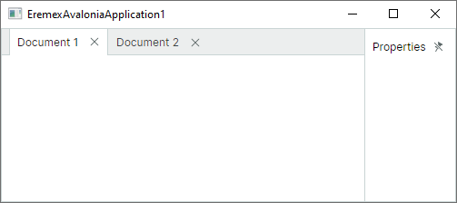
The following example arranges a DocumentGroup and DockPane horizontally in a split container, and sets a DocumentGroup's width to 4 times the width of a DockPane.
xmlns:mxd="https://schemas.eremexcontrols.net/avalonia/docking"

<mxd:DockManager Grid.Row="1" Name="dockManager1">
    <mxd:DockGroup Orientation="Horizontal">
        <mxd:DocumentGroup DockWidth="4*">
            <mxd:DocumentPane Name="documentPane1" Header="Document 1"/>
            <mxd:DocumentPane Name="documentPane2" Header="Document 2"/>
        </mxd:DocumentGroup>
        <mxd:DockPane DockWidth="*" Header="Properties"/>
    </mxd:DockGroup>
</mxd:DockManager>
The DockWidth and DockHeight properties do not affect size of Document Panes in the floating state. See the following link to learn more:
Specify Header Settings
Use the inherited DockPane.Header and DockPane.HeaderTemplate properties to set headers for Document Panes. To display images, use the inherited DockPane.Glyph and DockPane.GlyphSize properties.
Typically, Document Panes are placed within a DocumentGroup container in which they are rendered as tabs. In this case, you can also use the inherited DockPane.TabHeader, DockPane.TabHeaderTemplate, DockPane.TabGlyph and DockPane.TabGlyphSize properties to specify the header text and images. If these properties are not set, the DockPane.Header, DockPane.HeaderTemplate, DockPane.Glyph and DockPane.GlyphSize properties specify text and images displayed in tabs.
Related API
DockPane.ShowGlyphMode— Specifies the visibility and position of a glyph in a panel's header.DockPane.ShowTabGlyphMode— Specifies the visibility and position of a glyph in a tab when the panel is hosted within a tabbed container (for instance,DocumentGroup).
Create a Tabbed UI
You can combine Document Panes in a DocumentGroup container to create a tabbed MDI (Multiple Document Interface). DocumentGroup, like its ancestor (TabbedGroup) is a container that presents its children as tabs.
The following example creates a DocumentGroup container with three DocumentPane objects.
xmlns:mxd="https://schemas.eremexcontrols.net/avalonia/docking"

<mxd:DocumentGroup Name="documentGroup1" DockWidth="5*" >
    <mxd:DocumentPane Name="document1" Header="Document 1"></mxd:DocumentPane>
    <mxd:DocumentPane Name="document2" Header="Document 2"></mxd:DocumentPane>
    <mxd:DocumentPane Name="document3" Header="Document 3"></mxd:DocumentPane>
</mxd:DocumentGroup>
To combine Document Panes in a tab container in code-behind, use the the DockManager.Dock method with the dockType parameter set to DockType.Fill. If you dock a document to another document that is already hosted within a tab container, the source panel is displayed as an additional tab within the tab container.
// Dock a document to another document
dockManager1.Dock(document4, document1, DockType.Fill);
// or dock a document to a group:
dockManager1.Dock(document5, documentGroup1, DockType.Fill);
Access a Tab Container
For Document Panes that reside in a DocumentGroup container, use the inherited DockPane.DockParent property to return the parent tab container.
Related API
The following list shows frequently used API members that allow you to customize DocumentPane and DocumentGroup objects. Most of these settings are inherited from the objects' base classes.
DockManager.Dock— Allows you to dock an item (for example, aDocumentPaneobject) to another item. Set the method's dockType parameter toDockType.Fillto create a tab container.DockItemBase.DockParent— Allows you to get the immediate parent of a dock object. ForDocumentPaneobjects combined in aDocumentGroupcontainer, theDockParentproperty returns this container.DockPane.CloseCommand— The command that is invoked when a panel is closed. A panel can be closed by a click on the 'Close' button (seeDockPane.AllowCloseandTabbedGroup.CloseButtonShowMode). Closed panels can be accessed from theDockManager.ClosedPanescollection.DockPane.ShowTabGlyphMode— Specifies the visibility and position of a glyph in a panel's header (tab) when the panel is hosted within a tab container.DockPane.TabGlyphSize— Specifies size of the tab glyph (DockPane.TabGlyph). This property is in effect when the panel is hosted within a tab container.DockPane.TabGlyph— Specifies the glyph displayed in the tab. This property is in effect when the panel is hosted within a tab container.DockPane.TabHeaderTemplate— Specifies the template to render a tab. This property is in effect when the panel is hosted within a tab container.DockPane.TabHeader— Specifies text to display in a tab. This property is in effect when the panel is hosted within a tab container.TabbedGroup.AllowFloat— Specifies whether the tab container can be made floating by a user.TabbedGroup.CloseButtonShowMode— Specifies whether and where to display 'Close' buttons for child panels in the tab region: nowhere in the tab region, in each panel, in the active panel, or in the tab strip region. TheTabbedGroup.CloseButtonShowModeproperty does not affect the display of the 'Close' button in a panel's header. See Closing Panels.TabbedGroup.SelectTabOnClose— Specifies which tab is selected when you close a tab: the recently opened tab, the following tab, or preceding tab.TabbedGroup.SelectedIndex— Specifies the zero-based index of the selected tab in the current tab container. You can use theSelectedIndexproperty to select a specific tab.TabbedGroup.ShowTabStripForSingleChild— Specifies whether to display the tab strip when the tab container contains one child. If this property is set totrue, the tab strip is only displayed if the container owns two or more children.TabbedGroup.TabHeaderOrientation— Specifies whether to arrange tabs horizontally or vertically. InTabHeaderOrientation.Automode, tabs are arranged horizontally if theTabbedGroup.TabStripPlacementproperty is set toToporBottom. The tabs are arranged vertically, if theTabbedGroup.TabStripPlacementproperty is set toLeftorRight.TabbedGroup.TabStripLayoutType— Specifies how tabs are displayed.TabStripLayoutType.Scroll- Tab headers are wide enough to display tab headers' contents. Scroll buttons appear in the tab header region if there is not enough space to display all tab headers in their entirety.TabStripLayoutType.Stretch- All tab headers are arranged in a line, stretching to fit the control's width. They have the same width or height depending on the tab strip position (seeTabbedGroup.TabStripPlacement).TabStripLayoutType.MultiLine- Tab headers are arranged in multiple lines if there is not enough space to display them in a single line.TabbedGroup.TabStripPlacement— Specifies the edge along which tabs are displayed.
Activate Document Panes
A Document Pane's inherited DockPane.IsActive property allows you to move focus to a specific Document Pane. Use the DockManager.ActiveDockItem property to get the active dock item.
When Document Panes are combined in a DocumentGroup container, you can use the DocumentGroup.SelectedIndex property to select a specific Document Pane.
Close Document Panes
When Document Panes are placed within a DocumentGroup container, they display 'Close' buttons in tabs. The 'Close' buttons allow a user to close the panels. In code, you can close a panel with the DockManager.Close method.
Use the DockPane.AllowClose property to hide the 'Close' button for a panel, and thus prevent the panel from being closed using this button.
When a panel is closed, the inherited DockPane.CloseCommand command is activated.
All closed panels can be accessed from the DockManager.ClosedPanes collection.
The MVVM design pattern allows you to supply Document Panes from the DockManager.ItemsSource collection. On closing a Document Pane, you can remove the pane from the DockManager.ItemsSource collection. In this case, the pane is removed from the DockManager.ClosedPanes collection as well.
The following code from the "IDE Layout" demo shows specifies a CloseCommand command for a newly opened document. This command removes the pane from the Documents collection (DockManager.ItemsSource). See the "IDE Layout" demo for a complete example.
public void Open(SolutionFile solutionFile)
{
    var document = Documents.FirstOrDefault(x => x.Uri == solutionFile.Uri);
    if (document == null)
    {
        document = new IdeLayoutDocumentViewModel
        {
            Header = solutionFile.Filename,
            Uri = solutionFile.Uri
        };
        document.CloseCommand = new RelayCommand(() => Documents.Remove(document));
        Documents.Add(document);
    }
    document.IsActive = true;
}
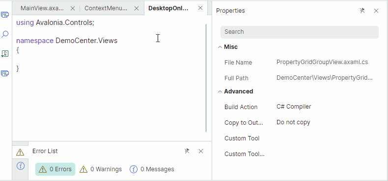
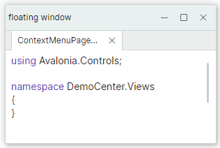
A DocumentGroup's CloseButtonShowMode property allows you to display additional 'Close' buttons in the tab strip region. You can display the 'Close' buttons in all tabs, in the active tab, or in the tab strip region. The image below displays the 'Close' button in the tab strip region (the CloseButtonShowMode property is set to TabControlCloseButtonShowMode.InHeaderPanel).
The DockManager.DockOperationStarting event allows you to prevent specific panels from being closed, or perform custom actions when panels are closed. This event does not raise if a panel is removed from the DockManager.ItemsSource collection on panel closing.
Runtime Options for Document Panes
DocumentPane objects contain settings that allow you to disable specific user operations at runtime. These settings are inherited from the base DockPane class.
DockPane.AllowClose— Gets or sets whether a user can close a panel. Set this property tofalseto hide the panel'sx(close) button. See Close Document Panes.DockPane.AllowFloat— Gets or sets whether a user can make a panel floating. See Floating Document Panes.DockPane.AllowMaximize— Specifies the visibility of the 'Maximize' button for a panel in the floating state.DockPane.AllowMinimize— Specifies the visibility of the 'Minimize' button for a panel in the floating state.
These options do not prevent you from performing corresponding operations on panels in code.
You can also handle the DockManager.DockOperationStarting event to dynamically prevent certain dock operations, or run custom logic when these operations occur.
Floating Document Panes
Like Dock Panes, Document Panes can be made floating. In the floating state, a user can move a Document Pane within the available screen space. Floating documents are hosted within floating windows.
Access a Floating Window
When a panel is made floating, a floating window (container) is created that hosts this panel. Floating windows are encapsulated by FloatGroup objects. You can access a panel's parent floating window with the panel's DockItemBase.FloatGroup property. This property returns null if the panel is not in the floating state.
You can use the following API members to specify the floating window's location, size, header and glyph:
FloatGroup.FloatHeightFloatGroup.FloatLocationFloatGroup.FloatWidthFloatGroup.GlyphFloatGroup.HeaderFloatGroup.HeaderTemplateDockManager.DefaultFloatGroupHeaderDockManager.DefaultFloatGroupGlyph
Make Document Panes Floating
To define a floating Document Pane in XAML, add a FloatGroup object to the DockManager.FloatGroups collection, and then add a DocumentPane panel to the FloatGroup object. You can also wrap a DocumentPane object within a DocumentGroup container to display the document as a tab.
Use the DockManager.Float method to create a floating dock item in code-behind.
Example - Define Floating Documents in XAML
The following example creates two floating windows. The first window contains a DocumentPane object. The second window displays a DocumentGroup container with a DocumentPane object.
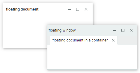
<mxd:DockManager.FloatGroups>
    <mxd:FloatGroup FloatLocation="200,200" FloatWidth="300" FloatHeight="150" >
        <mxd:DocumentPane Header="floating document"></mxd:DocumentPane>
    </mxd:FloatGroup>
    <mxd:FloatGroup FloatLocation="400,400" FloatWidth="300" FloatHeight="150" Header="floating window">
        <mxd:DocumentGroup>
            <mxd:DocumentPane Header="floating document in a container"></mxd:DocumentPane>
        </mxd:DocumentGroup>
    </mxd:FloatGroup>
</mxd:DockManager.FloatGroups>
Example - Create Floating Documents and Customize Floating Window in Code Behind
The code below makes the active Document floating and sets the bounds and header for the created floating window.
DocumentPane document = dockManager1.ActiveDockItem as DocumentPane;
if(document != null)
{
    dockManager1.Float(document);
    FloatGroup floatingWindow = document.FloatGroup;
    floatingWindow.FloatWidth = 300;
    floatingWindow.FloatHeight = 200;
    floatingWindow.Header = "floating window";
    document.FloatGroup.FloatLocation = dockManager1.PointToScreen(
        new Point(dockManager1.Bounds.Right - floatingWindow.FloatWidth,
        dockManager1.Bounds.Bottom - floatingWindow.FloatHeight));
}
Set a Floating Window's Header and Glyph
A floating window does not have a header and glyph, by default. Use the DockManager.DefaultFloatGroupHeader and DockManager.DefaultFloatGroupGlyph properties to specify the default header and glyph for all created floating windows.
You can also specify the header and glyph for a specific floating window using corresponding settings of a FloatGroup object:
FloatGroup.GlyphFloatGroup.HeaderFloatGroup.HeaderTemplateFloatGroup.ShowGlyphMode
dockManager1.Float(document);
FloatGroup floatingWindow = document.FloatGroup;
floatingWindow.Header = "floating window";
Set Floating Bounds
When a Document Pane is made floating, its previous size determines the floating window's initial size. You can set the FloatGroup.FloatWidth, FloatGroup.FloatHeight and FloatGroup.FloatLocation attached properties to specify custom floating bounds.
<mxd:DocumentPane Name="documentPane1" Header="Document 1"
    mxd:FloatGroup.FloatWidth="500" mxd:FloatGroup.FloatHeight="400"/>
After a dock item becomes floating, you can access its parent floating window (FloatGroup) and set its bounds.
The following example makes a Document Pane floating, accesses the created floating window, and sets its size.
using Eremex.AvaloniaUI.Controls.Docking;

dockManager1.Float(documentPane1);
FloatGroup floatingWindow = documentPane1.FloatGroup;
floatingWindow.FloatWidth = 400;
floatingWindow.FloatHeight = 300;
floatingWindow.FloatLocation = dockManager1.PointToScreen(new Point(100,100));
Related API
DockPane.FloatGroup— Returns the floating window (aFloatGroupobject) that contains the current panel when the panel is floating. Returns null if the panel is not floating.FloatGroup.FloatLocation— Specifies the position of the float group relative to the top left corner of the screen.FloatGroup.FloatHeight— Specifies theFloatGroup's height.FloatGroup.FloatWeight— Specifies theFloatGroup's width.FloatGroup.Header— Specifies theFloatGroup's header text.FloatGroup.HeaderTemplate— Specifies theFloatGroup's header template.FloatGroup.Glyph— Specifies theFloatGroup's glyph.DockManager.Float— Makes a dock item (for example, aDocumentPaneobject) floating.DockManager.FloatGroups— A collection of floating groups (floating windows).