Pages
Ribbon pages are used to create tabs in the Ribbon control's command bar. The following image shows a Ribbon control with three pages (Home, Insert and Help):

You can initially hide individual pages, and then make them visible and active at specific times. See the following section to learn more: Page Visibility.
Define and Access Ribbon Pages
Ribbon pages are encapsulated by RibbonPage class objects. In code-behind, you can create, access and modify ribbon pages using the RibbonControl.Pages collection. To define ribbon pages in XAML, add RibbonPage objects between the <RibbonControl> start and end tags.
<mxb:ToolbarManager IsWindowManager="True">
    <mxr:RibbonControl>
      <mxr:RibbonPage Header="Home" KeyTip="H">
        <!-- ... -->
      </mxr:RibbonPage>
      <mxr:RibbonPage Header="Insert" KeyTip="I">
        <!-- ... -->
      </mxr:RibbonPage>
      <mxr:RibbonPage Header="Help" KeyTip="P">
        <!-- ... -->
      </mxr:RibbonPage>
    </mxr:RibbonControl>
</mxb:ToolbarManager>
You can also use the RibbonControl.PagesSource property to create ribbon pages from a collection of business objects in a View Model. A corresponding data template should define a RibbonPage object and initialize its settings from an underlying business object.
Page Header and Content
When you create a page, use the RibbonPage.Header property to specify text for the page header.
The content of ribbon pages are ribbon page groups. Use the RibbonPage.Groups collection to create and access ribbon page groups. In XAML, you can define page groups between the <RibbonPage> start and end tags.
 <mxr:RibbonPage Header="Home" KeyTip="H">
    <mxr:RibbonPageGroup Header="File" IsHeaderButtonVisible="True">
        <mxb:ToolbarButtonItem Header="New" KeyTip="N" Glyph="{x:Static icons:Basic.Docs_Add}"
                               mxr:RibbonControl.DisplayMode="Large"/>
        <mxb:ToolbarButtonItem Header="Open" KeyTip="O"
                               Glyph="{x:Static icons:Basic.Folder_Open}" />
        <mxb:ToolbarButtonItem Header="Exit" KeyTip="E"
                               Glyph="{x:Static icons:Basic.Remove}" />
    </mxr:RibbonPageGroup>
    <mxr:RibbonPageGroup Header="Font" IsHeaderButtonVisible="True">
        <mxb:ToolbarCheckItemGroup ShowSeparator="True">
            <mxb:ToolbarCheckItem Header="Bold" KeyTip="B" Glyph="{x:Static icons:Basic.Font_Bold}" />
            <mxb:ToolbarCheckItem Header="Italic" KeyTip="I" Glyph="{x:Static icons:Basic.Font_Italic}" />
            <mxb:ToolbarCheckItem Header="Underline" KeyTip="U" Glyph="{x:Static icons:Basic.Font_Underline}"  />
        </mxb:ToolbarCheckItemGroup>
       <!-- ... -->
    </mxr:RibbonPageGroup>
</mxr:RibbonPage>
You can also use the RibbonPage.GroupsSource property to create page groups from a collection of business objects in a View Model. A corresponding data template should define a RibbonPageGroup object and initialize its settings from a business object.
Selected Page
The content of a page is shown to a user when the page is selected. A user can select a page by clicking the page header. In code, you can select a page with one of the following properties:
RibbonControl.SelectedPageRibbonPage.IsSelected
Page Visibility
Use the RibbonPage.IsVisible property to hide and display a page. The page's position is specified by its place in the RibbonControl.Pages collection.
The following code displays and activates an initially hidden Table page.
<mxr:RibbonControl Name="ribbon">
    <mxr:RibbonPage Header="Table" Name="pageTable" IsVisible="False">
        <!-- ... -->
    </mxr:RibbonPage>
<mxr:RibbonControl>
// Display and select the Table page.
pageTable.IsVisible = true;
pageTable.IsSelected = true;
Page Colorization
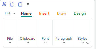
In the Ribbon control, you can highlight any page with a custom foreground color. Use the RibbonPage.Foreground property for this purpose.
<mxr:RibbonPage Header="Insert"  KeyTip="I" Foreground="Red"/>
<mxr:RibbonPage Header="Draw" KeyTip="D" Foreground="Goldenrod"/>
<mxr:RibbonPage Header="Design" KeyTip="S" Foreground="Green" />

Page colorization is helpful when you need to implement contextual pages (those that are temporarily visible and highlighted at certain times). You should manually control the visibility, position and selected state of these pages. See Selected Page and Page Visibility to learn more.