Page Groups
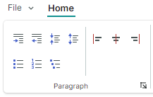
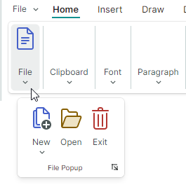
Items (commands) in ribbon pages can be logically divided into groups. Ribbon page groups are delimited by vertical separators. They display captions at the bottom when the Classic command layout is applied. The following image demonstrates the File, Clipboard, Font and Styles page groups displayed within the Home page:
Define and Access Ribbon Page Groups
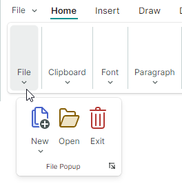
Ribbon page groups are encapsulated by RibbonPageGroup class objects. In code-behind, you can create, access and modify page groups using the RibbonPage.Groups collection. To define page groups in XAML, add RibbonPageGroup objects between the <RibbonPage> start and end tags.
<mxr:RibbonPage Header="Home" KeyTip="H" Name="pageHome">
    <mxr:RibbonPageGroup Header="File" IsHeaderButtonVisible="True">
        <!-- ... -->
    </mxr:RibbonPageGroup>
    <mxr:RibbonPageGroup Header="Clipboard" IsHeaderButtonVisible="True">
        <!-- ... -->
    </mxr:RibbonPageGroup>
    <mxr:RibbonPageGroup Header="Font" IsHeaderButtonVisible="True">
        <!-- ... -->
    </mxr:RibbonPageGroup>
    <!-- ... -->
</mxr:RibbonPageGroup>
You can also use the RibbonPage.GroupsSource property to create page groups from a collection of business objects in a View Model. A corresponding data template should define a RibbonPageGroup object and initialize its settings from a business object.
Page Group Header
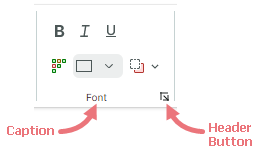
When the Classic command layout is applied, page groups have headers at the bottom. A group header displays a caption (RibbonPageGroup.Header) and a header button.
A click on the header button has no default action. You can associate an action with the header button as follows:
Handle the
RibbonPageGroup.HeaderButtonClickorRibbonPageGroup.HeaderButtonPressevent. For instance, your event handler can display a dialog or menu that brings up more settings related to the group.The
HeaderButtonClickevent is raised after the left mouse button is pressed and released over the header button. TheHeaderButtonPressevent is raised immediately after a user presses any mouse button over the header button.Assign a command to the
RibbonPageGroup.HeaderButtonCommandproperty. You can specify an optional command parameter using theRibbonPageGroup.HeaderButtonCommandParameterproperty.
Use the RibbonPageGroup.IsHeaderButtonVisible property to hide the header button.
Page Group Content
A page group displays a set of closely related ribbon items. Ribbon items are buttons, check buttons, button groups, sub-menus, in-place editors, galleries and more. See the following topics for more information: Ribbon Items and Galleries
To populate a ribbon page group with items, use the RibbonPageGroup.Items collection. In XAML, you can define items between the <RibbonPageGroup> start and end tags.
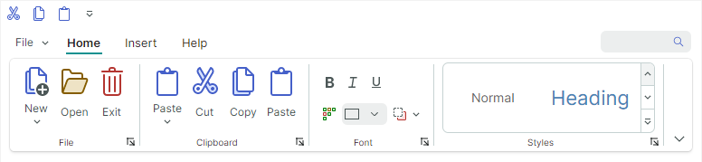
 <mxr:RibbonPage Header="Home" KeyTip="H">
    <mxr:RibbonPageGroup Header="File" IsHeaderButtonVisible="True">
        <mxb:ToolbarButtonItem Header="New" KeyTip="N" Glyph="{x:Static icons:Basic.Docs_Add}"
                               mxr:RibbonControl.DisplayMode="Large"/>
        <mxb:ToolbarButtonItem Header="Open" KeyTip="O"
                               Glyph="{x:Static icons:Basic.Folder_Open}" />
        <mxb:ToolbarButtonItem Header="Exit" KeyTip="E"
                               Glyph="{x:Static icons:Basic.Remove}" />
    </mxr:RibbonPageGroup>
    <mxr:RibbonPageGroup Header="Font" IsHeaderButtonVisible="True">
        <mxb:ToolbarCheckItemGroup ShowSeparator="True">
            <mxb:ToolbarCheckItem Header="Bold" KeyTip="B" Glyph="{x:Static icons:Basic.Font_Bold}" />
            <mxb:ToolbarCheckItem Header="Italic" KeyTip="I" Glyph="{x:Static icons:Basic.Font_Italic}" />
            <mxb:ToolbarCheckItem Header="Underline" KeyTip="U" Glyph="{x:Static icons:Basic.Font_Underline}"  />
        </mxb:ToolbarCheckItemGroup>
       <!-- ... -->
    </mxr:RibbonPageGroup>
</mxr:RibbonPage>
You can also use the RibbonPageGroup.ItemsSource property to create items from a collection of business objects in a View Model. Corresponding data templates should define ribbon items and initialize their settings from underlying business objects.
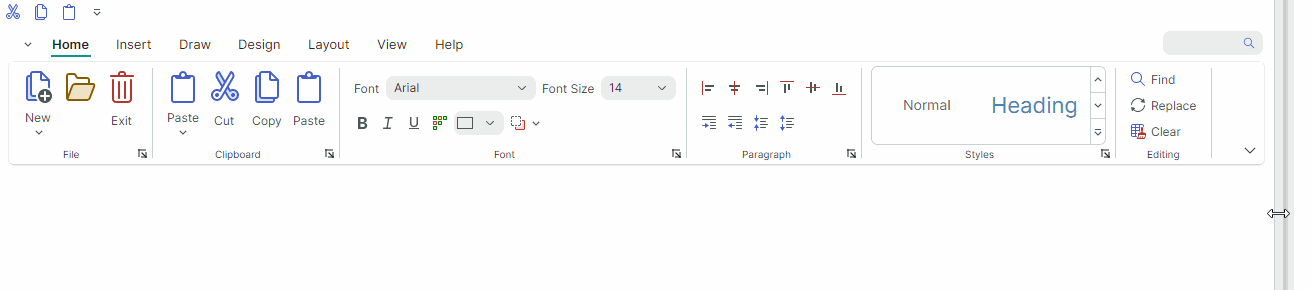
Page Group Image
When a Ribbon control is resized, the adaptive layout feature may collapse specific page groups. In the collapsed state, a group's items are displayed in a dropdown window.
You can use the RibbonPageGroup.Glyph property to display an image in a collapsed group's button:
xmlns:icons="https://schemas.eremexcontrols.net/avalonia/icons"
<mxr:RibbonPageGroup Header="File" Glyph="{x:Static icons:Basic.Doc}">
Layout of Items in Page Groups
Adaptive Layout
The Ribbon control supports the adaptive layout feature, which adjusts the layout of items in ribbon page groups when the Ribbon control is resized.
Combining Items in Groups
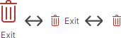
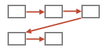
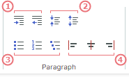
You can group sets of ribbon items in non-breaking containers (groups) using ToolbarItemGroup and ToolbarCheckItemGroup. These containers ensure that the items are displayed together in a single line, preserving this layout even when the adaptive layout functionality is applied. Only an entire container can be collapsed when the Ribbon is resized, not its individual items.
For instance, in the animation above the  ,
,  and
and  items are combined in a non-breaking container.
Item Images
When the Classic command layout is applied, the adaptive layout functionality also adjusts the display size of items as you resize the ribbon — from large to small with text to small glyphs, and backwards.
The RibbonControl.DisplayMode attached property allows you to specify supported display modes for ribbon items in ribbon page groups in the Classic command layout.
You can force an item to use only large images, small images, small images with text, or a combination of these display modes.
<mxb:ToolbarButtonItem Header="Open" KeyTip="O" mxr:RibbonControl.DisplayMode="Large"
                          Glyph="{x:Static icons:Basic.Folder_Open}" />
See the following topic for more information: Adaptive Glyph Size in the Classic Command Layout
Related API
AllowCollapse— Specifies whether a group can be collapsed when the Ribbon control's width is reduced.IsCollapsed— Returns if the current group is currently collapsed.
Customize Item Layout in Page Groups
Ribbon control supports two layout modes for items in page groups:
Column (down then across)
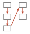
An item is moved to a new column if the group height is not enough to display the item below its preceding sibling.
Currently, all Ribbon items except non-breaking groups only support Column layout mode.
Row (across then down)
An item is moved to a new row if the group width is not enough to display the item to the right of its preceding sibling.
Non-breaking containers (ToolbarItemGroup and ToolbarCheckItemGroup) use Row layout mode by default.
The RibbonPageGroup.ItemLayouMode attached property allows you to change layout mode for non-breaking containers from Row (default) to Column. The RibbonPageGroup.ItemLayouMode property is not currently in effect for other ribbon items.
The RibbonPageGroup.ItemLayouMode property's default value is Default, which is equivalent to Row for non-breaking containers, and Column for other ribbon items.
- If two consecutive items use different layout modes (Column and Row), the second item is automatically shifted to a new column.
- To arrange a set of consecutive items using Column or Row layout mode, ensure that the required layout mode is applied to all of these items, either explicitly or implicitly.
- Tip: You can combine two ribbon items in a separate non-breaking container to make them act as a whole.
Example - Arrange Items in a Column
The following example uses the RibbonPageGroup.ItemLayouMode attached property to arrange items as a column.
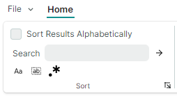
This layout consists of three rows of ribbon items:
Row 1 displays a check item.
<mxb:ToolbarCheckItem Name="btnSort" Header="Sort Results Alphabetically" CheckBoxStyle="CheckBox"/>Row 2 displays a container (
ToolbarItemGroup) that combines a text editor and a button. Grouping the items in a container is required to position the items next to each other.<mxb:ToolbarItemGroup Name="groupSearchBox"> <mxb:ToolbarEditorItem Header="Search" EditorWidth="150"> <mxb:ToolbarEditorItem.EditorProperties> <mxe:TextEditorProperties/> </mxb:ToolbarEditorItem.EditorProperties> </mxb:ToolbarEditorItem> <mxb:ToolbarButtonItem Header="Find" Glyph="{SvgImage 'avares://Ribbon-Layout/Assets/arrow-right.svg'}" Command="{Binding FindCommand}"/> </mxb:ToolbarItemGroup>Row 3 displays a container (
ToolbarCheckItemGroup) that combines three check items:<mxb:ToolbarCheckItemGroup Name="groupSearchProperties" > <mxb:ToolbarCheckItem Header="Match case" IsChecked="{Binding IsMatchCase}" Glyph="{SvgImage 'avares://Ribbon-Layout/Assets/match-case.svg'}"/> <mxb:ToolbarCheckItem Header="Match whole word" IsChecked="{Binding IsMatchWholeWord}" Glyph="{SvgImage 'avares://Ribbon-Layout/Assets/match-whole-word.svg'}"/> <mxb:ToolbarCheckItem Header="Use regular expressions" IsChecked="{Binding IsUseRegExp}" Glyph="{SvgImage 'avares://Ribbon-Layout/Assets/match-regexp.svg'}"/> </mxb:ToolbarCheckItemGroup>
Place the btnSort, groupSearchBox and groupSearchProperties items in a RibbonPageGroup:
<mxr:RibbonControl>
    <mxr:RibbonPage Header="Home">
        <mxr:RibbonPageGroup Header="Sort">
            <mxb:ToolbarCheckItem Name="btnSort" Header="Sort Results Alphabetically" CheckBoxStyle="CheckBox"/>
            <mxb:ToolbarItemGroup Name="groupSearchBox">
                <!-- ... -->
            </mxb:ToolbarItemGroup>
            <mxb:ToolbarCheckItemGroup Name="groupSearchProperties" >
                <!-- ... -->
            </mxb:ToolbarCheckItemGroup
        </mxr:RibbonPageGroup>
    </mxr:RibbonControl>
</mxr:RibbonPage
This code produces an unwanted layout, in which the groupSearchBox and groupSearchProperties containers are shifted to a separate column. This happens because the btnSort item uses Column layout mode, while the containers use Row layout mode by default.
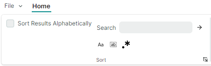
To arrange the containers below the btnSort button, set the RibbonPageGroup.ItemLayouMode attached property to Column for these containers.
<mxr:RibbonControl ApplicationButtonContent="File" ApplicationButtonKeyTip="F">
    <mxr:RibbonPage Header="Home" KeyTip="M">
        <mxr:RibbonPageGroup Header="Sort">
            <mxb:ToolbarCheckItem Name="btnSort" Header="Sort Results Alphabetically" CheckBoxStyle="CheckBox"/>
            <mxb:ToolbarItemGroup Name="groupSearchBox"
                                  mxr:RibbonPageGroup.ItemLayoutMode="Column">
                <mxb:ToolbarEditorItem Header="Search" EditorWidth="150">
                    <mxb:ToolbarEditorItem.EditorProperties>
                        <mxe:TextEditorProperties/>
                    </mxb:ToolbarEditorItem.EditorProperties>
                </mxb:ToolbarEditorItem>
                <mxb:ToolbarButtonItem
                        Header="Find"
                        Glyph="{SvgImage 'avares://Ribbon-Layout/Assets/arrow-right.svg'}"
                        Command="{Binding FindCommand}"/>
            </mxb:ToolbarItemGroup>

            <mxb:ToolbarCheckItemGroup Name="groupSearchProperties"
                                       mxr:RibbonPageGroup.ItemLayoutMode="Column" >
                <mxb:ToolbarCheckItem
                    Header="Match case"
                    IsChecked="{Binding IsMatchCase}"
                    Glyph="{SvgImage 'avares://Ribbon-Layout/Assets/match-case.svg'}"/>
                <mxb:ToolbarCheckItem
                    Header="Match whole word"
                    IsChecked="{Binding IsMatchWholeWord}"
                    Glyph="{SvgImage 'avares://Ribbon-Layout/Assets/match-whole-word.svg'}"/>
                <mxb:ToolbarCheckItem
                    Header="Use regular expressions"
                    IsChecked="{Binding IsUseRegExp}"
                    Glyph="{SvgImage 'avares://Ribbon-Layout/Assets/match-regexp.svg'}"/>
            </mxb:ToolbarCheckItemGroup>
        </mxr:RibbonPageGroup>
    </mxr:RibbonPage>
</mxr:RibbonControl>
Now, the btnSort, groupSearchBox and groupSearchProperties items use Column layout mode, so they are arranged in a single column, as demonstrated in the image below:
Arrange Non-Breaking Containers in Two or Three Rows
If a page group is wide enough, items combined in non-breaking containers (ToolbarItemGroup and ToolbarCheckItemGroup) are arranged in two rows. When the width of the page group is reduced, the containers are arranged in three rows, creating a more compact layout.
In specific cases, you may need to forcibly arrange non-breaking containers in two or three rows.
For this purpose, set the RibbonPageGroup.ItemGroupLayoutMode attached property for the first non-breaking container to Layout2Rows or Layout3Rows (the property's default value is AdaptiveLayout).
Example - Forcibly Arrange Containers in Two Rows
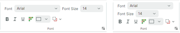
Consider a RibbonPageGroup that contains four non-breaking containers (groups) of items.
When you resize the Ribbon control, the adaptive layout feature arranges the containers in two or three rows to fit the available space.
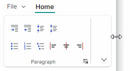
To forcibly arrange the containers in two rows, set the RibbonPageGroup.ItemGroupLayoutMode attached property for the first non-breaking container to Layout2Rows.
<mxr:RibbonPageGroup Header="Paragraph">
    <mxb:ToolbarItemGroup Name="gIndent"
                          mxr:RibbonPageGroup.ItemGroupLayoutMode="Layout2Rows">
        <mxb:ToolbarButtonItem Header="Increase Indent" Glyph="{x:Static icons:Basic.Level_Increase}"/>
        <mxb:ToolbarButtonItem Header="Decrease Indent" Glyph="{x:Static icons:Basic.Level_Reduce}"/>
    </mxb:ToolbarItemGroup>

    <mxb:ToolbarItemGroup  Name="gLineSpacing">
        <mxb:ToolbarButtonItem Header="Increase Line Spacing" Glyph="{x:Static icons:Basic.List_Collapse}"/>
        <mxb:ToolbarButtonItem Header="Decrease Line Spacing" Glyph="{x:Static icons:Basic.List_Expand}"/>
    </mxb:ToolbarItemGroup>

    <mxb:ToolbarItemGroup  Name="gParaNumbering">
        <mxb:ToolbarButtonItem Header="Bullets" Glyph="{x:Static icons:Office.Bullets}" />
        <mxb:ToolbarButtonItem Header="Numbering" Glyph="{x:Static icons:Office.Line_Numbering}" />
        <mxb:ToolbarButtonItem Header="Multilevel List" Glyph="{x:Static icons:Office.Multilevel_List}" />
    </mxb:ToolbarItemGroup>

    <mxb:ToolbarCheckItemGroup  Name="gAlign" CheckType="Radio">
        <mxb:ToolbarCheckItem Header="Align Left" Glyph="{x:Static icons:Alignment.Align_Left}"/>
        <mxb:ToolbarCheckItem Header="Align Center" Glyph="{x:Static icons:Alignment.Align_Horizontal_Centers}"/>
        <mxb:ToolbarCheckItem Header="Align Right" Glyph="{x:Static icons:Alignment.Align_Right}"/>
    </mxb:ToolbarCheckItemGroup>
</mxr:RibbonPageGroup>
This results in the containers being arranged in two rows. If there is not enough space to display the containers in their entirety they are automatically collapsed.
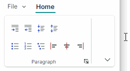
If you need a specific item to start a new column, place a ToolbarSeparatorItem object before this item.
<mxr:RibbonPageGroup Header="Paragraph">
    <mxb:ToolbarItemGroup Name="gIndent" mxr:RibbonPageGroup.ItemGroupLayoutMode="Layout2Rows">
        <!-- ... -->
    </mxb:ToolbarItemGroup>

    <mxb:ToolbarItemGroup  Name="gLineSpacing">
        <!-- ... -->
    </mxb:ToolbarItemGroup>

    <mxb:ToolbarItemGroup  Name="gParaNumbering">
        <!-- ... -->
    </mxb:ToolbarItemGroup>

    <mxb:ToolbarSeparatorItem/>

    <mxb:ToolbarCheckItemGroup  Name="gAlign" CheckType="Radio">
        <!-- ... -->
    </mxb:ToolbarCheckItemGroup>
</mxr:RibbonPageGroup>