Toolbars
ToolbarManager is a component that can manage traditional toolbars, popup and context menus, and a Ribbon UI in your application. You can dock traditional toolbars to the edges of a window/UserControl, and create floating toolbars. The Eremex Toolbar library also allows you to place toolbars anywhere within your window/UserControl.
When you use the ToolbarManager component to implement traditional toolbars, you need to create toolbar containers to dock these toolbars. A toolbar container is a visual container used to display docked toolbars. Toolbar containers are child elements of the ToolbarManager component.
Create Toolbars
The Toolbar control implements a toolbar. Use it to add a regular bar, main menu and status bar to your application.
Follows these steps to create toolbars:
- Create a
ToolbarManagercomponent. - Create toolbar containers.
- Create toolbars.
- Populate toolbars with items.
Create ToolbarManager
To create toolbars, first define a ToolbarManager component (an Avalonia.Controls.Border class descendant). The client control for which the toolbar UI is created needs to be placed inside the ToolbarManager component. The ToolbarManager object determines the area in which toolbars and popup menus function.
xmlns:mxb="https://schemas.eremexcontrols.net/avalonia/bars"

<mxb:ToolbarManager IsWindowManager="True">
    <Grid RowDefinitions="Auto, *, Auto" ColumnDefinitions="Auto, *, Auto">

        <TextBox x:Name="textBox" Text="Text Editor" AcceptsReturn="True"
         CornerRadius="0" FontFamily="Arial" FontSize="20"
         helpers:TextBoxHelper.IsEnabled="True"/>

    </Grid>
</mxb:ToolbarManager>
Tip
You can assign hotkeys to toolbar items. To allow the ToolbarManager object to process these hotkeys when keyboard focus is beyond the ToolbarManager's client area, enable the ToolbarManager.IsWindowManager option. See the following topic for information on the hotkey scope of toolbar items: Hotkeys.
Create Toolbar Containers
Add toolbar containers (ToolbarContainerControl) to the ToolbarManager component to allow toolbars to be docked at a specific position within a window/UserControl. A toolbar container specifies the region in which toolbars can be docked and dragged.
The following example creates four toolbar containers at the edges of a Grid control, allowing you to later dock toolbars at these positions.
xmlns:mxb="https://schemas.eremexcontrols.net/avalonia/bars"

<mxb:ToolbarManager IsWindowManager="True">
    <Grid RowDefinitions="Auto, *, Auto" ColumnDefinitions="Auto, *, Auto">
        <mxb:ToolbarContainerControl Grid.ColumnSpan="3" DockType="Top">
        </mxb:ToolbarContainerControl>

        <mxb:ToolbarContainerControl DockType="Left" Grid.Row="1"/>

        <TextBox x:Name="textBox" Text="Text Editor" AcceptsReturn="True"
         CornerRadius="0" FontFamily="Arial" FontSize="20"
         helpers:TextBoxHelper.IsEnabled="True"/>

        <mxb:ToolbarContainerControl DockType="Right" Grid.Row="1" Grid.Column="2"/>

        <mxb:ToolbarContainerControl Grid.Row="2" Grid.ColumnSpan="3" DockType="Bottom">
        </mxb:ToolbarContainerControl>
    </Grid>
</mxb:ToolbarManager>
Initialize the ToolbarContainerControl.DockType property for created containers to specify how they are docked. The container's dock type determines the default alignment of nested toolbars, and the appearance settings applied to the toolbar container. Available dock types include:
Left,Right,Top,Bottom— A toolbar container is docked to the corresponding side of the parent control. The containers that have these dock types draw border lines to be separated from the rest of the client area. For instance, a toolbar container docked to the top draws a border line at the bottom.Standalone— This mode should be applied to standalone toolbar containers. A standalone toolbar container is tailored to display toolbars at a custom position within the window/UserControl. Standalone toolbar containers have no borders.
You can define an empty ToolbarContainerControl to allow a toolbar to be added to this container later (by a user or in code).
Add Toolbars
Add Toolbar controls to toolbar containers to dock toolbars at corresponding positions.
xmlns:mxb="https://schemas.eremexcontrols.net/avalonia/bars"

<mxb:ToolbarContainerControl Grid.ColumnSpan="3" DockType="Top">
    <mxb:Toolbar x:Name="MainMenu" ToolbarName="Main Menu" DisplayMode="MainMenu">
    </mxb:Toolbar>

    <mxb:Toolbar x:Name="EditToolbar" ToolbarName="Edit" ShowCustomizationButton="False">
    </mxb:Toolbar>
</mxb:ToolbarContainerControl>

<mxb:ToolbarContainerControl Grid.Row="2" Grid.ColumnSpan="3" DockType="Bottom">
    <mxb:Toolbar DisplayMode="StatusBar" ToolbarName="Status Bar" x:Name="StatusBar">
    </mxb:Toolbar>
</mxb:ToolbarContainerControl>
See the following sections for additional information:
Add Toolbar Items
Toolbars can display various toolbar item types, demonstrated below:
ToolbarButtonItem— An item that can act as a regular button or dropdown button (if you associate a dropdown control/menu with it).ToolbarCheckItem— A check button.ToolbarMenuItem— An item that displays a sub-menu.ToolbarEditorItem— An item that displays an in-place editor.ToolbarTextItem— A text label.ToolbarItemGroup— A group of toolbar items.ToolbarCheckItemGroup— A group of check buttons. Use it to create a group of mutually exclusive check items, or a group that supports selecting multiple items at a time.ToolbarSeparatorItem— Draws a separator between adjacent items.
To add bar items to a toolbar, define them as child elements of a Toolbar control in XAML, or add them to the Toolbar.Items collection in code-behind.
xmlns:mxb="https://schemas.eremexcontrols.net/avalonia/bars"

<mxb:Toolbar x:Name="EditToolbar" ToolbarName="Edit" ShowCustomizationButton="False">
    <mxb:ToolbarButtonItem Header="Cut" Command="{Binding #textBox.Cut}"
     IsEnabled="{Binding #textBox.CanCut}"
     Glyph="{SvgImage 'avares://DemoCenter/Images/Group=Context Menu, Icon=Cut.svg'}"
     Category="Edit"/>
    <mxb:ToolbarButtonItem Header="Copy" Command="{Binding #textBox.Copy}"
     IsEnabled="{Binding #textBox.CanCopy}"
     Glyph="{SvgImage 'avares://DemoCenter/Images/Group=Context Menu, Icon=Copy.svg'}"
     Category="Edit"/>
    <mxb:ToolbarButtonItem Header="Paste" Command="{Binding #textBox.Paste}"
     IsEnabled="{Binding #textBox.CanPaste}"
     Glyph="{SvgImage 'avares://DemoCenter/Images/Group=Context Menu, Icon=Paste.svg'}"
     Category="Edit"/>
</mxb:Toolbar>
See the Toolbar Items topic for more information.
Choose Toolbar Type - Regular Bar, Main Menu or Status Bar
The Toolbar.DisplayMode property allows you to specify a toolbar type.
Regular Toolbars
Toolbar objects are rendered as regular toolbars if the Toolbar.DisplayMode property is not specified, or it's set to ToolbarDisplayMode.Default.

Regular toolbars have drag handles used to rearrange toolbars using drag-and-drop.
Main Menu
Set Toolbar.DisplayMode to ToolbarDisplayMode.MainMenu to display a toolbar as the main menu.

The main menu's features include:
- A user cannot hide it at runtime.
- The main menu receives focus when a user presses the ALT key.
- The main menu is stretched horizontally to fit the container's width.
- The main menu does not support multi-line item arrangement, floating mode, and drag-and-drop operations.
Status Bar
Set Toolbar.DisplayMode to ToolbarDisplayMode.StatusBar to render a toolbar as the application's status bar.
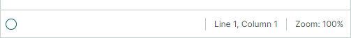
The status bar's features include:
- A user cannot hide it at runtime.
- The status bar is stretched horizontally to fit the container's width.
- The status bar does not support multi-line item arrangement, floating mode, and drag-and-drop operations.
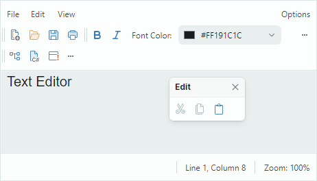
The following example creates a status bar with two items. The status bar is placed within a toolbar container displayed at the bottom of a parent Grid control.
xmlns:mxb="https://schemas.eremexcontrols.net/avalonia/bars"

<mxb:ToolbarContainerControl Grid.Row="2" Grid.ColumnSpan="3" DockType="Bottom">
    <mxb:Toolbar DisplayMode="StatusBar" ToolbarName="Status Bar" x:Name="StatusBar"
     ShowCustomizationButton="False">
        <mxb:ToolbarTextItem Alignment="Far" ShowSeparator="True" ShowBorder="False"
         Category="Info" CustomizationName="Position Info">
            <mxb:ToolbarTextItem.Header>
                <MultiBinding Converter="{helpers:LineAndColumnToTextConverter}">
                    <Binding ElementName="textBox" Path="(helpers:TextBoxHelper.Line)"/>
                    <Binding ElementName="textBox" Path="(helpers:TextBoxHelper.Column)"/>
                </MultiBinding>
            </mxb:ToolbarTextItem.Header>
        </mxb:ToolbarTextItem>
        <mxb:ToolbarTextItem
         Header="{Binding #scaleDecorator.Scale, StringFormat={}Zoom: {0:P0}}"
         ShowBorder="False" Alignment="Far" ShowSeparator="True" Category="Info"
         CustomizationName="Zoom Info"/>
    </mxb:Toolbar>
</mxb:ToolbarContainerControl>
Layout and Position of Toolbars
When toolbars reside within toolbar containers, they are aligned according to the container's dock type (the ToolbarContainerControl.DockType setting):
- Toolbars are oriented horizontally if the
ToolbarContainerControl.DockTypeproperty is set toTop,Bottom, orStandalone. - Toolbars are oriented vertically if the
ToolbarContainerControl.DockTypeproperty is set toLeftorRight.
A Toolbar object has its own dock type setting specified by the Toolbar.DockType property. You can use the Toolbar.DockType property to move a toolbar to a specific toolbar container in code-behind. When you set the Toolbar.DockType property to Left, Right, Top or Bottom, the toolbar is moved to a toolbar container that has its ToolbarContainerControl.DockType option set to a corresponding value.
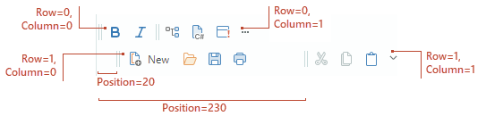
Toolbars can be arranged in multiple rows within their parent toolbar container. You can use the following properties to display a toolbar in a specific row, and move the toolbar within the row:
Toolbar.Row— Gets or sets the zero-based index of the row in which the toolbar is displayed. Row indexes start from0. The property is only in effect for regular toolbars. It's not possible to change the row index for the main menu, nor can you place a regular toolbar before the main menu.Toolbar.Column— Gets or sets the zero-based order of the toolbar in a row.Toolbar.Position— Gets or sets the minimum offset of the toolbar within the row.
Layout of Items in Toolbars
Adaptive Layout
Toolbars automatically hide and restore their items when the parent container is resized.
Disable the Toolbar.AllowShrinkToolbar option to prevent a specific bar from being collapsed when the container's size is reduced.
Toolbar Stretching
A toolbar can be stretched to fit the container's width. Set the Toolbar.StretchToolbar option to true to enable toolbar stretching. In this mode, no other toolbar can be displayed in the same row.
The main menu and status bar always occupy entire rows. The Toolbar.StretchToolbar option is not in effect for these toolbars.
Multi-line Item Arrangement
A toolbar can display its items in multiple rows when the parent container's width is not enough to display the items in a single row. Set the Toolbar.WrapItems property to true to enable a multiple row layout.
Floating Toolbars
To create a floating toolbar in XAML, add a Toolbar object to the ToolbarManager.Toolbars collection, and set the Toolbar.DockType property to Floating. Use the Toolbar.FloatingPosition property to set the floating toolbar's location.
xmlns:mxb="https://schemas.eremexcontrols.net/avalonia/bars"

<mxb:ToolbarManager.Toolbars>
    <mxb:Toolbar x:Name="bar1" DockType="Floating" FloatingPosition="200,200"
                        ToolbarName="Toolbar 1"  >
        <mxb:ToolbarButtonItem Header="Script"
         Glyph="{SvgImage 'avares://DemoCenter/Images/Group=Script, Icon=CSharpFile.svg'}"
         Category="UserCommands"/>
        <mxb:ToolbarButtonItem Header="Settings"
         Glyph="{SvgImage 'avares://DemoCenter/Images/Group=Basic, Icon=List of Bugs.svg'}"
         Category="UserCommands"/>
    </mxb:Toolbar>
</mxb:ToolbarManager.Toolbars>
The following snippet shows how to make a toolbar floating in code-behind.
toolBar1.DockType = Eremex.AvaloniaUI.Controls.Bars.MxToolbarDockType.Floating;
toolBar1.FloatingPosition = new PixelPoint(200, 200);
Runtime Toolbar Customization
Rearrange Toolbars
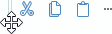
If the Toolbar.AllowDragToolbar option is enabled, a toolbar displays a drag handle. A user can press this button and then drag the toolbar to another position, or make the toolbar floating.
Rearrange Items Using Quick Customization
Users can re-arrange toolbar items without activating customization mode. They need to press the ALT key and then drag-and-drop an item to the required position. Instead of the ALT key, press the CTRL+ALT key combination to copy the item being dragged.
Customization Mode and Customization Window
Toolbars support customization mode in which users can perform the following operations:
- Access visible and hidden toolbars, and show and hide them.
- Access all items and manage their visibility and position in toolbars using drag-and-drop operations.
- Create and delete user toolbars.
To activate toolbar customization mode, a user can click a toolbar's Customization button ('...'), and then select the 'Customize' command. Activation of customization mode displays the Customization Window:
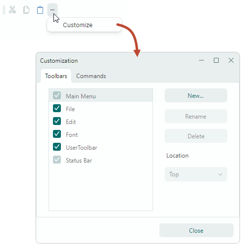
Tip
Enable the Toolbar.ShowCustomizationButton option to display the Customization button ('...') in a toolbar.
Call the ToolbarManager.ShowCustomizationWindow method to activate customization mode and display the Customization Window in code.
In customization mode, a user can use drag-and-drop operations to hide, show and move toolbar items:
- Drag items away from toolbars/sub-menus onto the Customization Window's 'Commands' tab to hide these items.
- Drag items from the Customization Window's 'Commands' tab to toolbars/sub-menus to display these items.
- Drag items between toolbars and sub-menus to re-arrange them.
The Customization Window also allows a user to hide/show toolbars and create custom ones. See the following section for more information: User Toolbars.
Toolbar Customization Options
Toolbars contain the following options that allow you to customize their view and behavior settings:
Toolbar.ToolbarName— Gets or sets the toolbar caption. The toolbar caption is displayed in the Customization Window and when the toolbar is floating.Toolbar.AllowDragToolbar— Gets or sets whether the toolbar displays a drag handle. This button allows a user to drag a toolbar to another dock position or make it floating.Toolbar.ShowCustomizationButton— Gets or sets whether the toolbar displays the customization ('...') button. A click on this button invokes a menu that allows a user to invoke the Customization Window.
Standalone Toolbars
You can display toolbars at any position within your window/UserControl. To do this, create a ToolbarContainerControl at this position, and add toolbars to this container.
Set the ToolbarContainerControl.DockType property to Standalone. This dock type applies appearance settings specific to standalone toolbar containers. For instance, standalone containers do not have borders in the Light and Dark Eremex themes.
The default orientation of toolbars within standalone toolbar containers is horizontal. You can the ToolbarContainerControl.Orientation property to align standalone bars vertically.
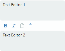
The following example displays a standalone toolbar between two text boxes. The bar contains commands that perform actions on the second text box.
xmlns:mxb="https://schemas.eremexcontrols.net/avalonia/bars"

<StackPanel Grid.Row="1" Grid.Column="1">
    <TextBox x:Name="textBox" Text="Text Editor 1" AcceptsReturn="True"
    FontSize="14" Height="70"/>

    <mxb:ToolbarContainerControl DockType="Standalone" Orientation="Horizontal"  >
        <mxb:Toolbar x:Name="EditToolbar2" ToolbarName="Edit (textBox2)"
         AllowDragToolbar="False" ShowCustomizationButton="False" >
            <mxb:ToolbarCheckItemGroup>
                <mxb:ToolbarCheckItem Header="Bold"
                 IsChecked="{Binding #textBox2.FontWeight,
                  Converter={local:BoolToFontWeightConverter}, Mode=TwoWay}"
                 Glyph="{SvgImage 'avares://bars_sample/Images/Toolbars/FontBold.svg'}" Category="Font"/>
                <mxb:ToolbarCheckItem Header="Italic"
                 IsChecked="{Binding #textBox2.FontStyle,
                  Converter={local:BoolToFontStyleConverter}, Mode=TwoWay}"
                 Glyph="{SvgImage 'avares://bars_sample/Images/Toolbars/FontItalic.svg'}" Category="Font"/>
            </mxb:ToolbarCheckItemGroup>
            <mxb:ToolbarButtonItem Header="Copy" Command="{Binding #textBox2.Copy}"
             IsEnabled="{Binding #textBox2.CanCopy}"
             Glyph="{SvgImage 'avares://bars_sample/Images/Toolbars/EditCopy.svg'}" Category="Edit"/>
            <mxb:ToolbarButtonItem Header="Paste"
                                    Command="{Binding #textBox2.Paste}"
                                    IsEnabled="{Binding #textBox2.CanPaste}"
                                    Glyph="{SvgImage 'avares://bars_sample/Images/Toolbars/EditPaste.svg'}"
                                    Category="Edit"
                                />
        </mxb:Toolbar>
    </mxb:ToolbarContainerControl>
    <TextBox x:Name="textBox2" Text="Text Editor 2" AcceptsReturn="True" FontSize="14" Height="70"/>
</StackPanel>
User Toolbars
A user can create toolbars in the Customization Window at runtime. These bars are called "user toolbars", and they have the Toolbar.UserToolbar option set to true.
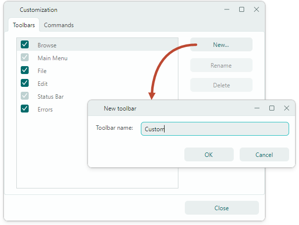
Unlike other toolbars, user toolbars can be renamed and deleted in the Customization Window.
When required, you can manually set the Toolbar.UserToolbar property to true to create a user toolbar in code. Users can rename and delete this toolbar in the Customization Window as well.
After a user toolbar is created, a user can populate it with commands using drag-and-drop operations.
Hotkey Scope
The ToolbarItem.HotKey property allows you to assign hotkeys to items. The ToolbarManager component can intercept hotkeys if focus is within the hotkey scope.
The default hotkey scope is the ToolbarManager's client area. Set the ToolbarManager.IsWindowManager property to true to expand the hotkey scope to the entire window. In this case, the ToolbarManager component registers item hotkeys in the window. It will be able to intercept and process hotkeys even if focus is outside its client area.
See the following topic for more information: Toolbar Item Hotkeys.