Lollipop Series View
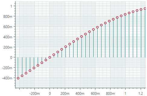
The Lollipop Series View (CartesianLollipopSeriesView) visualizes data using thin lines with markers at the end. The markers indicate individual data points, while the lines connect the markers to a baseline (a horizontal or vertical axis). The Lollipop chart uses square markers by default, but also supports custom markers in SVG format. The following image demonstrates a Lollipop Series View with circular markers loaded from an SVG file.
Create a Lollipop Series View
To create a Lollipop Series View, add a CartesianSeries object to the CartesianChart.Series collection and initialize the CartesianSeries.View property with a CartesianLollipopSeriesView instance.
Use the CartesianSeries.DataAdapter property to supply data for the series.
The following code shows how to create a Lollipop Series View in XAML and code-behind.
xmlns:mxc="https://schemas.eremexcontrols.net/avalonia/charts"

<mxc:CartesianChart x:Name="chartControl">
    <mxc:CartesianSeries DataAdapter="{Binding DataAdapter}">
        <mxc:CartesianLollipopSeriesView Color="YellowGreen"
                                            LineColor="Green"
                                            Thickness="2"
                                            MarkerSize="8"
                                            Orientation="Vertical">
        </mxc:CartesianLollipopSeriesView>
    </mxc:CartesianSeries>
</mxc:CartesianChart>
using Eremex.AvaloniaUI.Charts;

CartesianSeries series = new CartesianSeries();
chartControl.Series.Add(series);
double[] args = new double[] { -1, 0, 1, 2, 3, 4, 5 };
double[] values = new double[] { 10, 14, 15, 13, 5, 0, -3 };
series.DataAdapter = new SortedNumericDataAdapter(args, values);
series.View = new CartesianLollipopSeriesView()
{
    LineColor = Avalonia.Media.Colors.Green,
    Color = Avalonia.Media.Colors.YellowGreen,
    MarkerSize = 8,
    Thickness = 2,
    Orientation = CartesianLollipopOrientation.Horizontal
};
Example - Create a Lollipop Series View and Use Custom SVG Data Point Markers
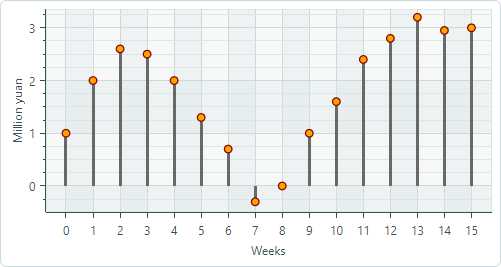
The following example creates a Lollipop Series View to visualize sample data supplied by a FormulaDataAdapter object. The example shows how to use an SVG image as custom data point markers and dynamically adjust the colors of SVG elements so they match the data series color.
-
Specify an SVG Image as Point Markers
Use the
MarkerImageproperty to assign an SVG image as data point markers. TheMarkerImageproperty is defined with the[Content]attribute, allowing you to specify the SVG image as the content of the <CartesianLollipopSeriesView> tag:<mxc:CartesianLollipopSeriesView ...> <SvgImage Source="avares://ChartLollipopSeriesView/Assets/circle.svg" /> </mxc:CartesianLollipopSeriesView>The 'circle.svg' file renders a circle with a green border and yellow fill:

<!-- part of 'circle.svg' file -->
<svg ...>
    <circle fill="yellow" stroke="green" stroke-width="10" cx="40" cy="40" r="30"/>
</svg>
The next step shows how to override these colors dynamically without modifying the source SVG file.
-
Apply the Series Color to SVG Elements
The Lollipop Series View (as well as any Point Series View descendant) supports the
MarkerImageCssproperty, which enables CSS-based SVG styling. This property allows you to customize the styles of specific SVG elements at runtime. For instance, CSS code can apply the series color to individual SVG elements.<mxc:CartesianLollipopSeriesView Color="Orange" MarkerImageCss="circle {{fill:{0};stroke:darkred;}}" >The CSS code above customizes the style of the
circleSVG object. The new style paints the border with Dark Red, and fills the circle using the data series color.{0}placeholder — Inserts the value of theCartesianLollipopSeriesView.Colorproperty.
The result is demonstrated below:

-
Set the Size of Point Markers
Use the
MarkerSizeproperty to adjust the size of the point markers.
Complete code:
<!-- MainWindow.axaml -->
<mx:MxWindow xmlns="https://github.com/avaloniaui"
        xmlns:x="http://schemas.microsoft.com/winfx/2006/xaml"
        xmlns:vm="using:ChartLollipopSeriesView.ViewModels"
        xmlns:d="http://schemas.microsoft.com/expression/blend/2008"
        xmlns:mc="http://schemas.openxmlformats.org/markup-compatibility/2006"
        xmlns:mx="https://schemas.eremexcontrols.net/avalonia"
        xmlns:mxc="https://schemas.eremexcontrols.net/avalonia/charts"
        mc:Ignorable="d" d:DesignWidth="800" d:DesignHeight="450"
        x:Class="ChartLollipopSeriesView.Views.MainWindow"
        x:DataType="vm:MainWindowViewModel"
        Icon="/Assets/EMXControls.ico"
        Title="ChartLollipopSeriesView">

    <Design.DataContext>
        <!-- This only sets the DataContext for the previewer in an IDE,
             to set the actual DataContext for runtime, set the DataContext property in code (look at App.axaml.cs) -->
        <vm:MainWindowViewModel/>
    </Design.DataContext>

    <mxc:CartesianChart x:Name="chartControl">
        <mxc:CartesianChart.Series>
            <mxc:CartesianSeries Name="lollipopSeries1"
                                 DataAdapter="{Binding PointSeriesVM1.DataAdapter}"
                                 SeriesName="Income"
                                 >
                <mxc:CartesianLollipopSeriesView Color="Orange"
                                                 LineColor="Dimgray"
                                                 LineThickness="3"
                                                 MarkerSize="10"
                                                 MarkerImageCss="circle {{fill:{0};stroke:darkred;}}"
                                                 >
                    <SvgImage Source="avares://ChartLollipopSeriesView/Assets/circle.svg" />
                </mxc:CartesianLollipopSeriesView>
            </mxc:CartesianSeries>
        </mxc:CartesianChart.Series>
        <mxc:CartesianChart.AxesX>
            <mxc:AxisX Title="Weeks" MinorCount="0" ShowMinorGridlines="False">
                <mxc:AxisX.ScaleOptions>
                    <mxc:NumericScaleOptions GridSpacing="1" />
                </mxc:AxisX.ScaleOptions>
            </mxc:AxisX>
        </mxc:CartesianChart.AxesX>
        <mxc:CartesianChart.AxesY>
            <mxc:AxisY Title="Million yuan"/>
        </mxc:CartesianChart.AxesY>
    </mxc:CartesianChart>
</mx:MxWindow>
// MainWindowViewModel.cs
using CommunityToolkit.Mvvm.ComponentModel;
using Eremex.AvaloniaUI.Charts;
using System;
using System.Collections.Generic;

namespace ChartLollipopSeriesView.ViewModels
{
    public partial class MainWindowViewModel : ViewModelBase
    {
        static double[] values = new double[] { 1, 2, 2.6, 2.5, 2, 1.3, 0.7, -0.3, 0, 1, 1.6, 2.4, 2.8, 3.2, 2.95, 3 };
        static double MyFunc(double argument) => values[(int)argument % values.Length];

        [ObservableProperty] SeriesViewModel pointSeriesVM1;

        public MainWindowViewModel()
        {
            PointSeriesVM1 = new()
            {
                DataAdapter = new FormulaDataAdapter(0, 1, values.Length, MyFunc)
            };
        }
    }

    public partial class SeriesViewModel : ObservableObject
    {
        [ObservableProperty] ISeriesDataAdapter dataAdapter;
    }
}
<!-- circle.svg image -->
<svg viewBox="0 0 80 80" width="80" height="80" xmlns="http://www.w3.org/2000/svg">
<g>
<title>Layer 1</title>
<circle fill="yellow" stroke="green" stroke-opacity="1" stroke-width="10" cx="40" cy="40" id="svg_1" r="30"/>
</g>
</svg>
Data for the Lollipop Series View
You can use the following data adapters to provide data for Lollipop Series Views:
Numeric X Values:
FormulaDataAdapterScatterDataAdapterSortedNumericDataAdapter
Date and Time X Values:
SortedDateTimeDataAdapterSortedTimeSpanDataAdapter
Qualitative X Values:
QualitativeDataAdapter
Lollipop Series View Settings
Color— Specifies the color used to paint the point markers.LineColor— Specifies the color used to paint the lines.LineThickness— Specifies the line thickness.-
LineOrientation— Specifies the direction of the lines.-
Vertical— The lines extend vertically from the point markers to the X axis.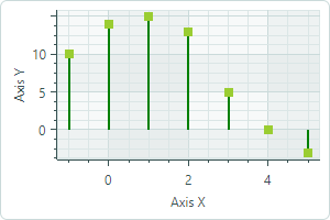
-
Horizontal— The lines extend horizontally from the point markers to the Y axis.
-
-
MarkerImage— Gets or sets an image to use as custom point markers. If no image is specified, default square-shaped markers are displayed. You can use anSvgImageclass instance to specify an SVG image.The
MarkerImageproperty is declared with the[Content]attribute, which allows you to define an image directly between the <CartesianLollipopSeriesView> tags.<mxc:CartesianLollipopSeriesView> <SvgImage Source="avares://ChartLollipopSeriesView/Assets/circle.svg" /> </mxc:CartesianLollipopSeriesView>SVG files contain predefined colors for SVG elements. To make these colors match your data series color, you can either:
- Manually edit the source SVG image file beforehand
- Use the
MarkerImageCssproperty to dynamically customize styles for SVG elements. The styles are applied when point markers are rendered.
-
MarkerImageCss— Specifies CSS styles for runtime customization of an SVG image defined by theCartesianLollipopSeriesView.MarkerImageproperty. The primary use case is replacing SVG element colors with the series color (CartesianLollipopSeriesView.Color). Include the{0}placeholder to insert the value of theCartesianLollipopSeriesView.Colorproperty in the CSS code.For example, when the
MarkerImageproperty contains an SVG image with a circle element, the following CSS code styles thecirclewith an Orange fill (using the series color) and Dark Red border:<mxc:CartesianLollipopSeriesView Color="orange" MarkerImageCss="circle {{fill:{0};stroke:darkred;}}"> <SvgImage Source="avares://ChartLollipopSeriesView/Assets/circle.svg" /> </mxc:CartesianLollipopSeriesView>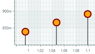
Complete code: Example - Create a Lollipop Series View and Use Custom SVG Markers.
-
MarkerSize— Specifies the size of the point markers, in pixels. ShowInCrosshair— Specifies the visibility of the crosshair chart label for the current series. See Customize Chart Labels of the Crosshair.