Scatter Line Series View
The Scatter Line Series View (CartesianScatterLineSeriesView) connects points with lines. Unlike the Line Series View, the points for the Scatter Line Series View do not need to be sorted by their X-values. Instead, the points are connected in the exact order they appear in the data series.
Create a Scatter Line Series View
To create a Scatter Line Series View, add a CartesianSeries object to the CartesianChart.Series collection, and initialize the CartesianSeries.View with a CartesianScatterLineSeriesView instance.
The following code shows how to create a Scatter Line Series View in XAML and code-behind.
<mxc:CartesianChart x:Name="chartControl">
    <mxc:CartesianChart.Series>
        <mxc:CartesianSeries Name="scatterLineSeries1" DataAdapter="{Binding DataAdapter}" >
            <mxc:CartesianScatterLineSeriesView Color="Red"
                                                ShowMarkers="True"
                                                MarkerSize="4" Thickness="2"/>
        </mxc:CartesianSeries>
    </mxc:CartesianChart.Series>
</mxc:CartesianChart>
CartesianSeries series = new CartesianSeries();
chartControl.Series.Add(series);
List<(double, double)> points = new List<(double, double)>() { (0, 2), (-1, 3), (-2, 0), (2,1), (-2,5) };
// The ScatterDataAdapter allows unsorted points
series.DataAdapter = new ScatterDataAdapter(points);
series.View = new CartesianScatterLineSeriesView()
{
    Color = Avalonia.Media.Colors.Green,
    MarkerSize = 4,
};
Example - Use a Scatter Line Series View to Connect Points in the Data Series
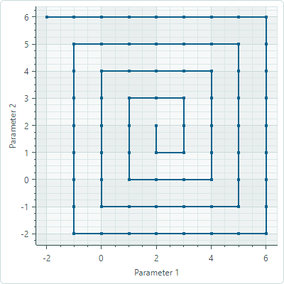
In this example, the Scatter Line Series View connects points that form a square spiral. The ScatterDataAdapter adapter is used to supply data for the chart. The points are connected in the order in which they appear in the data series.
<mx:MxWindow xmlns="https://github.com/avaloniaui"
        xmlns:x="http://schemas.microsoft.com/winfx/2006/xaml"
        xmlns:vm="using:ChartScatterLineSeriesView.ViewModels"
        xmlns:d="http://schemas.microsoft.com/expression/blend/2008"
        xmlns:mc="http://schemas.openxmlformats.org/markup-compatibility/2006"
        xmlns:mx="https://schemas.eremexcontrols.net/avalonia"
        xmlns:mxc="https://schemas.eremexcontrols.net/avalonia/charts"
        mc:Ignorable="d" d:DesignWidth="800" d:DesignHeight="450"
        x:Class="ChartScatterLineSeriesView.Views.MainWindow"
        x:DataType="vm:MainWindowViewModel"
        Icon="/Assets/EMXControls.ico"
        Title="ChartScatterLineSeriesView"
        Width="500" Height="500">
    <Design.DataContext>
        <vm:MainWindowViewModel/>
    </Design.DataContext>

    <mxc:CartesianChart x:Name="chartControl">
        <mxc:CartesianChart.Series>
            <mxc:CartesianSeries Name="scatterLineSeries1" DataAdapter="{Binding ScatterLineSeriesVM1.DataAdapter}" >
                <mxc:CartesianScatterLineSeriesView Color="{Binding ScatterLineSeriesVM1.Color}"
                                                    ShowMarkers="True"
                                                    MarkerSize="4" Thickness="2"/>
            </mxc:CartesianSeries>
        </mxc:CartesianChart.Series>
        <mxc:CartesianChart.AxesX>
            <mxc:AxisX Name="xAxis" Title="Parameter 1" />
        </mxc:CartesianChart.AxesX>
        <mxc:CartesianChart.AxesY>
            <mxc:AxisY Title="Parameter 2"/>
        </mxc:CartesianChart.AxesY>
    </mxc:CartesianChart>
</mx:MxWindow>
using Avalonia;
using Avalonia.Media;
using CommunityToolkit.Mvvm.ComponentModel;
using Eremex.AvaloniaUI.Charts;
using System;
using System.Collections.Generic;

namespace ChartScatterLineSeriesView.ViewModels;

public partial class MainWindowViewModel : ViewModelBase
{
    [ObservableProperty] SeriesViewModel scatterLineSeriesVM1;

    public MainWindowViewModel()
    {
        ScatterLineSeriesVM1 = new()
        {
            Color = Color.FromUInt32(0xff0d628d),
            DataAdapter = new ScatterDataAdapter(GenerateSquareSpiralData())
        };
    }

    private List<(double, double)> GenerateSquareSpiralData()
    {
        List<(double, double)> points = new List<(double, double)> ();
        double x = 2, y = 2;
        int stepsPerSide = 1; // Steps before changing direction
        int direction = 3; // 0=right, 1=up, 2=left, 3=down
        int turns = 4;
        double stepSize = 1.0;

        points.Add((x, y));

        for (int i = 0; i < turns * 4; i++) // 4 sides per turn
        {
            for (int step = 0; step < stepsPerSide; step++)
            {
                switch (direction)
                {
                    case 0: x += stepSize; break; // Right
                    case 1: y += stepSize; break; // Up
                    case 2: x -= stepSize; break; // Left
                    case 3: y -= stepSize; break; // Down
                }
                points.Add((x, y));
            }
            direction = (direction + 1) % 4; // Change direction
            if (i % 2 == 1) stepsPerSide++; // Increase steps every 2 turns
        }
        return points;
    }
}

public partial class SeriesViewModel : ObservableObject
{
    [ObservableProperty] Color color;
    [ObservableProperty] ScatterDataAdapter dataAdapter;
}
Data for the Scatter Line Series View
You can use the following data adapter to provide data for Scatter Line Series Views:
ScatterDataAdapter
Scatter Line Series View Settings
Color— Specifies the color used to paint the series.-
MarkerImage— Gets or sets an image to use as custom point markers. If no image is specified, default square-shaped markers are displayed. You can use anSvgImageclass instance to specify an SVG image.The
MarkerImageproperty is declared with the[Content]attribute, which allows you to define an image directly between the <CartesianScatterLineSeriesView> tags.<mxc:CartesianScatterLineSeriesView> <SvgImage Source="avares://Demo/Assets/circle.svg" /> </mxc:CartesianScatterLineSeriesView>SVG files contain predefined colors for SVG elements. To make these colors match your data series color, you can either:
- Manually edit the source SVG image file beforehand
- Use the
MarkerImageCssproperty to dynamically customize styles for SVG elements. The styles are applied when point markers are rendered. MarkerImageCss— Specifies CSS styles for runtime customization of an SVG image defined by theMarkerImageproperty. The primary use case is replacing SVG element colors with the series color (Color). Include the{0}placeholder to insert the value of theColorproperty in the CSS code.
For example, when the
MarkerImageproperty contains an SVG image with a circle element, the following CSS code styles thecirclewith an Orange fill (using the series color) and Dark Red border:<mxc:CartesianScatterLineSeriesView Color="orange" MarkerImageCss="circle {{fill:{0};stroke:darkred;}}"> <SvgImage Source="avares://Demo/Assets/circle.svg" /> </mxc:CartesianScatterLineSeriesView>See also: Example - Create a Lollipop Series View and Use Custom SVG Markers.
-
MarkerSize— Specifies the size of point markers. ShowInCrosshair— Specifies the visibility of the crosshair chart label for the current series. See Customize Chart Labels of the Crosshair.ShowMarkers— Enables or disables point markers.Thickness— Specifies the line thickness.