Stacked Area Series View
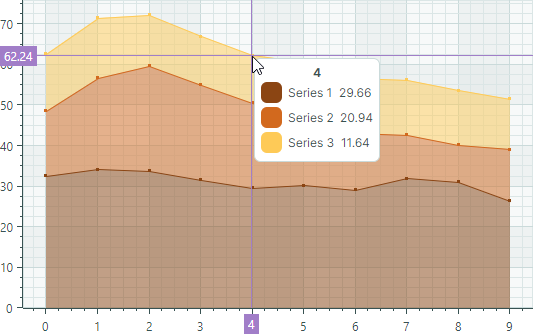
Stacked Area Series Views (CartesianStackedAreaSeriesView) allow you to show absolute relationships between two or more data series. Each Stacked Area Series is rendered as a filled area stacked on top of the previous Stacked Area Series. The series' thickness is determined by absolute values of data points. The top line shows the cumulative total of all Stacked Area Series in the chart control.
If all Stacked Area Series in the chart control only have negative values, the series are arranged in the direction of the negative Y axis. In this case, the bottom line shows the cumulative total:
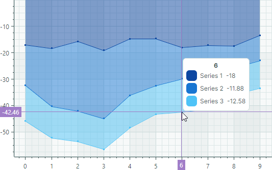
- Use Stacked Area Series Views to show only positive or only negative data in the same chart control.
- If any Stacked Area Series contains a mix of positive and negative values, all negative values are treated as zeroes.
Create Stacked Area Series Views
You typically use the Stacked Area Series presentation to show absolute relationships between two or more data series. Steps to create a Stacked Area chart include:
- Create a
CartesianSeriesobject for each data series and add it to theCartesianChart.Seriescollection. - Set the
CartesianSeries.Viewproperty to aCartesianStackedAreaSeriesViewobject. - Use the
CartesianSeries.DataAdapterproperty to supply data for the series.
The following code snippets show how to create a Stacked Area chart consisting of two data series in XAML and code-behind.
xmlns:mxc="https://schemas.eremexcontrols.net/avalonia/charts"

<mxc:CartesianChart x:Name="chartControl">
    <mxc:CartesianChart.Series>
        <mxc:CartesianSeries Name="stackedAreaSeries1" DataAdapter="{Binding DataAdapter1}" >
            <mxc:CartesianStackedAreaSeriesView Color="#ffDF3C5F" Transparency="0.6"
                MarkerSize="3" ShowMarkers="True"/>
        </mxc:CartesianSeries>
        <mxc:CartesianSeries Name="stackedAreaSeries2" DataAdapter="{Binding DataAdapter2}" >
            <mxc:CartesianStackedAreaSeriesView Color="#ff6F9BD1" Transparency="0.6"
                MarkerSize="3" ShowMarkers="True"/>
        </mxc:CartesianSeries>
    </mxc:CartesianChart.Series>
</mxc:CartesianChart>
double[] args = new double[] { 1, 2, 3, 4, 5};
double[] values1 = new double[] { 3, 2, 1, 2, 4 };
double[] values2 = new double[] { 1, 2, 1, 2, 2 };

CartesianSeries series1 = new CartesianSeries();
series1.DataAdapter = new SortedNumericDataAdapter(args, values1);
series1.View = new CartesianStackedAreaSeriesView()
{
    Color = Color.FromUInt32(0xffDF3C5F),
    Transparency = 0.6,
    ShowMarkers = true,
    MarkerSize = 5
};
CartesianSeries series2 = new CartesianSeries();
series2.DataAdapter = new SortedNumericDataAdapter(args, values2);
series2.View = new CartesianStackedAreaSeriesView()
{
    Color = Color.FromUInt32(0xff6F9BD1),
    Transparency = 0.6,
    ShowMarkers = true,
    MarkerSize = 5
};

chartControl.Series.Add(series1);
chartControl.Series.Add(series2);
The result is shown below:
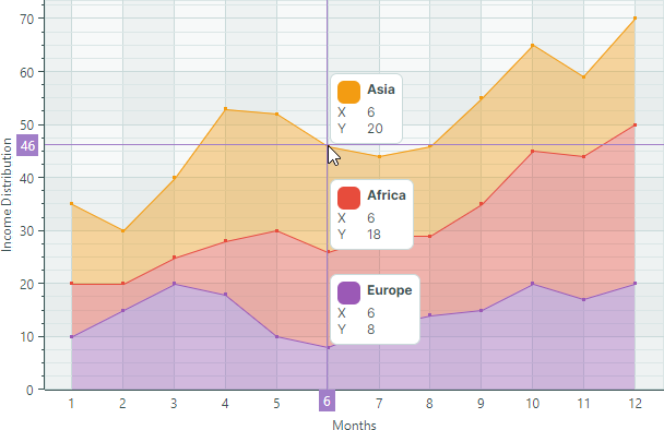
Example - Create a Stacked Area Chart Using the MVVM Design Pattern
The following example creates three series of the Stacked Area type from a View Model.
-
The
CartesianChart.SeriesSourceproperty is bound to the SeriesCollection property in the View Model. This collection is a source of SeriesViewModel objects used to initialize individual series in the Chart control. -
The
CartesianChart.SeriesTemplateproperty is set to a template that creates a series (aCartesianSeriesobject) of the Stacked Area type from each SeriesViewModel object. The series data, title and color are determined by the SeriesViewModel.DataAdapter, SeriesViewModel.Title, and SeriesViewModel.Color properties, respectively.
<!-- MainWindow.axaml -->
<mx:MxWindow xmlns="https://github.com/avaloniaui"
        xmlns:x="http://schemas.microsoft.com/winfx/2006/xaml"
        xmlns:vm="using:ChartStackedAreaSeriesViewExample.ViewModels"
        xmlns:d="http://schemas.microsoft.com/expression/blend/2008"
        xmlns:mc="http://schemas.openxmlformats.org/markup-compatibility/2006"
        xmlns:mx="https://schemas.eremexcontrols.net/avalonia"
        xmlns:mxc="https://schemas.eremexcontrols.net/avalonia/charts"
        mc:Ignorable="d" d:DesignWidth="800" d:DesignHeight="450"
        x:Class="ChartStackedAreaSeriesViewExample.Views.MainWindow"
        x:DataType="vm:MainWindowViewModel"
        Icon="/Assets/EMXControls.ico"
        Title="ChartStackedAreaSeriesViewExample">
    <Design.DataContext>
        <vm:MainWindowViewModel/>
    </Design.DataContext>
    <Grid ColumnDefinitions="*" Margin="10">
        <mxc:CartesianChart x:Name="chartControl" BorderThickness="0" SeriesSource="{Binding SeriesCollection}" >
            <mxc:CartesianChart.SeriesTemplate>
                <DataTemplate x:DataType="vm:SeriesViewModel">
                    <mxc:CartesianSeries DataAdapter="{Binding DataAdapter}" SeriesName="{Binding Title}">
                        <mxc:CartesianStackedAreaSeriesView
                            Color="{Binding Color}"
                            Transparency="0.6"
                            ShowMarkers="True"
                            MarkerSize="3"
                            Thickness="1" />
                    </mxc:CartesianSeries>
                </DataTemplate>
            </mxc:CartesianChart.SeriesTemplate>

            <mxc:CartesianChart.AxesX>
                <mxc:AxisX Name="xAxis" Title="Months" ShowMinorTickmarks="False">
                    <mxc:AxisX.ScaleOptions>
                        <mxc:NumericScaleOptions GridSpacing="1" LabelFormatter="{Binding ArgsLabelFormatter}"/>
                    </mxc:AxisX.ScaleOptions>
                </mxc:AxisX>
            </mxc:CartesianChart.AxesX>
            <mxc:CartesianChart.AxesY>
                <mxc:AxisY Title="Income Distribution">
                </mxc:AxisY>
            </mxc:CartesianChart.AxesY>
        </mxc:CartesianChart>
    </Grid>
</mx:MxWindow>
// MainWindow.axaml.cs
using ChartStackedAreaSeriesViewExample.ViewModels;
using Eremex.AvaloniaUI.Controls.Common;

namespace ChartStackedAreaSeriesViewExample.Views;

public partial class MainWindow : MxWindow
{
    public MainWindow()
    {
        InitializeComponent();
        this.DataContext = new MainWindowViewModel();
    }
}
// MainWindowViewModel.cs
using Avalonia.Media;
using CommunityToolkit.Mvvm.ComponentModel;
using Eremex.AvaloniaUI.Charts;
using System;
using System.Collections.ObjectModel;

namespace ChartStackedAreaSeriesViewExample.ViewModels;

public partial class MainWindowViewModel : ObservableObject
{
    [ObservableProperty]
    ObservableCollection<SeriesViewModel> seriesCollection = new();

    [ObservableProperty] FuncLabelFormatter argsLabelFormatter = new(o => String.Format("{0:n0}", o));
    public MainWindowViewModel()
    {
        double[] args = new double[] { 1, 2, 3, 4, 5, 6, 7, 8, 9, 10, 11, 12 };
        double[] values1 = new double[] { 10, 15, 20, 18, 10, 8, 12, 14, 15, 20, 17, 20 };
        double[] values2 = new double[] { 10, 5, 5, 10, 20, 18, 17, 15, 20, 25, 27, 30 };
        double[] values3 = new double[] { 15, 10, 15, 25, 22, 20, 15, 17, 20, 20, 15, 20 };

        SeriesCollection.Add(new SeriesViewModel { Title = "Europe", Color = Color.FromUInt32(0xFF9B59B6), DataAdapter = new SortedNumericDataAdapter(args, values1) });
        SeriesCollection.Add(new SeriesViewModel { Title = "Africa", Color = Color.FromUInt32(0xFFE74C3C), DataAdapter = new SortedNumericDataAdapter(args, values2) });
        SeriesCollection.Add(new SeriesViewModel { Title = "Asia", Color = Color.FromUInt32(0xFFF39C12), DataAdapter = new SortedNumericDataAdapter(args, values3) });
    }
}

public partial class SeriesViewModel : ObservableObject
{
    [ObservableProperty] string title;
    [ObservableProperty] Color color;
    [ObservableProperty] ISeriesDataAdapter dataAdapter;
}
Data for the Stacked Area Series View
You can use the following data adapters to provide data for Stacked Area Series Views:
Numeric X Values:
SortedNumericDataAdapterFormulaDataAdapter
Date and Time X Values:
SortedDateTimeDataAdapterSortedTimeSpanDataAdapter
Qualitative X Values:
QualitativeDataAdapter
Stacked Area Series View Settings
Color— Specifies the color used to paint the series.CrosshairMode— Specifies whether the crosshair's chart label snaps to the nearest data point, or displays an interpolated value. See Show an Exact or Interpolated Value in Crosshair Chart Labels.-
MarkerImage— Gets or sets an image to use as custom point markers. If no image is specified, default square-shaped markers are displayed. You can use anSvgImageclass instance to specify an SVG image.The
MarkerImageproperty is declared with the[Content]attribute, which allows you to define an image directly between the <CartesianStackedAreaSeriesView> tags.<mxc:CartesianStackedAreaSeriesView> <SvgImage Source="avares://Demo/Assets/circle.svg" /> </mxc:CartesianStackedAreaSeriesView>SVG files contain predefined colors for SVG elements. To make these colors match your data series color, you can either:
- Manually edit the source SVG image file beforehand
- Use the
MarkerImageCssproperty to dynamically customize styles for SVG elements. The styles are applied when point markers are rendered.
-
MarkerImageCss— Specifies CSS styles for runtime customization of an SVG image defined by theMarkerImageproperty. The primary use case is replacing SVG element colors with the series color (Color). Include the{0}placeholder to insert the value of theColorproperty in the CSS code.For example, when the
MarkerImageproperty contains an SVG image with a circle element, the following CSS code styles thecirclewith an Orange fill (using the series color) and Dark Red border:<mxc:CartesianStackedAreaSeriesView Color="orange" MarkerImageCss="circle {{fill:{0};stroke:darkred;}}"> <SvgImage Source="avares://Demo/Assets/circle.svg" /> </mxc:CartesianStackedAreaSeriesView>See also: Example - Create a Lollipop Series View and Use Custom SVG Markers.
-
MarkerSize— Specifies the size of point markers. ShowInCrosshair— Specifies the visibility of the crosshair chart label for the current series. See Customize Chart Labels of the Crosshair.ShowMarkers— Enables or disables point markers.Thickness— Specifies the line thickness.Transparency— A value between0and1which specifies the transparency level of filled areas:0means fully opaque1means fully transparent