Step Line Series View
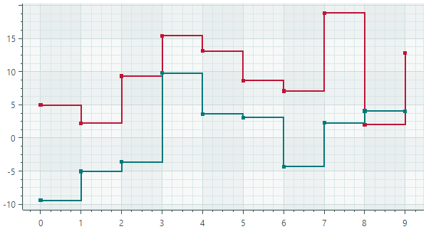
The Step Line Series View (CartesianStepLineSeriesView) connects points with horizontal and vertical line segments.
Data for the Step Line Series View
You can use the following data adapters to provide data for Step Line Series Views:
Numeric X Values:
SortedNumericDataAdapterFormulaDataAdapter
Date and Time X Values:
SortedDateTimeDataAdapterSortedTimeSpanDataAdapter
Qualitative X Values:
QualitativeDataAdapter
Step Line Series View Settings
Color— Specifies the color used to paint the series.CrosshairMode— Specifies whether the crosshair's chart label snaps to the nearest data point, or displays an interpolated value. See Show an Exact or Interpolated Value in Crosshair Chart Labels.-
InvertedStep— Specifies the drawing order of step segments between neighboring data points. IfInvertedStepisfalse(default), steps are composed of horizontal and then vertical segments. IfInvertedStepistrue, steps are composed of vertical and then horizontal segments.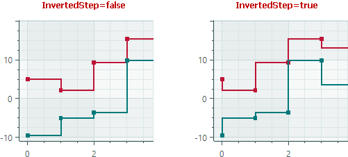
-
MarkerImage— Gets or sets an image to use as custom point markers. If no image is specified, default square-shaped markers are displayed. You can use anSvgImageclass instance to specify an SVG image.The
MarkerImageproperty is declared with the[Content]attribute, which allows you to define an image directly between the <CartesianStepLineSeriesView> tags.<mxc:CartesianStepLineSeriesView> <SvgImage Source="avares://Demo/Assets/circle.svg" /> </mxc:CartesianStepLineSeriesView>SVG files contain predefined colors for SVG elements. To make these colors match your data series color, you can either:
- Manually edit the source SVG image file beforehand
- Use the
MarkerImageCssproperty to dynamically customize styles for SVG elements. The styles are applied when point markers are rendered.
-
MarkerImageCss— Specifies CSS styles for runtime customization of an SVG image defined by theMarkerImageproperty. The primary use case is replacing SVG element colors with the series color (Color). Include the{0}placeholder to insert the value of theColorproperty in the CSS code.For example, when the
MarkerImageproperty contains an SVG image with a circle element, the following CSS code styles thecirclewith an Orange fill (using the series color) and Dark Red border:<mxc:CartesianStepLineSeriesView Color="orange" MarkerImageCss="circle {{fill:{0};stroke:darkred;}}"> <SvgImage Source="avares://Demo/Assets/circle.svg" /> </mxc:CartesianStepLineSeriesView>See also: Example - Create a Lollipop Series View and Use Custom SVG Markers.
-
MarkerSize— Specifies the size of point markers. ShowInCrosshair— Specifies the visibility of the crosshair chart label for the current series. See Customize Chart Labels of the Crosshair.ShowMarkers— Enables or disables point markers.Thickness— Specifies the line thickness.