Dock Panes and Containers
A Dock Pane (Eremex.AvaloniaUI.Controls.Docking.DockPane) is a panel that can be docked, made floating, auto-hidden, and combined in a tabbed group (container).
Dock Panes and Document Panes are basic elements of the Docking UI. Dock Panes allow you to create tool panels, while Document Panes allow you to create a tabbed MDI (Multiple Document Interface).
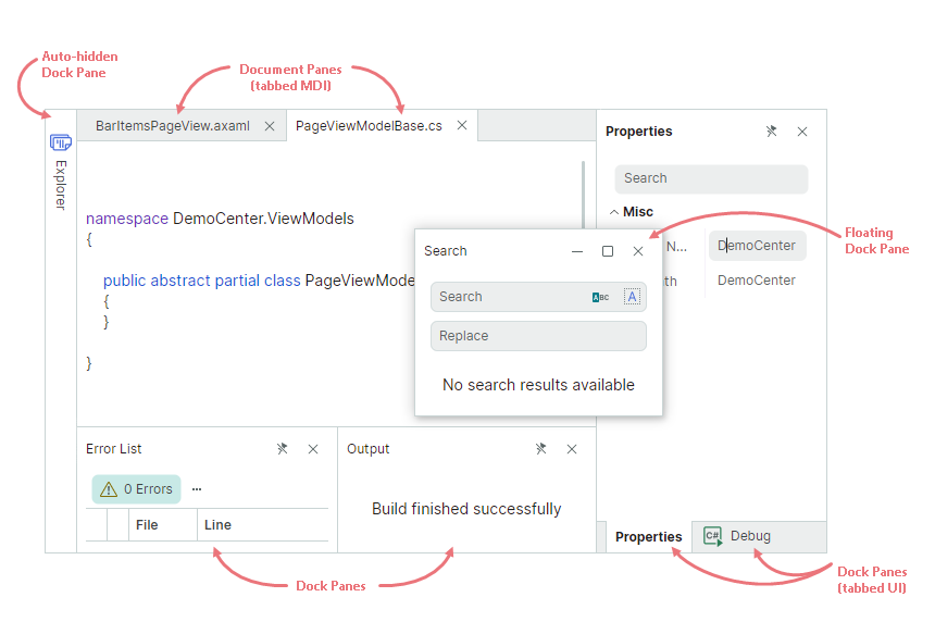
At runtime, users can rearrange the layout of panels using drag-and-drop operations and context menus: panels can be docked side by side, auto-hidden, displayed as tabs, or in floating windows. All these runtime actions reorganize the internal structure of dock items.
When you define a layout of panels in XAML or code-behind, you typically need to use special dock containers to combine panels, and present them in a specific manner.
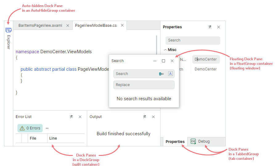
The following dock containers are supported:
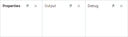
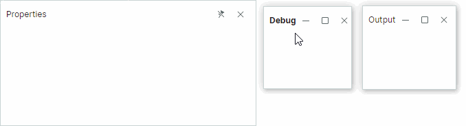
DockGroup(split container) — Displays dock items (Dock Panes and containers) side by side, either horizontally or vertically. Child dock items are delimited by splitters that enable panel resizing.TabbedGroup(tab container) — Displays dock items as tabs.AutoHideGroup— Child Dock Panes of this container feature the automatic hiding functionality. An auto-hidden panel appears when a user clicks the panel's header.FloatGroup— Displays dock items in a floating window.
Dock containers are automatically created and destroyed when a user rearranges panels at runtime.
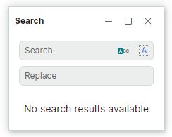
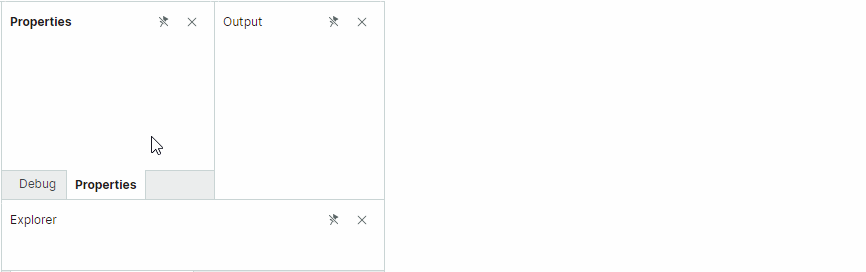
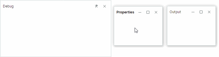
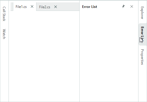
The following XAML file demonstrates how to create the structure of dock items shown in the image above:
xmlns:mxd="https://schemas.eremexcontrols.net/avalonia/docking"

<mxd:DockManager>
    <mxd:DockGroup Orientation="Horizontal">
        <mxd:DockGroup Orientation="Vertical" DockWidth="3*">
            <mxd:DocumentGroup DockHeight="2*">
                <mxd:DocumentPane Header="BarItemsPageView.axaml"/>
                <mxd:DocumentPane Header="PageViewModelBase.cs"/>
            </mxd:DocumentGroup>
            <mxd:DockGroup Orientation="Horizontal" DockHeight="*">
                <mxd:DockPane Header="Error List"/>
                <mxd:DockPane Header="Output"/>
            </mxd:DockGroup>
        </mxd:DockGroup>
        <mxd:TabbedGroup DockWidth="*">
            <mxd:DockPane Header="Properties"/>
            <mxd:DockPane Header="Debug"/>
        </mxd:TabbedGroup>
    </mxd:DockGroup>
    <mxd:DockManager.AutoHideGroups>
        <mxd:AutoHideGroup Dock="Left">
            <mxd:DockPane Header="Explorer"/>
        </mxd:AutoHideGroup>
    </mxd:DockManager.AutoHideGroups>
    <mxd:DockManager.FloatGroups>
        <mxd:FloatGroup FloatLocation="300,300">
            <mxd:DockPane Header="Search"/>
        </mxd:FloatGroup>
    </mxd:DockManager.FloatGroups>
</mxd:DockManager>
Using MVVM to Create a Docking UI
You can use the MVVM design pattern to populate a Docking UI with dock items (Dock Panes and Document Panes). Use the following API members for this purpose:
DockManager.ItemsSource— Specifies a list of objects that need to be rendered as dock items.DockManager.ItemTemplate— Specifies the template used to render objects from theDockManager.ItemsSourcelist as dock items.
See Use MVVM Pattern to Populate Dock Items more information.
Dock Pane Content and Size
Specify Content
You can use the DockPane.Content property to define a panel's content. In XAML, you can define the panel's content between the start and end <DockPane> tags.
The DockPane.ContentTemplate property allows you to specify the template used to render the Content object.
Specify Size
For dock items (panels and containers) that are displayed within split containers (DockGroup), the following properties allow you to set item size:
DockWidth(for panels that are horizontally arranged in their parent containers)DockHeight(for panels that are vertically arranged in their parent containers)
These properties do not affect size of panels in floating and auto-hide modes. See the following links to learn more:
Specify Header Text and Glyphs
Use the DockPane.Header and DockPane.HeaderTemplate properties to set headers for dock panels. To display images, use the DockPane.Glyph and DockPane.GlyphSize properties.
You can specify different header options for a panel when it is hosted within a tab container. Use the DockPane.TabHeader, DockPane.TabHeaderTemplate, DockPane.TabGlyph, and DockPane.TabGlyphSize properties for this purpose.
Related API
DockPane.ShowGlyphMode— Specifies the visibility and position of a glyph in a panel's header.DockPane.ShowTabGlyphMode— Specifies the visibility and position of a glyph in a tab when the panel is hosted within a tabbed group.
Activate Panels
The DockPane.IsActive property allows you to move focus to a specific panel. For instance, if a panel is auto-hidden, it is expanded and focused when you set the DockPane.IsActive property to true.
Use the DockManager.ActiveDockItem property to get the active dock item.
When panels are combined in a tab container (TabbedGroup), you can use the TabbedGroup.SelectedIndex property to select a specific panel.
Close Panels
Each Dock Panel displays the 'Close' button that allows a user to close the panel. In code, you can close a panel with the DockManager.Close method.
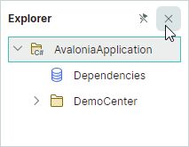
Use the DockPane.AllowClose property to hide the 'Close' button for a panel, and thus prevent the panel from being closed using this button.
When a panel is closed, the DockPane.CloseCommand command is activated. Closed panels can be accessed from the DockManager.ClosedPanes collection.
When panels are combined in a tab container, the container's CloseButtonShowMode property allows you to display additional 'Close' buttons in the tab strip region. You can display the 'Close' buttons in all tabs, in the active tab, or in the tab strip region.
For floating tab containers, the 'Close' button in a tab container's header can close either the active panel or all panels. Use the DockManager.CloseOnlyActivePane property to choose the required behavior.
The DockManager.DockOperationStarting event allows you to prevent specific panels from being closed, or perform custom actions when panels are closed.
Runtime Options for Dock Panels
DockPane objects contain settings that allow you to disable specific user operations at runtime:
DockPane.AllowAutoHide— Gets or sets whether the 'Pin' button and 'Auto Hide' context menu item are available for a panel. Set this property tofalseto prevent a user from enabling auto-hide mode for a specific panel.DockPane.AllowClose— Gets or sets whether a user can close a panel. Set this property tofalseto hide the panel'sx(close) button. See Close Panels.DockPane.AllowFloat— Gets or sets whether a user can make a panel floating. See Floating Panels.DockPane.AllowMaximize— Specifies the visibility of the 'Maximize' button for a panel in the floating state.DockPane.AllowMinimize— Specifies the visibility of the 'Minimize' button for a panel in the floating state.
These options do not prevent you from performing corresponding operations on panels in code.
You can also handle the DockManager.DockOperationStarting event to dynamically prevent certain dock operations, or run custom logic when these operations occur.
Split Panels
Dock items (panels and groups) can be arranged side-by-side, either horizontally or vertically. To create this layout, dock items are combined in a DockGroup container (split container).
A user can drag-and-drop a panel over the left, right, top or bottom dock hint of another panel to dock the panel at the corresponding position. The splitter between dock items allows for item resizing.
A DockGroup container's children can be panels (DockPane and DocumentPane), and other containers (DockGroup and DocumentGroup).
The default item arrangement in a DockGroup is horizontal. Set the DockGroup.Orientation property to Vertical to arrange items vertically.
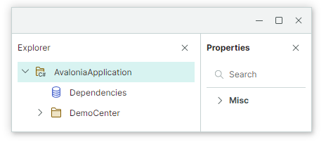
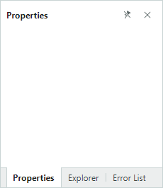
Example - Create a simple layout of Dock Panels
The XAML code below creates a layout of dock panels shown below.
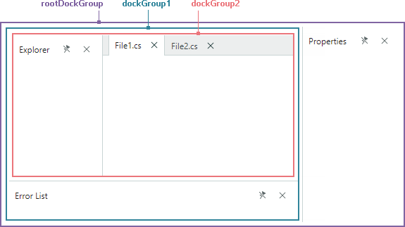
<mxd:DockManager Grid.Column="0" Grid.Row="1">
    <mxd:DockGroup Name="rootDockGroup">
        <mxd:DockGroup Name="dockGroup1" DockWidth="3*" Orientation="Vertical">
            <mxd:DockGroup Name="dockGroup2" DockHeight="4*">
                <mxd:DockPane DockWidth="*" Header="Explorer"/>
                <mxd:DocumentGroup DockWidth="3*">
                    <mxd:DocumentPane Header="File1.cs"/>
                    <mxd:DocumentPane Header="File2.cs"/>
                </mxd:DocumentGroup>
            </mxd:DockGroup>
            <mxd:DockPane Header="Error List" DockHeight="*"/>
        </mxd:DockGroup>
        <mxd:DockPane Header="Properties" DockWidth="*"/>
    </mxd:DockGroup>
</mxd:DockManager>
Split Panels in Code-Behind
To dock a panel next to another panel (or group) in code-behind, use the DockManager.Dock method with the dockType parameter set to DockType.Left, DockType.Right, DockType.Top or DockType.Bottom.
The DockManager.Dock method does not necessarily create a new DockGroup. If the required orientation and target group orientation match, a source panel is added to the target panel's parent group. A new DockGroup is created if the orientation of the new group does not match the orientation of the target group.
Assume that a target panel resides within a DockGroup that has the horizontal arrangement of child items. When you dock another (source) panel at the left or right side of the target panel, a new DockGroup is not created. Instead, the source panel is added to the target panel's parent group. When you dock the source panel at the top or bottom edge of the target panel, a new vertical DockGroup is created.
Example - Display Panels Side-by-side in Code-Behind
The following code docks the Explorer and Error List panels next to the Properties panel.
using Eremex.AvaloniaUI.Controls.Docking;

dockManager1.Dock(dockPaneExplorer, dockPaneProperties, DockType.Left);
dockManager1.Dock(dockPaneErrorList, dockPaneProperties, DockType.Bottom);
Related API
DockManager.Dock— Allows you to dock a dock item (for example, a panel) next to another dock item. Set the dockType parameter toDockType.Left,DockType.Right,DockType.ToporDockType.Bottomto create a split container.DockItemBase.DockParent— Allows you to get the immediate parent of aDockPaneobject, or another dock item.
Floating Panels
The Docking Library supports floating panels, which can be freely moved within the available screen space. Floating panels are hosted within floating windows.
A user can drag a panel with the mouse from its docked state to make the panel floating.
Access a Floating Window
When a panel is made floating, a floating window (container) is created that hosts this panel. Floating windows are encapsulated by FloatGroup objects. You can access a panel's parent floating window with the panel's DockItemBase.FloatGroup property. This property returns null if the panel is not in the floating state.
You can use the following API members to specify the floating window's location, size, header and glyph:
FloatGroup.FloatHeightFloatGroup.FloatLocationFloatGroup.FloatWidthFloatGroup.GlyphFloatGroup.HeaderFloatGroup.HeaderTemplate
Make Panels Floating
To define a floating panel in XAML, add a FloatGroup container to the DockManager.FloatGroups collection, and then add a DockPane panel to the FloatGroup container.
Use the DockManager.Float method to create a floating dock item in code-behind.
Example - Define Floating Panel in XAML
The following example creates a floating panel in XAML, and sets the position and size of the created floating window.
<mxd:DockManager.FloatGroups>
    <mxd:FloatGroup FloatLocation="600,600">
        <mxd:DockPane Name="dockPaneExplorer1" Header="Explorer-float">
            ...
        </mxd:DockPane>
    </mxd:FloatGroup>
</mxd:DockManager.FloatGroups>
Example - Create Floating Panels and Customize Floating Window in Code Behind
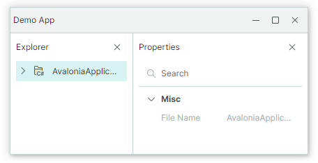
The code below makes a panel floating and then docks another panel next to the floating panel. This creates a floating window (FloatGroup) that hosts two panels. The created FloatGroup is positioned at the right bottom corner of the DockManager.
dockManager1.Float(dockPaneExplorer);
dockManager1.Dock(dockPaneSearch, dockPaneExplorer, DockType.Right);
FloatGroup floatingWindow = dockPaneExplorer.FloatGroup;
floatingWindow.Header = "My App";
floatingWindow.FloatWidth = 300;
floatingWindow.FloatHeight = 200;
floatingWindow.FloatLocation = dockManager1.PointToScreen(
    new Point(dockManager1.Bounds.Right - floatingWindow.FloatWidth,
    dockManager1.Bounds.Bottom - floatingWindow.FloatHeight));
Set a Floating Window's Header and Image
When two or more panels are docked side by side in the floating state, the floating window (FloatGroup) initially displays an empty header.
You can use the following properties to specify a floating window's header content:
FloatGroup.Glyph— An image to display in the header.FloatGroup.GlyphSize— The image size.FloatGroup.Header— An object to render in the header. UseFloatGroup.WindowTitleto specify a string to display in the header instead of an object.FloatGroup.HeaderTemplate— The template to render theFloatGroup.Headerobject.FloatGroup.ShowGlyphMode— Gets or sets the position and visibility of theFloatGroup.Glyphimage in the header.FloatGroup.WindowIcon— AWindowIconobject that represents the icon to render in the header. IfWindowIconis not specified, the header displays the image specified by theGlyphproperty.FloatGroup.WindowTitle— The text to render in the header. IfWindowTitleis not specified, the header displays the text representation of theHeaderobject.
Floating windows are dynamically created when panels are made floating. To initialize properties of dynamically created floating windows, handle the DockManager.RegisterDockItem event.
private void DockManager1_RegisterDockItem(object sender, Eremex.AvaloniaUI.Controls.Docking.DockItemEventArgs e)
{
    if (e.Item is FloatGroup floatGroup)
    {
        floatGroup.Header = "Demo App";
    }
}
Set Floating Bounds
When a panel is made floating, its previous size determines the floating window's initial floating size. You can set the FloatGroup.FloatWidth, FloatGroup.FloatHeight and FloatGroup.FloatLocation attached properties to specify custom floating bounds.
<mxd:DockPane DockWidth="*" Header="Properties"
              mxd:FloatGroup.FloatWidth="300"
              mxd:FloatGroup.FloatHeight="150"
              />
After a dock item becomes floating, you can access its parent floating window (FloatGroup) and set its bounds.
The following example makes a Dock Pane floating, accesses the created floating window, and sets its size.
using Eremex.AvaloniaUI.Controls.Docking;

dockManager1.Float(dockPane1);
FloatGroup floatingWindow = dockPane1.FloatGroup;
floatingWindow.FloatWidth = 400;
floatingWindow.FloatHeight = 300;
floatingWindow.FloatLocation = dockManager1.PointToScreen(new Point(100, 100));
Another way to specify settings for created FloatGroup objects is to handle the DockOperationCompleted event to access newly created FloatGroup objects, and customize their settings.
Related API
DockPane.FloatGroup— Returns the floating window (aFloatGroupobject) that contains the current panel when the panel is floating. Returns null if the panel is not floating.FloatGroup.FloatLocation— Specifies the position of the float group relative to the top left corner of the screen.FloatGroup.FloatHeight— Specifies theFloatGroup's height.FloatGroup.FloatWeight— Specifies theFloatGroup's width.FloatGroup.Header— Specifies theFloatGroup's header text.FloatGroup.HeaderTemplate— Specifies theFloatGroup's header template.FloatGroup.Glyph— Specifies theFloatGroup's glyph.DockManager.Float— Makes a dock item (for example, aDockPaneobject) floating.DockManager.FloatGroups— A collection of floating groups (floating windows).
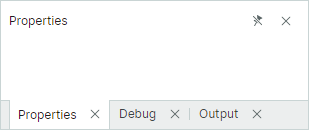
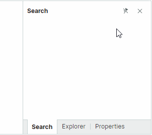
Tabs
A user can drag-and-drop a panel at the center of another panel to combine the panels into a tab container.
To arrange panels as tabs in code, combine them in a TabbedGroup container.
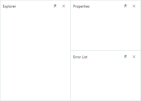
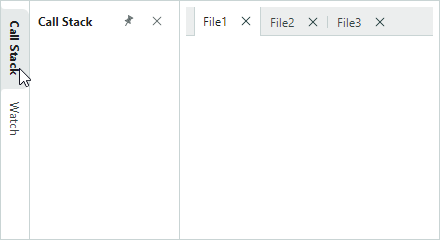
Example - Display Dock Panels as Tabs in XAML
The XAML code below creates a layout of dock panels shown below.
<mxd:DockManager Grid.Column="0" Grid.Row="1">
    <mxd:DockGroup Name="rootDockGroup">
        <mxd:DockGroup Name="dockGroup1" DockWidth="3*" Orientation="Vertical">
            <mxd:DockGroup Name="dockGroup2" DockHeight="4*">
                <mxd:DockPane DockWidth="*" Header="Explorer"/>
                <mxd:DocumentGroup DockWidth="3*">
                    <mxd:DocumentPane Header="File1.cs"/>
                    <mxd:DocumentPane Header="File2.cs"/>
                </mxd:DocumentGroup>
            </mxd:DockGroup>
            <mxd:DockPane Header="Error List" DockHeight="*"/>
        </mxd:DockGroup>
        <mxd:DockPane Header="Properties" DockWidth="*"/>
    </mxd:DockGroup>
</mxd:DockManager>
To combine panels in a tab container in code-behind, use the the DockManager.Dock method with the dockType parameter set to DockType.Fill. If you dock a source panel to another panel that is already hosted within a tab container, the source panel is displayed as an additional tab within the tab container.
Example - Display Dock Panels as Tabs in Code-Behind
The following code creates a tab container that owns three dock panels.
using Eremex.AvaloniaUI.Controls.Docking;

dockManager1.Dock(dockPaneExplorer, dockPaneProperties, DockType.Fill);
dockManager1.Dock(dockPaneErrorList, dockPaneProperties, DockType.Fill);
Access a Tab Container
For panels that reside in a tab container, use the DockPane.DockParent property to return the parent tab container (a TabbedGroup object).
Related API
DockManager.Dock— Allows you to dock an item (for example, a panel) to another item. Set the method's dockType parameter toDockType.Fillto create a tab container.DockItemBase.DockParent— Allows you to get the immediate parent of aDockPaneobject, or another dock item. For panels combined in a tab container, theDockParentproperty returns a parentTabbedGroupobject.DockPane.CloseCommand— The command that is invoked when a panel is closed. A panel can be closed by a click on the 'Close' button (seeDockPane.AllowCloseandTabbedGroup.CloseButtonShowMode). Closed panels can be accessed from theDockManager.ClosedPanescollection.DockPane.ShowTabGlyphMode— Specifies the visibility and position of a glyph in a panel's header (tab) when the panel is hosted within a tab container.DockPane.TabGlyphSize— Specifies size of the tab glyph (DockPane.TabGlyph). This property is in effect when the panel is hosted within a tab container.DockPane.TabGlyph— Specifies the glyph displayed in the tab. This property is in effect when the panel is hosted within a tab container.DockPane.TabHeaderTemplate— Specifies the template to render a tab. This property is in effect when the panel is hosted within a tab container.-
DockPane.TabHeader— Specifies text to display in a tab. This property is in effect when the panel is hosted within a tab container. -
TabbedGroup.AllowFloat— Specifies whether the tab container can be made floating by a user. TabbedGroup.CloseButtonShowMode— Specifies whether and where to display 'Close' buttons for child panels in the tab region: nowhere in the tab region, in each panel, in the active panel, or in the tab strip region. TheTabbedGroup.CloseButtonShowModeproperty does not affect the display of the 'Close' button in a panel's header. See Closing Panels.TabbedGroup.SelectTabOnClose— Specifies which tab is selected when you close a tab: the recently opened tab, the following tab, or preceding tab.TabbedGroup.SelectedIndex— Specifies the zero-based index of the selected tab in the current tab container. You can use theSelectedIndexproperty to select a specific tab.TabbedGroup.ShowTabStripForSingleChild— Specifies whether to display the tab strip when the tab container contains one child. If this property is set totrue, the tab strip is only displayed if the container owns two or more children.TabbedGroup.TabHeaderOrientation— Specifies whether to arrange tabs horizontally or vertically. InTabHeaderOrientation.Automode, tabs are arranged horizontally if theTabbedGroup.TabStripPlacementproperty is set toToporBottom. The tabs are arranged vertically, if theTabbedGroup.TabStripPlacementproperty is set toLeftorRight.TabbedGroup.TabStripLayoutType— Specifies how tabs are displayed.TabStripLayoutType.Scroll- Tab headers are wide enough to display tab headers' contents. Scroll buttons appear in the tab header region if there is not enough space to display all tab headers in their entirety.TabStripLayoutType.Stretch- All tab headers are arranged in a line, stretching to fit the control's width. They have the same width or height depending on the tab strip position (seeTabbedGroup.TabStripPlacement).TabStripLayoutType.MultiLine- Tab headers are arranged in multiple lines if there is not enough space to display them in a single line.TabbedGroup.TabStripPlacement— Specifies the edge along which tabs are displayed.
Auto-Hide Panels
At runtime, a user can click a panel's 'Pin' button ( ) or select the 'Auto Hide' command from the context menu to enable auto-hide mode for the panel.
In default mode, auto-hide panels are automatically collapsed when focus is moved to another panel. Only the headers of collapsed auto-hide panels remain visible. Clicking a collapsed panel's header expands it. See also: Inline Auto-Hide Panels.
To create auto-hide panels in code, use AutoHideGroup containers. See Create Auto-Hide Panels.
Hide 'Pin' Buttons
Set the DockPane.AllowAutoHide option to false to prevent a user from enabling auto-hide mode for a specific panel. This option hides the 'Pin' button and 'Auto Hide' context menu item for the panel.
'Pin' buttons are not available for floating panels.
Auto-Hide Tabbed Panels
When panels are displayed as tabs at a specific edge of the DockManager, a click on the 'Pin' button of any panel enables the auto-hide functionality for all panels of the current tab container, by default. This action creates an AutoHideGroup container at the specified edge of the DockManager, and moves all panels from the tab container to the AutoHideGroup container. Conversely, when you unpin any panel in this AutoHideGroup, the AutoHideGroup is transformed into a tab container (TabGroup).
Set the DockManager.AutoHideOnlyActivePane property to true to toggle the auto-hide feature only for the active panel, while keeping other panels of the tab container/auto-hide container intact.
Create Auto-Hide Panels
To create auto-hide panels in XAML, add AutoHideGroup containers with panels to the DockManager.AutoHideGroups collection. The AutoHideGroup.Dock property allows you to specify the edge of the DockManager at which the auto-hide container will be displayed.
To enable the auto-hide functionality for a panel in code-behind, use the DockManager.AutoHide method.
Example - Create Auto-Hide Panels in XAML
The following code creates two auto-hide containers at the left and right edges of the DockManager.
<mxd:DockManager Name="dockManager1" Grid.Column="0" Grid.Row="1">
    <mxd:DockManager.AutoHideGroups>
        <mxd:AutoHideGroup Dock="Right">
            <mxd:DockPane Name="dockPaneExplorer1" Header="Explorer" mxd:AutoHideGroup.AutoHideWidth="200" />
            <mxd:DockPane Name="dockPaneErrors1" Header="Error List" mxd:AutoHideGroup.AutoHideWidth="200"/>
            <mxd:DockPane Name="dockPaneProperties1" Header="Properties" mxd:AutoHideGroup.AutoHideWidth="200"/>
        </mxd:AutoHideGroup>
        <mxd:AutoHideGroup Dock="Left">
            <mxd:DockPane Name="dockPaneCallStack1" Header="Call Stack" mxd:AutoHideGroup.AutoHideWidth="200"/>
            <mxd:DockPane Name="dockPaneWatch1" Header="Watch" mxd:AutoHideGroup.AutoHideWidth="200"/>
        </mxd:AutoHideGroup>
    </mxd:DockManager.AutoHideGroups>

    <mxd:DockGroup Margin="6" Name="rootDockGroup">
        <mxd:DocumentGroup DockWidth="*">
            <mxd:DocumentPane Header="File1.cs"/>
            <mxd:DocumentPane Header="File2.cs"/>
        </mxd:DocumentGroup>
    </mxd:DockGroup>
</mxd:DockManager>
Example - Enable Auto-Hide Feature for Panels in Code-Behind
The following code applies the auto-hide feature to a panel, and then expands it.
Access Auto-Hide Container
To access the AutoHideGroup container that hosts an auto-hide panel, use the DockItemBase.AutoHideGroup property.
Expand and Collapse Auto-Hide Panel
The DockManager.ExpandAutoHidePanel and DockManager.CollapseAutoHidePanel methods allow you to display and collapse an auto-hide panel. The DockPane.IsActive property allows you to focus any panel. For an auto-hide panel, this property expands the panel (if it is collapsed), and then focuses it.
Set Size for Expanded Auto-Hide Panels
When a panel becomes auto-hidden, its previous width/height is used as the default size for the auto-hide panel in the expanded state.
You can use the AutoHideGroup.AutoHideWidth and AutoHideGroup.AutoHideHeight attached properties to set custom expanded width/height for auto-hide panels.
<mxd:DockPane Name="dockPane1" DockWidth="*" Header="Properties"
             mxd:AutoHideGroup.AutoHideWidth="200" />
If a user resizes a panel in the expanded state, the new size is saved to the AutoHideGroup.AutoHideWidth or AutoHideGroup.AutoHideHeight property and re-applied the next time the panel is expanded.
Inline Auto-Hide Panels
The DockManager.AutoHideMode property allows you to specify how an auto-hide panel is displayed when expanded. The following display modes are supported:
AutoHideMode.Default(default mode) - When expanded, an auto-hide panel overlaps other dock items.
AutoHideMode.Inline— When expanded, an auto-hide panel shifts adjacent dock items.
Related API
DockManager.AutoHideGroups— A collection ofAutoHideGroupobjects that host auto-hide panels. Use this collection to add and access auto-hide panels.DockManager.AutoHideMode— Specifies whether an expanded auto-hide panel overlaps adjacent dock items or shifts them.DockManager.AutoHideOnlyActivePane— Specifies whether a click on a panel's 'Pin' button toggles the auto-hide feature only for this panel. If this property is set tofalse(default value), and the current panel belongs to a tabbed group, the auto-hide feature is enabled for all panels in this tabbed group.DockPane.AutoHideGroup— Returns theAutoHideGroupcontainer that contains a panel. Returns null if the panel is not in an auto-hide group.DockPane.AllowAutoHide— Gets or sets whether the 'Pin' button and 'Auto Hide' context menu item are available for a panel. Set this property tofalseto prevent a user from enabling auto-hide mode for a specific panel.AutoHideGroup.Dock— Specifies the DockManager's edge along which theAutoHideGroupcontainer is displayed.AutoHideGroup.AutoHideHeight— Attached property. When applied to a panel, specifies the panel's height when the auto-hide feature is enabled, and the parentAutoHideGroupis docked to the top or bottom edge of the DockManager.AutoHideGroup.AutoHideWidth— Attached property. When applied to a panel, specifies the panel's width when the auto-hide feature is enabled, and the parentAutoHideGroupis docked to the left or right edge of the DockManager.