Ribbon Command Layouts
The ribbon command layout determines the arrangement of commands in the Ribbon bar. The Ribbon control supports two layouts: Classic and Simplified.
Classic Command Layout
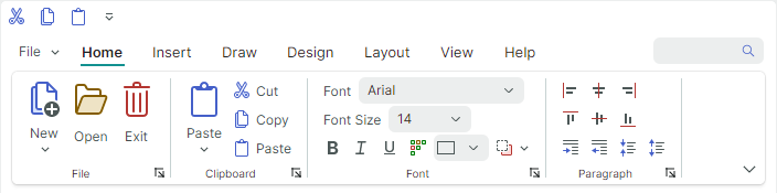
- The Ribbon bar is tall enough to display three rows of commands with small icons.
- Page group headers are visible
- Groups cannot be partially collapsed when the Ribbon is resized
- Support for inline galleries
- The default size of small icons is
16x16. You can use theRibbonControl.SmallGlyphSizeproperty to change the size of small icons. Large icons are twice the size of small icons. - When the Ribbon is resized, the adaptive layout feature adjusts the size of icons — from large to small with text to small glyphs, and backwards.
Simplified Command Layout
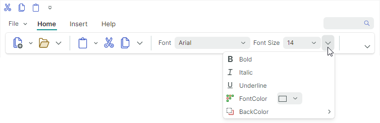
- Buttons are arranged in one row
- Page group headers are hidden
- Groups can be partially collapsed when the Ribbon is resized. Collapsed buttons are accessible from the group's dropdown menu.
- Galleries are displayed in dropdown menus
-
The default size of icons in the Simplified Command Layout is
22x22. Use theRibbonControl.GlyphSizeInSimplifiedLayoutproperty to specify a custom icon size.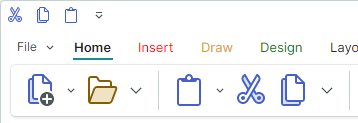
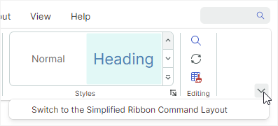
Select a Command Layout
A user can switch between the Classic and Simplified views at runtime by clicking the Command Layout Selection button at the Ribbon's right bottom corner.
Set the RibbonControl.IsCommandLayoutSelectionButtonVisible option to false to hide this button.
The RibbonControl.CommandLayout property allows you to specify the command layout in code.