Ribbon Items
You can add various items to the Ribbon control and its menus: buttons, check buttons, text labels, sub-menus, in-place editors, and more.
In addition to these classic items, the Ribbon control supports galleries. They are designed to display graphically rich elements, arranged in columns and rows. See Galleries for more information.
All items, including galleries, can be added to traditional toolbars and context menus.
Add Ribbon Items
You can display various items in different Ribbon elements: ribbon page groups, Quick Access Toolbar, Page Header Area, Main (Application) Menu, and sub-menus.
To add items to a ribbon page group in XAML, define these items between the <RibbonPageGroup> start and end tags. In code-behind, you can add, access and modify items using the RibbonPageGroup.Items collection. Other ribbon elements are populated with items in the same manner.
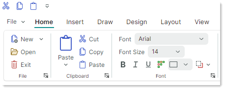
The following example adds three buttons (ToolbarButtonItem objects) to a RibbonPageGroup object.
<mxb:ToolbarManager IsWindowManager="True">
    <mxr:RibbonControl ApplicationButtonContent="File" ApplicationButtonKeyTip="F">
        <mxr:RibbonPage Header="Home" KeyTip="H">
            <mxr:RibbonPageGroup Header="Editing" IsHeaderButtonVisible="False">
                <mxb:ToolbarButtonItem Header="Find" KeyTip="FN"
                  Glyph="{x:Static icons:Basic.Search}"
                  Command="FindButtonClick" />
                <mxb:ToolbarButtonItem Header="Replace" KeyTip="RP"
                  Glyph="{x:Static icons:Basic.Update}"
                  Command="ReplaceButtonClick"/>
                <mxb:ToolbarButtonItem Header="Clear" KeyTip="CL"
                  Glyph="{x:Static icons:Basic.Table_Clear}"
                  Command="ClearButtonClick"/>
            </mxr:RibbonPageGroup>
        </mxr:RibbonPage>
    </mxr:RibbonControl>
</mxb:ToolbarManager>
Ribbon Item Types
All items you can add to the Ribbon control and traditional toolbars are ToolbarItem class descendants. The following sections describes available ribbon items and its settings.
Regular Buttons (ToolbarButtonItem)
ToolbarButtonItem objects allow you to implement regular buttons and buttons with dropdown functionality.
A regular button raises an action on a click.
Click the Button
To implement an action for a button, you can specify a command or handle the button's events:
-
ToolbarItem.Command— A command executed when the button is clicked. -
CommandParameter— A command parameter passed to the specified command. -
ToolbarItem.Click— Fires when the item is left-clicked (after the left mouse button is pressed and then released). ToolbarItem.Press— Fires when any mouse button is pressed over the item.
Button Caption and Glyph
Header— The item's display text.Glyph— The item's image. See also: Glyph Size.GlyphTemplate— A custom data template to render the item's image.
Glyph Size
The size of command glyphs in Ribbon page groups is different in the Simplified and Classic command layouts. The following sections provide more details:
- Glyph Size in the Simplified Command Layout
- Glyph Size in the Classic Command Layout
- Adaptive Glyph Size in the Classic Command Layout
Tip
To customize the size of item glyphs in popup and context menus, use the item's GlyphSize property.
Glyph Size in the Simplified Command Layout
All commands in page groups use one icon size in the Simplified Command Layout.
The default icon size is 22x22. You can use the RibbonControl.GlyphSizeInSimplifiedLayout property to specify a custom icon size.
Glyph Size in the Classic Command Layout
Commands in page groups can display large and small glyphs in the Classic Command Layout.
The default size of small icons is 16x16. You can use the RibbonControl.SmallGlyphSize property to change the size of small icons. Large icons are twice the size of small icons.
The RibbonControl.DisplayMode attached property can be used to specify display size (large, small, and small with text) for commands in ribbon page groups. See Adaptive Glyph Size in the Classic Command Layout for more information.
Adaptive Glyph Size in the Classic Command Layout
The Ribbon control's adaptive layout feature adjusts the layout of items in ribbon page groups when the Ribbon control is resized. This functionality also adjusts the display size of items during Ribbon resizing when the Classic command layout is used.
The RibbonControl.DisplayMode attached property allows you to specify supported display modes for ribbon items in ribbon page groups in the Classic command layout.
You can force an item to use only large images, small images, small images with text, or a combination of these display modes.
Predefined glyph display modes are defined by the RibbonItemDisplayMode enumeration:
-
Large— An item displays a large glyph and text.
-
Small— An item displays a small glyph and text.
-
SmallGlyph— An item displays a small glyph.
-
Auto— An item supports theLarge,SmallandSmallGlyphdisplay modes. Depending on the space available in the item's parent group, the Ribbon control automatically chooses one of these display modes for the item.
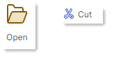
The following code snippet sets the RibbonControl.DisplayMode attached property for a ribbon item to Large. This forces the item to only use large images.
<mxr:RibbonPage Header="Home" KeyTip="H">
    <mxr:RibbonPageGroup Header="File" IsHeaderButtonVisible="True">
        <mxb:ToolbarButtonItem Header="Open" KeyTip="O" mxr:RibbonControl.DisplayMode="Large"
                            Glyph="{x:Static icons:Basic.Folder_Open}" />
    </mxr:RibbonPageGroup>
</mxr:RibbonPage>
The RibbonItemDisplayMode enumeration is marked with the [Flags] attribute. So you can use any combination of the Large, Small and SmallGlyph flags when setting the RibbonControl.DisplayMode attached property.
The following code allows a ribbon item to only use the Small and SmallGlyph display modes:
<mxb:ToolbarButtonItem Header="Help" KeyTip="LP" Glyph="{x:Static icons:Basic.Info}"
                       mxr:RibbonControl.DisplayMode="Small, SmallGlyph" />
Common Item Display Settings
ShowSeparator— Gets or sets whether to display a separator before the item. You can also use theToolbarSeparatorItembar item to insert a separator.
Buttons with Dropdown Functionality (ToolbarButtonItem)
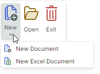
The ToolbarButtonItem item allows you to create a button with an associated dropdown control or menu.
Use the ToolbarButtonItem.DropDownControl property to specify a dropdown control/menu. This dropdown control is invoked when a user clicks the button or the built-in down-arrow button (depending on the DropDownArrowVisibility setting; see below).
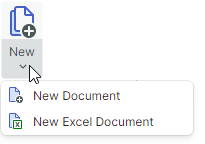
<mxb:ToolbarButtonItem Name="btnNew" Header="New" KeyTip="N"
    Glyph="{x:Static icons:Basic.Docs_Add}"
    mxr:RibbonControl.DisplayMode="Large"
    DropDownArrowVisibility="ShowSplitArrow">
    <mxb:ToolbarButtonItem.DropDownControl>
        <mxb:PopupMenu>
            <mxb:ToolbarButtonItem Header="New Document" KeyTip="ND"
                Glyph="{x:Static icons:Basic.Doc_Add}" />
            <mxb:ToolbarButtonItem Header="New Excel Document" KeyTip="NX"
                                    Glyph="{x:Static icons:Basic.Doc_Excel}" />
        </mxb:PopupMenu>
    </mxb:ToolbarButtonItem.DropDownControl>
</mxb:ToolbarButtonItem>
Dropdown Control and Down-Arrow Button
-
DropDownControl— Gets or sets a dropdown control (anEremex.AvaloniaUI.Controls.Bars.IPopupobject) associated with the item. The control pops up when a user clicks the item or the built-in down arrow button (seeDropDownArrowVisibility). The following objects implement theEremex.AvaloniaUI.Controls.Bars.IPopupinterface, and so they can be displayed as dropdown controls:Eremex.AvaloniaUI.Controls.Bars.PopupMenu— A popup menu. You can add all types of toolbar items to the menu to populate it with content.Eremex.AvaloniaUI.Controls.Bars.PopupContainer— A container of controls. UsePopupContainerto display custom controls in a dropdown.
-
DropDownArrowVisibility— Gets or sets whether the item displays a dropdown arrow used to invoke the associated dropdown control.
-
ShowSplitArroworDefault— The dropdown arrow is visible. It acts as a separate button embedded in the item. A click on the dropdown arrow invokes the associated dropdown control and raises theDropDownPressevent. A click on the item invokes its command (Command) and events (ClickandPress). -
ShowArrow— The dropdown arrow is visible. The item and arrow act as a single button. A click on them displays an associated dropdown control. -
Hide— The dropdown arrow is hidden. A click on the item invokes the dropdown control.
-
Invoke the Dropdown Control
DropDownOpenMode— Gets or sets whether and when the dropdown control is invoked when a user touches the item/dropdown arrow. Supported options include:PressorDefault— The dropdown is displayed on a mouse press event.Click— The dropdown is displayed after the mouse is pressed and then released over the item.Never— The dropdown is not displayed.
DropDownPress— The event that fires when the dropdown arrow is pressed.
Check Buttons (ToolbarCheckItem)
The ToolbarCheckItem item allows you to create a check button. Check buttons support two states — normal and pressed.

xmlns:mxb="https://schemas.eremexcontrols.net/avalonia/bars"

<mxb:ToolbarCheckItem Header="Bold"
 IsChecked="{Binding #textBox.FontWeight,
  Converter={helpers:BoolToFontWeightConverter}, Mode=TwoWay}"
 Glyph="{SvgImage 'avares://DemoCenter/Images/FontBold.svg'}" />
Check the Button
IsChecked— Gets or sets the button's check state.CheckedChanged— The event that fires when the check state changes.
Caption, Glyph and Display Settings
Header— The item's display text.-
Glyph— The item's image. A check button supports both large and small images. See the following sections to learn more: -
GlyphTemplate— A custom data template to render the item's image. -
CheckBoxStyle— Gets or sets display mode for aToolbarCheckItemobject. Available options include: -
CheckBoxStyle.CheckButton— The item is rendered as a check button. WhenIsCheckedistruethe button appears in the pressed state.
-
CheckBoxStyle.CheckBox— The item displays a toggle box before its text and glyph. WhenIsCheckedistruethe toggle box has a check mark.
-
CheckBoxStyle.RadioButton— The item displays a radio button before its text and glyph. WhenIsCheckedistruethe radio button is rendered as a filled circle.You can apply the RadioButton style to
ToolbarCheckItemobjects combined in a check group (ToolbarCheckItemGroup). In this case, the group appears as a typical radio group.<mxb:ToolbarCheckItemGroup CheckType="Radio"> <mxb:ToolbarCheckItem Header="E-mail" CheckBoxStyle="RadioButton" /> <mxb:ToolbarCheckItem Header="Phone" CheckBoxStyle="RadioButton" /> </mxb:ToolbarCheckItemGroup>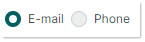
-
CheckBoxAlignment— Gets or sets whether the check box (or radio button) are displayed before or after an item's glyph and text. This option is in effect when theCheckBoxStyleproperty is set toCheckBoxStyle.CheckBoxorCheckBoxStyle.RadioButton.<mxb:ToolbarCheckItem Header="Status bar" CheckBoxAlignment="After" CheckBoxStyle="CheckBox" Hint="Show and hide the status bar"/> <mxb:ToolbarSeparatorItem/>
You can customize the general display settings for check buttons in the same manner as for regular buttons.
Sub-menus (ToolbarMenuItem)
Use ToolbarMenuItem to create an item that displays a sub-menu on a click.
Sub-menu's Content
To specify a sub-menu's content, define items between the <ToolbarMenuItem> start and end tags in XAML, or add items to the ToolbarMenuItem.Items collection in code-behind.
xmlns:mxb="https://schemas.eremexcontrols.net/avalonia/bars"

<mxb:ToolbarMenuItem Header="File" Category="File">
    <mxb:ToolbarButtonItem Header="New"
     Glyph="{SvgImage 'avares://DemoCenter/Images/Group=Context Menu, Icon=NewDraftAction.svg'}"
     Category="File" Command="{Binding NewFileCommand}"/>
    <mxb:ToolbarButtonItem Header="Open"
     Glyph="{SvgImage 'avares://DemoCenter/Images/Group=Basic, Icon=Folder Open.svg'}"
     Category="File" Command="{Binding OpenFileCommand}"/>
    <mxb:ToolbarButtonItem Header="Save"
     Glyph="{SvgImage 'avares://DemoCenter/Images/Group=Basic, Icon=Save.svg'}"
     Category="File" Command="{Binding SaveFileCommand}"/>
    <mxb:ToolbarButtonItem Header="Print"
     Glyph="{SvgImage 'avares://DemoCenter/Images/Group=Basic, Icon=Print.svg'}"
     ShowSeparator="True"  Category="File" Command="{Binding PrintFileCommand}"/>
</mxb:ToolbarMenuItem>
You can also use the ToolbarMenuItem.ItemsSource property to populate a sub-menu with items from a collection of business objects in a View Model. Corresponding data templates should define ribbon items and initialize their settings from underlying business objects.
Invoke the Sub-menu
When a sub-menu is invoked, the following events are raised:
Opening— Fires when the menu is about to be displayed. This event allows you to cancel the display of the menu.Opened— Fires after the menu is displayed.Closing— Fires when the menu is about to be closed. This event allows you to cancel closing the menu.Closed— Fires after the menu is closed.
The following property allows you to cancel the display of a sub-menu, and specify whether to display the sub-menu on a mouse click or press event.
DropDownOpenMode— Gets or sets whether and how the sub-menu is invoked when a user touches the item. Supported options include:PressorDefault— The menu is displayed on a mouse press event.Click— The menu is displayed after the mouse is pressed and then released over the item.Never— The menu is not displayed.
Caption, Glyph and Display Settings
Header— The sub-menu's header text.-
Glyph— The sub-menu's image. A sub-menu supports both large and small images in the header. See the following sections to learn how to specify the size of item glyphs in the Ribbon control: -
GlyphTemplate— A custom data template to render the item's image.
You can customize the general display settings for sub-menus in the same manner as for regular buttons.
In-place Editors (ToolbarEditorItem)
Use a ToolbarEditorItem object to embed an in-place editor in a Ribbon control.
A ToolbarEditorItem object supports the following approaches to specify an in-place editor:
-
Specify an Editor Type. This is the recommended way to specify an Eremex in-place editor.
Specify an Editor Type
This approach allows you to embed an Eremex editor.
To specify an editor type, set the ToolbarEditorItem.EditorProperties property to one of the following objects:
ButtonEditorProperties— Corresponds to aButtonEditorin-place editor.CheckEditorProperties— Corresponds to aCheckEditorin-place editor.ColorEditorProperties— Corresponds to aColorEditorin-place editor.ComboBoxEditorProperties— Corresponds to aComboBoxEditorin-place editor.HyperlinkEditorProperties— Corresponds to aHyperlinkEditorin-place editor.PopupColorEditorProperties— Corresponds to aPopupColorEditorin-place editor.PopupEditorProperties— Corresponds to aPopupEditorin-place editor.SegmentedEditorProperties— Corresponds to aSegmentedEditorin-place editor.SpinEditorProperties— Corresponds to aSpinEditorin-place editor.TextEditorProperties— Corresponds to aTextEditorin-place editor.MemoEditorProperties— Corresponds to aMemoEditorin-place editor.
These objects are BaseEditorProperties descendants. They contain settings to customize corresponding in-place editors.
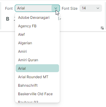
The following example defines the Font item (ToolbarEditorItem object) that displays a list of fonts using a combobox in-place editor. The ToolbarEditorItem.EditorProperties property is set to a ComboBoxEditorProperties object, which corresponds to a ComboBoxEditor editor. See the WordPad Example demo for the complete code.
<mxb:ToolbarEditorItem Header="Font" EditorWidth="150"
 EditorValue="{Binding #textBox.FontFamily, Converter={helpers:FontNameToFontFamilyConverter}}">
    <mxb:ToolbarEditorItem.EditorProperties>
        <mxe:ComboBoxEditorProperties
         ItemsSource="{Binding $parent[view:ToolbarAndMenuPageView].Fonts}"
         IsTextEditable="False" PopupMaxHeight="300"/>
    </mxb:ToolbarEditorItem.EditorProperties>
</mxb:ToolbarEditorItem>
Specify an Editor in a Data Template
Use the ToolbarEditorItem.EditorTemplate property to specify an editor in a Data Template. In this case, you need to manually set a value for the editor (for instance, using Data Binding).
<mxb:ToolbarEditorItem Width="150">
    <mxb:ToolbarEditorItem.EditorTemplate>
        <DataTemplate>
            <mxe:TextEditor EditorValue="{Binding Count}" Width="80"/>
        </DataTemplate>
    </mxb:ToolbarEditorItem.EditorTemplate>
</mxb:ToolbarEditorItem>
Change and Return the Editor's Value
-
ToolbarEditorItem.EditorValue— Gets or sets the in-place editor's value. Use this property for data binding. -
ToolbarEditorItem.EditorValueChanged— The event that fires after the editor's value is changed.
These members are in effect when you use the ToolbarEditorItem.EditorProperties property to specify an editor.
Editor's Width
ToolbarEditorItem.EditorWidth— Gets or sets the in-place editor's width. This property is in effect when you use theToolbarEditorItem.EditorPropertiesproperty to specify an editor. If you specify an editor in a Data Template, you can set the editor width with theToolbarEditorItem.Widthproperty, or set the width for the editor itself.
Caption and Glyph
-
Header— The item's display text. -
Glyph— The item's image.ToolbarEditorItemobjects support only small images. The size of small images is specified by theRibbonControl.SmallGlyphSizeproperty in the Classic command layout, and theRibbonControl.GlyphSizeInSimplifiedLayoutproperty in the Simplified command layout. GlyphTemplate— A custom data template to render the item's image.
You can customize the general display settings for ToolbarEditorItem objects in the same manner as for regular buttons.
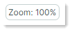
Text Labels (ToolbarTextItem)
Use a ToolbarTextItem object to display a text label that cannot be edited by users.

<mxb:ToolbarTextItem
 Header="{Binding #scaleDecorator.Scale, StringFormat={}Zoom: {0:P0}}"
 ShowBorder="False"
 />
Caption and Glyph
Header— The item's display text.-
Glyph— The item's image. A text label supports both large and small images. See the following sections to learn how to specify the size of item glyphs in the Ribbon control: - Adaptive Glyph Size in the Classic Command Layout
Text Label's Display Settings
ToolbarTextItem.ShowBorder— Gets or sets whether the item's border is visible.
You can use the ToolbarTextItem.BorderTemplate property to specify a custom template to paint the border.
- ToolbarTextItem.BorderTemplate — Gets or sets a custom template to paint the item's border. This template is in effect if the ToolbarTextItem.ShowBorder option is enabled.
See also:
Non-Breaking Groups of Items (ToolbarItemGroup)
Use ToolbarItemGroup to create a non-breaking container (group) of toolbar items. Items in this container are always displayed together in a line, and they act as a cohesive unit when the Ribbon is resized.
In the Classic command layout, a ToolbarItemGroup's items support only small images.
Group's Content
To specify a container's content, define items between the <ToolbarItemGroup> start and end tags in XAML, or add items to the ToolbarItemGroup.Items collection in code-behind.
<mxb:ToolbarItemGroup>
    <mxb:ToolbarButtonItem Header="Increase" KeyTip="CR" Glyph="{x:Static icons:Basic.Level_Increase}" />
    <mxb:ToolbarButtonItem Header="Decrease" KeyTip="DC" Glyph="{x:Static icons:Basic.Level_Reduce}" />
    <mxb:ToolbarButtonItem Header="Collapse" KeyTip="CL" Glyph="{x:Static icons:Basic.List_Collapse}" />
    <mxb:ToolbarButtonItem Header="Expand" KeyTip="EX" Glyph="{x:Static icons:Basic.List_Expand}" />
</mxb:ToolbarItemGroup>
You can also use the ToolbarItemGroup.ItemsSource property to populate the container with items from a collection of business objects stored in a View Model. Corresponding data templates should define ribbon items and initialize their settings from underlying business objects.
See also:
Non-Breaking Groups of Check Items (ToolbarCheckItemGroup)
Use ToolbarCheckItemGroup to create a non-breaking container (group) of check items (ToolbarCheckItem objects). Like a ToolbarItemGroup object, a ToolbarCheckItemGroup object acts as a whole when its parent is resized (the contents of the container cannot be partially hidden; items are always displayed in a single line and do not support wrapping).

The ToolbarCheckItemGroup container can control the check state of its child ToolbarCheckItem items. You can use the ToolbarCheckItemGroup container to create the following group types:
- A group of mutually exclusive items (radio group).
- A group that allows multiple items to be checked at the same time.
In the Classic command layout, a ToolbarCheckItemGroup's items support only small images.
Group's Content
To specify a container's content, define ToolbarCheckItem items between the <ToolbarCheckItemGroup> start and end tags in XAML, or add items to the ToolbarCheckItemGroup.Items collection in code-behind.
<mxb:ToolbarCheckItemGroup>
    <mxb:ToolbarCheckItem Header="Bold" KeyTip="B" Glyph="{x:Static icons:Basic.Font_Bold}" />
    <mxb:ToolbarCheckItem Header="Italic" KeyTip="I" Glyph="{x:Static icons:Basic.Font_Italic}" />
    <mxb:ToolbarCheckItem Header="Underline" KeyTip="U" Glyph="{x:Static icons:Basic.Font_Underline}" />
</mxb:ToolbarCheckItemGroup>
You can also use the ToolbarCheckItemGroup.ItemsSource property to populate the container with items from a collection of business objects stored in a View Model. Corresponding data templates should define ribbon items and initialize their settings from underlying business objects.
Check the Group's Items
-
ToolbarCheckItemGroup.CheckType— Gets or sets whether a single or multiple items can be checked in the group at a time. The following options are supported:DefaultorMultiple— Multiple items can be checked at a time.Radio— A group of mutually exclusive items. A user cannot uncheck an item other than by checking another one.Single— A group of mutually exclusive items. A user can uncheck all items within the group.
-
ToolbarCheckItem.IsChecked— Gets or sets a button's check state.
See also:
Separators (ToolbarSeparatorItem)
A ToolbarSeparatorItem object allows you to insert a separator.

<mxb:ToolbarMenuItem Header="File" Category="File">
    <mxb:ToolbarButtonItem Header="New"
     Glyph="{SvgImage 'avares://DemoCenter/Images/Group=Context Menu, Icon=NewDraftAction.svg'}"
     Category="File"/>
    <mxb:ToolbarButtonItem Header="Open"
     Glyph="{SvgImage 'avares://DemoCenter/Images/Group=Basic, Icon=Folder Open.svg'}"
     Category="File"/>
    <mxb:ToolbarButtonItem Header="Save"
     Glyph="{SvgImage 'avares://DemoCenter/Images/Group=Basic, Icon=Save.svg'}"
     Category="File"/>
    <mxb:ToolbarSeparatorItem/>
    <mxb:ToolbarButtonItem Header="Print"
     Glyph="{SvgImage 'avares://DemoCenter/Images/Group=Basic, Icon=Print.svg'}"
     Category="File"/>
</mxb:ToolbarMenuItem>
Galleries
To create a gallery, use a RibbonGalleryItem item. The following image displays an in-ribbon gallery.
When you add a RibbonGalleryItem object to a traditional toolbar or popup menu, the gallery is displayed as a sub-menu.
See the following topic for more information: Galleries
Hot Keys
You can use the ToolbarItem.HotKey property to assign hotkeys to items.
<mxb:ToolbarButtonItem
    Header="Open" Command="{Binding OpenCommand}" HotKey="Ctrl+O"
    Glyph="{x:Static icons:Basic.Folder_Open}"/>
A hotkey press activates an item's command provided that focus is within the hotkey scope. The default hotkey scope is the UI region within the ToolbarManager component's bounds. When the input focus is beyond the hotkey scope, ToolbarManager is not able to intercept hotkeys.
The ToolbarManager.IsWindowManager property allows you to extend the hotkey scope to the entire window. When you set this property to true, the ToolbarManager component registers item hotkeys in the window. It will be able to intercept and process hotkeys even if focus is outside its client area.
Tooltips
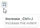
Use the ToolbarItem.Hint property to specify tooltips for ribbon items:
<mxb:ToolbarButtonItem Header="Increase" HotKey="CTRL+J"
  Glyph="{x:Static icons:Basic.Level_Increase}"
  Hint="Increase the indent"/>