Modify Control Themes
A control theme in Avalonia UI is a collection of styles, control themes and resources that define templates and appearance settings of controls.
This topic explains how to modify theme settings and styles for individual Eremex controls or for all Eremex controls in your project.
Default Theme
The Eremex.Avalonia.Themes.DeltaDesign theme is currently the default for Eremex Controls. To use the Eremex Controls library, you need to include this theme in your project and register it in the App.axaml file. Otherwise, the Eremex controls will appear blank.
To modify specific theme settings (for instance, colors or templates of control elements), refer to the theme's source code. You can find and download it from GitHub at: Eremex Controls Themes.
Modification of theme settings involves two steps:
- Identify a target theme setting (style, resource or template) that you need to override.
- Modify the target theme setting for all or individual controls.
Concepts: Locate a Target Style, Resource, or Template
You can explore the theme's source code to identify the theme settings you want to modify.
The image below demonstrates the structure of the DeltaDesign theme source code:
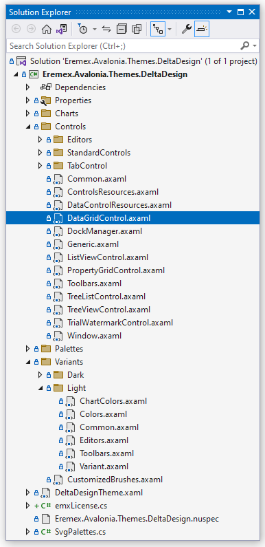
- Controls folder — Contains theme files for the Eremex and standard Avalonia UI controls.
- Charts folder — Contains theme files for the Eremex Chart controls.
- Variants — Contains theme definitions for the
LightandDarktheme variants.
Within these files, theme settings (templates, colors, margins, etc.) are defined as dynamic or static resources.
Declaration of Dynamic Resources in the Eremex Paint Theme
Theme settings that depend on a theme variant (Light or Dark) are defined as dynamic resources (DynamicResource). These theme settings include most colors for the Eremex controls.
The following code snippet shows a style selector that sets the ColumnHeaderControl.Foreground property in a TreeList control. This property determines the foreground color of TreeList column headers. The value of the ColumnHeaderControl.Foreground property is bound to the dynamic resource with the key Text/Neutral/Secondary.
<!-- Eremex.Avalonia.Themes.DeltaDesign\Controls\TreeListControl.axaml -->
<Styles ...>
    <Style Selector="mxdcv|ColumnHeaderControl">
        <Setter Property="Foreground" Value="{DynamicResource Text/Neutral/Secondary}" />
        <!-- ... -->
    </Style>
</Styles>
The Text/Neutral/Secondary resource has different values for the Light and Dark theme variants:
<!-- Eremex.Avalonia.Themes.DeltaDesign\Variants\Light\Colors.axaml file -->
<SolidColorBrush x:Key="Text/Neutral/Secondary" Color="#ff424d4d"/>

<!-- Eremex.Avalonia.Themes.DeltaDesign\Variants\Dark\Colors.axaml file -->
<SolidColorBrush x:Key="Text/Neutral/Secondary" Color="#ffc6d2d2"/>
The Text/Neutral/Secondary resource is used by multiple controls. You can search the theme source code for this key to find all its references.
The paint theme organizes resources for the Light and Dark theme variants into two resource dictionaries:
- Resource dictionary with the key "Default" — Combines resources related to the Light theme variant. See the Eremex.Avalonia.Themes.DeltaDesign\Variants\Light\Variant.axaml file.
- Resource dictionary with the key "Dark" — Combines resources related to the Dark theme variant. See the Eremex.Avalonia.Themes.DeltaDesign\Variants\Dark\Variant.axaml file.
To override dynamic resources for a specific theme variant in your project, you must know the key of its corresponding dictionary ("Default" or "Dark").
Declaration of Static Resources in the Eremex Paint Theme
Many theme settings are identical for the Light and Dark theme variants. These settings are defined as static resources (StaticResource). They include:
- Layout settings (for example, size and margins of UI elements)
- Templates used to render inner elements and context menus
For example, the Eremex.Avalonia.Themes.DeltaDesign\Controls\TreeListControl.axaml file contains theme settings for a TreeList control. In this file, the font size of TreeList column headers is defined as a static resource with the key "ColumnHeaderFontSize".
<!-- Eremex.Avalonia.Themes.DeltaDesign\Controls\TreeListControl.axaml file -->
<Styles ...>
    <Style Selector="mxdcv|ColumnHeaderControl">
        <Setter Property="FontSize" Value="{StaticResource ColumnHeaderFontSize}" />
        <!-- ... -->
    </Style>

    <Styles.Resources>
        <x:Double x:Key="ColumnHeaderFontSize">12</x:Double>
    </Styles.Resources>
</Styles>
Styling with Style Classes
The DeltaDesign theme includes control themes and style selectors that target specific style classes for Eremex and standard Avalonia controls.
When you assign a specific style class to a control (using the control's Classes property), the theme applies a corresponding style selector(s).
For example, to emphasize a CheckBox with a distinct border color, apply the warning style class:

In the DeltaDesign theme, the style selector for the CheckBox with the warning style class is defined as follows:
<!-- Eremex.Avalonia.Themes.DeltaDesign\Controls\StandardControls\CheckBox.axaml -->

<ControlTheme x:Key="{x:Type CheckBox}" TargetType="CheckBox">
    <!-- Warning State -->
    <Style Selector="^.warning /template/ Border#NormalRectangle">
        <Setter Property="BorderBrush" Value="{DynamicResource CheckBoxWarningRectBorderBrush}" />
    </Style>
    <!-- ... -->
</ControlTheme>
Below are main style classes customized by the DeltaDesign theme:
-
accent— Accented appearance settings.- Target standard Avalonia controls: Button and RepeatButton.
-
warning— Appearance settings to indicate warings and errors.- Target standard Avalonia controls: Button, RepeatButton, CheckBox, and RadioButton.
You can combine the
accentandwarningstyle classes: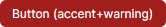
-
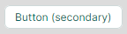
secondary— Appearance settings for controls displayed on a gray background.-
Target Eremex controls: Editors with a built-in text box (TextEditor, ButtonEditor, ComboBoxEditor, SpinEditor, DateEditor, and so on), and SegmentedEditor.
-
Target standard Avalonia controls: TextBox, Button, RepeatButton, ToggleButton, CheckBox, ProgressBar, RadioButton, and Slider.
-
Modify a Shared Dynamic Resource
Multiple controls can use the same dynamic resource.
To modify a shared resource for all target controls across your application, override it at the application level using the Application.Resources property.
To only apply the change within a specific window, use the Window.Resources property instead.
Example — Modify the focused row's border brush for controls in your application for the Light and Dark theme variants
Assume that you need to modify the brush used to paint the focused row's border in DataGrid, TreeList, and ListView controls throughout your application. The new brush should have different values for the Light and Dark theme variants.
The default paint theme defines the focused row's border brush as a dynamic resource with the key Outline/Accent/Focus.
<!-- Eremex.Avalonia.Themes.DeltaDesign\Controls\DataGridControl.axaml file -->
<Style Selector="mxdgv|DataGridRowControl:focusedState /template/ Border#FocusBorder, mxdgv|DataGridRowControl:focusedAndSelectedState /template/ Border#FocusBorder">
    <!-- ... -->
    <Setter Property="BorderBrush" Value="{DynamicResource Outline/Accent/Focus}" />
</Style>

<!-- Eremex.Avalonia.Themes.DeltaDesign\Controls\ListViewControl.axaml -->
<Style Selector="mxl|ListViewGroupControl:focus-visible/template/Rectangle#PART_Border">
    <Setter Property="Stroke" Value="{DynamicResource Outline/Accent/Focus}"/>
</Style>

<!-- Eremex.Avalonia.Themes.DeltaDesign\Controls\TreeListControl.axaml -->
<Style Selector="mxtlv|TreeListRowControl:focusedState /template/ Border#FocusBorder, mxtlv|TreeListRowControl:focusedAndSelectedState /template/ Border#FocusBorder">
    <Setter Property="BorderThickness" Value="1" />
    <Setter Property="BorderBrush" Value="{DynamicResource Outline/Accent/Focus}" />
</Style>
In the default theme, the Outline/Accent/Focus resource has different values for the Light and Dark theme variants:
<!-- Eremex.Avalonia.Themes.DeltaDesign\Variants\Light\Colors.axaml file -->
<ResourceDictionary xmlns="https://github.com/avaloniaui"
  xmlns:x="http://schemas.microsoft.com/winfx/2006/xaml">
    <!-- ... -->
    <SolidColorBrush x:Key="Outline/Accent/Focus" Color="#ff129190"/>
</ResourceDictionary>

<!-- Eremex.Avalonia.Themes.DeltaDesign\Variants\Dark\Colors.axaml file -->
<ResourceDictionary xmlns="https://github.com/avaloniaui"
  xmlns:x="http://schemas.microsoft.com/winfx/2006/xaml">
    <!-- ... -->
    <SolidColorBrush x:Key="Outline/Accent/Focus" Color="#ff36afb0"/>
</ResourceDictionary>
To modify this resource for the Light and Dark theme variants in your application, follow these steps:
-
In your project, create the "ModifiedResources.axaml" file inside the "Resources" folder.
-
Within this file, define two resource dictionaries with the "Default" and "Dark" keys (for the Light and Dark theme variants, respectively).
<ResourceDictionary xmlns="https://github.com/avaloniaui"
                    xmlns:x="http://schemas.microsoft.com/winfx/2006/xaml">
    <ResourceDictionary.ThemeDictionaries>

        <!-- Override resources for the Light theme variant -->
        <ResourceDictionary x:Key="Default">

        </ResourceDictionary>

        <!-- Override resources for the Dark theme variant -->
        <ResourceDictionary x:Key="Dark">

        </ResourceDictionary>

    </ResourceDictionary.ThemeDictionaries>
</ResourceDictionary>
- Define new values for the Outline/Accent/Focus resource in the "Default" and "Dark" resource dictionaries:
<ResourceDictionary xmlns="https://github.com/avaloniaui"
                    xmlns:x="http://schemas.microsoft.com/winfx/2006/xaml">
    <ResourceDictionary.ThemeDictionaries>

        <!-- Override resources for the Light theme variant -->
        <ResourceDictionary x:Key="Default">
            <SolidColorBrush x:Key="Outline/Accent/Focus" Color="Blue"/>
        </ResourceDictionary>

        <!-- Override resources for the Dark theme variant -->
        <ResourceDictionary x:Key="Dark">
            <SolidColorBrush x:Key="Outline/Accent/Focus" Color="Orange"/>
        </ResourceDictionary>

    </ResourceDictionary.ThemeDictionaries>
</ResourceDictionary>
- In your
App.axamlfile, merge the resources from the "Resources/ModifiedResources.axaml" file into the application's resources.
<Application ...>
    <Application.Resources>
        <ResourceDictionary>
            <ResourceDictionary.MergedDictionaries>
                <ResourceInclude Source="/Resources/ModifiedResources.axaml"/>
            </ResourceDictionary.MergedDictionaries>
        </ResourceDictionary>
    </Application.Resources>
</Application>
- Run the application to see the result. When the light theme variant is active, the focused row border is painted in blue. When the dark theme variant is applied, the orange color is used.
Modify Theme Resources for a Specific Control
You can use a control's Resources property to change specific resources for this control only.
This modification does not affect other controls.
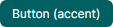
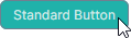
Example - Modify an individual Button's color in the pressed and focused states
The DeltaDesign theme includes control themes and style selectors that adjust the colors of standard Avalonia UI controls to match the appearance of Eremex controls when placed on the same window.
The following image shows the default appearance of the standard Button control in the pressed state painted by the DeltaDesign theme:
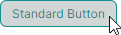
In the pressed state, the following style selectors are applied:
<!-- Eremex.Avalonia.Themes.DeltaDesign\Controls\StandardControls\Button.axaml -->
<ControlTheme x:Key="{x:Type Button}" TargetType="Button">
    <!-- Pressed State -->
    <Style Selector="^:pressed">
        <Style Selector="^ /template/ Border#PART_BackgroundBorder">
            <Setter Property="Background" Value="{DynamicResource ButtonBackgroundPressed}" />
        </Style>
        <Style Selector="^  /template/ ContentPresenter#PART_ContentPresenter">
            <Setter Property="Foreground" Value="{DynamicResource ButtonForegroundPressed}" />
            <Setter Property="Opacity" Value="0.8"/>
        </Style>
    </Style>
    <!--Focus Border-->
    <Style Selector="^:focus /template/ Border#PART_ButtonBorder">
        <Setter Property="BorderBrush" Value="{DynamicResource ButtonFocusBorderBrush}" />
        <Setter Property="BorderThickness" Value="{StaticResource EditorBorderThickness}"/>
    </Style>
    <!-- ... -->
</ControlTheme>
To change the colors of a single Button in the pressed and focused state, modify the ButtonBackgroundPressed, ButtonForegroundPressed and ButtonFocusBorderBrush resources from the Button.Resources property.
<Button Content="Simple Button" HorizontalAlignment="Center" >
    <Button.Resources>
        <SolidColorBrush x:Key="ButtonBackgroundPressed" Color="LightSeaGreen" />
        <SolidColorBrush x:Key="ButtonForegroundPressed" Color="Snow" />
        <SolidColorBrush x:Key="ButtonFocusBorderBrush" Color="SlateGray" />
    </Button.Resources>
</Button>
Modify Theme Resources for Controls Within a Window
You can change theme resources from the Window.Resources property to apply theme modifications to corresponding controls within this window.
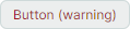
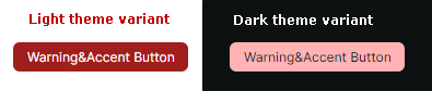
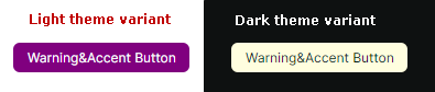
Example - Modify accented buttons within a Window for the Light and Dark theme variants
The DeltaDesign theme contains specific style selectors applied when you set the accent and/or warning style classes for the standard Avalonia Button control. This example shows how to override the appearances settings of accented buttons in a Window for the Light and Dark theme variants.
You can apply the accent and warning style classes to emphasize a button:
Refer to the Eremex.Avalonia.Themes.DeltaDesign\Controls\StandardControls\Button.axaml file to see style selectors applied to accented buttons in the normal, hovered, pressed and disabled states. The code snippet below demonstrates two style selectors for an accented button's normal state:
<!-- Eremex.Avalonia.Themes.DeltaDesign\Controls\StandardControls\Button.axaml file -->
<ControlTheme x:Key="{x:Type Button}" TargetType="Button">
    <!-- WarningAccent style -->
    <Style Selector="^.warning.accent">
        <Style Selector="^ /template/ Border#PART_BackgroundBorder">
            <Setter Property="Background" Value="{DynamicResource ButtonWarningAccentBackground}" />
        </Style>
        <Style Selector="^ /template/ ContentPresenter#PART_ContentPresenter">
            <Setter Property="Foreground" Value="{DynamicResource ButtonWarningAccentForeground}" />
        </Style>
        <!-- ... -->
    </Style>
    <!-- ... -->
</ControlTheme>
Use the Window.Resources property to override the background colors for accented buttons for the Light and Dark theme variants at the window level. The code below overrides the corresponding theme resources in the Default (Light) and Dark resource dictionaries:
<mx:MxWindow
    xmlns:mx="https://schemas.eremexcontrols.net/avalonia">

    <mx:MxWindow.Resources>
        <ResourceDictionary>
            <ResourceDictionary.ThemeDictionaries>
                <!--Resources for the Light theme variant-->
                <ResourceDictionary x:Key="Default">
                    <SolidColorBrush x:Key="ButtonWarningAccentBackground" Color="Purple" />
                </ResourceDictionary>

                <!--Resources for the Dark theme variant-->
                <ResourceDictionary x:Key="Dark">
                    <SolidColorBrush x:Key="ButtonWarningAccentBackground" Color="LightYellow" />
                </ResourceDictionary>
            </ResourceDictionary.ThemeDictionaries>
        </ResourceDictionary>
    </mx:MxWindow.Resources>
    <!-- ... -->
</mx:MxWindow>
You can also modify the brushes for other button states:
- Hovered —
ButtonWarningAccentBackgroundPointerOverandButtonWarningAccentForegroundPointerOver - Pressed —
ButtonWarningAccentBackgroundPressedandButtonWarningAccentForegroundPressed - Disabled —
ButtonWarningAccentBackgroundDisabledandButtonWarningAccentForegroundDisabled.
Modify Control Styles Defined in the Eremex Paint Theme
When you explore the DeltaDesign paint theme source code, you'll find style selectors that change not only the colors and brushes, but also other appearance settings of controls. These include the size of inner elements and the control templates that define layout and content.
You can override these style selectors in your application using the following properties:
Application.Styles— A collection of styles applied to controls throughout the application.Window.Styles— A collection of styles applied to controls within a window.Control.Styles— A collection of styles applied to a specific control.
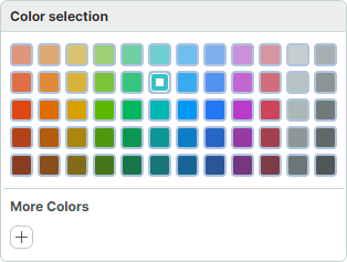
Example - Modify a style for a color toggle button in a ColorEditor control at the application level
This example shows how to change the appearance and template of color toggle buttons in the ColorEditor and PopupColorEditor controls. New styles are applied to all ColorEditor and PopupColorEditor controls within the application.
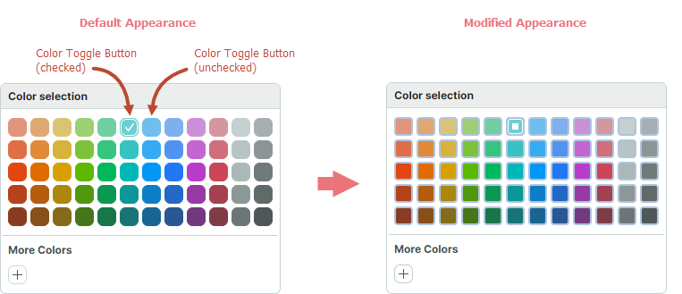
First, locate the default style for color toggle buttons in the DeltaDesign theme source code.
<!-- Eremex.Avalonia.Themes.DeltaDesign\Controls\Editors\ColorEditor.axaml -->
<!--Color Toggle Button-->
<ControlTheme x:Key="{x:Type mxev:ColorToggleButton}" TargetType="mxev:ColorToggleButton">
    <Setter Property="CornerRadius" Value="{StaticResource EditorCornerRadius}"/>
    <Setter Property="BorderThickness" Value="{StaticResource EditorBorderThickness}"/>
    <Setter Property="Width" Value="{StaticResource ColorButtonDefaultSize}"/>
    <!-- ... -->
    <Setter Property="Template">
        <ControlTemplate>
            <Border x:Name="PART_ExternalBorder"
                    CornerRadius="{TemplateBinding CornerRadius}"
                    BorderThickness="{TemplateBinding BorderThickness}"
                    ...>
                <Border x:Name="PART_InternalBorder"
                        CornerRadius="{TemplateBinding CornerRadius}"
                        BorderThickness="{TemplateBinding BorderThickness}"
                        ...>
                    <Path x:Name="PART_CheckGlyph"
                            Stretch="None"
                            Fill="{Binding $parent[mxev:ColorToggleButton].BorderBrush}"
                            Data="{StaticResource CheckBoxCheckIcon}"
                            .../>
                </Border>
            </Border>
        </ControlTemplate>
    </Setter>
</ControlTheme>
Follow the steps below to change the appearance of color toggle buttons at the application level:
-
Create the "ModifiedStyles.axaml" file inside the "Resources" folder of your project.
-
Add the following code to the "ModifiedStyles.axaml" file. This code overrides the styles for the
ColorToggleButtonclass
<Styles xmlns="https://github.com/avaloniaui"
        xmlns:x="http://schemas.microsoft.com/winfx/2006/xaml"
        xmlns:mxev="clr-namespace:Eremex.AvaloniaUI.Controls.Editors.Visuals;assembly=Eremex.Avalonia.Controls">
    <Styles.Resources>
        <RectangleGeometry x:Key="ColorCheckedIcon" Rect="0,0,7,7" />
    </Styles.Resources>

    <Style Selector="mxev|ColorToggleButton">
        <Setter Property="CornerRadius" Value="3"/>
        <Setter Property="Template">
            <ControlTemplate>
                <Border x:Name="PART_ExternalBorder"
                                CornerRadius="{TemplateBinding CornerRadius}"
                                BorderThickness="2"
                                BorderBrush="LightSteelBlue"
                                Background="{TemplateBinding Background}">
                    <Border x:Name="PART_InternalBorder"
                                    CornerRadius="{TemplateBinding CornerRadius}"
                                    BorderThickness="{TemplateBinding BorderThickness}"
                                    BorderBrush="{TemplateBinding BorderBrush}"
                                    Background="{TemplateBinding Background}">
                        <Path x:Name="PART_CheckGlyph"
                                    Stretch="None"
                                    VerticalAlignment="Center"
                                    HorizontalAlignment="Center"
                                    Data="{StaticResource ColorCheckedIcon}"
                                    Margin="0"
                                    Width = "7"
                                    Height="7"
                        />
                    </Border>
                </Border>
            </ControlTemplate>
        </Setter>
    </Style>
</Styles>
- In the
App.axamlfile, merge the styles from the "Resources/ModifiedStyles.axaml" file into theApplication.Stylescollection.
<Application ...>
    <Application.Styles>
        <theme:DeltaDesignTheme/>
        <StyleInclude Source="/Resources/ModifiedStyles.axaml"/>
    </Application.Styles>
</Application>
- Run the application to see the result.