Toolbar Items
Toolbar items are used to display buttons, check buttons, text labels, sub-menus, and in-place editors in toolbars and menus. You can add any number of items to each bar/menu, and create multiple hierarchy levels using sub-menus.
Add Toolbar Items to a Bar and Context Menu
Use the Toolbar.Items and PopupMenu.Items collections to populate bars and menus with items. In XAML, you can define items directly between the start and end <Toolbar>/<PopupMenu> tags.
The following example displays three items in a toolbar.
xmlns:mxb="https://schemas.eremexcontrols.net/avalonia/bars"

<mxb:Toolbar x:Name="EditToolbar" ToolbarName="Edit" ShowCustomizationButton="False">
    <mxb:ToolbarButtonItem Header="Cut" Command="{Binding #textBox.Cut}"
     IsEnabled="{Binding #textBox.CanCut}"
     Glyph="{SvgImage 'avares://DemoCenter/Images/Group=Context Menu, Icon=Cut.svg'}"
     Category="Edit"/>
    <mxb:ToolbarButtonItem Header="Copy" Command="{Binding #textBox.Copy}"
     IsEnabled="{Binding #textBox.CanCopy}"
     Glyph="{SvgImage 'avares://DemoCenter/Images/Group=Context Menu, Icon=Copy.svg'}"
     Category="Edit"/>
    <mxb:ToolbarButtonItem Header="Paste" Command="{Binding #textBox.Paste}"
     IsEnabled="{Binding #textBox.CanPaste}"
     Glyph="{SvgImage 'avares://DemoCenter/Images/Group=Context Menu, Icon=Paste.svg'}"
     Category="Edit"/>
</mxb:Toolbar>
Toolbar Item Types
The toolbar library supports multiple toolbar item types. All of them are descendants of the ToolbarItem class, which contains settings common to all toolbar items.
Common Toolbar Item Settings
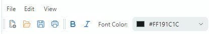
Alignment— The item's alignment within the toolbar.Category— The category to which the item belongs. Categories are used to organize items into logical groups within the Customization window. See the following section for more information: Toolbar Item Categories.Command— A command executed when the button is clicked.CommandParameter— A command parameter passed to the specified command.DisplayMode— Gets or sets whether to display only the glyph, the header, or both.Glyph— The item's image.GlyphAlignment— The glyph alignment relative to the item's header.GlyphSize— The glyph display size.Header— The item's display text.ShowSeparator— Gets or sets whether to display a separator before the item. You can also use theToolbarSeparatorItembar item to insert a separator.
Events
Click— Fires when the item is left-clicked (after the left mouse button is pressed and then released).Press— Fires when any mouse button is pressed over the item.
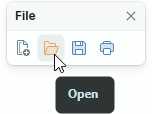
Regular and Dropdown Buttons (ToolbarButtonItem)
Use ToolbarButtonItem to create regular buttons. A click on a regular button invokes a linked command (Command) and events (Click and Press).
xmlns:mxb="https://schemas.eremexcontrols.net/avalonia/bars"

<mxb:ToolbarButtonItem Header="Open"
 Glyph="{SvgImage 'avares://bars_sample/Images/Toolbars/FileOpen.svg'}"
 Category="File" Command="{Binding OpenFileCommand}"/>
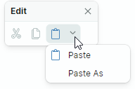
You can associate a dropdown control or menu with a ToolbarButtonItem object. In this case, ToolbarButtonItem can act as a dropdown button, invoking the specified dropdown control/menu on clicking the item or the built-in down arrow.
xmlns:mxb="https://schemas.eremexcontrols.net/avalonia/bars"

<mxb:ToolbarButtonItem Header="Paste"
                       Command="{Binding #textBox.Paste}"
                       IsEnabled="{Binding #textBox.CanPaste}"
                       Glyph="{SvgImage 'avares://bars_sample/Images/Toolbars/EditPaste.svg'}"
                       Category="Edit"
                       DropDownArrowVisibility="ShowArrow" DropDownArrowAlignment="Default"
                       >
    <mxb:ToolbarButtonItem.DropDownControl>
        <mxb:PopupMenu>
            <mxb:ToolbarButtonItem Header="Paste" Command="{Binding #textBox.Paste}"
             IsEnabled="{Binding #textBox.CanPaste}"/>
            <mxb:ToolbarButtonItem Header="Paste As" Command="{Binding PasteAsCommand}"
             IsEnabled="{Binding #textBox.CanPaste}"/>
        </mxb:PopupMenu>
    </mxb:ToolbarButtonItem.DropDownControl>
</mxb:ToolbarButtonItem>
Button's Main Settings
-
DropDownControl— Gets or sets a dropdown control (anEremex.AvaloniaUI.Controls.Bars.IPopupobject) associated with the item. The control pops up when a user clicks the item or the built-in down arrow button (seeDropDownArrowVisibility). The following objects implement theEremex.AvaloniaUI.Controls.Bars.IPopupinterface, and so they can be displayed as dropdown controls:Eremex.AvaloniaUI.Controls.Bars.PopupMenu— A popup menu. You can add all types of toolbar items to the menu to populate it with content.Eremex.AvaloniaUI.Controls.Bars.PopupContainer— A container of controls. UsePopupContainerto display custom controls in a dropdown.
-
DropDownArrowVisibility— Gets or sets whether the item displays a dropdown arrow used to invoke the associated dropdown control.
-
ShowArrow— The dropdown arrow is visible. The item and arrow act as a single button. A click on them displays an associated dropdown control. -
ShowSplitArroworDefault— The dropdown arrow is visible. It acts as a separate button embedded in the item. A click on the item invokes its command (Command) and events (ClickandPress). -
Hide— The dropdown arrow is hidden. A click on the item invokes the dropdown control.
-
-
DropDownArrowAlignment— Gets or sets the position of the dropdown arrow. DropDownOpenMode— Gets or sets whether and when the dropdown control is invoked when a user touches the item/dropdown arrow. Supported options include:PressorDefault— The dropdown is displayed on a mouse press event.Click— The dropdown is displayed after the mouse is pressed and then released over the item.Never— The dropdown is not displayed.
DropDownPress— The event that fires when the dropdown arrow is pressed.
See also: Common Toolbar Item Settings.
Check Buttons (ToolbarCheckItem)
ToolbarCheckItem encapsulates a check button, which supports two states - normal and pressed.

xmlns:mxb="https://schemas.eremexcontrols.net/avalonia/bars"

<mxb:ToolbarCheckItem Header="Bold"
 IsChecked="{Binding #textBox.FontWeight,
  Converter={helpers:BoolToFontWeightConverter}, Mode=TwoWay}"
 Glyph="{SvgImage 'avares://DemoCenter/Images/FontBold.svg'}" Category="Font"/>
Check Button's Main Settings and Events
IsChecked— Gets or sets the button's check state.-
CheckedChanged— The event that fires when the check state changes. -
CheckBoxStyle— Gets or sets display mode for aToolbarCheckItemobject. Available options include: -
CheckBoxStyle.CheckButton— The item is rendered as a check button. WhenIsCheckedistruethe button appears in the pressed state.
-
CheckBoxStyle.CheckBox— The item displays a toggle box before its text and glyph. WhenIsCheckedistruethe toggle box has a check mark.
-
CheckBoxStyle.RadioButton— The item displays a radio button before its text and glyph. WhenIsCheckedistruethe radio button is rendered as a filled circle.You can apply the RadioButton style to
ToolbarCheckItemobjects combined in a check group (ToolbarCheckItemGroup). In this case, the group appears as a typical radio group.<mxb:ToolbarCheckItemGroup CheckType="Radio"> <mxb:ToolbarCheckItem Header="E-mail" CheckBoxStyle="RadioButton" /> <mxb:ToolbarCheckItem Header="Phone" CheckBoxStyle="RadioButton" /> </mxb:ToolbarCheckItemGroup>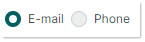
-
CheckBoxAlignment— Gets or sets whether the check box (or radio button) are displayed before or after an item's glyph and text. This option is in effect when theCheckBoxStyleproperty is set toCheckBoxStyle.CheckBoxorCheckBoxStyle.RadioButton.<mxb:ToolbarCheckItem Header="Status bar" CheckBoxAlignment="After" CheckBoxStyle="CheckBox" Hint="Show and hide the status bar"/> <mxb:ToolbarSeparatorItem/>
See also: Common Toolbar Item Settings.
Sub-Menus (ToolbarMenuItem)
ToolbarMenuItem is an item that displays a sub-menu on a click.
To specify a sub-menu's content, define items between the start and end <ToolbarMenuItem> tags in XAML, or add items to the ToolbarMenuItem.Items collection in code-behind.
xmlns:mxb="https://schemas.eremexcontrols.net/avalonia/bars"

<mxb:ToolbarMenuItem Header="File" Category="File">
    <mxb:ToolbarButtonItem Header="New"
     Glyph="{SvgImage 'avares://DemoCenter/Images/Group=Context Menu, Icon=NewDraftAction.svg'}"
     Category="File" Command="{Binding NewFileCommand}"/>
    <mxb:ToolbarButtonItem Header="Open"
     Glyph="{SvgImage 'avares://DemoCenter/Images/Group=Basic, Icon=Folder Open.svg'}"
     Category="File" Command="{Binding OpenFileCommand}"/>
    <mxb:ToolbarButtonItem Header="Save"
     Glyph="{SvgImage 'avares://DemoCenter/Images/Group=Basic, Icon=Save.svg'}"
     Category="File" Command="{Binding SaveFileCommand}"/>
    <mxb:ToolbarButtonItem Header="Print"
     Glyph="{SvgImage 'avares://DemoCenter/Images/Group=Basic, Icon=Print.svg'}"
     ShowSeparator="True"  Category="File" Command="{Binding PrintFileCommand}"/>
</mxb:ToolbarMenuItem>
Sub-menu's Main Settings and Events
DropDownOpenMode— Gets or sets whether and how the sub-menu is invoked when a user touches the item. Supported options include:PressorDefault— The menu is displayed on a mouse press event.Click— The menu is displayed after the mouse is pressed and then released over the item.Never— The menu is not displayed.
Items— A collection of items displayed in the sub-menu.ItemsSource— A collection of business objects in a View Model from which the sub-menu's items are created. Corresponding data templates should define toolbar items and initialize their settings from underlying business objects.
Events
Opening— Fires when the menu is about to be displayed. This event allows you to cancel the display of the menu.Opened— Fires after the menu is displayed.Closing— Fires when the menu is about to be closed. This event allows you to cancel closing the menu.Closed— Fires after the menu is closed.
See also: Common Toolbar Item Settings.
In-place Editors (ToolbarEditorItem)
ToolbarEditorItem allows you to display an in-place editor.
To specify the in-place editor's type and settings, use the ToolbarEditorItem.EditorProperties property. You can set ToolbarEditorItem.EditorProperties to one of the following objects:
ButtonEditorProperties— Corresponds to aButtonEditorin-place editor.CheckEditorProperties— Corresponds to aCheckEditorin-place editor.ColorEditorProperties— Corresponds to aColorEditorin-place editor.ComboBoxEditorProperties— Corresponds to aComboBoxEditorin-place editor.HyperlinkEditorProperties— Corresponds to aHyperlinkEditorin-place editor.PopupColorEditorProperties— Corresponds to aPopupColorEditorin-place editor.PopupEditorProperties— Corresponds to aPopupEditorin-place editor.SegmentedEditorProperties— Corresponds to aSegmentedEditorin-place editor.SpinEditorProperties— Corresponds to aSpinEditorin-place editor.TextEditorProperties— Corresponds to aTextEditorin-place editor.MemoEditorProperties— Corresponds to aMemoEditorin-place editor.
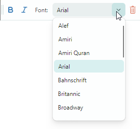
In the following example, the Font ToolbarEditorItem object displays a list of fonts using a combobox in-place editor. The ToolbarEditorItem.EditorProperties property is set to a ComboBoxEditorProperties, which corresponds to a ComboBoxEditor control.
<mxb:ToolbarEditorItem Header="Font:" EditorWidth="150" Category="Font"
 EditorValue="{Binding #textBox.FontFamily, Converter={helpers:FontNameToFontFamilyConverter}}">
    <mxb:ToolbarEditorItem.EditorProperties>
        <mxe:ComboBoxEditorProperties
         ItemsSource="{Binding $parent[view:ToolbarAndMenuPageView].Fonts}"
         IsTextEditable="False" PopupMaxHeight="300"/>
    </mxb:ToolbarEditorItem.EditorProperties>
</mxb:ToolbarEditorItem>
In-place Editor's Main Settings and Events
ToolbarEditorItem.EditorProperties— Gets or sets the object that specifies the type and settings of the in-place editor.ToolbarEditorItem.EditorValue— Gets or sets the in-place editor's value. Use this property for data binding.ToolbarEditorItem.SizeMode— Gets or sets the item's size mode. This property allows you to stretch the bar item, so it occupues all the available empty space within the bar.ToolbarEditorItem.EditorWidth— Gets or sets the in-place editor's width.ToolbarEditorItem.EditorHeight— Gets or sets the in-place editor's height.-
ToolbarEditorItem.EditorAlignment— Gets or sets the editor's alignment relative to the item's header. -
ToolbarEditorItem.EditorValueChanged— The event that fires after the editor's value is changed.
See also: Common Toolbar Item Settings.
Text Labels (ToolbarTextItem)
ToolbarTextItem displays a text label specified by the ToolbarTextItem.Header property. Use this item to render text that is not editable by users.
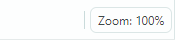
<mxb:ToolbarTextItem
 Header="{Binding #scaleDecorator.Scale, StringFormat={}Zoom: {0:P0}}"
 ShowBorder="True" Alignment="Far" ShowSeparator="True" Category="Info"
 CustomizationName="Zoom Info"/>
Text Label's Main Settings and Events
ToolbarTextItem.SizeMode— Gets or sets the item's size mode. This property allows you to stretch the item, so it occupues all the available empty space within the bar.ToolbarTextItem.ShowBorder— Gets or sets whether the item's border is visible. You can use theToolbarTextItem.BorderTemplateproperty to specify a custom template to paint the border.ToolbarTextItem.BorderTemplate— Gets or sets a custom template to paint the item's border. This template is in effect if theToolbarTextItem.ShowBorderoption is enabled.
See also: Common Toolbar Item Settings.
Non-Breaking Groups of Items (ToolbarItemGroup)
Use ToolbarItemGroup to create a non-breaking group of toolbar items. A non-breaking group is a container of items that acts as a whole when its parent is resized (the contents of the group cannot be partially hidden; items are always displayed in a single line and do not support wrapping).

To specify the group's contents, define items between the start and end <ToolbarItemGroup> tags, or add items to the ToolbarItemGroup.Items collection in code-behind.
<mxb:ToolbarItemGroup CustomizationName="Clipboard" >
    <mxb:ToolbarButtonItem Header="Cut" Command="{Binding #textBox.Cut}"
     IsEnabled="{Binding #textBox.CanCut}"
     Glyph="{SvgImage 'avares://DemoCenter/Images/Group=Context Menu, Icon=Cut.svg'}"
     Category="Edit"/>
    <mxb:ToolbarButtonItem Header="Copy" Command="{Binding #textBox.Copy}"
     IsEnabled="{Binding #textBox.CanCopy}"
     Glyph="{SvgImage 'avares://DemoCenter/Images/Group=Context Menu, Icon=Copy.svg'}"
     Category="Edit"/>
    <mxb:ToolbarButtonItem Header="Paste" Command="{Binding #textBox.Paste}"
     IsEnabled="{Binding #textBox.CanPaste}"
     Glyph="{SvgImage 'avares://DemoCenter/Images/Group=Context Menu, Icon=Paste.svg'}"
     Category="Edit"/>
</mxb:ToolbarItemGroup>
Group's Main Settings and Events
ToolbarItemGroup.Items— Allows you to access the group's children.
Non-Breaking Groups of Check Items (ToolbarCheckItemGroup)
Use ToolbarCheckItemGroup to create a non-breaking group of check items. A non-breaking group is a container of items that acts as a whole when its parent is resized (the contents of the group cannot be partially hidden; items are always displayed in a single line and do not support wrapping).

The ToolbarCheckItemGroup container can control the check state of its child items (ToolbarCheckItem objects). You can use ToolbarCheckItemGroup to create the following group types:
- A group of mutually exclusive items (radio group).
- A group that allows multiple items to be checked at the same time.
To specify the group's content, add ToolbarCheckItem items between the start and end <ToolbarCheckItemGroup> tags in XAML, or add items to the ToolbarCheckItemGroup.Items collection in code-behind.
<mxb:ToolbarCheckItemGroup CustomizationName="Check group" CheckType="Radio" >
    <mxb:ToolbarCheckItem Header="1" IsChecked="{Binding Option1}"
     Category="Settings"/>
    <mxb:ToolbarCheckItem Header="2" IsChecked="{Binding Option2}"
     Category="Settings"/>
    <mxb:ToolbarCheckItem Header="3" IsChecked="{Binding Option3}"
     Category="Settings"/>
</mxb:ToolbarCheckItemGroup>
A ToolbarCheckItemGroup object accepts child items of all supported bar item types. The group, however, only manipilates the check states of nested ToolbarCheckItem objects.
Check Group's Main Settings and Events
-
ToolbarCheckItemGroup.CheckType— Gets or sets whether a single or multiple items can be checked in the group at a time. The following options are supported:DefaultorMultiple— Multiple items can be checked at a time.Radio— A group of mutually exclusive items. A user cannot uncheck an item other than by checking another one.Single— A group of mutually exclusive items. A user can uncheck all items within the group.
-
ToolbarCheckItemGroup.Items— Allows you to access the group's children.
See also: Common Toolbar Item Settings.
Separators (ToolbarSeparatorItem)
ToolbarSeparatorItem draws a separator.

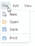
<mxb:ToolbarMenuItem Header="File" Category="File">
    <mxb:ToolbarButtonItem Header="New"
     Glyph="{SvgImage 'avares://DemoCenter/Images/Group=Context Menu, Icon=NewDraftAction.svg'}"
     Category="File"/>
    <mxb:ToolbarButtonItem Header="Open"
     Glyph="{SvgImage 'avares://DemoCenter/Images/Group=Basic, Icon=Folder Open.svg'}"
     Category="File"/>
    <mxb:ToolbarButtonItem Header="Save"
     Glyph="{SvgImage 'avares://DemoCenter/Images/Group=Basic, Icon=Save.svg'}"
     Category="File"/>
    <mxb:ToolbarSeparatorItem/>
    <mxb:ToolbarButtonItem Header="Print"
     Glyph="{SvgImage 'avares://DemoCenter/Images/Group=Basic, Icon=Print.svg'}"
     Category="File"/>
</mxb:ToolbarMenuItem>
Toolbar Item Categories
You can classify toolbar items into categories to enable item grouping in the Customization Window. A user can select a category in the Customization Window to access related items.
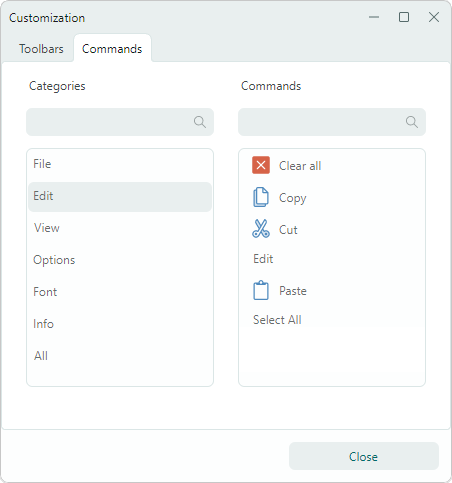
Use the ToolbarItem.Category property to assign an item to a category. This property specifies the category name. To assign a group of items to the same category, set their ToolbarItem.Category property to the same category name.
<mxb:ToolbarMenuItem Header="Edit" Category="Edit">
    <mxb:ToolbarButtonItem Header="Cut"
     Glyph="{SvgImage 'avares://DemoCenter/Images/Group=Context Menu, Icon=Cut.svg'}"
     Category="Edit"/>
    <mxb:ToolbarButtonItem Header="Copy"
     Glyph="{SvgImage 'avares://DemoCenter/Images/Group=Context Menu, Icon=Copy.svg'}"
     Category="Edit"/>
    <mxb:ToolbarButtonItem Header="Paste"
     Glyph="{SvgImage 'avares://DemoCenter/Images/Group=Context Menu, Icon=Paste.svg'}"
     Category="Edit"/>
    <mxb:ToolbarButtonItem Header="Select All"
     Command="{Binding #textBox.SelectAll}" Category="Edit" ShowSeparator="True"/>
    <mxb:ToolbarButtonItem Header="Clear all"
     Command="{Binding #textBox.Clear}"
     Glyph="{SvgImage 'avares://DemoCenter/Images/Group=Basic, Icon=Clear.svg'}"
     Category="Edit"/>
</mxb:ToolbarMenuItem>
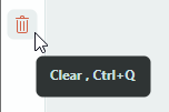
Hotkeys
You can use the ToolbarItem.HotKey property to assign hotkeys to items.
<mxb:ToolbarButtonItem
    Header="Clear" Command="{Binding #textBox.Clear}" HotKey="Ctrl+Q"
    Glyph="{SvgImage 'avares://bars_sample/Images/Toolbars/EditDelete.svg'}"/>
A hotkey press activates an item's command provided that focus is within the hotkey scope. The default hotkey scope is the UI region within the ToolbarManager component's bounds. When the input focus is beyond the hotkey scope, ToolbarManager is not able to intercept hotkeys.
The ToolbarManager.IsWindowManager property allows you to extend the hotkey scope to the entire window. When you set this property to true, the ToolbarManager component registers item hotkeys in the window. It will be able to intercept and process hotkeys even if focus is outside its client area.
Displaying Hotkeys
Hotkeys assigned to toolbar items are displayed in the following cases:
- In items when they reside within sub-menus or popup menus.
- In items' tooltips.
You can use the ToolbarItem.HotKeyDisplayString property to specify a hotkey display text. This text is displayed even if no hotkey is assigned to the item. This is helpful if a target hotkey is already registered by another object to perform a specific operation, and you want to indicate that the same hotkey is linked to a toolbar item.
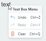
For instance, a TextBox registers the Ctrl+Z shortcut to perform an Undo operation. If a toolbar item performs the same Undo operation on the TextBox, do not assign the Ctrl+Z hotkey to the item. Instead, set the item's ToolbarItem.HotKeyDisplayString to "Ctrl+Z" to display this shortcut to users in tooltips and sub-menus/popup menus.
<mxb:ToolbarButtonItem Header="Undo" HotKeyDisplayString="Ctrl+Z"
    Command="{Binding $parent[TextBox].Undo}"
    IsEnabled="{Binding $parent[TextBox].CanUndo}"
    Glyph="{SvgImage 'avares://bars_sample/Images/Toolbars/EditUndo.svg'}"/>