CalendarControl
The CalendarControl displays a calendar that allows a user to select a date. The control's navigation header displays buttons to browse through months and years.
The control's main features include:
- Date selection in the calendar using the mouse and keyboard.
- Navigation bar allows for browsing through months and years.
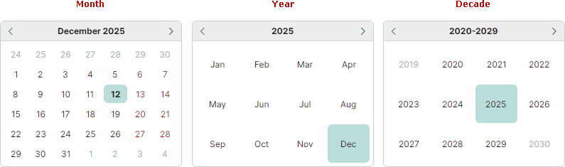
- Three calendar views: month view, year view, and year range view.
- An option to limit the available date range.
Select a Date
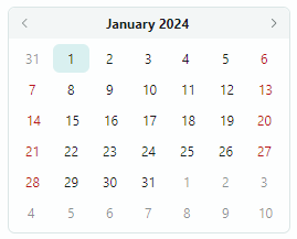
A user can select a date in the calendar using the mouse and keyboard arrow keys.
The calendar's navigation header allows a user to browse through months and years. Clicking the header text zooms out the current view: - In the month view, a click on the header switches to the year view. - In the year view, a click on the header switches to the year range view.
Use the CalendarControl.SelectedDate property to select a date or read the currently selected date.
Customize the Calendar
Use the following properties to set up the calendar:
FirstDayOfWeek— Gets or sets the day of the week that comes first in the calendar's month view.IsTodayHighlighted— Gets or sets whether to highlight the Today's date in the calendar.DisplayDateStart— Specifies the minimum allowed date. TheDisplayDateStartandDisplayDateEndproperties allow you to specify the range of values displayed in the calendar.DisplayDateEnd— Specifies the maximum allowed date.-
DisplayMode— Gets or sets the calendar's view mode (Month,Year, orDecade):