GroupBox
GroupBox is a panel that has a header and a line at the bottom that visually separates the GroupBox from other controls.
GroupBox is a Avalonia.Controls.Primitives.HeaderedContentControl descendant.
Specify a Header
Use the Header property to set the GroupBox's header. The HeaderTemplate property allows you to set the template to render the control's header in a custom manner.
Related Members
ShowHeader— Gets or sets whether the header is visible.HeaderHorizontalAlignment— Specifies the header's horizontal alignment.HeaderVerticalAlignment— Specifies the header's vertical alignment.
Define the Content
You can specify the GroupBox's content in XAML between the start and end <GroupBox> tags. In code, use the inherited Content property for this purpose. You can set the ContentTemplate property to specify the template used to render the control's content.
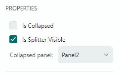
Example
The following example defines a GroupBox that displays a StackPanel with controls.
xmlns:mxe="https://schemas.eremexcontrols.net/avalonia/editors"

<mxe:GroupBox Header="PROPERTIES">
    <StackPanel>
        <mxe:CheckEditor x:Name="IsCollapsedSelector"
         Content="Is Collapsed" Classes="LayoutItem"/>
        <mxe:CheckEditor x:Name="IsSplitterVisibleSelector"
         Content="Is Splitter Visible" IsChecked="True"
         Classes="LayoutItem"/>
        <DockPanel>
            <Label Content="Collapsed panel:" Classes="LayoutItem"/>
            <mxe:ComboBoxEditor EditorValue="{Binding CollapsedPanel, Mode=TwoWay}"
            ItemsSource="{mxc:EnumItemsSource EnumType=mxe:SplitContainerControlCollapsePanel}"/>
        </DockPanel>
    </StackPanel>
</mxe:GroupBox>