SplitButton
MxSplitButton combines two buttons in one control. The primary button executes the main action, which can be implemented as a command or an event. The secondary button activates an associated dropdown control (menu), in which you can display custom content or commands.
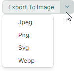
The following image demonstrates a SplitButton that displays a PopupMenu as a dropdown control.
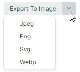
The code used to create this button is shown below. See the DemoCenter application for the complete example.
xmlns:mx="https://schemas.eremexcontrols.net/avalonia"
xmlns:mxb="https://schemas.eremexcontrols.net/avalonia/bars"

<mx:MxSplitButton Name="splitButton1"
                  Content="Export To Image" Margin="0,8,0,0"
                  Command="{Binding ExportImageCommand}"
                  CommandParameter="{x:Static exports:MxImageFormat.Jpeg}"
                  HorizontalAlignment="Left" Grid.Row="6"
                  >
    <mx:MxSplitButton.DropDownControl>
        <mxb:PopupMenu>
            <mxb:ToolbarButtonItem Header="Jpeg" Command="{Binding ExportImageCommand}" CommandParameter="{x:Static exports:MxImageFormat.Jpeg}"/>
            <mxb:ToolbarButtonItem Header="Png" Command="{Binding ExportImageCommand}" CommandParameter="{x:Static exports:MxImageFormat.Png}"/>
            <mxb:ToolbarButtonItem Header="Svg" Command="{Binding ExportImageCommand}" CommandParameter="{x:Static exports:MxImageFormat.Svg}"/>
            <mxb:ToolbarButtonItem Header="Webp" Command="{Binding ExportImageCommand}" CommandParameter="{x:Static exports:MxImageFormat.Webp}"/>
        </mxb:PopupMenu>
    </mx:MxSplitButton.DropDownControl>
</mx:MxSplitButton>
Content
Use the Content property to assign visual content to the primary button.

The Content property allows you to display an image next to the text or adjust the appearance of the primary button in a custom manner. The following example displays an image and text:
xmlns:mx="https://schemas.eremexcontrols.net/avalonia"
xmlns:mxi="https://schemas.eremexcontrols.net/avalonia/icons"

<mx:MxSplitButton Height="27" VerticalContentAlignment="Center" Command="{Binding SaveCommand}">
    <mx:MxSplitButton.Content>
        <StackPanel Orientation="Horizontal" Spacing="5" >
            <Image Source="{x:Static mxi:Basic.Save}" Height="20"/>
            <TextBlock Text="Save" />
        </StackPanel>
    </mx:MxSplitButton.Content>
</mx:MxSplitButton>

Specify the Main Action
The primary button triggers the MxSplitButton's main action.
You can use the following API members to implement this action:
MxSplitButton.Clickevent — An event raised when the primary button is clicked.MxSplitButton.Commandcommand — A command executed when the primary button is clicked. You can use theMxSplitButton.CommandParameterproperty to pass a parameter to the command.
using CommunityToolkit.Mvvm.Input;

public partial class MainWindowViewModel : ViewModelBase
{
    [RelayCommand]
    void Save()
    {
        //...
    }
}
Specify the Dropdown Control
The secondary button opens a dropdown control/menu, which is specified by the MxSplitButton.DropDownControl property.
You can set the DropDownControl property to the following objects:
-
Eremex.AvaloniaUI.Controls.Bars.PopupMenu— A popup menu that can host various items (buttons, check buttons, sub-menus, and so on). See the following topic for more information: Popup and Context Menus. -
Eremex.AvaloniaUI.Controls.Bars.PopupContainer— A popup control that can display custom content.
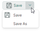
The following example defines a PopupMenu with two commands as a SplitButton's dropdown control:
xmlns:mx="https://schemas.eremexcontrols.net/avalonia"
xmlns:mxi="https://schemas.eremexcontrols.net/avalonia/icons"
xmlns:mxb="https://schemas.eremexcontrols.net/avalonia/bars"

<mx:MxSplitButton Height="27" VerticalContentAlignment="Center" Command="{Binding SaveCommand}">
    <mx:MxSplitButton.Content>
        ...
    </mx:MxSplitButton.Content>

    <mx:MxSplitButton.DropDownControl>
        <mxb:PopupMenu>
            <mxb:ToolbarButtonItem Header="Save"
                    Glyph="{x:Static mxi:Basic.Save}"
                    GlyphSize="20,20"
                    Command="{Binding SaveCommand}"/>
            <mxb:ToolbarButtonItem Header="Save As" Command="{Binding SaveAsCommand}"/>
        </mxb:PopupMenu>
    </mx:MxSplitButton.DropDownControl>
</mx:MxSplitButton>
using CommunityToolkit.Mvvm.Input;

public partial class MainWindowViewModel : ViewModelBase
{
    [RelayCommand]
    void Save()
    {
        //...
    }
    [RelayCommand]
    void SaveAs()
    {
        //...
    }
}
Related API
MxSplitButton.IsPopupOpen— Gets or sets whether the dropdown control/menu is currently open. You can use this property to open or close the dropdown control in code.