Toolbars and Menus
The EMX Controls Library contains the ToolbarManager component that allows you to create traditional Toolbars & Menus or the Ribbon UI in your application. ToolbarManager offers rich capabilities to arrange and manage traditional toolbars, create context menus, adjust toolbar view and behavior settings, and customize bars at runtime.
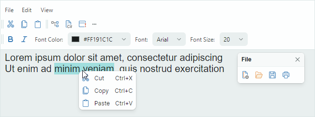
You can use multiple bar item types to create the menu UI: regular buttons, check buttons, editors, labels, sub-menus and group items.
The toolbars can be customized by users. At runtime they can choose to display the commands they need.
The main features of the Toolbar&Menu library include:
User customization:
- Bar drag-and-drop — Allows a user to rearrange bars using drag handles.
- Customization mode and Customization Window — In the Customization Window, a user can change the visibility of existing toolbars, and create custom toolbars. A user can hide, restore, and move toolbar items using drag-and-drop operations.
- Quick customization — A user can move items within and between bars using drag-and-drop by holding the Alt key down. There is no need to activate customization mode/Customization Window to perform quick customization.
Numerous bar layout options:
- Horizontal and vertical directions of individual bars.
- Any position within a window.
- Bar stretching.
- Bar adaptive layout — Toolbars automatically hide and restore their items when the space they accommodate is changed.
- An option to show/hide bar drag handles.
- An option to show/hide bar customization buttons.
Supported bar items:
ToolbarButtonItem,ToolbarCheckItem,ToolbarMenuItem,ToolbarEditorItem,ToolbarTextItem,ToolbarItemGroup, andToolbarCheckItemGroup.Context menus — You can create context menus for external controls. The style settings of the context menus are consistent with all components of the the Toolbar&Menu library.
See the following topics for more information: