Utility Controls
Multiple utility controls shipped with the Eremex Controls library help you create a functional and appealing UI.
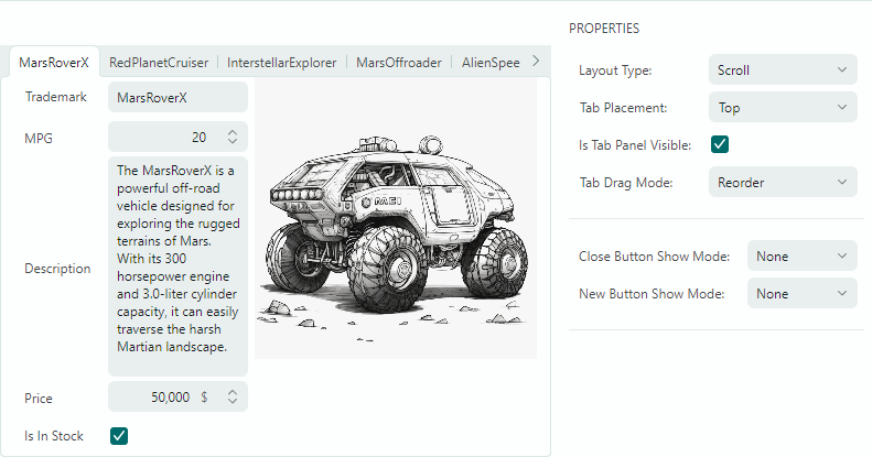
MxTabControl — A control that allows you to combine panels into a tabbed UI.
- An unlimited number of tabs.
- Populatng tabs and tab contents from an items source.
- Tab re-ordering via drag-and-drop.
- Tab layout modes: stretch, scroll and multi-line.
- 'Close tab' buttons.
- 'New Tab' button.
- Custom controls in the tab header area.
SplitContainerControl — Separates two panels with a splitter.
- A user can drag the splitter to change size of the panels.
- Vertical or horizontal arrangement of the panels.
- Ability to collapse/expand one of the panels.
- An option to hide the splitter.
ColorEditor— A standalone control that allows a user to pick a color.- The ColorEditor is used as part of the PopupColorEditor control, and it can be used as a standalone control as well.
- Three color palettes — Default, Standard, Custom.
- The Default color palette can be initialized in code.
- The Standard color palette displays predefined standard colors.
- The Custom color palette allows users to add and modify colors using the built-in Color Picker.
- Ability to specify colors in the RGB and HSB formats.
CalendarControl — A standalone control that allows a user to pick a date.
- The CalendarControl is used as part of the DateEditor control. You can use it as a standalone control as well.
- Date selection in the calendar using the mouse and keyboard.
- Navigation bar allows for browsing through months and years.
- Three calendar views: month view, year view, and year range view.
- An option to limit the available date range.
GroupBox — A panel with a header.
- The control's header allows you to display custom text.
- The control displays a line below the client region.
CircleProgressIndicator- Displays the progress of an operation as a rotating circle.