Version 1.2
1.2.63 (Beta)
DataGrid and TreeList
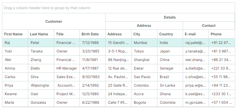
Column Bands
The DataGrid and TreeList controls now support the Column Bands feature. Bands allow you to visually group columns together and display additional headers above them. The controls support hierarchical bands with an unlimited number of nesting levels.
See the following topics for more information:
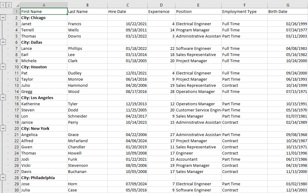
Export to Excel Format
You can now export data from the DataGrid and TreeList controls to XLSX format. The export engine allows you to preserve the control's data shaping options in the output XLSX document:
- Row grouping
- Value formatting
- Data sorting
See the following topics to learn more:
Template Updates
The following templates for the DataGridControl and TreeListControl have been updated:
<ControlTheme x:Key="{x:Type mxdg:DataGridControl}" TargetType="mxdg:DataGridControl">
<ControlTheme x:Key="{x:Type mxtl:TreeListControl}" TargetType="mxtl:TreeListControl">
Key changes include:
- The ColumnHeaderPanel object in these templates have been replaced with ColumnHeadersControl. The ColumnHeaderPanel object is now nested inside the ColumnHeadersControl's template.
- All members of the DataGridGroupPanelControl class have been migrated to the new DataGridGroupPanelItemsControl class (an ItemsControl descendant). The DataGridGroupPanelControl class now inherits from TemplatedControl. Its template includes an instance of the DataGridGroupPanelItemsControl class.
TreeView
The new TreeViewControl.CellWidth property allows you to control the width of cells in the TreeView control. The default value of the CellWidth property is "*", which stretches cells to fill the control's width.
If cell text is too long, it is trimmed at the right edge, and no horizontal scrollbar appears.
Set the CellWidth property to "Auto" to automatically adjust the data column width based on cell contents. The horizontal scrollbar appears if the maximum cell content width exceeds the control's width.
Cartesian Chart
The new Lollipop Series View (CartesianLollipopSeriesView) allows you to visualize data using thin lines with markers at the end. The markers indicate individual data points, while the lines connect the markers to a baseline.
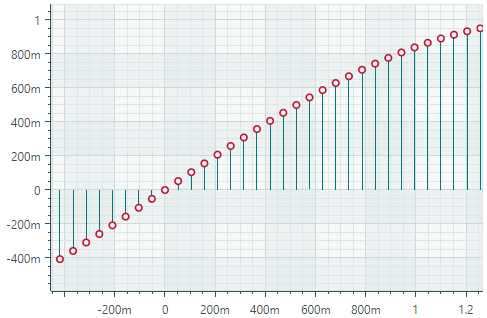
The main features include:
- Extending lines (stems) to the horizontal or vertical axis.
- Custom markers in SVG format.
Breaking Changes
-
Point Series Views and descendants — You now need to use the
{0}syntax instead of#{0}syntax when setting theMarkerImageCssproperty. This change aims to enhance the control's usability.The
MarkerImageCssproperty in Point Series Views (and descendats) supports CSS-based styling of SVG elements. The{0}placeholder allows you to insert the value of theCartesianLollipopSeriesView.Colorproperty in the CSS code.In previous versions, you needed to prepend the
{0}placeholder with#:<!-- version 1.1 --> <mxc:CartesianPointSeriesView Color="orange" MarkerImageCss="circle {{fill:#{0}}}">In version 1.2 and higher, use the
{0}syntax without the#character.<!-- version 1.2 --> <mxc:CartesianPointSeriesView Color="orange" MarkerImageCss="circle {{fill:{0}}}">See the following topics for more information:
-
Area Series View and Step Area Series View — Starting with version 1.2, the
Transparencyproperty's interpretation has been reversed to align with standard graphics conventions. The property now directly controls transparency (not opacity) of filled areas.Version 1.2+: -
Transparencyset to0means fully opaque -Transparencyset to1means fully transparentVersion 1.1: -
Transparencyset to0means fully transparent -Transparencyset to1means fully opaque
Docking
Document Switcher
The Document Switcher is a tool window that shows available dock panes and documents and allows users switch to a specific panel using the keyboard. Users can press CTRL+TAB or CTRL+SHIFT+TAB to show the Document Switcher.
See Document Switcher for more details.
Miхed Document Layout
The new DockManager.AllowFreeDocumentLayout property allows DocumentGroups to be docked side-by-side horizontally and vertically simultaneously.
If this option is set to false (default), DocumentGroups can be docked side-by-side only vertically or horizontally.
Specify Contents for FloatGroup Titles
The new FloatGroup.WindowTitle and FloatGroup.WindowIcon properties allow you to specify a title and icon for floating groups (floating windows).
See the following topic for more details: Set a Floating Window's Header and Image.
Editors
ComboBoxEditor
You can use the new SelectAllItemText and ClearValueItemText properties to specify custom captions for the predefined (Select All) and (None) items in the editor's popup:
(Select All)item — Selects/deselects all items. Applies to multiple selection mode.(None)item — Clears the current selection by setting the editor's value to null. Applies to single selection mode.
PopupEditor and its descendants
Popup editors now feature the ShowPopupIfReadOnly property which allows you to disable popups for read-only editors.
ColorEditor and PopupColorEditor
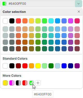
-
The Color Selection dialog has been redesigned. It now displays abbreviated names of color components:
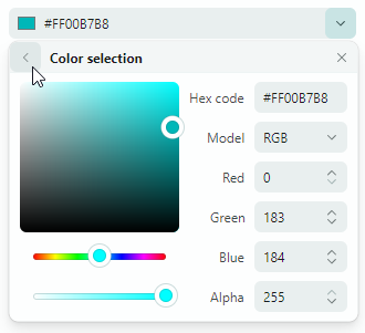
-
Color boxes in the
ColorEditorandPopupColorEditorcontrols now display additional sections with gray squares to indicate the presence of the alpha channel (transparency) in the color.