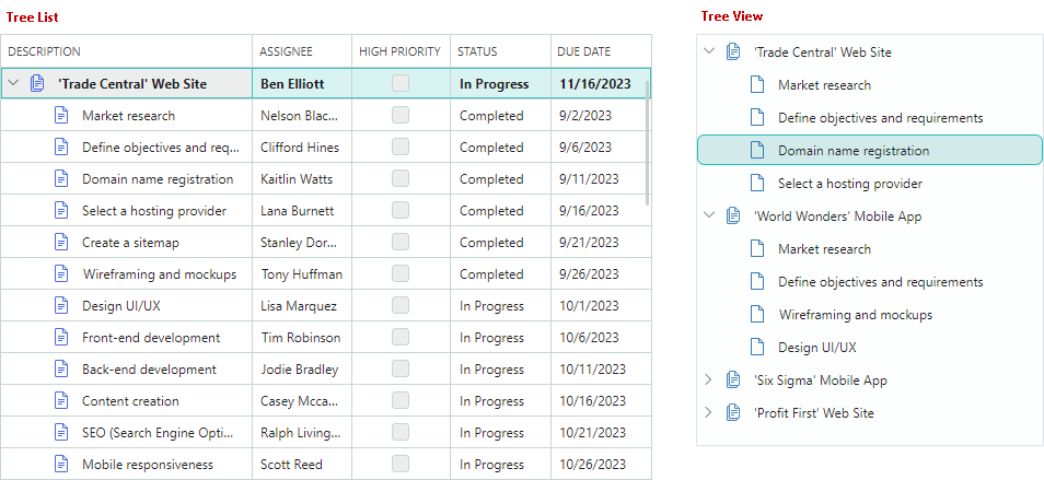
Columns
The TreeList control supports multiple columns of data, while TreeView displays values in a single column.
Column in TreeView Control
The TreeView control displays data in a single column. This column cannot be deleted. Values displayed in the TreeView column are retrieved from the field/property specified by the TreeViewControl.DataFieldName member.
The TreeViewControl.CellWidth property allows you to customize the width of this column. See the following link for more information: Column Width.
Create TreeList Columns
TreeList columns are encapsulated by the TreeListColumn class, which is a ColumnBase class descendant. The GridColumn class (a column in the DataGridControl) is also derrived from ColumnBase. Thus, columns in the DataGrid and TreeList controls share many API members.
The TreeList control does not automatically create columns once you bind the control to a data source. Four approaches allow you to create columns:
-
Manual Column Creation
You can define all TreeList columns manually in the
TreeList.Columnscollection (in XAML or code-behind). With this approach you have access to the created column objects by name in code.The following sample creates two TreeList columns and customizes the display format of the second column's values:
xmlns:mxtl="https://schemas.eremexcontrols.net/avalonia/treelist" <mxtl:TreeListControl Name="treeList1" > <mxtl:TreeListControl.Columns> <mxtl:TreeListColumn Name="colName" FieldName="Name" /> <mxtl:TreeListColumn Name="colBirthdate" FieldName="Birthdate" > <mxtl:TreeListColumn.EditorProperties> <mxe:TextEditorProperties DisplayFormatString="yyyy-MM-dd"/> </mxtl:TreeListColumn.EditorProperties> </mxtl:TreeListColumn> </mxtl:TreeListControl.Columns> </mxtl:TreeListControl> -
Automatic Column Generation
Enable the
TreeListControl.AutoGenerateColumnsoption to automatically generate missing columns once you bind the control to a data source. You can apply specific attributes (from theSystem.ComponentModelandSystem.ComponentModel.DataAnnotationsnamespaces) to properties of a business object to manage the automatic generation of columns, and customize settings of auto-generated columns (for instance, the column display name and order). See Column Automatic Generation. -
Combining Manual Column Creation and Automatic Generation
You can combine the two approaches above: create required columns manually in the
TreeList.Columnscollection, and then enable theTreeListControl.AutoGenerateColumnsoption to delegate the generation of other columns to the TreeList. -
Column Generation from a View Model
TreeList can create columns from a column source defined in a View Model. Use the
ColumnsSourceandColumnTemplateproperties in this scenario. See Generate Columns from a View Model.
Bind Columns to Data
The TreeListColumn.FieldName property allows you to bind a column to a field in the underlying data table, or to a public property of a business object. Once the column is bound, it retrieves values from the data source.
TreeList also allows you to create unbound columns, whose values should be supplied manually, via the TreeListControl.CustomUnboundColumnData event. See Unbound Columns for more information.
It is not recommended to bind multiple TreeList columns to the same data field/property.
The following example creates TreeList columns and binds them to data.
xmlns:mxtl="https://schemas.eremexcontrols.net/avalonia/treelist"

<mxtl:TreeListControl Grid.Column="3" Width="200" Name="treeListUnbound"
 HorizontalAlignment="Stretch">
    <mxtl:TreeListControl.Columns>
        <mxtl:TreeListColumn Name="colFirstName" FieldName="FirstName"
         Header="First Name" Width="*"  AllowSorting="False"  />
        <mxtl:TreeListColumn Name="colLastName" FieldName="LastName"
         Header="Last Name" Width="*"/>
        <mxtl:TreeListColumn Name="colCity" FieldName="City"
         Header="City" Width="*" ReadOnly="True" />
        <mxtl:TreeListColumn Name="colPhone" FieldName="Phone"
         Header="Phone" Width="*"/>
    </mxtl:TreeListControl.Columns>
</mxtl:TreeListControl>
using Eremex.AvaloniaUI.Controls.TreeList;

TreeListColumn colFirstName = new TreeListColumn()
{
    FieldName = "FirstName", Header = "First Name", AllowSorting = false,
    Width= new GridLength(1, GridUnitType.Star)
};
treeList1.Columns.Add(colFirstName);
Automatic Column Generation
Set the AutoGenerateColumns property to true (the default value is false) to enable automatic column generation for properties in the data source. When AutoGenerateColumns is set to true, the TreeList control fetches public properties from the data source, generates columns and binds them to the properties. If the control's Columns collection already contains a column bound to a specific property/field, no extra column bound to the same property/field is auto-generated.
The AutoGeneratingColumn and AutoGeneratedColumns events allow you to customize auto-generated columns. The AutoGeneratingColumn event fires when an auto-generated column is about to be added to the Columns collection. The event allows you to prevent a column from being added to the collection.
The AutoGeneratedColumns event fires after all columns have been auto-generated.
When you assign another data source to the control, the TreeList first deletes columns that were previously auto-generated, and then auto-generates columns for the new data source.
Use Attributes to Customize Settings of Auto-Generated Columns
You can apply specific attributes (from the System.ComponentModel and System.ComponentModel.DataAnnotations namespaces) to properties of a business object (data source record) to customize the visibility status, view and behavior settings for corresponding auto-generated TreeList columns. The following attributes are supported:
Browsable Attribute
The System.ComponentModel.BrowsableAttribute attribute controls column auto-generation. Apply the Browsable(false) attribute to specific properties to prevent corresponding columns from being auto-generated.
using CommunityToolkit.Mvvm.ComponentModel;
using System.ComponentModel;

public partial class MyBusinessObject : ObservableObject
{
    [ObservableProperty]
    [property: Browsable(false)]
    public int serviceId = "";
}
The System.ComponentModel.BrowsableAttribute attribute is equivalent to using the System.ComponentModel.DataAnnotations.DisplayAttribute attribute with the AutoGenerateField parameter.
Display Attribute
The System.ComponentModel.DataAnnotations.DisplayAttribute is a general-purpose attribute that controls column auto-generation and display settings of auto-generated columns. The attribute has the following parameters supported by the TreeList control:
-
AutoGenerateField— Specifies whether to auto-generate a corresponding column. -
Order— Specifies the auto-generated column's visible position (ColumnBase.VisibleIndex). -
Name— Specifies the auto-generated column's caption (ColumnBase.Header). -
ShortName— Equivalent to theNameparameter. -
GroupName— Specifies the name of the band to associate with the auto-generated column. This attribute value is used to initialize theTreeListColumn.BandNameproperty if theTreeListControl.AutoGenerateBandsoption istrue(default).When Tree List encounters
DisplayAttribute.GroupName, it checks for an existing band with a matching name (TreeListBand.BandName). If none exists, the control automatically creates the band and initializes itsTreeListBand.BandNameproperty with theDisplayAttribute.GroupNamevalue.The
DisplayAttribute.GroupNameparameter also supports nested bands. Use the '/' character to separate parent and child bands (for instance, "ParentBandName/ChildBandName"). To include '/' as a literal, use "//".
using CommunityToolkit.Mvvm.ComponentModel;
using System.ComponentModel.DataAnnotations;

public partial class MyBusinessObject : ObservableObject
{
    [ObservableProperty]
    [property: Display(Name = "Birth date", Order=2, GroupName="General")]
    public DateTime? birthdate = null;

    [ObservableProperty]
    [property: Display(GroupName = "Details/Address")]
    public string country { get; set; }

    [ObservableProperty]
    [property: Display(GroupName = "Details/Contact")]
    public string phone { get; set; }
}
DisplayName Attribute
The System.ComponentModel.DisplayNameAttribute attribute allows you to initialize an auto-generated column's caption (ColumnBase.Header).
using CommunityToolkit.Mvvm.ComponentModel;
using System.ComponentModel;

public partial class MyBusinessObject : ObservableObject
{
    [ObservableProperty]
    [property: DisplayName("Birth date")]
    public DateTime? birthdate = null;
}
The System.ComponentModel.DisplayNameAttribute attribute is equivalent to using the System.ComponentModel.DataAnnotations.DisplayAttribute attribute with the Name or ShortName parameter.
Editable Attribute
The System.ComponentModel.EditableAttribute attribute applied to a property creates a non-editable column. Users cannot open in-place editors, and thus select and copy text.
using CommunityToolkit.Mvvm.ComponentModel;
using System.ComponentModel;

public partial class MyBusinessObject : ObservableObject
{
    [ObservableProperty]
    [property: Editable(false)]
    public int parentId = -1;
}
Readonly Attribute
The System.ComponentModel.ReadonlyAttribute attribute applied to a property creates a read-only column. Users can select and copy text in read-only columns, but not edit values.
using CommunityToolkit.Mvvm.ComponentModel;
using System.ComponentModel;

public partial class MyBusinessObject : ObservableObject
{
    [ObservableProperty]
    [property: ReadOnly(true)]
    public int id = -1;
}
Generate Columns from a View Model
You can populate the TreeList control with columns from a column source defined in a View Model. The column source is a collection of business objects from which TreeListColumn objects are generated according to a specified template. The following API members maintain column generation from a View Model:
-
TreeListControl.ColumnsSource— A collection of business objects used to generate treelist columns according to theColumnTemplatetemplate. -
TreeListControl.ColumnTemplate— A template that initializes aTreeListColumnobject from business objects stored in the column source.
Move Columns
Use the TreeListColumn.VisibleIndex property to specify the column's visual position. To hide the column, set its TreeListColumn.VisibleIndex property to -1, or set the IsVisible property to false.
The control's default behavior allows a user to rearrange columns. Use the following properties to forbid column movement:
TreeListControl.AllowColumnMoving— Specifies whether a user can move any column.TreeListColumn.AllowMoving— Specifies whether a user can move a specific column.
Column Width
You can use the following properties to control column width in the TreeList and TreeView controls:
TreeList settings:
TreeListColumn.Width— The column width specified as aGridLengthvalue.TreeListColumn.MinWidth— The column's minimum width.TreeListColumn.MaxWidth— The column's maximum width.
TreeView settings:
TreeViewControl.CellWidth- The width of the control's cells specified as aGridLengthvalue.
The TreeListColumn.Width and TreeViewControl.CellWidth properties are of the GridLength type. The GridLength type allows you to set the column width to:
- A fixed width (a number of pixels).
- A weighted proportion of available space (the star notation).
- The
Autovalue — Activates automatic column width calculation to fit the contents of cells. When a user scrolls the control vertically, the control can enlarge the column width to fit new cell values appeared during the scroll operation.
xmlns:mxtl="https://schemas.eremexcontrols.net/avalonia/treelist"

<mxtl:TreeListControl Name="treeList1">
    <mxtl:TreeListControl.Columns>
        <mxtl:TreeListColumn Name="colFirstName"
         FieldName="FirstName" Header="First Name" Width="*"/>
        <mxtl:TreeListColumn Name="colLastName"
         FieldName="LastName" Header="Last Name" Width="2*"/>
        <mxtl:TreeListColumn Name="colPhone"
         FieldName="Phone" Header="Phone" Width="*"/>
    </mxtl:TreeListControl.Columns>
</mxtl:TreeListControl>
The following properties control column resize operations performed by users.
TreeListControl.AllowColumnResizing— Specifies whether a user can resize any column.TreeListColumn.AllowResizing— Specifies whether a user can resize a specific column.
Hierarchy Column
The hierarchy column in the TreeList control displays the node hierarchy, along with node images and built-in checkboxes.
By default, the hierarchy column is the first visible column in the TreeList. If you drag another column to the first position, that column becomes the new hierarchy column.
The TreeListControl.TreeColumnFieldName property allows you to designate any column as the hierarchy column. This property specifies the field name (ColumnBase.FieldName) of the column that should display the node hierarchy.
You can then position this column (and therefore the node hierarchy) anywhere within the column layout using the ColumnBase.VisibleIndex property.
The following example assigns the colDescription column as the hierarchy column and places it in the second position:
<mxtl:TreeListControl x:Name="treeList" TreeColumnFieldName="Description">
    <mxtl:TreeListColumn FieldName="IsUrgent" Header="Urgent" VisibleIndex="0" />
    <mxtl:TreeListColumn Name="colDescription" FieldName="Description" Width="*" VisibleIndex=1 />
    <!-- ... -->
</mxtl:TreeListControl>
Best Fit
The Best Fit feature resizes columns to their optimal widths — the minimum widths required to fully display column contents (values and headers) without truncation.
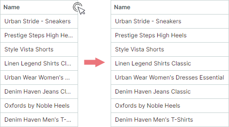
Best Fit calculates the optimal widths for columns in pixels and assigns these values to the TreeListColumn.Width properties, replacing any previously set widths.
Note
Best Fit replaces original column widths with calculated absolute pixel values. If a column previously had its width set to Auto or a star value (*), it is also replaced with an absolute pixel width. The original widths can be restored using the Reset Column Width command.
Users can invoke the Best Fit functionality in the following ways:
-
Double-click a column header's right edge.
-
Right-click a column header and choose the Best Fit or Best Fit All Columns command from the context menu.
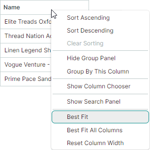
- Best Fit command — Resizes the selected column to its optimal width.
- Best Fit All Columns command — Resizes all columns to their optimal widths.
Enable and Disable Best Fit Operations
The Best Fit functionality is enabled by default. You can use the following properties to control Best Fit operations for all columns and individual columns.
TreeListControl.AllowBestFit(default istrue) — Specifies whether Best Fit operations are enabled for all TreeList columns. You can override this global setting for individual columns using theTreeListColumn.AllowBestFitproperty.TreeListColumn.AllowBestFit(default isnull) — Specifies whether Best Fit operations are enabled for a specific column. If theTreeListColumn.AllowBestFitproperty is set tonull, the actual setting is specified by the globalTreeListControl.AllowBestFitproperty.
Best Fit Mode
You can use the TreeListControl.BestFitMode and TreeListColumn.BestFitMode properties to control the scope of processed row values for Best Fit operations.
Available Best Fit Calculation Modes
-
BestFitMode.Fastmode — Measures widths of unique row values, which significantly boosts Best Fit performance in most scenarios.Note
-
Fastmode is not applicable if the display text of target cells is dependent on other cells. You need to switch toFullmode in this case. -
Fastmode may incorrectly calculate column widths if cell templates (TreeListColumn.CellTemplate) are used to assign custom editors, or cells show validation errors triggered by the data source (seeShowItemsSourceErrors).
-
-
BestFitMode.Fullmode — Measures widths of all row values, including duplicates. Although this mode is slower thanFast, it corrrectly calculates column widths if cell templates or validation errors are used.
Automatic (Default) Best Fit Calculation Mode
Fastis the default mode in most cases.Fullis automatically activated as the default in the following scenarios:- Cell templates (
TreeListColumn.CellTemplate) are used to assign editors to columns. - The control's
DataControlBase.ShowItemsSourceErrorsproperty is set totrueand validation errors are applied to columns at the data source level (using validation attributes, theIDataErrorInfointerface, or theINotifyDataErrorInfointerface).
- Cell templates (
Choose Best Fit Calculation Mode
Use the following properties to specify Best Fit calculation mode for all or individual columns:
-
TreeListControl.BestFitMode— Specifies the global Best Fit calculation mode for all TreeList columns. WhenTreeListControl.BestFitModeis set tonull(the initial value), Best Fit calculation mode is determined automatically. Use theTreeListColumn.BestFitModeproperty to override this global setting for specific columns. -
TreeListColumn.BestFitMode— Allows you to set Best Fit calculation mode for individual columns, overriding theTreeListControl.BestFitModeproperty. If theTreeListColumn.BestFitModeproperty isnull(the initial value), the actual setting is specified by the control'sTreeListControl.BestFitModeproperty.
Call Best Fit Operations in Code
Use the following methods to resize TreeList columns to their optimal widths:
TreeListControl.BestFit(TreeListColumn column)— Resizes the specified column to the width required to fully display its content.TreeListControl.BestFitAllColumns()— Resizes all columns to the widths required to fully display their contents.
To perform Best-Fit operations when the TreeList control is initialized, call the BestFit or BestFitAllColumns method within a TreeListControl.AttachedToVisualTree event handler.
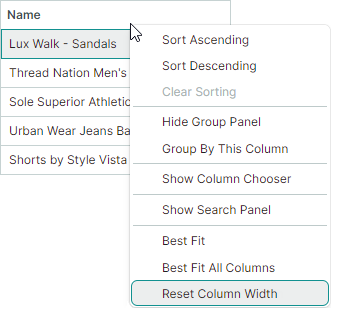
Reset Column Width User Modifications
After a user changes column widths (by dragging or using Best Fit), the Reset Column Width command appears in column context menus. This command resets changes made by users to column widths, restoring original widths applied to columns in XAML or code-behind before user modifications.
Related API
TreeListControl.AllowResetColumnWidth(default istrue) — Specifies whether the Reset Column Width command is availble in column context menus. If this property is disabled, users cannot undo their column resize operations through the UI. TheTreeListControl.AllowResetColumnWidthdoes not affect resetting column width using theTreeListControl.ResetColumnWidthmethod.TreeListControl.ResetColumnWidthmethod — Resizes columns to their original widths, as defined in XAML or code-behind before any user modifications.
Column Headers
TreeList column headers are displayed in the header panel. You can hide this panel with the TreeListControl.ShowColumnHeaders property.
The panel's height is automatically adjusted to fit contents of column headers. Use the HeaderPanelMinHeight property to limit the panel's minimum height.
A column header initially displays a caption (text label), which is a text representation of the ColumnBase.Header property. If the ColumnBase.Header property is not set, the column caption is generated from the column's field name (ColumnBase.FieldName).
Use the ColumnBase.HeaderTemplate property to specify a template used to render the column header. The template allows you to display images and custom controls, and to render text in a custom manner.
The following code displays an image before the column's caption. The <TextBlock Text="{Binding}"> expression displays the contents of the column's Header property:
xmlns:mxtl="https://schemas.eremexcontrols.net/avalonia/treelist"

<mxtl:TreeListControl Name="treeList" HeaderPanelMinHeight="50">
    <mxtl:TreeListColumn FieldName="Number" Header="Position"
     HeaderVerticalAlignment="Bottom">
        <mxtl:TreeListColumn.HeaderTemplate>
            <DataTemplate>
                <StackPanel Orientation="Horizontal">
                    <Image Source="/info24x24.png" Width="24"
                     Height="24" Margin="0,0,5,0"/>
                    <TextBlock Text="{Binding}" VerticalAlignment="Center"/>
                </StackPanel>
            </DataTemplate>
        </mxtl:TreeListColumn.HeaderTemplate>
    </mxtl:TreeListColumn>
</mxtl:TreeListControl>
Use the ColumnBase.HeaderHorizontalAlignment and ColumnBase.HeaderVerticalAlignment properties to align a column header's content horizontally and vertically.
Column Sorting
A user can click a column header or use a column header's context menu to sort the TreeList against the column. See Data Sorting for more information.
Column Values
To learn how to retrieve cell values for specific nodes, see Nodes.
Column Header Tooltips
Use the HeaderToolTip property to specify custom tooltips for column headers. Custom tooltips are displayed when hovering over column headers regardless of whether column header text is trimmed or not.
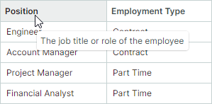
When no custom tooltip is assigned to a column, the default tooltip is shown for the column header if the header text is trimmed. The default tooltip displays the full, untrimmed header text.
Fixed Columns
If the total column width exceeds the control's viewport, a scrollbar appears to perform horizontal scrolling. TreeList allows you to fix (pin) individual columns to the left or right edge. These columns remain frozen during horizontal scrolling, while non-fixed columns are scrolled normally.

Tip
The total column width is calculated as a sum of individual column widths (see TreeListColumn.Width). To activate a horizontal scrollbar, set the widths of individual columns so that their sum exceeds the viewport width. Do not use star notation ("*") for column widths when you use fixed columns.
To fix a column or restore it to its normal state, set the TreeListColumn.FixedMode property to one of the following values:
Left— Pins the column to the left edge.Right— Pins the column to the right edge.None— Unpins the fixed column.
<mxtl:TreeListColumn FieldName="FirstName" FixedMode="Left"/>
<mxtl:TreeListColumn FieldName="Phone" FixedMode="Right"/>
Fixed Menu
Users can fix a column at runtime using the built-in Fixed sub-menu available from the column's context menu. Set the control's ShowColumnMenuFixedItem property to true to enable this Fixed sub-menu:

Fixed Column Position
When a column is fixed (pinned) or restored to its normal state, its visible position (synced with the TreeListColumn.VisibleIndex property) is automatically updated.
- Fixing to the left: The column is placed after existing left-fixed columns.
- Fixing to the right: The column is placed before existing right-fixed columns.
- Unfixing from the left: The column becomes the first scrollable column.
- Unfixing from the right: The column becomes the last scrollable column.
Fixed Column Width
To change a fixed column's width, set the TreeListColumn.Width property to an absolute pixel value, or to Auto for automatic calculation based on cell content. Fixed columns do not support the star notation (proportional sizing) to set column width.
When a column with a star width is fixed, its width is automatically reset to 120 pixels.
Horizontal Scrollbar Display Mode
The horizontal scrollbar is displayed across scrollable columns, by default. Enable the ExtendScrollbarToFixedColumns property to display the horizontal scrollbar across all columns, including the fixed ones.

Related API
TreeListControl.FixedColumnSeparatorWidth— Specifies the width of separators that delimit fixed columns from scrollable columns.