Version 1.3
1.3.55
Fixed Issues
MX-650
- DataGrid and TreeList — Incorrect cell width after updating data and vertical scrolling.
1.3.49
DataGrid and TreeList
Fixed Columns
With the Fixed Columns feature, you can pin columns in the DataGrid and TreeList controls to the left or right edge to keep these columns in view at all times. These columns remain stationary during horizontal scrolling while other columns move normally.

To allow users to pin or unpin columns at runtime, enable the built-in Fixed sub-menu in column header menus:

Related API:
ColumnBase.FixedModeDataGridControl.ShowColumnMenuFixedItemandTreeListControl.ShowColumnMenuFixedItemDataGridControl.ExtendScrollbarToFixedColumnsandTreeListControl.ExtendScrollbarToFixedColumnsDataGridControl.FixedColumnSeparatorWidthandTreeListControl.FixedColumnSeparatorWidth
Learn more:
Show Condition Operators in the Auto Filter Row
The Auto Filter Row has been enhanced to support runtime selection of filter operators in individual cells. When this feature is active, a filter operator icon appears in each Auto Filter Row cell. Users can click this icon to open a dropdown menu and select the desired operator.
Related API:
DataGridControl.ShowConditionInAutoFilterRowTreeListControl.ShowConditionInAutoFilterRowColumnBase.ShowConditionInAutoFilterRow
Learn more:
- Data Grid - Enable Runtime Filter Operator Selectors
- Tree List - Enable Runtime Filter Operator Selectors
Column Filter Menus - Checked List Mode
Column filter menus now allow you to present their items as a checked list. In Checked List mode, use built-in check boxes to select multiple filter values simultaneously.
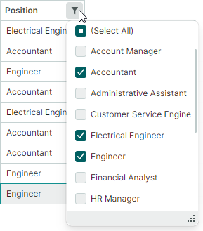
You can enable Checked List display mode for all columns or individual columns, using the following properties:
DataGridControl.ColumnFilterPopupModeandTreeListControl.ColumnFilterPopupModeGridColumn.FilterPopupModeandTreeListColumn.FilterPopupMode
Learn more:
Export to Image
The DataGrid and TreeList controls now include the ability to export data to image formats (PNG, JPEG, SVG, and WebP) with pagination.

Specify a page size and call the new ExportToImages method. The export engine automatically splits the source control into pages and saves each as a separate image. The ExportToImages method uses the same pagination mechanism as the ExportToPdf method.
Learn more:
Export to CSV
The DataGrid, TreeList and TreeView controls support data export to CSV format. CSV is a text format in which row values are separated by a specific delimiter (a comma, by default). Use the ExportToCsv method to export the control's data. This method's parameters allow you to customize value export mode, the separator character, and more.
Alphanumeric Sort
The DataGrid, TreeList, and TreeView controls now support alphanumeric sorting in addition to the default alphabetical sort. This algorithm is helpful when columns contain a mix of text and numbers. It arranges strings in a human-friendly, logical order by comparing numbers based on their numerical value.

Use the DataControlBase.TextSortMode property exposed by the DataGrid, TreeList and TreeView controls to enable alphanumeric sorting. This property affects sorting for all columns that display text values.
Learn more:
Charts
Stacked Area Views
This release adds two new Views to the CartesianChart control:
- Stacked Area View represents a data series as a colored layer. These layers are stacked vertically to show absolute relationships between the data series. At any given point, the height of a layer corresponds to its individual value, while the total height of the entire stack represents the cumulative sum of all series.
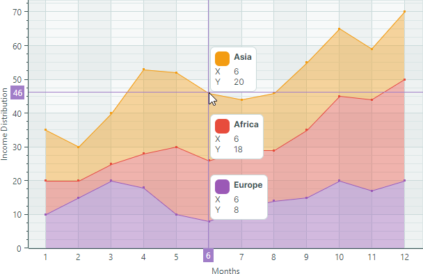
- Full-Stacked Area View (or 100% Stacked Area View) also renders a data series as a colored layer. However, these Views are used to visualize proportional relationships. Instead of showing absolute values, each layer's height represents its percentage share of the total at that point. The top line always indicates
100%.

Learn more:
Swapping X and Y Axes
The new CartesianChart.SwapAxes property allows you to transpose the X and Y axes. Set it to true to display X axes vertically, and Y axes horizontally.


Learn more:
Inverting the Axis Direction
The CartesianChart control now includes the Axis.Reverse property to change the direction of any axis. When it's set to true, the order of axis values is inverted:
- X-axis will display values from right-to-left instead of the default left-to-right direction.
- Y-axis will display values from top-to-bottom instead of the default bottom-to-top direction.

Learn more:
Empty Points
CartesianChart and PolarChart now support empty points (data points with undefined values). The chart controls leave visible gaps in series when they encounter empty points.

To specify an empty point, set the data point's value to double.NaN, double.PositiveInfinity, or double.NegativeInfinity.
Learn more:
Graphics3DControl
New API
The new LookCameraAtScene method allows you to position and orient the camera to look at the center of the 3D scene from a specified direction.
LookCameraAtScene(Vector3 cameraViewDirection, Vector3 upDirection)
Displaying Axis Names in the Gizmo
The Graphics3DControl's Gizmo now displays the names of the X, Y, and Z axes.

To render the axis names, three models that represent the letters "X", "Y", and "Z" are added to the Gizmo.
The new Gizmo.Models and Gizmo.ModelsSource properties allow you to specify 3D models to render the Gizmo in a custom manner. These properties replace the old Gizmo.Model property, which is now obsolete.
Breaking Change - Paint Theme is Now Required to Render Graphics3DControl
Starting with version 1.3, Graphics3DControl and Gizmo classes inherit from Graphics3DControlBase, which is a descendant of the TemplatedControl class.
Common appearance settings for these controls are now specified by the Controls3D paint theme. To ensure correct rendering of the Graphics3DControl, you must register this theme in the App.xaml file:
<!-- App.xaml file -->
<Application ...
    xmlns:theme3D="clr-namespace:Eremex.AvaloniaUI.Themes.Controls3D;assembly=Eremex.Avalonia.Controls3D"
             >
    <Application.Styles>
        ...
        <theme3D:Controls3DTheme />
    </Application.Styles>
</Application>
If the Controls3D paint theme is not registered, the Graphics3DControl will appear blank.
Docking
You can now apply resizing constraints to dock items using their MinWidth, MinHeight, MaxWidth, and MaxHeight properties.
SplitContainerControl - Panel Size Constraints
The new Panel1MinLength, Panel1MaxLength, Panel2MinLength, and Panel2MaxLength properties allow you to set resizing constraints for the panels in the SplitContainerControl. Users cannot resize the panels beyond these limits.
MxWindow
The new Header and HeaderTemplate properties allow you to display custom content in a window's title.
Fixed Issues
- Toolbars & Menus — A bar item's associated dropdown cannot be displayed if the dropdown was previously opened from a bar's overflow menu.
- Docking — The header of an auto-hide item remains visible when the item is hidden.
- Docking - The height of a tab panel's header region is incorrectly calculated when there are many tabs.
Breaking Changes
- Graphics3DControl — The
Gizmo.Modelproperty has been deprecated. Use the newGizmo.ModelsandGizmo.ModelsSourceproperties instead. - Editors — The
IsClearTextButtonVisibleproperty has been renamed toIsNullValueButtonVisible. - Editors — The
ClearTextCommandcommand has been renamed toSetNullValueCommandand moved from thePopupEditorclass to theButtonEditorclass.