Eremex Avalonia UI Controls Library
The Eremex Avalonia UI Controls Library includes powerful UI controls and utility libraries for the Avalonia framework to help you build highly customizable cross-platform applications with enhanced UX.
Getting Started
- Get Started with Eremex Avalonia UI Controls
- Use Standard Avalonia UI Templates to Create a New Project with Eremex Controls
Demo Application
Our Demo application allows you to explore and test a wide range of features of the Eremex Controls library.
Download and Run Demo Offline
Run Demo Online
You can run the WASM (WebAssembly) version of the Demo application and practice using the Eremex Controls directly in your browser. Access the Online Demo at:
Certain example modules are disabled in the Online Demo, including:
- Examples that demonstrate features not supported in WASM (for instance, the 3D engine).
- Examples not optimized for display and interaction in a web browser.
Known limitations: Hyperlinks are not supported.
What's Included
Controls and Libraries
Data Management Controls
| col 2 | |
|---|---|
| Data Grid | |
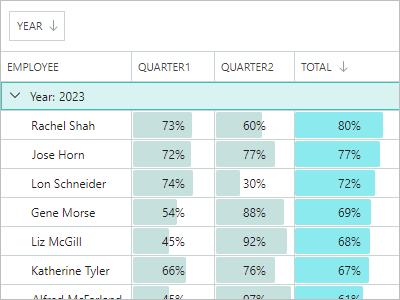 |
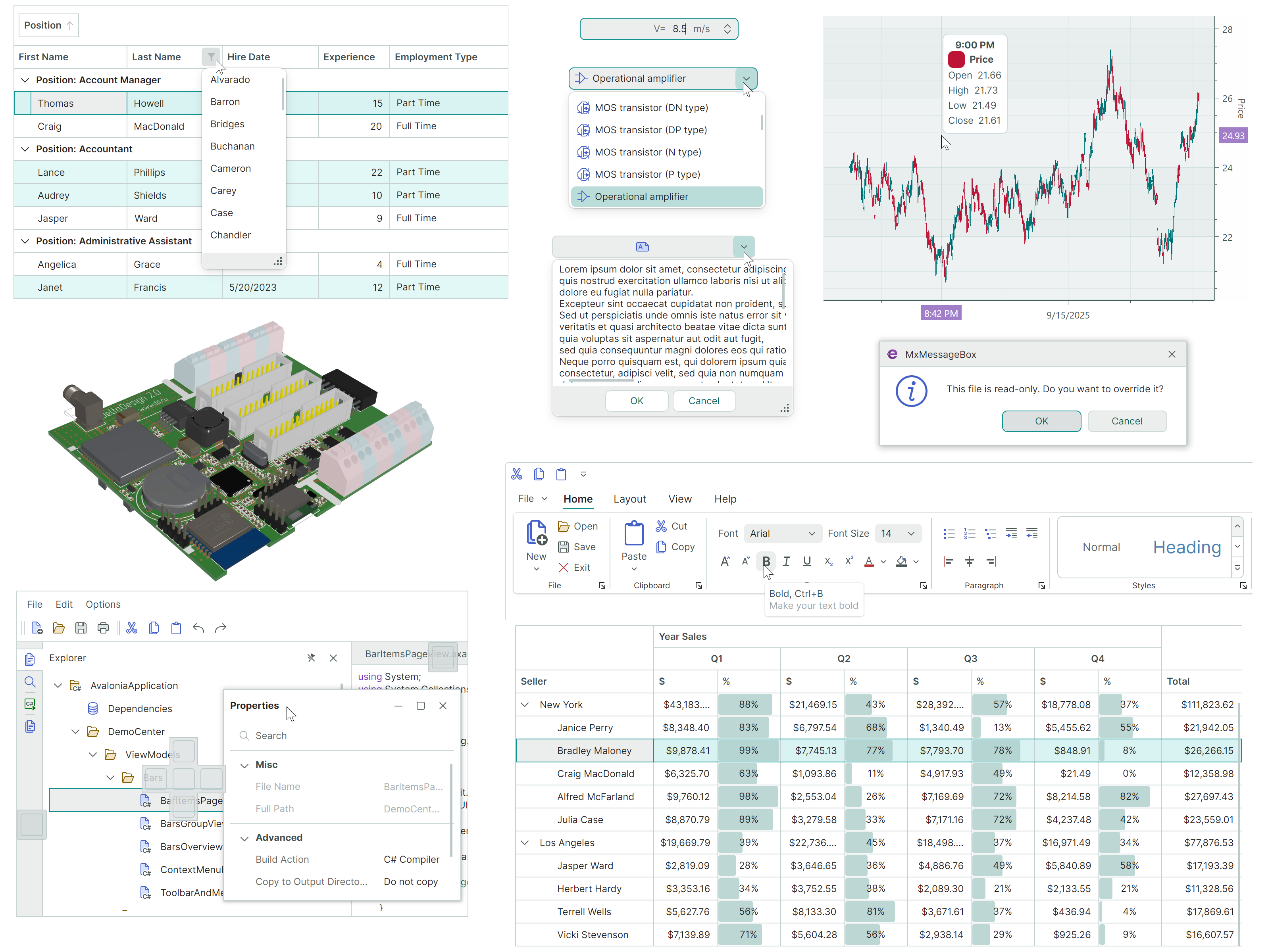
Displays data from an item source as a two-dimensional table, and provides rich data shaping and editing functionality. - Large data sources support - Unbound data - Data sorting and grouping - In-place editors - Search and data filtration - Multiple row selection - Row drag-and-drop - Data validation - Built-in and custom context menus - Column bands Learn more... |
| Tree List and Tree View | |
 |
Renders hierarchical data in the form of a tree. Tree List supports multiple data columns, while Tree View is a single-column control. - Binding to self-referential (flat) and hierarchical data sources - Unbound mode (allows you to manually supply data) - Multiple row selection - Row selection via built-in checkboxes - Data sorting - In-place editors - Data search and filtering - Row drag-and-drop - Data validation - Built-in and custom context menus - Column bands Learn more... |
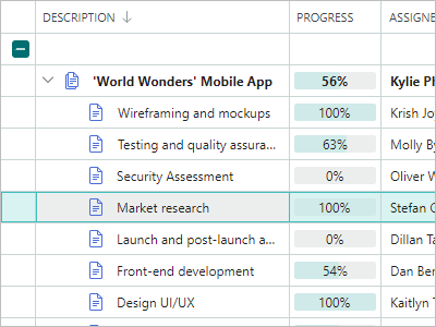
| Property Grid | |
 |
An efficient solution for browsing and editing properties of one or more objects. - Automatic generation of rows from public properties of a bound object(s) - Manual row creation mode - Combining rows into category rows - Combining rows into embedded tabs - Search panel (for quick row location) - In-place editors Learn more... |
| List View | |
 |
An advanced list that renders items according to your template. Supports item sorting, grouping, filtering and multi-selection. - Two item arrangement modes: Stack (a single column of items) and Wrap (multi-column arrangement with the item wrapping feature) - Rendering ListView items in a custom manner according to your template - Item sorting and grouping against an unlimited number of item properties - Item filtration with an event - Single and multiple selection modes Learn more... |
Navigation and Layout Controls
| col 2 | |
|---|---|
| Ribbon | |
 |
The menu inspired by the ribbon UI found in Microsoft Office products. - Classic and Simplified views - Support for all types of items (commands) available in the traditional menus: regular buttons, check buttons, editors, labels, sub-menus and button groups. - In-place and dropdown galleries - Quick Access Toolbar - A user can add frequently used commands to this toolbar at runtime from a context menu. - Customizing the Quick Access Toolbar position (above or below the Ribbon command panel) and visibility - Displaying items in the tab header area - Tab header colorization (allows you to highlight contextual tabs)- Ribbon item navigation with the keyboard - Adaptive layout of groups and items (adjusts the layout of commands when the Ribbon control's width changes) Learn more... |
| Toolbars and Menus | |
 |
Traditional toolbars and menus for your applications. - Supported toolbar item types: buttons, check buttons, sub-menus, item groups, and more - Docking toolbars at the edges of a container - Placing toolbars at any position within the window (for example, at the top of client controls) - Horizontal and vertical toolbar orientations - Adaptive layout of commands - Toolbar layout customization at runtime using drag-and-drop operations - Runtime customization mode for advanced toolbar personalization - Quick customization (without the need to activate customization mode) - Show values in toolbars, and allow users to edit them using in-place editors - Hotkey support, including complex shortcuts, such as Ctrl+R, Ctrl+K - Context menus for external controls Learn more... |
| Docking UI | |
 |
Classic docking interface inspired by the Microsoft Visual Studio IDE. - Dock panels help you create tool panes - Documents (embedded dock windows) allow you to display the main content of your UI - Floating panels - Panel auto-hide functionality - Tab containers - Panel resizing and drag-and-drop - Dock hints - Built-in context menus to perform operations on panels and Documents - MVVM support - Docking on multiple monitors - Save and restore layouts of dock panels between application runs Learn more... |
Data Visualization Controls
| col 2 | |
|---|---|
| Chart Controls | |
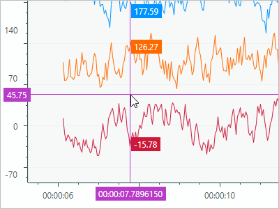 |
The CartesianChart, PolarChart and SmithChart controls allow you to integrate the most popular interactive graphs into your application's UI.- An unlimited number of data series - Supported Views: Line, Bar, Range Bar, Step Line, Candlestick, and more - Multiple axis types: Numeric, Date-Time, Time Span, Qualitative, and Logarithmic - Scrolling and zooming the entire view and individual axes - High-performance when displaying large data. - Real-time data visualization. Learn more... |
| Heatmap Control | |
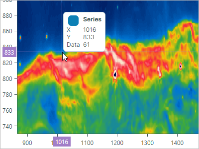 |
A two-dimensional heat map - a chart that visualizes data using colored points. - 2D representation of numerical values as color - Customization of the X and Y axes - Crosshair - Strips and constant lines - Scroll and zoom with the mouse - Export rendering to a bitmap Learn more... |
3D Graphics
| col 2 | |
|---|---|
| Graphics3D Control | |
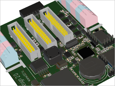 |
Allows you to visualize 3D models in your Avalonia applications. - API to specify 3D models - Simple materials - Textured materials in PBR format - Displaying multiple 3D models simultaneously - Perspective and isometric camera modes - Model rotation, panning and zooming with the mouse and keyboard at runtime - Rendering on a video card with the Vulkan SDK - MVVM pattern support for specifying 3D models Learn more... |
Editors and Utility Controls
| col 2 | |
|---|---|
| Data Editors | |
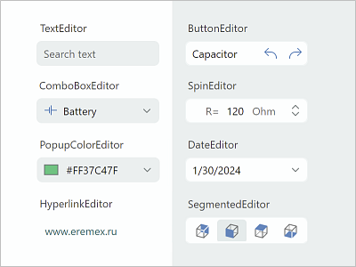 |
Simple and advanced editors that allow users to edit almost everything - from text and numbers to date/time values and colors. You can use them as standalone controls, or as in-place editors - ButtonEditor - CheckEditor - ComboBoxEditor - DateEditor - HyperlinkEditor - MemoEditor - PopupColorEditor - SegmentedEditor - SpinEditor - TextEditor Learn more... |
| Utility Controls | |
 |
A collection of useful controls shipped with the Eremex Controls library allow you to create feature-rich applications. - TabControl - SplitContainerControl - GroupBox - CalendarControl - MxMessageBox - CircleProgressIndicator Learn more... |
Eremex Paint Themes
The Eremex Controls Library ships with the 'DeltaDesign' paint theme that helps you deliver interfaces with the light and dark color palettes.
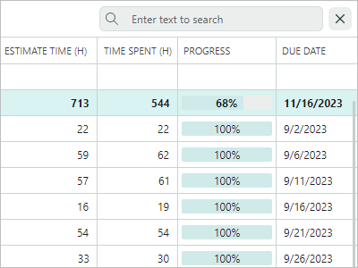
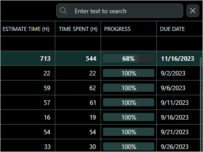
| DeltaDesign Light Theme | DeltaDesign Dark Theme |
 |
 |
 |
 |
See the following topic for more information: