Version 1.4
1.4.28-preview1
Avalonia 12 Support
This release brings full support for Avalonia 12 to the Eremex Controls library. Avalonia 12 delivers significant improvements in performance, stability, and platform reliability. This release ensures that Eremex Controls integrates smoothly with the changes introduced in the new version of the Avalonia framework.
For details on breaking changes in Avalonia 12, see: https://docs.avaloniaui.net/docs/avalonia12-breaking-changes.
DataGrid and TreeList
Row Drag-and-Drop Enhancements
Row Previews
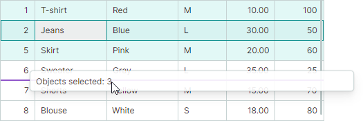
DataGrid and TreeList now show row previews during drag-and-drop operations, giving you visual feedback as you reorder or move data.
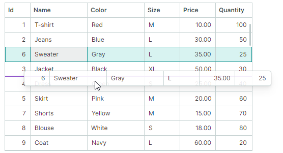
When you drag multiple rows, a row preview shows the number of objects being dragged.
Row Drag Handles
This version adds a new drag mode, in which special Drag Handles are used to drag rows. The Drag Handles are displayed in the Row Indicator region to the left of the rows.
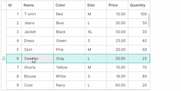
Drag Handles simplify cell editor activation when drag-and-drop functionality is enabled. Previously, users initiated row drag-and-drop by clicking and dragging any row cell. This behavior, however, contradicts the requirement (expressed by many) to activate a cell editor on pressing the mouse within the cell. The new Drag Handle-based mode resolves this issue:
- A single click on a cell activates a cell editor, by default.
- To drag rows, use the dedicated row drag handles.
Related API
DataGridControl.RowDragModeDataGridControl.RowIndicatorWidthTreeListControl.RowDragModeTreeListControl.RowIndicatorWidth
Breaking Change - Drag Rows Between Applications
Starting with version 1.4, to allow rows to be dragged between applications, enable the new UsePlatformRowDragDrop property for the control in which drag-and-drop operations start. Note that row previews are not shown during platform-based row drag operations.
Versions prior to v1.4 do not require any additional option to enable row drag-and-drop between applications.
Documentation
Best-Fit
The DataGrid and TreeList controls now support the Best Fit functionality. This feature allows users to automatically resize columns to their ideal minimum width to show cell contents in their entirety.
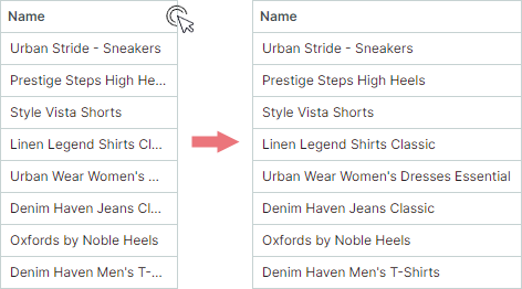
To apply Best Fit, users can double-click a column header's right edge or select the "Best Fit" command from the column's context menu. Users can also apply Best Fit to all columns at once to ensure all content remains fully visible.
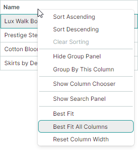
The controls include BestFitMode properties to specify which row values are measured during Best Fit operations:
-
Fastmode – Measures widths of unique row values. This improves Best Fit performance in most standard scenarios. -
Fullmode – Measures widths of all row values, including duplicates. This mode is slower than Fast but correctly calculates column widths when cell templates or validation errors are used.
Related API
DataGridControl.AllowBestFitDataGridControl.BestFitModeDataGridControl.BestFitModeDataGridControl.BestFitDataGridControl.BestFitAllColumnsGridColumn.AllowBestFitGridColumn.BestFitModeGridColumn.BestFitModeTreeListControl.AllowBestFitTreeListControl.BestFitModeTreeListControl.BestFitModeTreeListControl.BestFitTreeListControl.BestFitAllColumnsTreeListColumn.AllowBestFitTreeListColumn.BestFitModeTreeListColumn.BestFitMode
Documentation
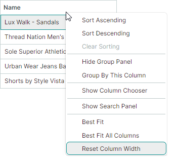
Reset User Changes to Column Width
After a user changes column widths (by dragging or using Best Fit), the Reset Column Width command appears in column context menus. This command resets changes made by users to column widths, restoring original widths applied to columns in XAML or code-behind before user modifications.
Related API
DataGridControl.AllowResetColumnWidthDataGridControl.ResetColumnWidthTreeListControl.AllowResetColumnWidthTreeListControl.ResetColumnWidth
Fixed Issues
- TreeList - StackOverflowException is raised when filtering data if
ExpandNodesOnFilteringistrue - TreeList - Active editor in auto-filter row is closed when the node collection is changed.
Cartesian Chart - Crosshair Enhancements
The Cartesian Chart control extends its public API to give you finer control over the behavior and appearance of crosshair labels.
New Crosshair Label Display Mode
The CrosshairOptions.SeriesLabelMode property specifies whether and how multiple crosshair labels are combined. This property's default value is now Smart:
Smartmode — Each series displays its own crosshair label. When labels overlap, they are combined in a single label.
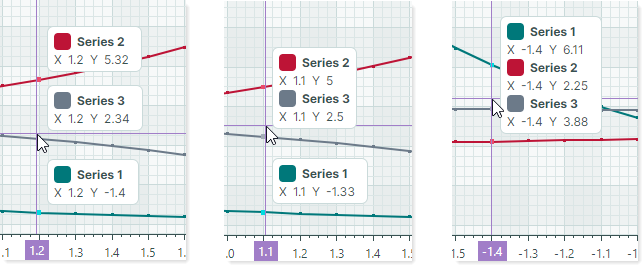
Crosshair Series Sorting
When multiple series are combined in a single crosshair label, you can use the new CrosshairOptions.SeriesLabelItemSortMode property to specify the display order of the series in the label:
-
By Seriesorder — Sorts series by the order in which these series are added to theCartesianChart.Seriescollection.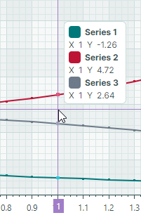
-
By Valueorder — Sorts series by their Y values.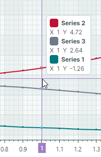
Include Only Series Near the Cursor
The following property allows you to show crosshair labels only for data points near the cursor.
-
CrosshairOptions.MaxPickDistance— Specifies the range within which to search for data points to include in crosshair labels.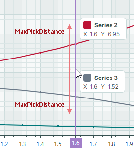
Crosshair Show Delay
CrosshairOptions.SeriesLabelShowDelay— Specifies the delay (in milliseconds) before a crosshair series label is displayed.
Show and Hide Crosshair API
ShowCrosshair(Point position)HideCrosshair()
Updated Crosshair Template
The chart control's crosshair template has been revamped to optimize the structure, support the new series sorting feature, and achieve a consistent visual appearance in different scenarios.
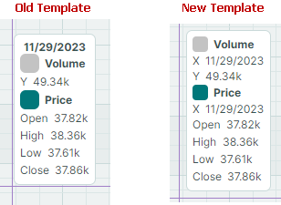
The template changes include:
- The
CrosshairAllSeriesLabelControlDataclass now contains theObservableCollection<CrosshairSeriesLabelItem> SeriesItemscollection instead of aCrosshairAllSeriesLabelGroupcollection. - The
CrosshairAllSeriesLabelGroupclass has been removed. - The
CrosshairAllSeriesLabelSeriesItemclass has been renamed toCrosshairSeriesLabelItem. This class contains information on the series argument and argument prefix. - The
CrosshairAllSeriesLabelSeriesValueItemclass has been renamed toCrosshairSeriesLabelSeriesValueItem. - The
CrosshairSingleSeriesLabelControlDataclass no longer inherits fromCrosshairAllSeriesLabelSeriesValueItem.CrosshairSingleSeriesLabelControlDatanow exposes theSeriesItemproperty of typeCrosshairSeriesLabelItem.
Documentation
Breaking Changes
- The dependency on the CommunityToolkit.Mvvm package has been removed. If your project requires this package, add a reference to CommunityToolkit.Mvvm explicitly.
- The
DataControlCommands,DataGridControlCommands,TreeListCommands, and editor commands now containICommandinstead of CommunityToolkit'sIRelayCommand.