Ribbon Overview
Use RibbonControl to create a ribbon menu like the one found in Microsoft Office applications. RibbonControl is a toolbar that organizes commands and other items into a series of pages (tabs). Pages consist of groups which in turn display ribbon items (commands, in-place editors, labels, galleries, and so on).
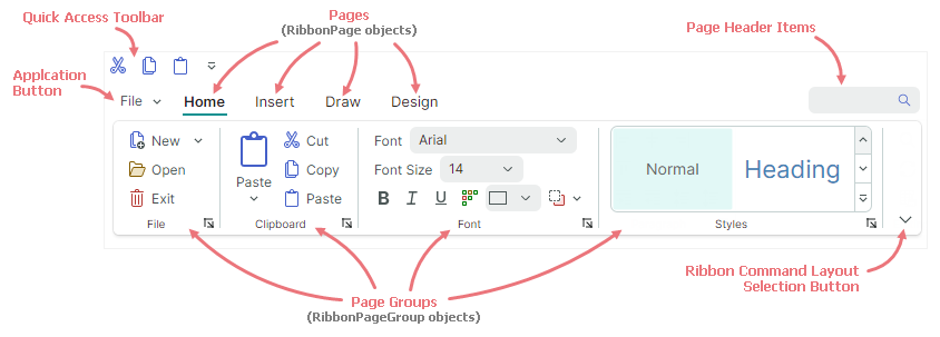
Ribbon Visual Elements
RibbonControl comprises the following elements:
Pages — Ribbon pages allow you to create tabs. You can add as many pages as you need. At least, one page must be created.
Each page displays one or more groups of items.
Page Groups — Ribbon groups provide a logical way to combine sets of items within pages. Groups are separated with vertical lines.
Application Button — This button invokes a dropdown Application Menu, which typically contains commands used to work with files.
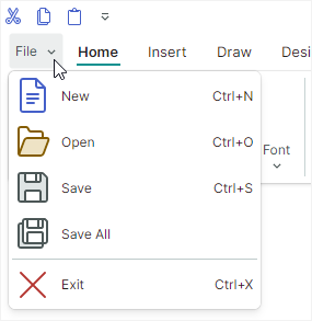
The Application Button, if enabled, is displayed before page headers.
Quick Access Toolbar — This toolbar provides access to frequently used commands. Users can add a command to this toolbar using a context menu.
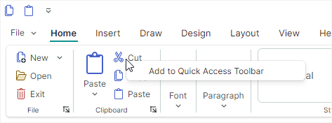
The Quick Access Toolbar can be displayed above or below the ribbon pages.
Page Header Items — You can display ribbon items at the Ribbon's right edge, in line with the page headers. The collection that stores these items is called Page Header Items.
Ribbon Command Layout Selection Button — This button displays a menu that allows a user to switch between the Classic and Simplified ribbon command layouts.
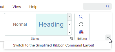
The
Classiccommand layout arranges ribbon items in three rows:
The
Simplifiedlayout uses one row of items:
Refer to Ribbon Command Layouts for more information.
Demo
See the Eremex Controls Demo application for examples that demonstrate the features of the RibbonControl in action.
Create a Ribbon UI
In short, the creation of a Ribbon UI consists of the following stages:
- Create a
RibbonControl. - Add ribbon pages (tabs) to the ribbon.
- Add ribbon page groups to the pages.
- Add ribbon items (commands, galleries, etc.) to the page groups.
You can also add ribbon items to the Page Header Area, Quick Access Toolbar, popup menus and sub-menus.
Define RibbonControl
RibbonControl is a feature-rich toolbar. Like traditional toolbars, RibbonControl is managed by the ToolbarManager component.
Tip
The ToolbarManager component can manage not only RibbonControl. You can use this component to create traditional toolbars (for instance, a status bar) and context menus for controls.
To create a RibbonControl, define it inside a ToolbarManager component.
<mxb:ToolbarManager IsWindowManager="True">
    <mxr:RibbonControl Name="ribbon1">
      <!-- ... -->
    </mxr:RibbonControl>
</mxb:ToolbarManager>
Define and Access Ribbon Pages
Ribbon pages (tabs) are encapsulated by the RibbonPage class.
To add ribbon pages in XAML, define <RibbonPage> objects as the content of the <RibbonControl> tag. To add and access ribbon pages in code-behind, use the RibbonControl.Pages collection.
<mxb:ToolbarManager IsWindowManager="True">
    <mxr:RibbonControl>
      <mxr:RibbonPage Header="Home" KeyTip="H">
        <!-- ... -->
      </mxr:RibbonPage>
      <mxr:RibbonPage Header="View" KeyTip="V">
        <!-- ... -->
      </mxr:RibbonPage>
      <mxr:RibbonPage Header="Design" KeyTip="S">
        <!-- ... -->
      </mxr:RibbonPage>
    </mxr:RibbonControl>
</mxb:ToolbarManager>
Define and Access Ribbon Page Groups
Ribbon page groups are encapsulated by the RibbonPageGroup class. They are child elements of ribbon pages.
To create page groups in XAML, define <RibbonPageGroup> objects as the content of <RibbonPage> elements. To add and access page groups in code-behind, use the RibbonPage.Groups collection.
<mxr:RibbonPage Header="Home" KeyTip="H" Name="pageHome">
  <mxr:RibbonPageGroup Header="File" IsHeaderButtonVisible="True">
    <!-- ... -->
  </mxr:RibbonPageGroup>
  <mxr:RibbonPageGroup Header="Clipboard" IsHeaderButtonVisible="True">
    <!-- ... -->
  </mxr:RibbonPageGroup>
  <mxr:RibbonPageGroup Header="Font" IsHeaderButtonVisible="True">
    <!-- ... -->
  </mxr:RibbonPageGroup>
</mxr:RibbonPage>
Define Ribbon Items (Commands, Sub-Menus, Galleries, and so on)
Ribbon items are basic elements that you can add to a ribbon UI (ribbon page groups, Quick Access Toolbar, and Page Header Items collection). They include:
Buttons (
ToolbarButtonItem) — A regular or dropdown button.A regular button executes a command (
ToolbarButtonItem.Command) and events (ClickandPress) on a click.
You can also associate a dropdown control with the button. This control will be displayed when a user clicks the button or the built-in down arrow.
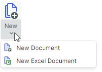
The Ribbon control allows you to specify display size for buttons. You can use the
RibbonControl.DisplayModeattached property to choose between large size, small size with text and small size without text.


Check Buttons (
ToolbarCheckItem) — A button that supports two states - normal and pressed. The button's state is specified by theToolbarCheckItem.IsCheckedproperty. TheToolbarCheckItem.CheckedChangedevent fires when the check state changes.
Sub-menu (
ToolbarMenuItem) — Displays a sub-menu on a click.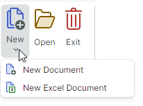
In-place editor (
ToolbarEditorItem) — Displays an in-place editor specified by theToolbarEditorItem.EditorPropertiesproperty. For instance, you can embed a SpinEditor or TextEditor to the Ribbon UI.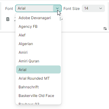
A text label (
ToolbarTextItem) — Displays static text specified by theToolbarTextItem.Headerproperty.
A group of items (
ToolbarItemGroup) — A non-breaking group of items.
The Ribbon's adaptive layout feature automatically collapses and restores items when the control is resized. Groups function as a whole. Only an entire group can be collapsed when the Ribbon is resized, not its individual items.
A group of check buttons (
ToolbarCheckItemGroup) — A non-breaking group of check buttons (ToolbarCheckItemobjects). TheToolbarCheckItemGroupclass allows you to create a group of mutually exclusive items (radio group), and a group that allows multiple items to be checked at the same time.
A separator (
ToolbarSeparatorItem) — Displays a separator between Ribbon items.
A gallery (
RibbonGalleryItem) — A gallery of elements. Use theRibbonGalleryItem.ItemsSourceproperty to specify a list of objects to be rendered as gallery items.
An in-ribbon gallery has a dropdown button, which activates a dropdown view of the gallery. The dropdown gallery can display additional commands at the bottom, specified by the
RibbonGalleryItem.DropDownItemsproperty.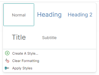
All ribbon items listed above are ToolbarItem class descendants.
They can be added to traditional toolbars and context menus as well.
To add items to ribbon page groups, define corresponding ribbon items between the <RibbonPageGroup> start and end tags. To add and access ribbon items in code-behind, use the RibbonPageGroup.Items collection.
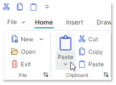
The following code snippet adds four regular buttons (ToolbarButtonItem objects) to the Clipboard group. You can find the complete code in the WordPad Example demo.
<mxr:RibbonPageGroup Header="Clipboard" IsHeaderButtonVisible="True">
    <mxb:ToolbarButtonItem Header="Paste" KeyTip="PA" Glyph="{x:Static icons:Basic.Paste}"
                           mxr:RibbonControl.DisplayMode="Large"
                           DropDownArrowVisibility="ShowSplitArrow">
        <mxb:ToolbarButtonItem.DropDownControl>
            <mxb:PopupMenu>
                <mxb:ToolbarButtonItem Header="Paste Special" KeyTip="PS"
                  Glyph="{x:Static icons:Basic.Paste}"
                  Command="{Binding PasteSpecialCommand}"/>
                <mxb:ToolbarButtonItem Header="Set Default Paste..." KeyTip="SP"
                  Command="{Binding SetDefaultPasteCommand}"
                />
            </mxb:PopupMenu>
        </mxb:ToolbarButtonItem.DropDownControl>
    </mxb:ToolbarButtonItem>
    <mxb:ToolbarButtonItem Header="Cut" KeyTip="CT"
                           Glyph="{x:Static icons:Basic.Cut}" Command="{Binding CutCommand}"/>
    <mxb:ToolbarButtonItem Header="Copy" KeyTip="CP"
                           Glyph="{x:Static icons:Basic.Copy}" Command="{Binding CopyCommand}"/>
    <mxb:ToolbarButtonItem Header="Paste" KeyTip="P"
                           Glyph="{x:Static icons:Basic.Paste}" Command="{Binding PasteCommand}"/>
</mxr:RibbonPageGroup>
See the following topics for more information:
MVVM Design Pattern Support
The Ribbon control supports the MVVM design pattern, allowing you to create pages, page groups, and items (in page groups, Quick Access Toolbar, and Page Header area) from collections of business objects defined in a View Model. The following properties maintain the MVVM design pattern:
RibbonControl.PagesSource— A collection of business objects used to populate a Ribbon control's pages. Corresponding data templates should defineRibbonPageobjects.RibbonPage.GroupsSource— A collection of business objects used to populate groups in Ribbon pages. Corresponding data templates should defineRibbonPageGroupobjects.RibbonPageGroup.ItemsSource— A collection of business objects used to create Ribbon items in page groups. Corresponding data templates should define ribbon items.RibbonControl.QuickAccessToolbarItemsSource— A collection of business objects used to create Ribbon items in the Quick Access Toolbar. Corresponding data templates should define ribbon items.RibbonControl.PageHeaderItemsSource— A collection of business objects used to create Page Header Items. Corresponding data templates should define ribbon items.ToolbarMenuItem.ItemsSource— A collection of business objects used to populate a sub-menu with items. Corresponding data templates should define ribbon items.