Version 1.5
1.5.52-preview2
Color Palettes for DeltaDesign Theme
The new version introduces color palettes for the DeltaDesign visual theme. A color palette is a predefined set of colors applied to the base theme, allowing users to quickly switch styling and accent colors.
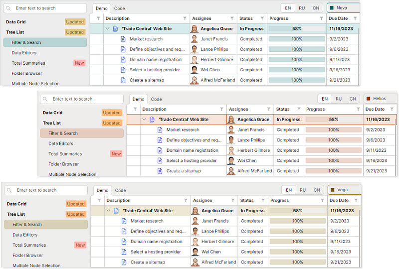
Applying a palette dynamically updates the color values of key UI elements, including:
- Window, panel, and container backgrounds.
- Editor backgrounds in various states.
- Row and cell backgrounds in data-aware controls.
- Selection highlights, hot-tracked elements, and focused control accents.
- And more.
DataGrid and TreeList
Total Summaries
The DataGrid and TreeList controls can now calculate total summaries against their rows and display the results in a summary footer at the bottom of the control.
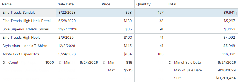
- Summary footer — Both controls display a summary footer that shows aggregate values calculated across all rows.
- Built-in summary types — Sum, Min, Max, Count, and Average.
- Multiple summaries per column — Each column can display more than one summary calculated against that column's values.
- Cross-column summaries — You can calculate a summary against one column and display the result in another column's footer cell.
- Runtime summary management — End users can add and remove summaries using a built-in dropdown menu and the Summary Editor dialog.
- Custom summaries — You can handle the
CustomSummaryevent to calculate your own aggregate values when the built-in types aren't enough.
Row Drag-and-Drop Enhancements
Initially, the DataGrid and TreeList controls prevent rows from being dropped over the empty area (the area below all rows). Starting with v1.5, you can handle the DragOver event to allow row drop operations over the empty area. Rows dropped within this area are appended at the end of all rows.
private void ProductsInStockGrid_DragOver(object sender, DataGridDragEventArgs e)
{
    if (e.DropPosition == DropPosition.EmptyArea)
        e.Effects = Avalonia.Input.DragDropEffects.Move;
}
You can also handle the DragOver event to forcibly change how rows are inserted when dropped. For example, the following DragOver event handler force rows to always append at the end of the control.
private void ProductsInStockGrid_DragOver(object sender, DataGridDragEventArgs e)
{
    e.DropPosition = DropPosition.EmptyArea;
    e.Effects = Avalonia.Input.DragDropEffects.Move;
}
'Select All' in Column Chooser
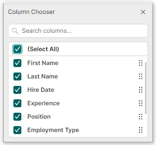
The DataGrid and TreeList controls now include the (Select All) command in the Column Chooser.
Users now can select or clear all columns in a single action instead of checking each column individually.
Application Services
This release introduces Application Services — a set of platform-agnostic services for working with windows, dialogs, and application-wide appearance settings directly from your ViewModels, without referencing any Avalonia window type.
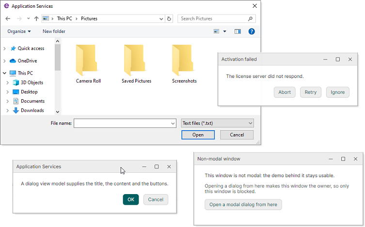
You can invoke services from your ViewModel code to:
- Open windows
- Show
Save FileandOpen Filedialogs - Display message boxes and custom modal dialogs
- Identify the active window
- Customize the settings of the current Eremex visual theme
The services decouple your ViewModels from the UI framework. You access services through well-defined interfaces. The platform-specific work (creating windows, resolving owners, showing dialogs, etc.) is handled internally by the service.
Available Application Services include:
User Interaction Services
| Service | Description |
|---|---|
IMessageBoxService |
Shows standard message boxes with fixed button sets defined by the MessageBoxButtons enumeration (Ok, Ok|Cancel, Yes|No|Cancel, Yes|No, Abort|Retry|Ignore, and Retry|Cancel). |
IDialogService |
Shows dialogs from ViewModel code, so that a ViewModel can ask the user a question without referencing any window type. A dialog is driven by a dialog ViewModel. You can also implement a View to display as the dialog's content. This View is located through the ViewLocatorAttribute applied to the dialog ViewModel. |
IChoiceDialogService |
Shows a dialog with an arbitrary set of buttons and returns the result of the pressed one. |
IWindowService |
Shows non-modal windows from ViewModel code, so that a ViewModel can open a window without referencing any window type. The counterpart for modal dialogs is IDialogService. |
File Services
| Service | Description |
|---|---|
IOpenFileDialogService |
Shows the platform Open File dialog from ViewModel code in sync or async mode. |
ISaveFileDialogService |
Shows the platform Save File dialog from ViewModel code in sync or async mode. |
Infrastructure Services
| Service | Description |
|---|---|
IWindowsManager |
Tracks the active window of the application. Dialog services use the IWindowsManager service to get the default owner for newly created dialogs. |
IAppearanceService |
Lists visual theme settings and applies the chosen theme variant. |
Charts
Advanced Line Customization with LineStyle
Chart objects now provide advanced options of the LineStyle type for customizing lines. LineStyle exposes properties that give you full control over how lines are rendered.
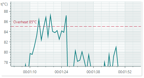
These properties include:
Thickness— The stroke thickness.Dashes— The dash pattern for dashed lines.DashOffset— The offset at which the dash pattern starts.LineCap— The shape used at both ends of a line.LineJoin— The join style for the ends of two consecutive lines.MiterLimit— The limit of the thickness of the join on a mitered corner.
New line customization is available for:
- Graph lines in the following series views: all Line and Area Series Views, Lollipop Series View, Range Area Series View, Polar Line and Polar Range Area Series Views, and Smith Line Series View.
-
Constant Lines in supported Series Views
The
ConstantLine.Thicknessproperty has been deprecated. Use theLineStyle.Thicknessoption instead.
Docking UI
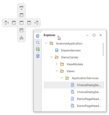
The DockManager component now provides a new CustomizeDockGuide event that allows you to dynamically hide specific dock guides and individual guide items at runtime.
Editors Library
The SpinEditor control now includes a new AllowRoundOutOfRangeValue property that controls whether out-of-range values entered by a user are automatically rounded to the nearest valid value. A range of valid values can be limited using the Minimum and Maximum properties.
Breaking Changes
DateEditor and SpinEditor - Forced Masked Mode
The DateEditor and SpinEditor now always work in masked mode — MaskType.DateTime and MaskType.Numeric respectively. It is no longer possible to disable masked mode (MaskType.None) or enable an incompatible mask mode for these editors.