棒棒糖系列视图
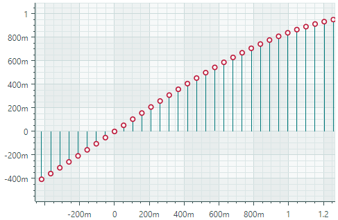
Lollipop 系列视图 (CartesianLollipopSeriesView) 使用末端带有标记的细线可视化数据。标记指示各个数据点,而线条将标记连接到基线(水平轴或垂直轴)。 Lollipop 图表使用方形标记 by default,但也支持 SVG 格式的自定义标记。以下 image 演示了带有从 SVG 文件加载的圆形标记的 Lollipop 系列视图。
创建棒棒糖系列视图
要创建 Lollipop 系列视图,请将 CartesianSeries 对象添加到 CartesianChart.Series 集合中,并使用 CartesianLollipopSeriesView 实例初始化 CartesianSeries.View 属性。
将 CartesianSeries.DataAdapter 属性用于该系列的 supply 数据。
以下代码演示如何在 XAML 和代码隐藏中创建 Lollipop 系列视图。
xmlns:mxc="https://schemas.eremexcontrols.net/avalonia/charts"

<mxc:CartesianChart x:Name="chartControl">
    <mxc:CartesianSeries DataAdapter="{Binding DataAdapter}">
        <mxc:CartesianLollipopSeriesView Color="YellowGreen"
                                            LineColor="Green"
                                            Thickness="2"
                                            MarkerSize="8"
                                            Orientation="Vertical">
        </mxc:CartesianLollipopSeriesView>
    </mxc:CartesianSeries>
</mxc:CartesianChart>
using Eremex.AvaloniaUI.Charts;
CartesianSeries series = new CartesianSeries();
chartControl.Series.Add(series);
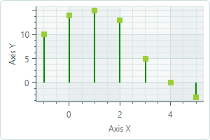
double[] args = new double[] { -1, 0, 1, 2, 3, 4, 5 };
double[] values = new double[] { 10, 14, 15, 13, 5, 0, -3 };
series.DataAdapter = new SortedNumericDataAdapter(args, values);
series.View = new CartesianLollipopSeriesView()
{
LineColor = Avalonia.Media.Colors.Green,
Color = Avalonia.Media.Colors.YellowGreen,
MarkerSize = 8,
Thickness = 2,
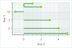
Orientation = CartesianLollipopOrientation.Horizontal
};
示例 - 创建 Lollipop 系列视图并使用自定义 SVG 数据点标记
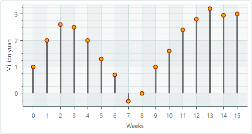
以下示例创建一个 Lollipop 系列视图来可视化 FormulaDataAdapter 对象提供的示例数据。该示例演示如何使用 SVG image 作为自定义数据点标记并动态调整 SVG 元素的颜色,使其与数据系列颜色相匹配。
- 指定 SVG 图像作为点标记
使用 MarkerImage 属性将 SVG image 指定为数据点标记。 MarkerImage 属性与 [Content] 属性一起定义,允许您将 SVG image 指定为 <CartesianLollipopSeriesView> 标记的内容:
``` xml
<mxc:CartesianLollipopSeriesView ...>
    <SvgImage Source="avares://ChartLollipopSeriesView/Assets/circle.svg" />
</mxc:CartesianLollipopSeriesView>
```
“circle.svg”文件呈现一个带有绿色边框和黄色填充的圆形:

``` xml
<!-- part of 'circle.svg' file -->
<svg ...>
    <circle fill="yellow" stroke="green" stroke-width="10" cx="40" cy="40" r="30"/>
</svg>
```
下一步展示如何动态覆盖这些颜色而不修改源 SVG 文件。
- 将系列颜色应用于 SVG 元素
Lollipop 系列视图(以及任何 Point Series View 后代)
支持 MarkerImageCss 属性,该属性启用 CSS-based SVG styling。此属性允许您在运行时自定义特定 SVG 元素的样式。例如,CSS 代码可以将系列颜色应用于各个 SVG 元素。
``` xml
<mxc:CartesianLollipopSeriesView
    Color="Orange"
    MarkerImageCss="circle {{fill:{0};stroke:darkred;}}"
>
```
上面的 CSS 代码自定义了 circle SVG 对象的样式。新样式用深红色绘制边框,并使用数据系列颜色填充圆圈。
{0}占位符 — 插入CartesianLollipopSeriesView.Color属性的值。
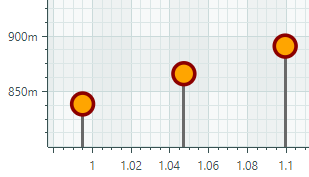
结果如下所示:

- 设置点标记的大小
使用 MarkerSize 属性调整点标记的大小。
完整代码:
<!-- MainWindow.axaml -->
<mx:MxWindow xmlns="https://github.com/avaloniaui"
        xmlns:x="http://schemas.microsoft.com/winfx/2006/xaml"
        xmlns:vm="using:ChartLollipopSeriesView.ViewModels"
        xmlns:d="http://schemas.microsoft.com/expression/blend/2008"
        xmlns:mc="http://schemas.openxmlformats.org/markup-compatibility/2006"
        xmlns:mx="https://schemas.eremexcontrols.net/avalonia"
        xmlns:mxc="https://schemas.eremexcontrols.net/avalonia/charts"
        mc:Ignorable="d" d:DesignWidth="800" d:DesignHeight="450"
        x:Class="ChartLollipopSeriesView.Views.MainWindow"
        x:DataType="vm:MainWindowViewModel"
        Icon="/Assets/EMXControls.ico"
        Title="ChartLollipopSeriesView">

    <Design.DataContext>
        <!-- This only sets the DataContext for the previewer in an IDE,
             to set the actual DataContext for runtime, set the DataContext property in code (look at App.axaml.cs) -->
        <vm:MainWindowViewModel/>
    </Design.DataContext>

    <mxc:CartesianChart x:Name="chartControl">
        <mxc:CartesianChart.Series>
            <mxc:CartesianSeries Name="lollipopSeries1"
                                 DataAdapter="{Binding PointSeriesVM1.DataAdapter}"
                                 SeriesName="Income"
                                 >
                <mxc:CartesianLollipopSeriesView Color="Orange"
                                                 LineColor="Dimgray"
                                                 LineThickness="3"
                                                 MarkerSize="10"
                                                 MarkerImageCss="circle {{fill:{0};stroke:darkred;}}"
                                                 >
                    <SvgImage Source="avares://ChartLollipopSeriesView/Assets/circle.svg" />
                </mxc:CartesianLollipopSeriesView>
            </mxc:CartesianSeries>
        </mxc:CartesianChart.Series>
        <mxc:CartesianChart.AxesX>
            <mxc:AxisX Title="Weeks" MinorCount="0" ShowMinorGridlines="False">
                <mxc:AxisX.ScaleOptions>
                    <mxc:NumericScaleOptions GridSpacing="1" />
                </mxc:AxisX.ScaleOptions>
            </mxc:AxisX>
        </mxc:CartesianChart.AxesX>
        <mxc:CartesianChart.AxesY>
            <mxc:AxisY Title="Million yuan"/>
        </mxc:CartesianChart.AxesY>
    </mxc:CartesianChart>
</mx:MxWindow>
// MainWindowViewModel.cs
using CommunityToolkit.Mvvm.ComponentModel;
using Eremex.AvaloniaUI.Charts;
using System;
using System.Collections.Generic;

namespace ChartLollipopSeriesView.ViewModels
{
    public partial class MainWindowViewModel : ViewModelBase
    {
        static double[] values = new double[] { 1, 2, 2.6, 2.5, 2, 1.3, 0.7, -0.3, 0, 1, 1.6, 2.4, 2.8, 3.2, 2.95, 3 };
        static double MyFunc(double argument) => values[(int)argument % values.Length];

        [ObservableProperty] SeriesViewModel pointSeriesVM1;

        public MainWindowViewModel()
        {
            PointSeriesVM1 = new()
            {
                DataAdapter = new FormulaDataAdapter(0, 1, values.Length, MyFunc)
            };
        }
    }

    public partial class SeriesViewModel : ObservableObject
    {
        [ObservableProperty] ISeriesDataAdapter dataAdapter;
    }
}
<!-- circle.svg image -->
<svg viewBox="0 0 80 80" width="80" height="80" xmlns="http://www.w3.org/2000/svg">
<g>
<title>Layer 1</title>
<circle fill="yellow" stroke="green" stroke-opacity="1" stroke-width="10" cx="40" cy="40" id="svg_1" r="30"/>
</g>
</svg>
Lollipop 系列视图的数据
您可以使用以下数据适配器为 Lollipop 系列视图提供数据:
数字 X 值:
FormulaDataAdapterScatterDataAdapterSortedNumericDataAdapter
日期和时间 X 值:
SortedDateTimeDataAdapterSortedTimeSpanDataAdapter
定性 X 值:
QualitativeDataAdapter
棒棒糖系列视图设置
Color— 指定用于 paint 点标记的颜色。LineColor— 指定用于 paint 线条的颜色。LineThickness— 指定 line 厚度。-
LineOrientation— 指定线的方向。 -
Vertical— 线条从点标记垂直延伸到 X 轴。
Horizontal— 线条从点标记水平延伸到 Y 轴。
MarkerImage— 获取或设置用作自定义点标记的 image。如果未指定 image,则显示默认的方形标记。您可以使用SvgImage类实例来指定 SVG 图像。
MarkerImage 属性使用 [Content] 属性进行声明,这允许您直接在 <CartesianLollipopSeriesView> 标记之间定义 image。
``` xml
<mxc:CartesianLollipopSeriesView>
    <SvgImage Source="avares://ChartLollipopSeriesView/Assets/circle.svg" />
</mxc:CartesianLollipopSeriesView>
```
SVG 文件包含 SVG 元素的预定义颜色。要使这些颜色与您的数据系列颜色相匹配,您可以:
-
预先手动编辑源 SVG image 文件
- 使用
MarkerImageCss属性为 SVG 元素动态自定义 styles。渲染点标记时将应用这些样式。
- 使用
-
MarkerImageCss— 指定 CSS styles,用于由CartesianLollipopSeriesView.MarkerImage属性定义的 SVG image 的运行时自定义。主要用例是将 SVG 元素颜色替换为系列颜色 (CartesianLollipopSeriesView.Color)。包含{0}占位符以在 CSS 代码中插入CartesianLollipopSeriesView.Color属性的值。
例如,当 MarkerImage 属性包含带有圆形元素的 SVG image 时,以下 CSS 代码将使用橙色填充(使用系列颜色)和深红色边框设置 circle 的样式:
``` xml
<mxc:CartesianLollipopSeriesView Color="orange" MarkerImageCss="circle {{fill:{0};stroke:darkred;}}">
    <SvgImage Source="avares://ChartLollipopSeriesView/Assets/circle.svg" />
</mxc:CartesianLollipopSeriesView>
```
完整代码:Example - Create a Lollipop Series View and Use Custom SVG Markers。
MarkerSize— 指定点标记的大小(以像素为单位)。ShowInCrosshair— 指定当前系列的十字线图表 label 的可见性。参见 Customize Chart Labels of the Crosshair。
* 本页面使用机器翻译技术翻译。