画廊
画廊是一种 Ribbon 项,可以显示一组图形丰富的元素(例如带图片的格式化文本),并根据指定的数据模板进行渲染。画廊项从左到右、再从上到下排列,形成一个多列列表。
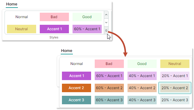
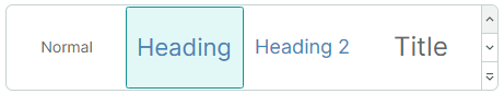
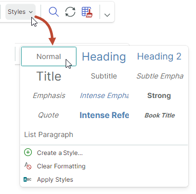
下图展示了一个显示 3 列项的内嵌 Ribbon 画廊。
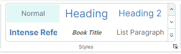
内嵌 Ribbon 画廊包含两个用于垂直滚动的按钮。这些按钮下方是一个下拉按钮,用于在下拉窗口中显示画廊的全部内容。
创建 Ribbon 画廊
使用 RibbonGalleryItem 项将画廊添加到 Ribbon 界面。您可以将 RibbonGalleryItem 对象添加到页面分组、弹出菜单、页面标题区域或快速访问工具栏中,方式与添加其他 Ribbon 项相同。例如,要将 Ribbon 项添加到页面分组中,请在 <RibbonPageGroup> 起始和结束标签之间定义它们。在后台代码中,您可以使用 RibbonPageGroup.Items 集合添加项。
以下代码片段来自 WordPad Example 演示,将一个画廊添加到 Styles 页面分组中。画廊项的来源由视图模型中定义的 FontStyles 集合指定。
<mxr:RibbonPageGroup Header="Styles" IsHeaderButtonVisible="True">
    <mxr:RibbonGalleryItem MaxColumnCount="3" ItemWidth="108" StretchItemVertically="True"
                           ItemHeight="80"
                           Header="Styles"
                           MaxDropDownColumnCount="3"
                           ItemsSource="{Binding FontStyles}">
</mxr:RibbonPageGroup>
画廊项
使用 RibbonGalleryItem.ItemsSource 属性提供一个业务对象集合,以作为画廊项显示。要在画廊中渲染这些业务对象,请定义相应的数据模板。
要定义画廊项模板,您也可以使用 RibbonGalleryItem.ItemTemplate 属性。
示例 - 为画廊项使用多个模板
在以下来自 WordPad Example 演示的代码中,画廊项由视图模型中定义的 FontStyles 集合填充。FontStyles 集合的元素是业务对象(NormalGalleryItem、HeadingGalleryItem 和 TitleGalleryItem),其数据模板定义在 UserControl.DataTemplates 集合中。
public partial class WordPadExampleViewModel : PageViewModelBase
{
    [ObservableProperty] private ObservableCollection<FontStyleGalleryItem> fontStyles;
    //...
    fontStyles = new ObservableCollection<FontStyleGalleryItem>();
    fontStyles.Add(new NormalGalleryItem() { Header = "Normal" });
    fontStyles.Add(new HeadingGalleryItem() { Header = "Heading" });
    fontStyles.Add(new TitleGalleryItem() { Header = "Title" });
}
<!-- Define data templates -->
<UserControl.DataTemplates>
    <DataTemplate DataType="vm:NormalGalleryItem">
        <Grid>
            <TextBlock Text="{Binding Header}"
                        FontSize="14"
                        HorizontalAlignment="Center"
                        VerticalAlignment="Center" />
        </Grid>
    </DataTemplate>
    <DataTemplate DataType="vm:HeadingGalleryItem">
        <Grid>
            <TextBlock Text="{Binding Header}"
                        FontSize="22"
                        Foreground="SteelBlue"
                        HorizontalAlignment="Center"
                        VerticalAlignment="Center" />
        </Grid>
    </DataTemplate>
    <DataTemplate DataType="vm:TitleGalleryItem">
        <Grid>
            <TextBlock Text="{Binding Header}"
                        FontSize="24"
                        HorizontalAlignment="Center"
                        VerticalAlignment="Center" />
        </Grid>
    </DataTemplate>
</UserControl.DataTemplates>
完整代码请参见 WordPad Example 演示。
示例 - 为所有画廊项使用一个模板
下面的示例使用 RibbonGalleryItem.ItemTemplate 属性定义一个数据模板,用于渲染所有画廊项。该模板绘制一个文本块,其文本和颜色由存储在视图模型 CellStyles 集合中的画廊项对象(CellStyle 对象)的设置指定。
RibbonGalleryItem.FocusedItem 属性用于标识当前被选中的画廊项。在该示例中,RibbonGalleryItem.FocusedItem 属性绑定到视图模型中的 SelectedCellStyle 属性。为了在选中某个画廊项时执行操作,视图模型的 PropertyChanged 事件处理程序会跟踪 SelectedCellStyle 属性的更改。
<mxb:ToolbarManager IsWindowManager="True">
    <mxr:RibbonControl IsApplicationButtonVisible="False">
        <mxr:RibbonPage Header="Home">
            <mxr:RibbonPageGroup Header="Styles" IsHeaderButtonVisible="True">
                <mxr:RibbonGalleryItem MaxColumnCount="3"
                                        ItemWidth="108"
                                        ItemHeight="40"
                                        Header="Cell Styles"
                                        MaxDropDownColumnCount="4"
                                        ItemsSource="{Binding CellStyles}"
                                        FocusedItem="{Binding SelectedCellStyle, Mode=TwoWay}"
                                        >
                    <mxr:RibbonGalleryItem.ItemTemplate>
                        <DataTemplate>
                            <Border Background="{Binding BackColor}">
                                <TextBlock Text="{Binding Text}"
                                  HorizontalAlignment="Center"
                                  VerticalAlignment="Center"
                                  Foreground="{Binding TextColor}"/>
                            </Border>
                        </DataTemplate>
                    </mxr:RibbonGalleryItem.ItemTemplate>
                </mxr:RibbonGalleryItem>
            </mxr:RibbonPageGroup>
        </mxr:RibbonPage>
    </mxr:RibbonControl>
</mxb:ToolbarManager>
public partial class MainWindowViewModel : ViewModelBase
{
    [ObservableProperty] private ObservableCollection<CellStyle> cellStyles;
    [ObservableProperty] private CellStyle selectedCellStyle;

    public MainWindowViewModel()
    {
        cellStyles = new ObservableCollection<CellStyle>
        {
            new CellStyle(){ Text="Normal", TextColor=Brushes.Black, BackColor=Brushes.White },
            new CellStyle(){ Text="Bad", TextColor=Brushes.Maroon, BackColor=Brushes.Pink },
            new CellStyle(){ Text="Good", TextColor=Brushes.Green, BackColor=Brushes.Honeydew },
            new CellStyle(){ Text="Neutral", TextColor=Brushes.Sienna, BackColor=Brushes.Khaki }
        };
        //Add accent colors
        Color[] accentColors = new Color[] { Colors.MediumOrchid, Colors.Chocolate, Colors.CadetBlue };
        for (int accentColorIndex=1; accentColorIndex<= accentColors.Length; accentColorIndex++)
        {
            Color accentColor = accentColors[accentColorIndex-1];
            string accentTitle = $"Accent {accentColorIndex}";
            cellStyles.Add(new CellStyle() {
              Text = accentTitle,
              TextColor=Brushes.White,
              BackColor=new SolidColorBrush(accentColor)
            });
            for (double opacity = 0.6; opacity > 0.1; opacity -= 0.2)
            {
                cellStyles.Add(new CellStyle() {
                  Text = $"{opacity:p0} - " + accentTitle,
                  TextColor=Brushes.Black,
                  BackColor=new SolidColorBrush(accentColor, opacity)
                });
            }
        };
        selectedCellStyle = cellStyles[0];
        PropertyChanged += PropertyChanged1;
    }

    // Perform actions when a gallery item is selected.
    private void PropertyChanged1(object? sender, System.ComponentModel.PropertyChangedEventArgs e)
    {
        if (e.PropertyName == nameof(SelectedCellStyle))
        {
            string selectedCellStyleName = SelectedCellStyle.Text;
            //...
        }
    }
}

public class CellStyle : ObservableObject
{
    public CellStyle()
    {
        Text = "Default";
        TextColor = Brushes.Black;
        BackColor = Brushes.White;
    }
    public string Text { get; set; }
    public IBrush TextColor { get; set; }
    public IBrush BackColor { get; set; }
}
画廊显示设置
RibbonGalleryItem.Header— 画廊的标题。
画廊的标题会在以下情况下显示:
-
在启用了
IsDropDownHeaderVisible选项的下拉画廊中。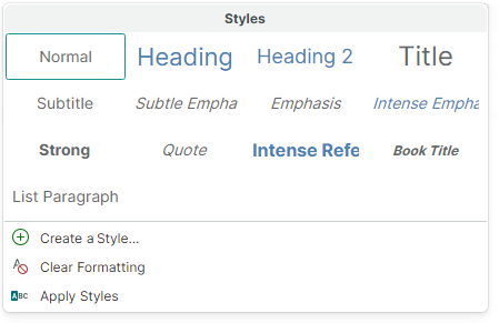
-
当
RibbonGalleryItem对象被渲染为带有关联下拉画廊的按钮时。这种情况出现在RibbonGalleryItem对象嵌入到弹出菜单中,或使用简化命令布局时。RibbonGalleryItem.Header属性指定该按钮的标题。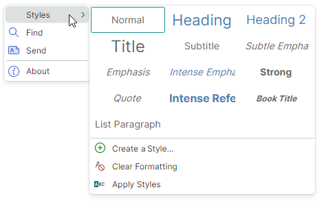
有关详细信息,请参阅以下部分:简化命令布局中的画廊 和 工具栏、弹出菜单和上下文菜单中的画廊。
-
RibbonGalleryItem.ItemHeight— 指定画廊项的高度。此属性的优先级高于RibbonGalleryItem.StretchItemVertically设置。
如果未设置 RibbonGalleryItem.ItemHeight 属性,则默认的画廊项高度由第一个画廊项的高度指定。该高度来自相应的数据模板。
RibbonGalleryItem.ItemWidth— 指定画廊项的宽度。RibbonGalleryItem.MaxColumnCount— 指定内嵌 Ribbon 画廊中的最大列数。RibbonGalleryItem.MaxDropDownColumnCount— 指定下拉画廊中的最大列数。RibbonGalleryItem.StretchItemVertically— 指定是否在垂直方向拉伸画廊项的第一行,以适应内嵌 Ribbon 画廊的高度。该自动高度会传播到其他行,包括下拉画廊中的行。
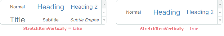
如果设置了 RibbonGalleryItem.ItemHeight 属性,则 RibbonGalleryItem.StretchItemVertically 属性不会生效。
当 RibbonGalleryItem.StretchItemVertically 属性为 false,且未使用 RibbonGalleryItem.ItemHeight 属性时,默认的画廊项高度由第一个画廊项的高度指定。该高度来自相应的数据模板。
聚焦和选择画廊项
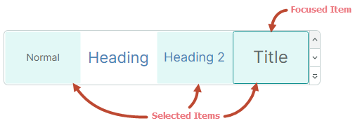
RibbonGalleryItem.FocusedItem— 允许您获取与当前获得焦点的画廊项对应的业务对象。获得焦点的项是指接收到焦点的项。您可以通过焦点框来识别获得焦点的项。
RibbonGalleryItem.ItemSelectionMode— 允许您在单项选择和多项选择模式之间进行选择。当ItemSelectionMode属性设置为Multiple时,用户可以同时选择多个画廊项。
在单项选择模式下,使用 RibbonGalleryItem.FocusedItem 属性获取/设置获得焦点(被选中)的项。
在多项选择模式下,使用 RibbonGalleryItem.SelectedItems 属性获取/设置当前选中的项。
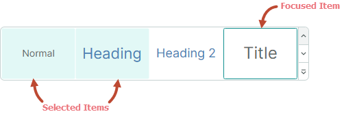
在多选模式下点击某个项时,该项会自动获得焦点并被选中。 被选中的项具有高亮背景。画廊项周围的边框表示该项已获得焦点。
要选择多个项,请在按住 CTRL 和/或 SHIFT 键的同时点击各项。
按住 CTRL 键点击可切换获得焦点项的选中状态,从而允许用户取消选中该获得焦点的项。
RibbonGalleryItem.SelectedItems— 与被选中的画廊项对应的业务对象集合。将RibbonGalleryItem.ItemSelectionMode属性设置为Multiple以允许多项选择。
在单项选择模式下,RibbonGalleryItem.SelectedItems 属性只包含一个元素,它与 RibbonGalleryItem.FocusedItem 属性一致。
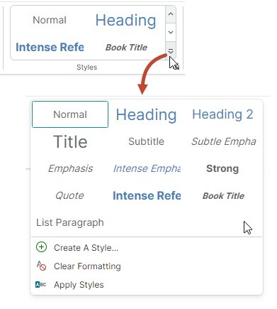
显示和关闭下拉画廊
RibbonGalleryItem.IsPopupOpen— 获取或设置下拉画廊是否处于打开状态。RibbonGalleryItem.ClosePopup— 关闭下拉画廊。
下拉画廊中的附加命令
下拉画廊可以在底部显示附加的 Ribbon 项(命令)。
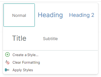
使用 RibbonGalleryItem.DropDownItems 属性指定这些附加项。
<mxr:RibbonPageGroup Header="Styles" IsHeaderButtonVisible="True">
    <mxr:RibbonGalleryItem MaxColumnCount="3" ItemWidth="108" StretchItemVertically="True"
                           ItemHeight="80"
                           Header="Styles"
                           MaxDropDownColumnCount="3"
                           ItemsSource="{Binding FontStyles}">
        <mxr:RibbonGalleryItem.DropDownItems>
            <mxb:ToolbarButtonItem Header="Create A Style..." Glyph="{x:Static icons:Basic.Add}" />
            <mxb:ToolbarButtonItem Header="Clear Formatting"
                                   Glyph="{x:Static icons:Filter.Does_not_contain}" />
            <mxb:ToolbarButtonItem Header="Apply Styles" Glyph="{x:Static icons:Filter.Starts_with}" />
        </mxr:RibbonGalleryItem.DropDownItems>
    </mxr:RibbonGalleryItem>
</mxr:RibbonPageGroup>
简化命令布局中的画廊
在简化命令布局中,添加到页面分组中的画廊会渲染为一个按钮。点击该按钮会调出整个画廊。
按钮的文本由 RibbonGalleryItem.Header 属性指定。
工具栏、弹出菜单和上下文菜单中的画廊
当您将画廊添加到传统工具栏或弹出菜单中时,画廊会显示为一个子菜单。
子菜单的标题由 RibbonGalleryItem.Header 属性指定。
* 本页面使用机器翻译技术翻译。