修改控件主题
Avalonia UI 中的控件主题(control theme)是一组样式、控件主题和资源的集合,用于定义控件的模板和外观设置。
本主题介绍了如何为项目中单个 Eremex 控件或所有 Eremex 控件修改主题设置和样式。
默认主题
Eremex.Avalonia.Themes.DeltaDesign 主题目前是 Eremex 控件的默认主题。要使用 Eremex Controls 库,您需要在项目中包含此主题,并在 App.axaml 文件中注册它。否则,Eremex 控件将显示为空白。
要修改特定的主题设置(例如控件元素的颜色或模板),请参阅主题的源代码。您可以在 GitHub 上找到并下载它:Eremex Controls Themes。
修改主题设置涉及两个步骤:
- 确定需要覆盖的目标主题设置(样式、资源或模板)。
- 为所有控件或单个控件修改目标主题设置。
概念:定位目标样式、资源或模板
您可以浏览主题的源代码,以确定要修改的主题设置。
下图展示了 DeltaDesign 主题源代码的结构:
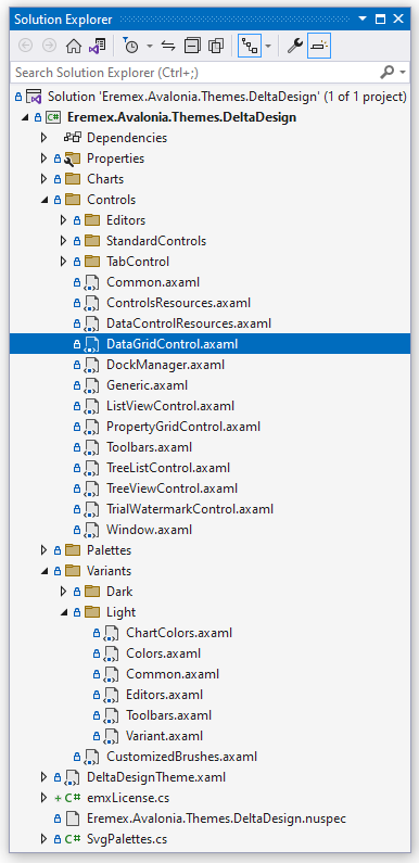
- Controls 文件夹 — 包含 Eremex 控件和标准 Avalonia UI 控件的主题文件。
- Charts 文件夹 — 包含 Eremex 图表控件的主题文件。
- Variants — 包含
Light和Dark主题变体的定义。
在这些文件中,主题设置(模板、颜色、边距等)被定义为动态资源或静态资源。
在 Eremex 视觉主题中声明动态资源
依赖于主题变体(Light 或 Dark)的主题设置被定义为动态资源(DynamicResource)。这些主题设置包括 Eremex 控件的大多数颜色。
以下代码片段展示了一个样式选择器,它在 TreeList 控件中设置 ColumnHeaderControl.Foreground 属性。该属性决定了 TreeList 列标题的前景色。ColumnHeaderControl.Foreground 属性的值绑定到键为 Text/Neutral/Secondary 的动态资源。
<!-- Eremex.Avalonia.Themes.DeltaDesign\Controls\TreeListControl.axaml -->
<Styles ...>
    <Style Selector="mxdcv|ColumnHeaderControl">
        <Setter Property="Foreground" Value="{DynamicResource Text/Neutral/Secondary}" />
        <!-- ... -->
    </Style>
</Styles>
Text/Neutral/Secondary 资源在 Light 和 Dark 主题变体中具有不同的值:
<!-- Eremex.Avalonia.Themes.DeltaDesign\Variants\Light\Colors.axaml file -->
<SolidColorBrush x:Key="Text/Neutral/Secondary" Color="#ff424d4d"/>

<!-- Eremex.Avalonia.Themes.DeltaDesign\Variants\Dark\Colors.axaml file -->
<SolidColorBrush x:Key="Text/Neutral/Secondary" Color="#ffc6d2d2"/>
Text/Neutral/Secondary 资源被多个控件使用。您可以在主题源代码中搜索此键,以查找它的所有引用。
视觉主题将 Light 和 Dark 主题变体的资源组织到两个资源字典中:
- 键为 "Default" 的资源字典 — 汇集与 Light 主题变体相关的资源。参见 Eremex.Avalonia.Themes.DeltaDesign\Variants\Light\Variant.axaml 文件。
- 键为 "Dark" 的资源字典 — 汇集与 Dark 主题变体相关的资源。参见 Eremex.Avalonia.Themes.DeltaDesign\Variants\Dark\Variant.axaml 文件。
要在项目中为特定主题变体覆盖动态资源,您必须知道其对应字典的键("Default" 或 "Dark")。
在 Eremex 视觉主题中声明静态资源
许多主题设置在 Light 和 Dark 主题变体中是相同的。这些设置被定义为静态资源(StaticResource)。它们包括:
- 布局设置(例如 UI 元素的大小和边距)
- 用于渲染内部元素和上下文菜单的模板
例如,Eremex.Avalonia.Themes.DeltaDesign\Controls\TreeListControl.axaml 文件包含 TreeList 控件的主题设置。在该文件中,TreeList 列标题的字体大小被定义为键为 "ColumnHeaderFontSize" 的静态资源。
<!-- Eremex.Avalonia.Themes.DeltaDesign\Controls\TreeListControl.axaml file -->
<Styles ...>
    <Style Selector="mxdcv|ColumnHeaderControl">
        <Setter Property="FontSize" Value="{StaticResource ColumnHeaderFontSize}" />
        <!-- ... -->
    </Style>

    <Styles.Resources>
        <x:Double x:Key="ColumnHeaderFontSize">12</x:Double>
    </Styles.Resources>
</Styles>
使用样式类进行样式设置
DeltaDesign 主题包含控件主题和样式选择器,它们针对 Eremex 控件和标准 Avalonia 控件的特定样式类。
当您为控件指定特定的_样式类_(使用控件的 Classes 属性)时,主题会应用相应的样式选择器。
例如,要用不同的边框颜色突出显示 CheckBox,请应用 warning 样式类:

在 DeltaDesign 主题中,带有 warning _样式类_的 CheckBox 的样式选择器定义如下:
<!-- Eremex.Avalonia.Themes.DeltaDesign\Controls\StandardControls\CheckBox.axaml -->

<ControlTheme x:Key="{x:Type CheckBox}" TargetType="CheckBox">
    <!-- Warning State -->
    <Style Selector="^.warning /template/ Border#NormalRectangle">
        <Setter Property="BorderBrush" Value="{DynamicResource CheckBoxWarningRectBorderBrush}" />
    </Style>
    <!-- ... -->
</ControlTheme>
以下是 DeltaDesign 主题自定义的主要_样式类_:
-
accent— 强调外观设置。- 目标标准 Avalonia 控件:Button 和 RepeatButton。
-
warning— 用于表示警告和错误的外观设置。- 目标标准 Avalonia 控件:Button、RepeatButton、CheckBox 和 RadioButton。
您可以组合使用
accent和warning样式类: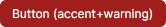
-
secondary— 用于在灰色背景上显示的控件的外观设置。-
目标 Eremex 控件:带内置文本框的编辑器(TextEditor、ButtonEditor、ComboBoxEditor、SpinEditor、DateEditor 等)以及 SegmentedEditor。
-
目标标准 Avalonia 控件:TextBox、Button、RepeatButton、ToggleButton、CheckBox、ProgressBar、RadioButton 和 Slider。
-
修改共享动态资源
多个控件可以使用同一个动态资源。
要为整个应用程序中的所有目标控件修改共享资源,请使用 Application.Resources 属性在应用程序级别覆盖该资源。
要仅在特定窗口内应用更改,请改用 Window.Resources 属性。
示例 — 为应用程序中 Light 和 Dark 主题变体修改控件的聚焦行边框画刷
假设您需要修改整个应用程序中用于绘制 DataGrid、TreeList 和 ListView 控件中聚焦行边框的画刷。新画刷在 Light 和 Dark 主题变体中应具有不同的值。
默认视觉主题将聚焦行的边框画刷定义为键为 Outline/Accent/Focus 的动态资源。
<!-- Eremex.Avalonia.Themes.DeltaDesign\Controls\DataGridControl.axaml file -->
<Style Selector="mxdgv|DataGridRowControl:focusedState /template/ Border#FocusBorder, mxdgv|DataGridRowControl:focusedAndSelectedState /template/ Border#FocusBorder">
    <!-- ... -->
    <Setter Property="BorderBrush" Value="{DynamicResource Outline/Accent/Focus}" />
</Style>

<!-- Eremex.Avalonia.Themes.DeltaDesign\Controls\ListViewControl.axaml -->
<Style Selector="mxl|ListViewGroupControl:focus-visible/template/Rectangle#PART_Border">
    <Setter Property="Stroke" Value="{DynamicResource Outline/Accent/Focus}"/>
</Style>

<!-- Eremex.Avalonia.Themes.DeltaDesign\Controls\TreeListControl.axaml -->
<Style Selector="mxtlv|TreeListRowControl:focusedState /template/ Border#FocusBorder, mxtlv|TreeListRowControl:focusedAndSelectedState /template/ Border#FocusBorder">
    <Setter Property="BorderThickness" Value="1" />
    <Setter Property="BorderBrush" Value="{DynamicResource Outline/Accent/Focus}" />
</Style>
在默认主题中,Outline/Accent/Focus 资源在 Light 和 Dark 主题变体中具有不同的值:
<!-- Eremex.Avalonia.Themes.DeltaDesign\Variants\Light\Colors.axaml file -->
<ResourceDictionary xmlns="https://github.com/avaloniaui"
  xmlns:x="http://schemas.microsoft.com/winfx/2006/xaml">
    <!-- ... -->
    <SolidColorBrush x:Key="Outline/Accent/Focus" Color="#ff129190"/>
</ResourceDictionary>

<!-- Eremex.Avalonia.Themes.DeltaDesign\Variants\Dark\Colors.axaml file -->
<ResourceDictionary xmlns="https://github.com/avaloniaui"
  xmlns:x="http://schemas.microsoft.com/winfx/2006/xaml">
    <!-- ... -->
    <SolidColorBrush x:Key="Outline/Accent/Focus" Color="#ff36afb0"/>
</ResourceDictionary>
要在您的应用程序中为 Light 和 Dark 主题变体修改此资源,请执行以下步骤:
-
在项目中的 "Resources" 文件夹内创建 "ModifiedResources.axaml" 文件。
-
在该文件中,定义两个键分别为 "Default" 和 "Dark" 的资源字典(分别对应 Light 和 Dark 主题变体)。
<ResourceDictionary xmlns="https://github.com/avaloniaui"
                    xmlns:x="http://schemas.microsoft.com/winfx/2006/xaml">
    <ResourceDictionary.ThemeDictionaries>

        <!-- Override resources for the Light theme variant -->
        <ResourceDictionary x:Key="Default">

        </ResourceDictionary>

        <!-- Override resources for the Dark theme variant -->
        <ResourceDictionary x:Key="Dark">

        </ResourceDictionary>

    </ResourceDictionary.ThemeDictionaries>
</ResourceDictionary>
- 在 "Default" 和 "Dark" 资源字典中为 Outline/Accent/Focus 资源定义新值:
<ResourceDictionary xmlns="https://github.com/avaloniaui"
                    xmlns:x="http://schemas.microsoft.com/winfx/2006/xaml">
    <ResourceDictionary.ThemeDictionaries>

        <!-- Override resources for the Light theme variant -->
        <ResourceDictionary x:Key="Default">
            <SolidColorBrush x:Key="Outline/Accent/Focus" Color="Blue"/>
        </ResourceDictionary>

        <!-- Override resources for the Dark theme variant -->
        <ResourceDictionary x:Key="Dark">
            <SolidColorBrush x:Key="Outline/Accent/Focus" Color="Orange"/>
        </ResourceDictionary>

    </ResourceDictionary.ThemeDictionaries>
</ResourceDictionary>
- 在您的
App.axaml文件中,将 "Resources/ModifiedResources.axaml" 文件中的资源合并到应用程序的资源中。
<Application ...>
    <Application.Resources>
        <ResourceDictionary>
            <ResourceDictionary.MergedDictionaries>
                <ResourceInclude Source="/Resources/ModifiedResources.axaml"/>
            </ResourceDictionary.MergedDictionaries>
        </ResourceDictionary>
    </Application.Resources>
</Application>
- 运行应用程序以查看结果。 当浅色主题变体处于活动状态时,聚焦行边框绘制为蓝色。 当应用深色主题变体时,使用橙色。
为特定控件修改主题资源
您可以使用控件的 Resources 属性来仅为该控件更改特定资源。
此修改不会影响其他控件。
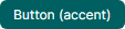
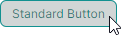
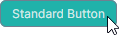
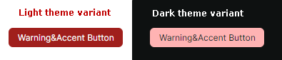
示例 — 修改单个 Button 在按下和聚焦状态下的颜色
DeltaDesign 主题包含控件主题和样式选择器,用于调整标准 Avalonia UI 控件的颜色,使其在与 Eremex 控件位于同一窗口时外观保持一致。
下图展示了标准 Button 控件在按下状态下由 DeltaDesign 主题绘制的默认外观:
在按下状态下,应用了以下样式选择器:
<!-- Eremex.Avalonia.Themes.DeltaDesign\Controls\StandardControls\Button.axaml -->
<ControlTheme x:Key="{x:Type Button}" TargetType="Button">
    <!-- Pressed State -->
    <Style Selector="^:pressed">
        <Style Selector="^ /template/ Border#PART_BackgroundBorder">
            <Setter Property="Background" Value="{DynamicResource ButtonBackgroundPressed}" />
        </Style>
        <Style Selector="^  /template/ ContentPresenter#PART_ContentPresenter">
            <Setter Property="Foreground" Value="{DynamicResource ButtonForegroundPressed}" />
            <Setter Property="Opacity" Value="0.8"/>
        </Style>
    </Style>
    <!--Focus Border-->
    <Style Selector="^:focus /template/ Border#PART_ButtonBorder">
        <Setter Property="BorderBrush" Value="{DynamicResource ButtonFocusBorderBrush}" />
        <Setter Property="BorderThickness" Value="{StaticResource EditorBorderThickness}"/>
    </Style>
    <!-- ... -->
</ControlTheme>
要更改单个 Button 在按下和聚焦状态下的颜色,请从 Button.Resources 属性中修改 ButtonBackgroundPressed、ButtonForegroundPressed 和 ButtonFocusBorderBrush 资源。
<Button Content="Simple Button" HorizontalAlignment="Center" >
    <Button.Resources>
        <SolidColorBrush x:Key="ButtonBackgroundPressed" Color="LightSeaGreen" />
        <SolidColorBrush x:Key="ButtonForegroundPressed" Color="Snow" />
        <SolidColorBrush x:Key="ButtonFocusBorderBrush" Color="SlateGray" />
    </Button.Resources>
</Button>
为窗口内的控件修改主题资源
您可以从 Window.Resources 属性修改主题资源,以将主题修改应用于该窗口内的相应控件。
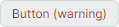
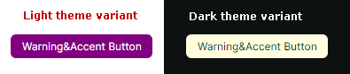
示例 — 为窗口内 Light 和 Dark 主题变体修改强调按钮
DeltaDesign 主题包含特定的样式选择器,当您为标准 Avalonia Button 控件设置 accent 和/或 warning 样式类时会应用这些选择器。此示例展示了如何为 Light 和 Dark 主题变体覆盖窗口中强调按钮的外观设置。
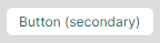
您可以应用 accent 和 warning 样式类来突出显示按钮:
请参阅 Eremex.Avalonia.Themes.DeltaDesign\Controls\StandardControls\Button.axaml 文件,以查看应用于强调按钮在正常、悬停、按下和禁用状态下的样式选择器。下面的代码片段展示了强调按钮正常状态下的两个样式选择器:
<!-- Eremex.Avalonia.Themes.DeltaDesign\Controls\StandardControls\Button.axaml file -->
<ControlTheme x:Key="{x:Type Button}" TargetType="Button">
    <!-- WarningAccent style -->
    <Style Selector="^.warning.accent">
        <Style Selector="^ /template/ Border#PART_BackgroundBorder">
            <Setter Property="Background" Value="{DynamicResource ButtonWarningAccentBackground}" />
        </Style>
        <Style Selector="^ /template/ ContentPresenter#PART_ContentPresenter">
            <Setter Property="Foreground" Value="{DynamicResource ButtonWarningAccentForeground}" />
        </Style>
        <!-- ... -->
    </Style>
    <!-- ... -->
</ControlTheme>
使用 Window.Resources 属性在窗口级别为 Light 和 Dark 主题变体覆盖强调按钮的背景颜色。以下代码在 Default(Light)和 Dark 资源字典中覆盖了相应的主题资源:
<mx:MxWindow
    xmlns:mx="https://schemas.eremexcontrols.net/avalonia">

    <mx:MxWindow.Resources>
        <ResourceDictionary>
            <ResourceDictionary.ThemeDictionaries>
                <!--Resources for the Light theme variant-->
                <ResourceDictionary x:Key="Default">
                    <SolidColorBrush x:Key="ButtonWarningAccentBackground" Color="Purple" />
                </ResourceDictionary>

                <!--Resources for the Dark theme variant-->
                <ResourceDictionary x:Key="Dark">
                    <SolidColorBrush x:Key="ButtonWarningAccentBackground" Color="LightYellow" />
                </ResourceDictionary>
            </ResourceDictionary.ThemeDictionaries>
        </ResourceDictionary>
    </mx:MxWindow.Resources>
    <!-- ... -->
</mx:MxWindow>
您还可以修改按钮其他状态的画刷:
- 悬停 —
ButtonWarningAccentBackgroundPointerOver和ButtonWarningAccentForegroundPointerOver - 按下 —
ButtonWarningAccentBackgroundPressed和ButtonWarningAccentForegroundPressed - 禁用 —
ButtonWarningAccentBackgroundDisabled和ButtonWarningAccentForegroundDisabled。
修改 Eremex 视觉主题中定义的控件样式
当您浏览 DeltaDesign 视觉主题源代码时,会发现不仅改变颜色和画刷,还会改变控件其他外观设置的样式选择器。这些包括内部元素的大小以及定义布局和内容的控件模板。
您可以使用以下属性在应用程序中覆盖这些样式选择器:
Application.Styles— 应用于整个应用程序中控件的样式集合。Window.Styles— 应用于窗口内控件的样式集合。Control.Styles— 应用于特定控件的样式集合。
示例 — 在应用程序级别修改 ColorEditor 控件中颜色切换按钮的样式
此示例展示了如何更改 ColorEditor 和 PopupColorEditor 控件中颜色切换按钮的外观和模板。新样式将应用于应用程序中所有 ColorEditor 和 PopupColorEditor 控件。
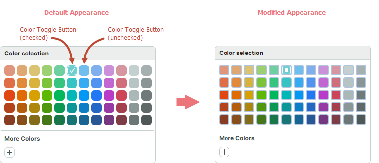
首先,在 DeltaDesign 主题源代码中找到颜色切换按钮的默认样式。
<!-- Eremex.Avalonia.Themes.DeltaDesign\Controls\Editors\ColorEditor.axaml -->
<!--Color Toggle Button-->
<ControlTheme x:Key="{x:Type mxev:ColorToggleButton}" TargetType="mxev:ColorToggleButton">
    <Setter Property="CornerRadius" Value="{StaticResource EditorCornerRadius}"/>
    <Setter Property="BorderThickness" Value="{StaticResource EditorBorderThickness}"/>
    <Setter Property="Width" Value="{StaticResource ColorButtonDefaultSize}"/>
    <!-- ... -->
    <Setter Property="Template">
        <ControlTemplate>
            <Border x:Name="PART_ExternalBorder"
                    CornerRadius="{TemplateBinding CornerRadius}"
                    BorderThickness="{TemplateBinding BorderThickness}"
                    ...>
                <Border x:Name="PART_InternalBorder"
                        CornerRadius="{TemplateBinding CornerRadius}"
                        BorderThickness="{TemplateBinding BorderThickness}"
                        ...>
                    <Path x:Name="PART_CheckGlyph"
                            Stretch="None"
                            Fill="{Binding $parent[mxev:ColorToggleButton].BorderBrush}"
                            Data="{StaticResource CheckBoxCheckIcon}"
                            .../>
                </Border>
            </Border>
        </ControlTemplate>
    </Setter>
</ControlTheme>
按照以下步骤在应用程序级别更改颜色切换按钮的外观:
-
在项目的 "Resources" 文件夹内创建 "ModifiedStyles.axaml" 文件。
-
将以下代码添加到 "ModifiedStyles.axaml" 文件中。此代码覆盖了
ColorToggleButton类的样式
<Styles xmlns="https://github.com/avaloniaui"
        xmlns:x="http://schemas.microsoft.com/winfx/2006/xaml"
        xmlns:mxev="clr-namespace:Eremex.AvaloniaUI.Controls.Editors.Visuals;assembly=Eremex.Avalonia.Controls">
    <Styles.Resources>
        <RectangleGeometry x:Key="ColorCheckedIcon" Rect="0,0,7,7" />
    </Styles.Resources>

    <Style Selector="mxev|ColorToggleButton">
        <Setter Property="CornerRadius" Value="3"/>
        <Setter Property="Template">
            <ControlTemplate>
                <Border x:Name="PART_ExternalBorder"
                                CornerRadius="{TemplateBinding CornerRadius}"
                                BorderThickness="2"
                                BorderBrush="LightSteelBlue"
                                Background="{TemplateBinding Background}">
                    <Border x:Name="PART_InternalBorder"
                                    CornerRadius="{TemplateBinding CornerRadius}"
                                    BorderThickness="{TemplateBinding BorderThickness}"
                                    BorderBrush="{TemplateBinding BorderBrush}"
                                    Background="{TemplateBinding Background}">
                        <Path x:Name="PART_CheckGlyph"
                                    Stretch="None"
                                    VerticalAlignment="Center"
                                    HorizontalAlignment="Center"
                                    Data="{StaticResource ColorCheckedIcon}"
                                    Margin="0"
                                    Width = "7"
                                    Height="7"
                        />
                    </Border>
                </Border>
            </ControlTemplate>
        </Setter>
    </Style>
</Styles>
- 在
App.axaml文件中,将 "Resources/ModifiedStyles.axaml" 文件中的样式合并到Application.Styles集合中。
<Application ...>
    <Application.Styles>
        <theme:DeltaDesignTheme/>
        <StyleInclude Source="/Resources/ModifiedStyles.axaml"/>
    </Application.Styles>
</Application>
- 运行应用程序以查看结果。
* 本页面使用机器翻译技术翻译。