TabControl
MxTabControl control 允许您将 organize 面板转换为选项卡式 UI。用户可以通过单击相应的选项卡来激活特定面板。
MxTabControl 是标准 Avalonia.Controls.TabControl 控件的后代。它继承了 TabControl 的基本功能,并通过附加功能进行了扩展:
- 无限数量的选项卡。
- 来自项目源的选项卡和 tab 内容的填充。
- 通过拖放选项卡重新排序。
- 选项卡 layout 模式:拉伸、滚动和多行。
- “关闭选项卡”按钮。
- “新标签”按钮。
- tab 标头区域中的自定义 controls。
创建选项卡
MxTabControl 从 Avalonia.Controls.TabControl 基类继承 tab 创建功能。 controls 支持两种添加选项卡的方法:
- 手动添加tab项目
- 从项目源填充选项卡和 tab 内容。
手动添加选项卡项目
MxTabControl control 中的选项卡项由 MxTabItem 对象封装。它们公开设置以指定 tab 标题文本、tab 标题 image (glyph)、“关闭”命令(单击 tab 的“关闭”button 时激活的命令)等。
例子
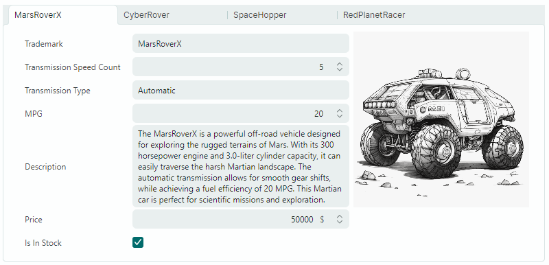
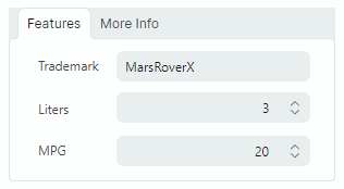
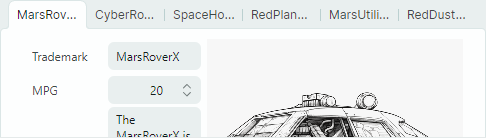
以下示例创建两个具有预定义内容(编辑器和标签)的选项卡。
xmlns:mx="https://schemas.eremexcontrols.net/avalonia"
xmlns:mxe="https://schemas.eremexcontrols.net/avalonia/editors"

<mx:MxTabControl Margin="5" Height="160" Name="tabControl1" Width="300">
    <mx:MxTabItem Header="Features">
        <Grid RowDefinitions="Auto Auto Auto" ColumnDefinitions="Auto *" Margin="5">
            <Label Classes="LayoutItem" Grid.Column="0" Grid.Row="0" Content="Trademark"/>
            <mxe:TextEditor EditorValue="{Binding SelectedCar.Trademark}" Margin="5"
             Height="20" Grid.Row="0" Grid.Column="1"/>
            <Label Classes="LayoutItem" Grid.Column="0" Grid.Row="1" Content="Liters"/>
            <mxe:SpinEditor EditorValue="{Binding SelectedCar.Liter}" Margin="5"
             Height="20" Grid.Row="1" Grid.Column="1"/>
            <Label Classes="LayoutItem" Grid.Column="0" Grid.Row="2" Content="MPG"/>
            <mxe:SpinEditor EditorValue="{Binding SelectedCar.MPG}" Margin="5"
             Height="20" Grid.Row="2" Grid.Column="1"/>
        </Grid>
    </mx:MxTabItem>
    <mx:MxTabItem Header="More Info" >
        <mxe:TextEditor Margin="5" EditorValue="{Binding SelectedCar.Description}"
         TextWrapping="Wrap" VerticalAlignment="Stretch"/>
    </mx:MxTabItem>
</mx:MxTabControl>
从项目源填充选项卡
MxTabControl 的祖先之一是 Avalonia.Controls.ItemsControl 类。这允许您使用项目源中的项目填充 TabControl。为此目的,请使用以下主要属性:
ItemsSource— 指定包含要呈现为选项卡的项目的源。ItemTemplate— 指定用于呈现 tab 标头的 DataTemplate。ContentTemplate— 指定用于呈现 tab 内容的 DataTemplate。
例子
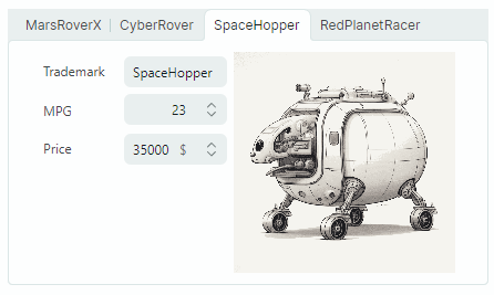
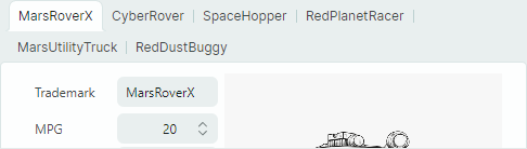
以下示例将 MxTabControl control 绑定到 items source 并指定呈现 tab 标头和内容的 DataTemplate。
xmlns:mx="https://schemas.eremexcontrols.net/avalonia"
xmlns:mxe="https://schemas.eremexcontrols.net/avalonia/editors"

<mx:MxTabControl ItemsSource="{Binding Cars}" SelectedItem="{Binding SelectedCar}">
    <mx:MxTabControl.ItemTemplate>
        <DataTemplate DataType="demoData:CarInfo">
            <TextBlock Text="{Binding Trademark}"></TextBlock>
        </DataTemplate>
    </mx:MxTabControl.ItemTemplate>

    <mx:MxTabControl.ContentTemplate>
        <DataTemplate DataType="demoData:CarInfo">
            <StackPanel Orientation="Horizontal" Margin="10">
                <Grid RowDefinitions="Auto Auto Auto" ColumnDefinitions="Auto *">
                    <Label Classes="LayoutItem" Grid.Column="0" Grid.Row="0" Content="Trademark"/>
                    <mxe:TextEditor Classes="LayoutItem"  Grid.Column="1" Grid.Row="0"
                     EditorValue="{Binding Trademark}"/>

                    <Label Classes="LayoutItem" Grid.Column="0" Grid.Row="1" Content="MPG"/>
                    <mxe:SpinEditor Classes="LayoutItem" Grid.Column="1" Grid.Row="1"
                     EditorValue="{Binding  MPG}" Minimum="0"/>

                    <Label Classes="LayoutItem" Grid.Column="0" Grid.Row="2" Content="Price"/>
                    <mxe:SpinEditor Classes="LayoutItem" Grid.Column="1" Grid.Row="2"
                     EditorValue="{Binding  Price}" Suffix="{Binding Currency}" Minimum="0"/>
                </Grid>
                <Image Grid.Column="1" Width="200" Source="{Binding Image}" VerticalAlignment="Top"/>
            </StackPanel>
        </DataTemplate>
    </mx:MxTabControl.ContentTemplate>
</mx:MxTabControl>
选择一个选项卡
使用以下属性来选择选项卡并获取选定的选项卡:
SelectedIndex— 指定所有选项卡中所选 tab 的 zero-based 索引。您可以使用MxTabControl.Items属性来访问 tab 集合。SelectedItem— 指定所选 tab 的项目。如果使用MxTabItem对象手动将选项卡添加到 TabControl,则SelectedItem属性指定选定的MxTabItem对象。如果 TabControl 是从 items source 填充的,则SelectedItem属性指定来自绑定项源的选定 tab 的数据对象。
SelectedValue 属性指定所选 tab 的值。该属性返回以下值:
null,如果使用MxTabItem对象手动将选项卡添加到 TabControl。- tab 的 underlying 数据对象(如果 TabControl 是从项目源填充的)。
以下属性允许您返回所选 tab 的内容:
SelectedContent— 指定所选 tab 的内容。SelectedContentTemplate— 指定所选 tab 的内容模板。
选项卡排列
默认情况下,选项卡标题沿着 TabControl 的顶部边缘显示。您可以使用 TabStripPlacement 属性来指定 tab 标头的 position。
TabControl 支持三种 tab 接头 layout 模式。使用 MxTabControl.TabStripLayoutType 属性指定 tab 标头排列类型:
Scroll— 选项卡标题的宽度足以显示 tab 标题的内容。如果没有足够的空间来完整显示所有 tab 标题,则滚动按钮会出现在 tab 标题区域中。
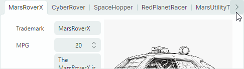
Stretch— 所有 tab 标头均按 line、stretching、to fit 和 control 的宽度排列。它们具有相同的宽度或高度,具体取决于 tab 条带 position(请参阅TabStripPlacement属性)。
MultiLine— 如果没有足够的空间在单行中显示选项卡标题,则选项卡标题会排列在多行中。
选项卡重新排序
如果 MxTabControl.TabDragMode 属性设置为 Reorder,则用户可以使用拖放操作重新设置 arrange 选项卡。
处理 TabItemStartDragging 和 TabItemCompleteDragging 事件以取消拖动操作或在拖动选项卡时执行其他操作。
“关闭”按钮
TabControl 支持内置“选项卡关闭”(“x”) 按钮。它们可以显示在选项卡和/或 tab 标题区域中,如 MxTabControl.CloseButtonShowMode 属性所指定。
默认情况下,“选项卡关闭”按钮不执行任何操作。您需要使用以下方法之一实施“关闭”button 操作:
- 处理
MxTabControl.CloseButtonClick事件。 - 使用
MxTabItem.CloseCommand成员指定命令。
“新标签”按钮
将 MxTabControl.NewButtonShowMode 属性设置为 InHeaderPanel 以显示“新选项卡”(“+”)按钮。默认情况下,单击此 button 没有任何操作。您可以使用以下成员指定操作:
MxTabControl.NewButtonClick事件。MxTabControl.NewCommand命令。
选项卡标题区域中的自定义控件
您可以使用 ControlBoxContent 和 ControlBoxContentTemplate 属性将自定义 controls 添加到 tab 标头区域。
例子
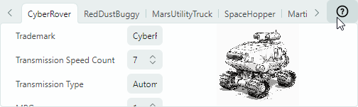
以下示例添加了“?” button 到 tab 标头区域。单击 button 将引发 HelpCommand 命令。当前选择的 tab 的 item 作为命令的参数传递。
xmlns:mx="https://schemas.eremexcontrols.net/avalonia"
x:Class="SampleTabControl.TabControlPageView"
xmlns:vm="using:SampleTabControl"
x:DataType="vm:TabControlPageViewModel"

<mx:MxTabControl ItemsSource="{Binding Cars}"
                SelectedItem="{Binding SelectedCar}"
                x:Name="TabControl"
    >
    <mx:MxTabControl.ControlBoxContent>
        <Button Command="{Binding HelpCommand}"
         CommandParameter="{Binding $parent.SelectedItem}">
            <Image Width="20" Height="20"
             Source="{SvgImage 'avares://SampleTabControl/Images/help-icon.svg'}"/>
        </Button>
    </mx:MxTabControl.ControlBoxContent>
    ...
</mx:MxTabControl>
public partial class TabControlPageViewModel : PageViewModelBase
{
    //...
    [RelayCommand]
    private void Help(object parameter)
    {
        //...
    }
}
* 本页面使用机器翻译技术翻译。